


White_Moth
Comment #3 Sunday, May 11, 2003 9:41 PM
Comment #3 Sunday, May 11, 2003 9:41 PM
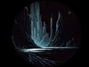
I always liked your style webdiod, and this is no exception, but I have to say, the white lines are a bit too much.
Great work though.
Great work though.

river55IL
Comment #4 Sunday, May 11, 2003 9:54 PM
Comment #4 Sunday, May 11, 2003 9:54 PM
The white lines ruin it, other than that I like it.
EventHorizon
Comment #5 Sunday, May 11, 2003 10:10 PM
Comment #5 Sunday, May 11, 2003 10:10 PM
White lines...id have to say i agree with Dm, river55lL and W_M. But aside from that, Nice job. 

JM_Zen
Comment #6 Sunday, May 11, 2003 11:08 PM
Comment #6 Sunday, May 11, 2003 11:08 PM
Intense. This one is going straight onto my desktop.
Oh, and I have to disagree with EventHorizon, river55lL, White_Moth and Dark Mist; I LOVE the white lines. They make me dizzy. LOL
Oh, and I have to disagree with EventHorizon, river55lL, White_Moth and Dark Mist; I LOVE the white lines. They make me dizzy. LOL
Dredd_67
Comment #7 Monday, May 12, 2003 1:29 AM
Comment #7 Monday, May 12, 2003 1:29 AM
As i've said it about some other walls, shades of grey are my favorite. And so this one is a winner!

No Rules
Comment #9 Monday, May 12, 2003 4:06 PM
Comment #9 Monday, May 12, 2003 4:06 PM
i like this wall, good colors and fine detail. i would change 1 thing,[ turn the lighting down lin the middle, i would like 2 b able 2 c more details down in the middle, i give ya a 7, b4n. 
denny

denny
joetheblow
Comment #10 Tuesday, May 13, 2003 3:26 AM
Comment #10 Tuesday, May 13, 2003 3:26 AM
hmmmmm.... another wall I wonder how it was created...
it is nice.
it is nice.
Thornycat
Comment #11 Tuesday, May 13, 2003 6:34 PM
Comment #11 Tuesday, May 13, 2003 6:34 PM
holy crap. i have this one on my home comp, and on my work comp. if someones looking over my shoulder when i log into the network, and they see the wallpaper, they ALWAYS say something like "wow! where did you find that?", or "hey cool desktop!". Yep, i like it alot.
Sketch01
Comment #12 Monday, May 19, 2003 7:32 PM
Comment #12 Monday, May 19, 2003 7:32 PM
I think the image would look better if the 'white lines' faded into transparent as they emerge from the center. This way, focus remains on the central, blinding light.
Interesting concept. LOL
Interesting concept. LOL
diiorio
Comment #13 Wednesday, May 21, 2003 3:49 PM
Comment #13 Wednesday, May 21, 2003 3:49 PM
excuse me!!!!!!!!!!!!!!!!!!!!!!!!!!!!!!!!!!!!!!!!!!!!!!!!!!!!!!!!!!!!!!!!!!!!!!!!!!!!!!!!!!!!!!!
u ripped it from http://shadowness.com/


u ripped it from http://shadowness.com/


webdiod
Comment #14 Tuesday, May 27, 2003 3:28 PM
Comment #14 Tuesday, May 27, 2003 3:28 PM
what kind of idiot are you diiorio it's possible to submit an image to more then one website.
Please login to comment and/or vote for this skin.
Welcome Guest! Please take the time to register with us.
There are many great features available to you once you register, including:
- Richer content, access to many features that are disabled for guests like commenting on the forums and downloading files.
- Access to a great community, with a massive database of many, many areas of interest.
- Access to contests & subscription offers like exclusive emails.
- It's simple, and FREE!


Comment #1 Sunday, May 11, 2003 7:25 PM