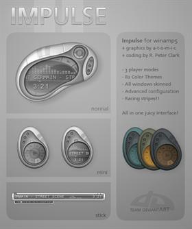
Impulse
Average Rating: 10
Yours: -1
File Size: .42MB
Downloads Today: 0 Downloads Total: 14040

Impulse

Updated Jul 01, 2004 by a-t-o-m-i-c


First Previous Page 2 of 2 Next Last
TrueDis
Comment #21 Wednesday, April 28, 2004 2:36 AM
First off, this is the best Winamp5 modern skin I've seen. AWESOME work. Very thorough.

A few suggestions:
- Make the control panel a bit bigger when it's in shade mode, the buttons are so damn small...
- Add an open button to the control panel in shade mode

That's really all I've got. This one is sweet.
Alien_Paradox
Comment #22 Friday, April 30, 2004 1:29 PM
the best skin i've ever seen....awesome!
a-t-o-m-i-c
Comment #23 Tuesday, May 4, 2004 1:30 AM
**Updated May 1st: now includes the open button in the stick mode, and fixed a small issue with the stick mode shadow.

@TrueDis: the buttons on the stick mode are meant to be really small, I tried to make it as space saving as possible. You can try using the scaling option but I don't think I'll be modifying the design too much at this point. Your second wish is now included in the update.

@astrofaes: The bug you found seems to be native to winamp5 thus there is little we can do at this point to fix it. Your best bet is to hope for an update from nullsoft fixing this issue!
b0se
Comment #24 Tuesday, May 4, 2004 1:43 PM
This is so nice mate, pity it wasn't in the most useable category! Using it now
a-t-o-m-i-c
Comment #25 Tuesday, May 4, 2004 2:05 PM
I decided that this skin was not the most usable for everyone... To me its really intuitive but not necessarily the most easy to use. I opted for the power user category since it was designed to take as little real-estate as possible without losing functionality and still carrying a whole lot of options.

Glad you're liking it!
TrueDis
Comment #26 Wednesday, May 5, 2004 1:55 AM
a-t-o-m-i-c:
Thanks for updating the skin, I've gotten used to the small buttons, and it really is exactly what I need in a skin. Thanks for such a well-done, well-rounded skin with so many awesome color schemes. And thanks for being so open to user input!
erasid
Comment #27 Friday, May 7, 2004 2:52 PM
This is not just another skin. This is elevating Winamp to a whole new level. The design and color combinations are so beautiful it should be listed under 'work of art' category. Small details like the 'Tips' window show the amount of love and work that went into this project. Keep up the good work! I almost have the 'impulse' to use Winamp because of your skin but my CPU dissagrees.
Maisch
Comment #28 Saturday, May 8, 2004 11:53 AM
Great design, and loaded with features. Awesome work guy's!!
Playboy Skins
Comment #29 Wednesday, May 12, 2004 11:47 AM
this is definetly a winner.
Kylhwch
Comment #30 Thursday, May 27, 2004 1:48 PM
First off - I adore this skin. It's my favorite modern skin of all time.

I have a question though - sometimes when I have the skin in itty-bitty mode, the songtitle appears and scrolls back and forth. Other times, instead of the songtitle, I get a little visualization in that space.

Is there someway to toggle the visualization on or off? I can't tell why sometimes I see the title and sometimes the viz.

Thanks and congrats!
TrueDis
Comment #31 Friday, May 28, 2004 5:02 AM
I've got a bug report this time around. I run the player in stick mode. When the playlist window is docked beneath it and ed, if I click on the main window (somewhere that isn't a control, like on the song title), the playlist window freaks out and moves down and to the right. Don't quite know how else to describe it, and I'm not sure what the cause could be at all.
a-t-o-m-i-c
Comment #32 Saturday, May 29, 2004 3:30 AM
@Kyhlwch: This is weird. In stick mode you should always be able to see the songtitle and time, but if you drag one of the edges you should see the visualiser and vol/pos sliders revealed. I am not sure how you can possibly only have the visualization showing, but if there is a way to reproduce it tell me and I'll see if I can do something about it!

@TrueDis: Yes this bug has been reported (see a few comments below), my response was: The bug you found seems to be native to winamp5 thus there is little we can do at this point to fix it. Your best bet is to hope for an update from nullsoft fixing this issue!
teddybearcholla
Comment #33 Sunday, October 3, 2004 5:30 PM
This is an excellent example of fine craftsmanship! A far cry from winamp skins a few years ago!! Thank you both for creating and sharing this skin with us!
Ion BR
Comment #34 Wednesday, December 29, 2004 11:01 AM
No more comments.....

IT'S THE BEST SKIN EVER !!!

Please login to comment and/or vote for this skin.

Welcome Guest! Please take the time to register with us.
There are many great features available to you once you register, including:

  • Richer content, access to many features that are disabled for guests like commenting on the forums and downloading files.
  • Access to a great community, with a massive database of many, many areas of interest.
  • Access to contests & subscription offers like exclusive emails.
  • It's simple, and FREE!
Downloads remaining: 5
User Level: Visitor

Featured WinAmp

Popular WinAmp

Top WinAmp Skinners

Yesterday  |   Last 30 Days  |   All Time
1. ariszlo 209
2. teffumi 104
3. tatosh 72
4. SisTeck 52
5. Pimousse38 50
6. Graypony 48
7. mdwm 48
8. nelleht 45
9. kriptoner 43
10. eric menk 43
11. SMAR 43
12. zrco 43
13. sxnc 39
14. Dangeruss 34
15. TheD2JBug 30


web-wc01