|
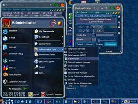
Docking StationUpdated Nov 26, 2003 by TheGreenReaper |
||||||||
Comment #22 Friday, November 23, 2001 8:53 PM
Comment #23 Friday, November 23, 2001 9:14 PM
Comment #24 Friday, November 23, 2001 10:27 PM
But just for you - www.bath.ac.uk/~cs1lomp/nonorn.zip (extract the files in here to get rid of all signs of Creatures, except the DS logo). May the Shee have mercy on you. Amen.
Comment #25 Friday, November 23, 2001 10:45 PM
However, I found one redraw problem when using Winzip 8.1 beta (Docking Station Advanced). Whenever I tried to extract file(s), there is nothing shown in the section 'File' (Selection for all/selected file(s)). I have to move to mouse pointer to that section to let it redraw again. There is no problem when using Docking Station Basic.
If this problem is solved, then this skin is perfect.
Thanks for this great skin.
Comment #26 Friday, November 23, 2001 11:02 PM
I'll have a word with the programmers - should be sorted out "soon" . . .
Comment #27 Saturday, November 24, 2001 1:11 PM
Comment #28 Saturday, November 24, 2001 1:43 PM
Comment #29 Saturday, November 24, 2001 9:21 PM
Its obvious that a lot of work has gone into this skin and I can only compliment you on it. I especially like the animated border on the taskbar buttons when the cursor is moved over it. I look forward to seeing more of your work in the future. Well done m8
Comment #30 Sunday, November 25, 2001 4:41 PM
One little problem I'm having. On reboot, it always resizes the taskbar to a thin one that doesn't show all the icons. Any idea?
Comment #31 Sunday, November 25, 2001 6:11 PM
Comment #32 Sunday, November 25, 2001 10:36 PM
Zoltron: Sorry you feel that way - but it *is* a skin based off a computer game essentially for children (of all ages
Comment #34 Monday, November 26, 2001 8:30 PM
My personal favourite part is the transparency feature ... it's actually stable!
Comment #35 Tuesday, November 27, 2001 7:23 AM
Comment #36 Tuesday, November 27, 2001 9:40 AM
The highest my monitor goes at is 1280x960, and the highest I really feel *comfortable* at is 800x600. Since the Start menu background is complex and varies in brightness, it inevitably causes problems when resizing it. From testing I suggest a "number of items in the recently used list" value of 6, 7 or 9 with this skin.
Comment #37 Tuesday, November 27, 2001 12:47 PM
This skin is crap. The colors don't go well, the buttons for min/max/close are too big, the creatures are annoying and the scrollbars don't make sense. The whole this is just cluttered and doesn't work well.
Sorry, but the final judgment: CRAP!
Comment #38 Tuesday, November 27, 2001 1:35 PM
If you do want to remove the creatures, get the file at http://www.bath.ac.uk/~cs1lomp/nonorn.zip and extract the files in there to the skin directory.
I'd review your DX theme in return, but my monitor whistles if I put it up to 1280 - and my eyes water, too . . .
Comment #39 Tuesday, November 27, 2001 3:58 PM
Comment #40 Tuesday, November 27, 2001 5:06 PM
Please login to comment and/or vote for this skin.
Welcome Guest! Please take the time to register with us.
There are many great features available to you once you register, including:
- Richer content, access to many features that are disabled for guests like commenting on the forums and downloading files.
- Access to a great community, with a massive database of many, many areas of interest.
- Access to contests & subscription offers like exclusive emails.
- It's simple, and FREE!


Comment #21 Friday, November 23, 2001 7:04 PM