Comment #22 Sunday, November 7, 2004 2:44 PM
Comment #24 Sunday, November 7, 2004 5:48 PM
Update should be ready in a few days!
Comment #25 Sunday, November 7, 2004 6:20 PM
http://www.infa.abo.fi/~tiggi/propaganda/ab/all-good-people-1.html
Right click the picture and save as a .bmp file.
Comment #26 Thursday, November 18, 2004 3:37 PM
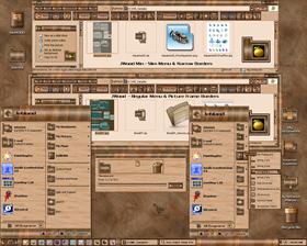
Window frames show attention to detail, "burned in wood" look by font choice is also excellent (although the width of font causes some text wrapping issues).
Scroll up size might be one too far, and the task pane of Windows Explorer is unskinned.
Overall, excellent first skin effort. Attention to details shows and the rating reflects that.
Comment #27 Tuesday, November 30, 2004 10:47 AM
Comment #28 Tuesday, November 30, 2004 4:45 PM
Byron, I'm working on an update to correct the issues you mentioned. Thank you for the input.
Comment #31 Friday, December 17, 2004 7:41 PM
Comment #33 Saturday, December 18, 2004 10:03 PM
Just tried it on Thunderbird and the same problem occurs so maybe it just Mozilla stuff? Don't know.
Just tried it with Sunbird, menu content was messed up but the entire menu frame was showing.
Comment #34 Sunday, December 19, 2004 1:37 AM

when in a window, if i click on a window in my start bar, it wont pull up the window. I have to minimize all windows then pull it up. Also, id love if you could add being able to max. the window by double clicking the title bar in IE.
but! i *love* the skin!

Comment #35 Sunday, December 19, 2004 9:41 AM
This is an obsolete setting I left in there because I thought it might be needed on older versions of Windows. It that fixes it, I will update the skin. Thank you for your help.
Comment #36 Sunday, December 19, 2004 9:49 AM
Comment #37 Sunday, December 19, 2004 2:16 PM

Comment #38 Sunday, December 19, 2004 2:46 PM
Comment #39 Sunday, December 19, 2004 4:35 PM
I installed FireFox (well, I hadn't screwed up my computer in a long time so why not). If you load SkinStudio and go to "Fonts for Classic widgets" and delete the setting for System Menu Fonts, that fixes it. I put that setting in so the menus would show the dungeon font. I guess FireFox just threw up at having a custom font. Sorry for the problem.
Comment #40 Wednesday, December 29, 2004 3:36 AM
You need a cursor to match your theme. I find that "Gold Cursors" by J J Ling works well. Simple, without a lot of animation. Curious to see what YOU would do.
A wallpaper that is more "woodsy" would be nice. Perhaps some type of grain or a marquee would work. It would be hard to keep the grained visual elements separate. Your selection meets that requirement well.
Keep creating!
Please login to comment and/or vote for this skin.
Welcome Guest! Please take the time to register with us.
There are many great features available to you once you register, including:
- Richer content, access to many features that are disabled for guests like commenting on the forums and downloading files.
- Access to a great community, with a massive database of many, many areas of interest.
- Access to contests & subscription offers like exclusive emails.
- It's simple, and FREE!


Comment #21 Sunday, November 7, 2004 1:50 PM