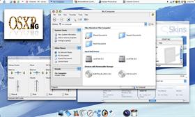
OSXP NG
Average Rating: 7
Yours: -1
File Size: 1.15MB
Downloads Today: 0 Downloads Total: 136878

OSXP NG

Updated Dec 09, 2005 by Judge


First Previous Page 1 of 8 Next Last
taha syed
Comment #1 Wednesday, October 30, 2002 12:58 AM
( It aint working... it gives the windows classic theme with no toolbars.
Surj
Comment #2 Wednesday, October 30, 2002 1:31 AM
pretty nice looking, good job. A little critique though, I would review the OSXP title on the start menu, I believe an icon or shape would be more suited, the text just seems off to me. In addition, the programs list on the start menu, the white bubbly thing, looks out of place. It just doesnt appeal to me, I would think it would be better to maintain a flat or indented look with either the lines or something blue.

love the colors, love the buttons, and I like the quality. Keep up the good work
Judge
Comment #3 Wednesday, October 30, 2002 10:59 AM
Anyone else have the same problem as taha? I just tried it on a clean system and it worked fine for me. (
GoodMorphing
Comment #4 Wednesday, October 30, 2002 2:05 PM
It works fine for me! I like it! I like the textures and the buttons. I think the start menu is unique. It is like looking through a little window, and the white part provides a nice balance. This one will get some use for sure! Thanks.
messybuu
Comment #5 Wednesday, October 30, 2002 2:16 PM
It's good to see that you're taking advantage of WB's alpha transparency features! It's looking good now.

Powered by SkinBrowser!
DarkSeraphim
Comment #6 Wednesday, October 30, 2002 9:35 PM
This is a purely excellent skin, as I love the look and feel of the MAC OS in general.

My only comment is that I would be completely thrilled if you would release a version with titlebar flashing support. I use Trillian on a daily basis, and not having that feature makes it functionally useless.

Keep up the great work!
LOL
GoodMorphing
Comment #7 Wednesday, October 30, 2002 10:02 PM
I was just coming back to say that the more I use this skin, the more I like about it. I like the choice you built in of having controls on one side or the other. And i like the sounds too!
npinchot
Comment #8 Thursday, October 31, 2002 12:36 AM
Really nice skin I like it, looks great.
It would be cool if you would add support for flashing taskbar items cause like DarkSeraphim said it sucks without it when you use trillian.
Keep up the good work
RTCP
Comment #9 Thursday, October 31, 2002 3:42 PM
This skin has it all! LOL Thanks for you outstanding work.
audleyg
Comment #10 Thursday, October 31, 2002 6:22 PM
A really nice skin... I love it... I always liked the Mac�s Aqua interface

Just a few tweaks I�d like to see in the next version.
. When maximized, hovering over the green "max/restore" button still show a +
. I also agree with �thornz� that the recent programs list on the XP start menu, could use some dressing up. Maybe sunken would look better.

Anyhow, these are my thought and again excellent work.
d s
Comment #11 Friday, November 1, 2002 12:15 AM
Any chance for a brushed metal version of this theme? Great skin!
shay reuveny
Comment #12 Friday, November 1, 2002 11:51 AM
the Best Skin I Ever saw!
it's perfect.
if you can make the Default Buttons like the MouseHover it
will be geat.
i tried but i can't.
Judge
Comment #13 Monday, November 4, 2002 5:46 PM
Sorry. Its not possible to make an animated default button. Yes, there is a chance of a brushed metal version, but it could be a while. Any other mods (such as start panel/flashing taskbar for XP) would be after the brushed metal version.

Thanks for all the comments. They're much appreaciated.
adni18
Comment #14 Wednesday, November 6, 2002 6:44 PM
Great skin Judge!
I was preparing a skin with almost identical StartMenu, but I will not post it, after your skin. What a coincidence!
todds
Comment #15 Tuesday, November 19, 2002 8:44 AM
this skin makes it much easier for me to switch between the Mac and Windows systems I use all day long, and this rev is fantastic. the glassy buttons are much cleaner than before. very nicely (re-)done!
sorbon
Comment #16 Sunday, November 24, 2002 6:19 PM
WINDOWS SUPREME! AH WOOT WOOT!!!
heeroyuy
Comment #17 Tuesday, November 26, 2002 9:50 PM
hey!
where is the wallpaper?
the wallpaper is hella cool man!!
heeroyuy_ac2002@yahoo.com.hk
can u send it to me Author?
Judge
Comment #18 Tuesday, November 26, 2002 11:09 PM
Sure. It's by Lockheart. You can get it here http://www.deviantart.com/deviation/333753. Be sure to check out her other works.
GoodMorphing
Comment #19 Wednesday, November 27, 2002 12:49 AM
I liked it before and I really like it now. Great skin! I will use this a lot. Thanks.
Daiwa
Comment #20 Wednesday, November 27, 2002 9:30 AM
This is a great skin & the custom color support is SWEET, but it doesn't import into ObjectBar properly - the TaskBar background just tiles repeatedly behind the text and neither the StartButton nor SysTray appear correctly (Win2K, OB 1.5). Could you take a look at that, Judge? Thanks so much. Great work.

Please login to comment and/or vote for this skin.

Welcome Guest! Please take the time to register with us.
There are many great features available to you once you register, including:

  • Richer content, access to many features that are disabled for guests like commenting on the forums and downloading files.
  • Access to a great community, with a massive database of many, many areas of interest.
  • Access to contests & subscription offers like exclusive emails.
  • It's simple, and FREE!
Downloads remaining: 5
User Level: Visitor

Featured WindowBlinds

Popular WindowBlinds

Top WindowBlinds Skinners

Yesterday  |   Last 30 Days  |   All Time
1. LightStar 7353
2. don5318 4450
3. SimplexDesigns 3221
4. Vampothika 3188
5. adni18 2928
6. 2of3 1267
7. retiredmaster 1208
8. AeroPurple 761
9. SemoB 606
10. IceBabee 576
11. gmc2 570
12. BoXXi 542
13. DaveBax 513
14. jazzymjr 429
15. Dcrew57 422


web-wc01