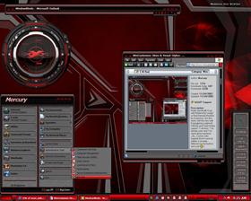
C-N Red
Average Rating: 9
Yours: -1
File Size: .13MB
Downloads Today: 0 Downloads Total: 38178

C-N Red

Updated Nov 28, 2002 by Mercury


First Previous Page 1 of 3 Next Last
murassmeblade
Comment #1 Sunday, November 24, 2002 8:39 AM
A Simply marvelous artistic scheme.

Ive always loved deep red designs.

great job
WOM
Comment #2 Sunday, November 24, 2002 9:09 AM
Very nice looking skin. Love the detail work. Agree with the wall choices.
Mercury
Comment #3 Sunday, November 24, 2002 9:33 AM
Thanks guys! I wish I could've gotten this out sooner but work is very busy and my free time is at a minimum. (

murassmeblade: I'm with you on the red designs, when those walls came out it just seemed like time to do one myself!
KW88
Comment #4 Sunday, November 24, 2002 10:16 AM
Sharp looking skin Merc love the color. Thanks for the great work.
wombat_1
Comment #5 Sunday, November 24, 2002 12:02 PM
Nice! Another great Mercury production.

Powered by SkinBrowser!
Nightwisher
Comment #6 Sunday, November 24, 2002 12:24 PM
Nice skin..
but what's that winamp skin? I want it!
Digital Daze
Comment #7 Sunday, November 24, 2002 12:47 PM
Mercury, this is a great WB skin! Wonderful detail
joetheblow
Comment #8 Sunday, November 24, 2002 1:05 PM
ummmm what is domain and regular?

Oh and nice skin by the way!
adni18
Comment #9 Sunday, November 24, 2002 1:05 PM
Great work Mercury!
I like all the details of this skin
elvee
Comment #10 Sunday, November 24, 2002 1:47 PM
Super Job Mercury! It does go well with the walls you mentioned
Mercury
Comment #11 Sunday, November 24, 2002 2:10 PM
Thanks all!

joetheblow: Domain machines are usually found in the workplace, there is a master server which does authentication for logons. Domain machines don't use the user picture in XP, hence the need for a separate version.

Nightwisher: That's Cardinal by kriptoner. You can get it right here at WinCustomize.
the wok
Comment #12 Sunday, November 24, 2002 2:44 PM
Nice skin, would have looked good on my CPU if you made the start menu more attractive, it looks to messy. The rest is great though
Mercury
Comment #13 Sunday, November 24, 2002 5:20 PM
the wok: Glad you like most of it! How would you improve the start menu?
palomino64
Comment #14 Sunday, November 24, 2002 8:20 PM
Its so.., so... RED! Very nice work.
treetog
Comment #15 Sunday, November 24, 2002 8:28 PM
excelent work here, well, as usual
starone
Comment #16 Sunday, November 24, 2002 11:43 PM
This is really nice. I like the deep red.
Ande
Comment #17 Monday, November 25, 2002 1:01 AM
Excellent Skin Mercury and I can see the time.
chadlachlanross
Comment #18 Monday, November 25, 2002 6:57 AM
Very dark, very red. Take the round button background out from the xp start menu, and it will look better. Just doesn't seem to match the rest of the skin.
APB
Comment #19 Monday, November 25, 2002 7:37 AM
Awesome skin and it looks great with all the other matching skins.
csirmi
Comment #20 Monday, November 25, 2002 4:04 PM
I don'T download!!!!
Please send this skin:
vysor15@freemail.hu
Thank you!!!

Please login to comment and/or vote for this skin.

Welcome Guest! Please take the time to register with us.
There are many great features available to you once you register, including:

  • Richer content, access to many features that are disabled for guests like commenting on the forums and downloading files.
  • Access to a great community, with a massive database of many, many areas of interest.
  • Access to contests & subscription offers like exclusive emails.
  • It's simple, and FREE!
Downloads remaining: 5
User Level: Visitor

Featured WindowBlinds

Popular WindowBlinds

Top WindowBlinds Skinners

Yesterday  |   Last 30 Days  |   All Time
1. LightStar 7125
2. don5318 4337
3. Vampothika 3356
4. SimplexDesigns 3222
5. adni18 2814
6. 2of3 1382
7. retiredmaster 1210
8. AeroPurple 817
9. SemoB 629
10. IceBabee 620
11. gmc2 605
12. BoXXi 601
13. DaveBax 599
14. jazzymjr 434
15. Dcrew57 429


web-wc01