Comment #23 Friday, April 25, 2003 11:46 PM
Comment #25 Saturday, April 26, 2003 2:00 AM
Comment #26 Saturday, April 26, 2003 3:12 AM
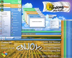
Really an improvement over the last version and you took care of all the little details that were mentioned by us users. (although I am not too partial to the "Launch" part of the Start button)
Dont be afraid to release another version if there is room for improvement (you never know what may come up)
Thanks for my new favorite skin!
Comment #27 Saturday, April 26, 2003 3:16 AM
Just some observations I have made, and maybe more to come. I'd like to see this skin perfected to the hilt!
Comment #28 Saturday, April 26, 2003 3:26 AM
One more thing to say tonight...
The task bar widens when you choose "skin quick launch buttons" in WB config, but nothing is skinned. This is kindof a problem because parts of the task bar, noteably the start button, start to alias when it is enlarged.
If you tweak the task bar and start button to look better with "large task bar" and for when we manually extend the task bar, then this will not be a problem. Also, you may wish to actually give the quick launch buttons some sort of skin for those that wish to have them skinned.
Thanks again!
Comment #29 Saturday, April 26, 2003 3:52 AM
You should reduce the amount of cutoff for the borders of fullscreen (maximized) windows.
It kind of cuts into the buttons on the topright.
Okay later,
PlumbDrumb
Comment #31 Saturday, April 26, 2003 12:43 PM
Comment #32 Saturday, April 26, 2003 2:56 PM
I have been a big fan of Radial for quite a while now, and believe me you two make quite a team. Hope to see more from you in the future. As for your skin. I have it on my system, and the softness, color, and font choices sold me right away. GOOD JOB!!
Comment #33 Saturday, April 26, 2003 3:08 PM
Comment #34 Saturday, April 26, 2003 8:59 PM
Comment #35 Saturday, April 26, 2003 11:14 PM
Comment #36 Sunday, April 27, 2003 12:28 AM
Just 3.5 things:
1. When you have quicklaunch buttons and have them skinned, they make the taskbar vertically larger and stretches the startbutton bitmaps.
2. The progress bars are ugly. I think a solid gradient with no "dots" would look nice. At lease anti-alias them please.
3. The arrow on All Programs in the start menu is the wrong colour.
3.5 The username might look nicer with a tad more space from the user icon.
Otherwise, a very slick and non-obnoxious skin
Comment #37 Sunday, April 27, 2003 12:52 AM
Comment #38 Sunday, April 27, 2003 3:22 AM
Comment #40 Sunday, April 27, 2003 8:43 AM
Please login to comment and/or vote for this skin.
Welcome Guest! Please take the time to register with us.
There are many great features available to you once you register, including:
- Richer content, access to many features that are disabled for guests like commenting on the forums and downloading files.
- Access to a great community, with a massive database of many, many areas of interest.
- Access to contests & subscription offers like exclusive emails.
- It's simple, and FREE!


Comment #21 Friday, April 25, 2003 8:00 PM