


wulfn1
Comment #4 Saturday, March 27, 2004 1:29 PM
Comment #4 Saturday, March 27, 2004 1:29 PM
neat cerebrojd!
has a 70's glow in the dark feel to it.
works well, and is fast!
only thing I notice, on my machine, the menues tend to get washed out when the mouse hovers over each program in the list....
Thanks for the skin! good luck in the competition!!
has a 70's glow in the dark feel to it.
works well, and is fast!
only thing I notice, on my machine, the menues tend to get washed out when the mouse hovers over each program in the list....
Thanks for the skin! good luck in the competition!!
sig101
Comment #5 Saturday, March 27, 2004 7:53 PM
Comment #5 Saturday, March 27, 2004 7:53 PM
Heh, this is a really cool skin and very usable for everyday use too. I like the design and colors. And I love playing with the transparency. 
Good job, CerebroJD!

Good job, CerebroJD!
CerebroJD
Comment #6 Saturday, March 27, 2004 8:46 PM
Comment #6 Saturday, March 27, 2004 8:46 PM
LOL I like the transparency too. Thanks for your comments!
Diafragma
Comment #7 Sunday, March 28, 2004 3:09 AM
Comment #7 Sunday, March 28, 2004 3:09 AM
Very nice, good job on this however I believe the mouse overs the all programs menu were not intended to be that way... Is this a bug.
NightTrainthedark
Comment #8 Sunday, March 28, 2004 7:02 AM
Comment #8 Sunday, March 28, 2004 7:02 AM
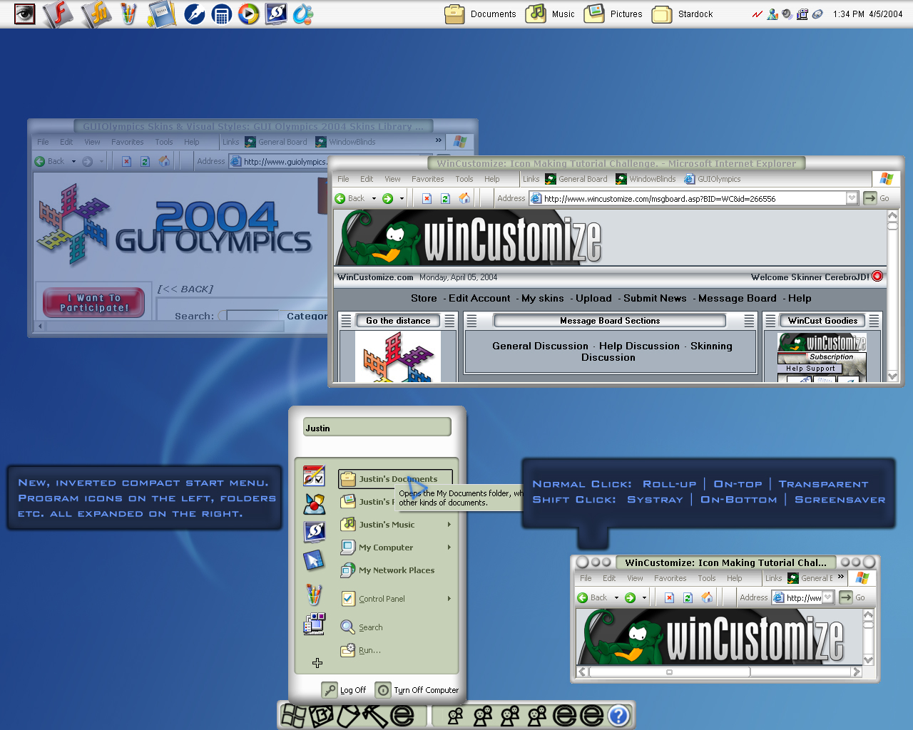
Nice job, See how much your old nickname was holding you back. 
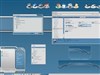
The screenshot is a bit shy in detail but the skin is awesome.

The screenshot is a bit shy in detail but the skin is awesome.
CerebroJD
Comment #9 Sunday, March 28, 2004 10:14 PM
Comment #9 Sunday, March 28, 2004 10:14 PM
Thanks for the comments!
Diafragma: The BUTTON or the top and bottom of the actual MENU?
Cant fix the menu without rebuilding it, and the button mouseover is fixed by applying the skin again in WB config.
Diafragma: The BUTTON or the top and bottom of the actual MENU?
Cant fix the menu without rebuilding it, and the button mouseover is fixed by applying the skin again in WB config.
ozmars
Comment #10 Sunday, March 28, 2004 10:30 PM
Comment #10 Sunday, March 28, 2004 10:30 PM
I really love this skin. It remInds me of a late 90's interface but I can't remember the program.
Just a quick point which may be beyond WB anyhow. If I go start - favourites - the menus here are too short and the text seems to get chopped off in the silver surround.
Just a quick point which may be beyond WB anyhow. If I go start - favourites - the menus here are too short and the text seems to get chopped off in the silver surround.
CerebroJD
Comment #11 Sunday, March 28, 2004 11:29 PM
Comment #11 Sunday, March 28, 2004 11:29 PM
ozmars: Its just a bug that I couldnt find a design to work around. Thanks for finding it though!
ps: Late 90's...the iPod maybe?
ps: Late 90's...the iPod maybe?

CerebroJD
Comment #13 Thursday, April 8, 2004 9:37 AM
Comment #13 Thursday, April 8, 2004 9:37 AM
Thanks. I really thought it was a better design than the "old" compact menu. I hope I see it used more, once people figure out how I did it.
risblaque
Comment #14 Wednesday, April 28, 2004 4:21 AM
Comment #14 Wednesday, April 28, 2004 4:21 AM
Very nice. Good luck.
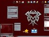
The start menu is a definite winner.
The start menu is a definite winner.
Please login to comment and/or vote for this skin.
Welcome Guest! Please take the time to register with us.
There are many great features available to you once you register, including:
- Richer content, access to many features that are disabled for guests like commenting on the forums and downloading files.
- Access to a great community, with a massive database of many, many areas of interest.
- Access to contests & subscription offers like exclusive emails.
- It's simple, and FREE!


Comment #1 Friday, March 26, 2004 3:34 PM