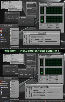
M16 Dark
Average Rating: 8
Yours: -1
File Size: .52MB
Downloads Today: 1 Downloads Total: 19779

M16 Dark

Updated Oct 18, 2004 by Michael Brandt


First Previous Page 3 of 3 Next Last
Keila
Comment #41 Wednesday, October 20, 2004 11:18 AM
Wonderful work here Michael. The glassy is my favorite but that is the type I like.
I have always liked the detail you put into your work.
EventHorizon
Comment #42 Wednesday, October 20, 2004 6:16 PM
Really like this one... Worth a download methinks.
Gothicspell
Comment #43 Wednesday, October 20, 2004 9:06 PM
Another awesome skin! All your WB are so good...Thanks for sharing
gef
Comment #44 Thursday, October 21, 2004 9:55 AM
Stunning Michael - using it now
Tecumseh
Comment #45 Thursday, October 21, 2004 10:26 PM
Hey,Michael ...

This one is really swell!!

Do believe I like the matte version the best and even though this considered a "dark" skin it is very easy on the eyes.

Also, those tiny,little arrows pointing to open apps on the Taskbar didn't go un-noticed. Cool added effect.This is a hands down 10 in my book.
ByronTodd
Comment #46 Friday, October 22, 2004 10:54 PM
Good skin. Very consistent throughout, everything looks like it belongs to this skin. The glass version looks better on my system due to the higher contrast.

That said, I do have issues on button text. In quite a few cases, button text no longer fits on the button, and occasionally on a selected button, text is near impossible to read (black text on dark grey button).

Overall, it's a nicely done dark skin.
Bebi Bulma
Comment #47 Friday, October 22, 2004 11:44 PM
Hey, great skin, I'm personally a fan of black and gray. But I have a question, the font on the task bar is really hard to read for me, I've managed to change it on the titlebar but can't seem to figure out where to do it for the start task bar thing, how could I change the font there? Thanks!
Bebi Bulma
Comment #48 Sunday, October 24, 2004 8:19 PM
I downloaded SkinStudio and figured out how to change the font, so I'm all good now. As for me, I prefer the matte version.

Dark skins own!
Facehugger
Comment #49 Tuesday, October 26, 2004 7:43 AM
This is a great skin!
I can't decide which one I prefer - so I decided to use the glassy on Monday, Wednesday, Friday and the matt one on the other days.

Really great work!
Jafo
Comment #50 Thursday, October 28, 2004 8:04 AM
It's got all my favourite colours...like grey....and grey.....even gray.....
LordCobalt
Comment #51 Sunday, October 31, 2004 2:10 PM
I prefer all the bells and wistles I can get, so I prefer the glass version. Both are equally nice, just my preference.
meat
Comment #52 Wednesday, November 3, 2004 2:42 AM
Mike, I just downloaded every WB skin you've created. If there is one author that I can count on to make something I *will* dig, it's you. As long as you keep pumping them out, I will keep using them.

Good job chief!

meat
LOL
Erk.
Comment #53 Sunday, November 7, 2004 2:24 AM
Superb! ...I love the subskin too! I think I'll be using this one for a while...
Robert_Snyder
Comment #54 Wednesday, November 17, 2004 6:10 PM
Very nice, Mike! This the first dark WB I've ever downloaded! I don't usually go for the darkies, but this one caught my eye. Well done!
3v07z
Comment #55 Wednesday, November 24, 2004 9:35 AM
nice maden
Steve Grenier
Comment #56 Tuesday, November 30, 2004 6:49 PM
Nice skin. I like the glossy subskin the best. Looks very nice with the style of the theme. If your next theme is as nice as this one and M19 it will def find it's way on my system.
Optimus_666
Comment #57 Wednesday, December 1, 2004 10:33 AM
nice work
d00derino
Comment #58 Sunday, January 23, 2005 4:40 PM
It's incredibly cool, but has some faults. The task bar (when expanded to reveal the console) doesnt align correctly with your windows icon. Also, when an envent is happening to one of your windows on the task bar, the image is ugly (it's a huge light grey blob). Two more things, when you open a program, I really hate those menu "tabs" (the back, forward button in IE, etc), and I dislike the bold font used when you extend menus. Very minor things to be fixed, but I don't have SkinStudio to do so.

Also, I am using the glass variant.
stephenfarrell
Comment #59 Saturday, March 28, 2009 1:26 PM
nice skin works well on vista.

Please login to comment and/or vote for this skin.

Welcome Guest! Please take the time to register with us.
There are many great features available to you once you register, including:

  • Richer content, access to many features that are disabled for guests like commenting on the forums and downloading files.
  • Access to a great community, with a massive database of many, many areas of interest.
  • Access to contests & subscription offers like exclusive emails.
  • It's simple, and FREE!
Downloads remaining: 5
User Level: Visitor

Featured WindowBlinds

Popular WindowBlinds

Top WindowBlinds Skinners

Yesterday  |   Last 30 Days  |   All Time
1. LightStar 7161
2. don5318 4418
3. Vampothika 3344
4. SimplexDesigns 3222
5. adni18 2807
6. 2of3 1367
7. retiredmaster 1187
8. AeroPurple 800
9. IceBabee 617
10. SemoB 616
11. BoXXi 597
12. gmc2 592
13. DaveBax 577
14. jazzymjr 439
15. Dcrew57 428


web-wc01