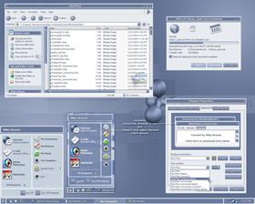
SkinPlant 2005
Average Rating: 9
Yours: -1
File Size: .32MB
Downloads Today: 1 Downloads Total: 62873

SkinPlant 2005

Updated Feb 14, 2005 by MikeB314


First Previous Page 3 of 4 Next Last
Septimus
Comment #41 Monday, January 10, 2005 3:41 AM
Great skin, very useable. Agree with Autumnmist though.

Thanks!
DesignCaddy
Comment #42 Monday, January 10, 2005 3:42 AM
amazing as always, mike. simple yet elegent and easy on the eyes every day. can't wait to play with colors
c242
Comment #43 Monday, January 10, 2005 6:47 AM
Wonderful work here. Thanks for this skin.
martin10018
Comment #44 Monday, January 10, 2005 10:16 AM
Looks great Mike!

But how can I recolor it to a bright orange with the recolor feature of the latest version of WB (4.5RC)? All I get is a brown orange if I select the color...
todds
Comment #45 Monday, January 10, 2005 10:44 AM
very few complaints with this. love the colors (match my current wallpaper) and the simplicity (the disconnected titlebar does nothing for me; glad there's the "connected" option). the taskbar is a little overwhelming (would rather have a silver/gray than blue), and the quicklaunch icons are a little far apart. i suppose i can fix these things myself in SkinStudio (rather than just whine). overall a tremendous skin.
rkadowns
Comment #46 Monday, January 10, 2005 4:36 PM
Hey essorant! Please do a NextStart to Match. This one is great!
1ke
Comment #47 Tuesday, January 11, 2005 12:13 AM
Three words for you, Mike:

Hubba F*ckin' Hubba!

Any chance of seeing a Winamp Modern to keep this bad boy company?
This is really impressive GUI design. Sweet and smooth without kowtowing to the rampant faux-Dutch-minimalism GUIs have been plagued by for years; functionality is complete, yet simple. Not an ounce of severity to any element or animation, and the suble glows on activation/highlight are truly inspired.
Unfortunately, it's being rebellious with a couple of programs, all of which I should be excluding anyway, but the behaviour itself (min/max and right X window buttons) would have to be to do with the skin and not the override, if any, from the other app. So far it's Photo-Paint 12 the only example that I can't force to work, but as I said, that's not an app that takes kindly to WB anyway (though somehow Painter 9, with its pre-fuxored GUI, cries not a whimper of protest).

Colour th
Ogre66
Comment #48 Tuesday, January 11, 2005 4:27 PM
Yet another outstanding skin!!! Very clean and easy on the eyes for all day usage. Thank you, thank you, thank you!!!!
Action_Jay
Comment #49 Tuesday, January 11, 2005 5:48 PM
I like!
Xymantix
Comment #50 Wednesday, January 12, 2005 6:25 PM
This is a fantastic WB skin, Mike. It's extraordinarily useable for day-to-day activities and looks great at the same time. Combining form and functionality is not an easy thing to do, and yet your skins always amaze me by doing both!
butch123
Comment #51 Thursday, January 13, 2005 8:58 AM
verry nice well done
teddybearcholla
Comment #52 Friday, January 14, 2005 4:48 PM
Excellent skin! Love the blue. I've been using it for awhile and it works very well with my wallpaper, Blue Mountain valley! It's amazing how many variations of the color blue there are!
Timoleon5
Comment #53 Saturday, January 15, 2005 9:36 AM
For anyone looking for a Sysmetrix skin that goes well with SkinPlant 2005, try "RPG 27" by Rich Guere (rpguere)
TheD2JBug
Comment #54 Sunday, January 16, 2005 6:10 PM
OMG .. Truly an epic GUI experience .
5/5 .. and I think they named a star that Hubble found after this
Skinplant 2005.
zoogies ln e
Comment #55 Sunday, January 16, 2005 10:40 PM
Awesome! I would use it, too, but I kind of need to see and use the icons in the task bar, and I can't do that with this skin. Is it just me, or?...
MikeB314
Comment #56 Monday, January 17, 2005 6:58 AM
zoogies, I'm not sure what you mean. Everything should be there. Can you see the icons you're referring to in the preview here?
FilkoSE
Comment #57 Tuesday, January 18, 2005 5:47 PM
Great skin.
FilkoSE
Comment #58 Tuesday, January 18, 2005 5:48 PM
Great skin.
unferno1
Comment #59 Thursday, January 20, 2005 1:26 AM
I love this skin, thank you so much for making it. What icon set did you use in the screenshot?
MikeB314
Comment #60 Thursday, January 20, 2005 9:14 AM
unferno1, the icons in the screenshot are d3A by Miloszwl. http://www2.wincustomize.com/ViewSkin.aspx?SID=1&SkinID=1202&LibID=2

Please login to comment and/or vote for this skin.

Welcome Guest! Please take the time to register with us.
There are many great features available to you once you register, including:

  • Richer content, access to many features that are disabled for guests like commenting on the forums and downloading files.
  • Access to a great community, with a massive database of many, many areas of interest.
  • Access to contests & subscription offers like exclusive emails.
  • It's simple, and FREE!
Downloads remaining: 5
User Level: Visitor

Featured WindowBlinds

Popular WindowBlinds

Top WindowBlinds Skinners

Yesterday  |   Last 30 Days  |   All Time
1. LightStar 7425
2. don5318 4608
3. SimplexDesigns 3194
4. Vampothika 3139
5. adni18 2990
6. 2of3 1361
7. retiredmaster 1266
8. AeroPurple 768
9. gmc2 618
10. IceBabee 613
11. SemoB 602
12. BoXXi 530
13. DaveBax 527
14. jazzymjr 458
15. Dcrew57 434


web-wc01