|
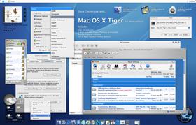
Mac OS X TigerUpdated Mar 25, 2005 by Steve Grenier |
||||||||
Comment #22 Sunday, February 20, 2005 9:50 PM
Yes, my shellstyles are loading fine, there isn't a shellstyle background, it's meant to blend into the regular window, if thats what you meant.
Make sure you have Windowblinds installed, you can get it here in the Software tab located at the top of this page.
Comment #23 Sunday, February 20, 2005 10:35 PM
I found my problem or at least a solution to it. I uninstalled and reinstalled WB and now your shellstyle appears to be working. WB can be finicky that way but I love it none the less.
Great job.

Comment #24 Sunday, February 20, 2005 10:50 PM
Comment #25 Sunday, February 20, 2005 10:52 PM
Comment #26 Sunday, February 20, 2005 11:54 PM

GJ chief.
meat

Comment #27 Monday, February 21, 2005 12:21 AM
Comment #30 Monday, February 21, 2005 1:57 AM
Oh, and good job on the skin Steve.
Comment #32 Monday, February 21, 2005 4:08 AM
Comment #33 Monday, February 21, 2005 4:43 AM
ZZzzzzz....
Comment #34 Monday, February 21, 2005 4:56 AM
 How can I create that???
Comment #36 Monday, February 21, 2005 7:31 AM
attention to detail
thank you for sharing this with us

Comment #37 Monday, February 21, 2005 8:21 AM
Comment #39 Monday, February 21, 2005 9:02 AM

Can anyone tell me why?
Comment #40 Monday, February 21, 2005 9:18 AM
| Comment# 22 By Steve Grenier - 2/20/2005 9:50:54 PM The reason the buttons are placed the way they are is because thats how Mac's organize there buttons, Close, Min, Max, so when reversed they are Max, Min, Close, sorry if it creates a problem, but it's going for an authentic look. |
Steve, Let me reiterate that I love the look of this skin and it would be on my desktop now except for the right side button order, so I'm not trying to be a smart-@ss, just offer comments...hopefully you don't view this as belligerent, I don't intend it to be.
My thought is once you have the buttons on the right side to "accomodate Windows users", the "authentic" look is gone, but the Tiger "theme" still remains - which is a lot more than just titlebar buttons. So what difference does it make at
Please login to comment and/or vote for this skin.
Welcome Guest! Please take the time to register with us.
There are many great features available to you once you register, including:
- Richer content, access to many features that are disabled for guests like commenting on the forums and downloading files.
- Access to a great community, with a massive database of many, many areas of interest.
- Access to contests & subscription offers like exclusive emails.
- It's simple, and FREE!


Comment #21 Sunday, February 20, 2005 9:35 PM