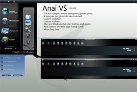
Anai VS - updated
Average Rating: 7
Yours: -1
File Size: 2.63MB
Downloads Today: 1 Downloads Total: 26811

Anai VS - updated

Updated Apr 10, 2005 by Nymite


First Previous Page 5 of 7 Next Last
Nymite
Comment #81 Wednesday, April 13, 2005 5:51 AM
@Prometheus273 - You have no idea how much this means to me:). All you said just made my day:). And thank you for the congratulations:). I still can't quite believe it:).
Nymite
Comment #82 Wednesday, April 13, 2005 5:59 AM
@vStyler - I'm glad we're ok then:).
But still (and I do hope that is the last time I have to say that) - I didn't copy anything. The gloss you are referring to is similar at best, and it is not like I just thought "hey, that's a cool gloss, let's use it". I made the skin to look exactly how I wanted it to be and it was my concept, mine alone.
hgtl
Comment #83 Wednesday, April 13, 2005 8:20 AM
hi well i feel that this skin is great. i downloaded it because it just looks like the mac. however after i downloaded it, i cannot get things like shown on the picture of Anai Vs. hope u can elighten me. thx i hope u can reply as soon as possibleEmail
Nymite
Comment #84 Wednesday, April 13, 2005 8:34 AM
@hqtl - I would be glad to help, but what do you mean by "I cannot get things like shown on the picture"? Are you referring to the toolbar placed on top? To to that, you have to unlock your toolbars (via right-click menu), and then simply arrange them the way you want to (drag and drop). Then lock the toolbars again.
hgtl
Comment #85 Wednesday, April 13, 2005 9:20 AM
no srry i dont mean that i mean like the start menu. it is soo 3d. anothe suggestion is to ceate somthing more to mac osx the latest one you know panther x. to really make good use of your design i feel you should put some mac fetures into it. just a suggestion if you like it the way it is it is still fine.
abuoslec
Comment #86 Wednesday, April 13, 2005 4:57 PM
Nice job.u have talent! now I'm looking forward for the Upgrade of this skin and also for the Icons.lol
arcticlynx
Comment #87 Wednesday, April 13, 2005 6:34 PM
ahh! it looks like a sweet skin, but i cant get it to work.. any suggestions of what app. to use to open it?
Jafo
Comment #88 Wednesday, April 13, 2005 7:47 PM

Just a 'gentle reminder'..skinning started long before XP came along.  It has always been a personal process.  Someone who 'could do it' 'would do it'.  Then, they may, or may not subsequently choose to share it with others and upload it.

Because they were 'personal creations' they may suit the author admirably, with or without 'issues' that others may perceive on their own systems.

Case in point...my WB skins were all designed for Litestep and, to the XP Explorer shell user they are not just 'buggy', they are very incomplete....yet on an LS system they work just fine.

When suggesting there are errors, etc...and the author remarks 'I don't use IE so it doesn't affect me'...you are left with 2 options.  Either adjust it yourself, or POLITELY suggest it could benefit with/from amendments.

There really are only two rules to remember.

1. The skins are given freely...appreciate that.

and

2. Fellow site members de

Jafo
Comment #89 Wednesday, April 13, 2005 7:50 PM

2. Fellow site members deserve consideration and respect.

Remember...skinning is supposed to be fun.  There IS no room for 'attitude'....

wolepi
Comment #90 Thursday, April 14, 2005 4:21 AM
Mr Nymite,

I think this is a great skin for a first one. I don't make any skins, but I use a lot of them, and personally I like dark skins. I really love the gradient effects. On some context menus, though, the background and the fonts seem to blend and I can hardly read the text. I forget where this happened, but it was just this one time and I didn't take note. Sorry.
Maybe it wasn't even WindowBlinds and it was something else.

Anyway, to make a short comment really long, this is my favorite skin right now.
hgtl
Comment #91 Thursday, April 14, 2005 5:15 AM
no srry i dont mean that i mean like the start menu. it is soo 3d. anothe suggestion is to ceate somthing more to mac osx the latest one you know panther x. to really make good use of your design i feel you should put some mac fetures into it. just a suggestion if you like it the way it is it is still fine. i also totally agree with what wolepi said about not being able to see the words. but overall it is fine.Keep up the good work
butch123
Comment #92 Thursday, April 14, 2005 6:48 AM
I also just wnated to encourage a newcomer unlike some of the people who frequent this website,and say that I would be glad to help you if i can.Nymite keep up the good work.
Snowman
Comment #93 Thursday, April 14, 2005 8:08 AM
(but at least he made the skin himself, unlike other people)
butch123
Comment #94 Thursday, April 14, 2005 10:16 AM
Snowman for sure i agree, and say that he did a really nice job..but maybe we should not say things that might be taken the wrong way..(unlike other people) You know maybe someone will take it the wrong way..by the way looking fordward to your next port..keep up the good work.
Fuzzy Logic
Comment #95 Thursday, April 14, 2005 12:13 PM

For a first skin this is excellent. I would encourage you ignore what people have said and continue to do things your own way.

For the rest of you, skinning is supposed to be fun - for everyone...

Nymite
Comment #96 Thursday, April 14, 2005 8:49 PM
Thank you all for your comments and feedback:). Couldn't imagine a better way to encourage a newcomer, well done!

Anyway, the skin has been updated again. It might take some time before it becomes available for download (verification procedures etc.), but I hope that I managed to get rid off of most of the bugs. As for the ClearType issue - I did switch it off and didn't notice any major difference, so my advice for all of you who experience problems with the fonts - turn ClearType ON;).
Again, big thx for all the kind words and support:).
Nymite
Comment #97 Thursday, April 14, 2005 10:05 PM
Note: If you didn't experience any problems with the previous version, you might consider NOT downloading the update. There are some major changes (transparent start menus), and those changes did include the buttons, which are brighter and... blue:). The fit the style in my opinion, but... well, the dark ones were better:). I changed them in order to avoid errors with IE.
Orihime
Comment #98 Friday, April 15, 2005 1:38 PM
where is the backround i cant find it:S
Nymite
Comment #99 Friday, April 15, 2005 5:52 PM
I didn't include it because it's not mine. And to be honest, I cannot remember where I got it:(.
hgtl
Comment #100 Friday, April 15, 2005 8:13 PM
Um....Mr Nymite i hope you can tell us what is in that major update as i just updated but i still dont get those cool effects shown on the picture. is it because i have to have the full version of windowblinds? hope u can help me. thx

Please login to comment and/or vote for this skin.

Welcome Guest! Please take the time to register with us.
There are many great features available to you once you register, including:

  • Richer content, access to many features that are disabled for guests like commenting on the forums and downloading files.
  • Access to a great community, with a massive database of many, many areas of interest.
  • Access to contests & subscription offers like exclusive emails.
  • It's simple, and FREE!
Downloads remaining: 5
User Level: Visitor

More From This Author

Featured WindowBlinds

Popular WindowBlinds

Top WindowBlinds Skinners

Yesterday  |   Last 30 Days  |   All Time
1. LightStar 7312
2. don5318 4478
3. Vampothika 3333
4. SimplexDesigns 3230
5. adni18 2871
6. 2of3 1373
7. retiredmaster 1178
8. AeroPurple 787
9. IceBabee 620
10. SemoB 612
11. gmc2 611
12. BoXXi 597
13. DaveBax 583
14. jazzymjr 443
15. Dcrew57 439


web-wc01