Comment #3 Saturday, April 16, 2005 8:28 AM
Comment #4 Saturday, April 16, 2005 10:09 AM

Comment #5 Saturday, April 16, 2005 10:55 AM
Comment #7 Saturday, April 16, 2005 3:13 PM
Comment #8 Saturday, April 16, 2005 3:39 PM
Thank you, everyone!
Fairyy, make sure you have "Apply any wallpaper supplied" checked in the WB configuration (doubleclick systray icon -> Basic Settings), then the wallpaper will be applied automatically 
Comment #9 Saturday, April 16, 2005 4:40 PM
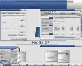
The jaggies on the start menu curves... I thought WB was capable of alpha-trans now? Why not soften them up?
The Scroll bar buttons don't seem to complete the theme when compared to the nice soft, round, buttons you have everywhere else.
The all programs and shortcut menus look too bland with just a silver gradient. I think some blue accenting could help them out and would balance them into the rest of the theme.
None of that will keep me from installing it however.

Comment #10 Saturday, April 16, 2005 7:27 PM
Comment #11 Saturday, April 16, 2005 8:52 PM

SGTCW

Comment #12 Sunday, April 17, 2005 3:51 AM
Psynex, nit-pick all you want 
| The jaggies on the start menu curves... I thought WB was capable of alpha-trans now? Why not soften them up? |
I'll have a look at it when I get the time - I havent had any time to 'play' with the new alpha-blending yet.
The rest I wont be touching. I don't want the port to differ too much from the original.
---
starone/shelby - thanks 
Comment #13 Sunday, April 17, 2005 4:45 AM
Comment #15 Sunday, April 17, 2005 11:56 AM
| It is nice (already noticed it when it was msstyle only). Reminds me of Pixoffice in some way. |
same here thought it reminded me of pixoffice but i happen am a fan of blue & grey so this is a 10 in my book

Comment #16 Sunday, April 17, 2005 2:47 PM

love love love the taskbar (and I'm super picky about them
 )
)Comment #17 Monday, April 18, 2005 2:10 AM
| Fairyy, make sure you have "Apply any wallpaper supplied" checked in the WB configuration (doubleclick systray icon -> Basic Settings), then the wallpaper will be applied automatically |
Oh ok..I was looking in the blinds folder for the wall bmp. Usually I can find it so I can save the walls in a separate folder. Ty
Comment #19 Tuesday, April 19, 2005 7:24 AM
 ?)
?)Comment #20 Tuesday, April 19, 2005 12:26 PM
Like Mr. Lankford, however, I don't see any selection background color around selected text. I tried changing the color for "Selected Items" in Desktop Properties -> Appearance -> Advanced -> Other Advanced Controls, but to no avail. Any ideas how to fix? I can't see my selections. Apparently the text selection background color is white and window backgrounds are also white?
Keep 'em comin'. Thanks.
Please login to comment and/or vote for this skin.
Welcome Guest! Please take the time to register with us.
There are many great features available to you once you register, including:
- Richer content, access to many features that are disabled for guests like commenting on the forums and downloading files.
- Access to a great community, with a massive database of many, many areas of interest.
- Access to contests & subscription offers like exclusive emails.
- It's simple, and FREE!


Comment #1 Saturday, April 16, 2005 7:36 AM