Comment #22 Tuesday, November 15, 2005 9:16 PM

heres a link Link
Comment #23 Wednesday, November 16, 2005 3:40 AM
I really don't know why this is happening...
1 - Did you try another skin with per-pixel transparent taskbar ? (like DreamLand, for instance) Is there the same problem ?
2 - Did you choose "skin decides taskbar size" under "User Overrides" in WB config ?
I have a problem with the upper-right corner of maximized windows not displaying in per-pixel skins, but I'm quite sure it's a bug in the beta, as it's the same with any per-pixel skin I use...
Never had your problem though...
Comment #25 Wednesday, November 16, 2005 5:29 AM
Good job. Just a shame that WIndows BLins 5 isn't available yet.
Comment #27 Wednesday, November 16, 2005 11:30 AM
| Just a shame that WIndows BLins 5 isn't available yet. |
Ever thought about Buying it...? You could have the Beta version running for a few weeks now.

Comment #28 Wednesday, November 16, 2005 12:27 PM
Yes, I have restarted and I am using "skin decides taskbar size". Also I have been using skins such as Dreamland and 5imple Alpha fine.
However, things have gotten worse now. It seems now that if I use any WB5 skin the taskbar doesn't skin at all - it just remains as Windows Classic style - but with the new skin's start button. Older skins (i.e. non-transparent) still work fine. It seems there's still some bugs in the latest beta.
Comment #30 Wednesday, November 16, 2005 1:26 PM


I guess xgman's right : you should uninstall, restart and re-install a fresh version of WB. Hope it will run ok then

Comment #31 Thursday, November 17, 2005 12:00 AM
Comment #32 Thursday, November 17, 2005 3:14 AM
| or does it also come with a thinner border? |
It doesn't : thinner borders are incompatible with the shadow effect on the border in this skin.
Just a question of visual balance.
Sorry mate

Comment #33 Thursday, November 17, 2005 3:52 AM

Comment #34 Thursday, November 17, 2005 5:25 AM
| the start button should be Vista-like |
Could you be more specific about "Vista-like" please ? I'm not sure I get it right...
Actually, I'm planning to re-draw this button, so I'm open to any suggestions.
Thanks for your feedback.

Comment #35 Thursday, November 17, 2005 5:50 AM
 It should look a little more ´professional´ when you compare it with the rest of the skin! But again: it´s personal taste
Comment #36 Friday, November 18, 2005 2:38 AM

Comment #37 Friday, November 18, 2005 3:05 AM
| in the preview, i noticed the borders were transparent, but i see them as solid... |
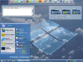
I guess it's a problem with WB5 Beta... maybe you should re-install. The borders should be transparent as in the preview.
| if you happen to have a window behind it, u still only see the background behind it... |
1 - The start menu is "really" transparent : you should see anything that sits behind it (may be the same problem as before...)
2 - As regards the Taskbar : its transparency is only fake. i.e. you can only see the backround through it. This subject has been discussed somewhere in the forums here.

Comment #38 Friday, November 18, 2005 10:00 AM
and frustrating that I had to stop using the skin.
Instead I use your blueglass alpha PEL skin.javascript:editor_insertHTML('ucSkinCommentForm_comments_txtBody','
 ')
')javascript:editor_insertHTML('ucSkinCommentForm_comments_txtBody','
 ')
')Comment #40 Saturday, November 19, 2005 4:35 AM
You simply seem to have checked the "Never use per pixel borders on a skin" checkbox in the "Troubleshooting" section of WB...
Uncheck this and it should display fine !


Please login to comment and/or vote for this skin.
Welcome Guest! Please take the time to register with us.
There are many great features available to you once you register, including:
- Richer content, access to many features that are disabled for guests like commenting on the forums and downloading files.
- Access to a great community, with a massive database of many, many areas of interest.
- Access to contests & subscription offers like exclusive emails.
- It's simple, and FREE!


Comment #21 Tuesday, November 15, 2005 2:37 PM