


|
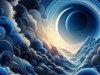
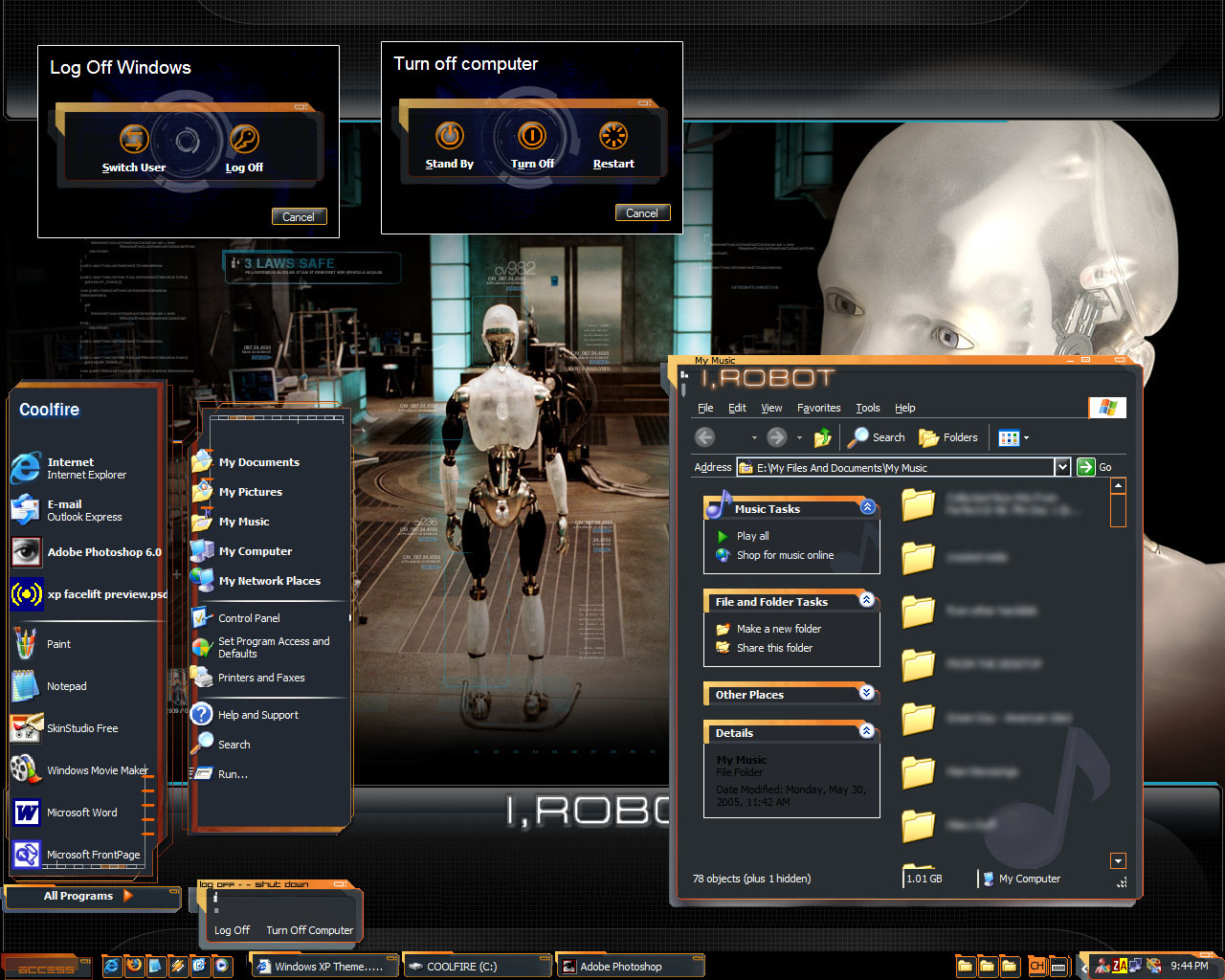
i, RobotUpdated Dec 22, 2005 by coolfire92 |
||||||||
 |
|
Page 1 of 2 |
|---|
Hapkido
Comment #3 Thursday, December 22, 2005 10:51 AM
Comment #3 Thursday, December 22, 2005 10:51 AM
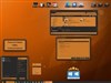
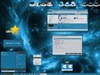
This is an incredibly creative skin which deserves serious consideration. I haven't used it long enough to give you a comprehensive assessment of it but I did notice that the "highlight" (mouseover effect) on the Start Menu items needs some adjustment, i.e., it is a fixed size and centered and consequently it doesn't surround the various links as it should. That shouldn't be all that difficult to fix. It really deserves its own set of Toolbar icons to finish it off too. Otherwise, it is a dazzler of a skin. 

kin242
Comment #4 Thursday, December 22, 2005 11:23 AM
Comment #4 Thursday, December 22, 2005 11:23 AM
Start menu looks very screwy when you use different font sizes (for higher res screens this is a must)... Also the I, Robot text at the top of every screen is way superfluous imho. It would look a lot better if you removed that and kept it minimal.
SubjectDivider
Comment #5 Thursday, December 22, 2005 11:23 AM
Comment #5 Thursday, December 22, 2005 11:23 AM
I would really like to use this skin, as it does look quite nice. However, it wreaks havoc with Opera, which is the only browser I use regularly - not just on web pages, but the interface itself.
Apart from that, I have a couple of suggestions for your next release. First, per-pixel transparency would do wonders for this UI, as would a bit of anti-aliasing on the edges of the window borders. Secondly, a substyle with 'normal' text box and font colours would be extremely welcome. This is a good skin - it just needs some polish and some usability tweaks to be very good.
Apart from that, I have a couple of suggestions for your next release. First, per-pixel transparency would do wonders for this UI, as would a bit of anti-aliasing on the edges of the window borders. Secondly, a substyle with 'normal' text box and font colours would be extremely welcome. This is a good skin - it just needs some polish and some usability tweaks to be very good.
Graypony
Comment #6 Thursday, December 22, 2005 12:33 PM
Comment #6 Thursday, December 22, 2005 12:33 PM
Start menu is screwy. Rollup is ALL screwed up. If the robots were built like this, no wonder they went haywire. Sorry coolfire, kewlness idea but get a low vote from me.
Nutshell69
Comment #7 Thursday, December 22, 2005 1:25 PM
Comment #7 Thursday, December 22, 2005 1:25 PM
First let me say - Nice Skin
However, when I saw I,Robot, I immediatley thought this would be a translucent white with neon blue colors
However, when I saw I,Robot, I immediatley thought this would be a translucent white with neon blue colors

snowhawk77c
Comment #8 Thursday, December 22, 2005 1:25 PM
Comment #8 Thursday, December 22, 2005 1:25 PM
im not getting any problems with it and i love the design great job
koolet22
Comment #9 Thursday, December 22, 2005 5:40 PM
Comment #9 Thursday, December 22, 2005 5:40 PM
sorry mate start panel is screwed up. theres a black or a shadow on my internet explorer. Kinda like the uniqueness of the blind but cant used it becaused of the poor graphics on the start panel. 

Surj
Comment #10 Thursday, December 22, 2005 7:29 PM
Comment #10 Thursday, December 22, 2005 7:29 PM
very creative idea! its not quite working properly on my machines however
might also be interesting to see this use a bit more transparency in some areas, rather than rely on a dark background.
might also be interesting to see this use a bit more transparency in some areas, rather than rely on a dark background.
coolfire92
Comment #11 Thursday, December 22, 2005 8:17 PM
Comment #11 Thursday, December 22, 2005 8:17 PM
to everyone, i do not know how to create skins with the translucent effect, though it would be great if i could. secondly, the free version of windowblinds 5 does not allow the use of translucent effects [except for the stock given skins], and that's what im using.
if you know how to use translucent effects, please teach me.. and maybe next time if i do purchase it.
what do u mean by rollup?
and im seriously bad at substyles. my last skin "windows xp facelift", all the substyles didn't work. anyone can give me a step by step instructions for substyles?
and for internet browsers, please make sure you change the setting "use windows colors". i suppose that might work. but for opera if the interface is gone, then im seriously not sure.
since im using a free wb, i did not create toolbar icons since they don't even work for me..
ok then i will remove the i,robot word on the top left of the windows.
sorry about the mouseover effect. will definitely correct it in the update.
since many of you think the start menu is screwed, in what way is it screwed may i ask? perhaps you can send me a screenshot to me [fiery.altis@gmail.com] and i will see why and correct the problem in a next update.
in the mean time, continue commenting as i would like to improve on it as much as possible...
boopish
Comment #12 Thursday, December 22, 2005 9:14 PM
Comment #12 Thursday, December 22, 2005 9:14 PM
coolfire....the design is great, but you are missing some bits and pieces and have that dratted magic pink showing up.
Here are some hints: 1) open skin studio and open your skin file....now start at the top of the left hand panel and be sure each and every item is skinned to the best of your ability. You can find the bits and bobs that you missed by checking the preview images as you click each item. 2) use .png's wherever possible...that way you don't have to deal with magic pink. 3) be patient.....go slowly. I know this is hard, as we all really get excited about our ideas for a skin. But really take your time, check it over and then over again...then ask others to check it out for you as well. Even ask for help and advise from some of the skinners whose work you admire, most are more than willing to help us newbies. $) substyles....all well and good, but get your main skin perfected first. Once that is done look at the top toolbar...see your skin name and the + sign...click on that...then choose"add a substyle", "Duplicate this substyle". Now a new window opens up and see the check box....see the empty prefix box...type ss1 or whatever you want to call your substyle and click ok....you now have a substyle identical to the original...now make the changes in color, startmenu size or whatever and save it. You now have both the original and the substyle in the same folder.
Most of all, remember that this is FUN!!!
Here are some hints: 1) open skin studio and open your skin file....now start at the top of the left hand panel and be sure each and every item is skinned to the best of your ability. You can find the bits and bobs that you missed by checking the preview images as you click each item. 2) use .png's wherever possible...that way you don't have to deal with magic pink. 3) be patient.....go slowly. I know this is hard, as we all really get excited about our ideas for a skin. But really take your time, check it over and then over again...then ask others to check it out for you as well. Even ask for help and advise from some of the skinners whose work you admire, most are more than willing to help us newbies. $) substyles....all well and good, but get your main skin perfected first. Once that is done look at the top toolbar...see your skin name and the + sign...click on that...then choose"add a substyle", "Duplicate this substyle". Now a new window opens up and see the check box....see the empty prefix box...type ss1 or whatever you want to call your substyle and click ok....you now have a substyle identical to the original...now make the changes in color, startmenu size or whatever and save it. You now have both the original and the substyle in the same folder.

Most of all, remember that this is FUN!!!
indigonecro
Comment #13 Friday, December 23, 2005 2:41 AM
Comment #13 Friday, December 23, 2005 2:41 AM
Amazing idea. Great first attempt IMO.
However, my desktop whereas now looking "futuristic", also looks as though someone hit my computer with about 6 tons of C4 Explosives and is wrecking the havok.
I would not recommend this skin for anyone, however, if it's re-done and "perfected" I could easily see it being a top skin and possibly even features by Stardock
DrJBHL
Comment #15 Friday, December 23, 2005 6:54 AM
Comment #15 Friday, December 23, 2005 6:54 AM
Love the skin...very creative, but one bug...browsers don't "adjust" to assume full screen...slightly less. Also, the center button which should force the browser to assume full screen size is slightly offset to the left. So far these are the only bugs. My screen res is 1440x900 if that relays any useful info.
Dr. J.
Dr. J.
skinz2nice
Comment #16 Friday, December 23, 2005 7:40 AM
Comment #16 Friday, December 23, 2005 7:40 AM
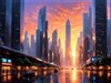
This is way too cool. I was waiting on an I, Robot skin. It looks really nice and that wallpaper you can find at the webstie of I,Robot if I'm not mistaking. Looks really good for a dark skin and goes well for a I, Robot Theme.
Jonep
Comment #17 Friday, December 23, 2005 8:22 AM
Comment #17 Friday, December 23, 2005 8:22 AM
Nice Skin coolfire read that you want some advice on creating transparency effect images I'd be glad to help my email jonahearne@hotmail.com
Kevison
Comment #18 Friday, December 23, 2005 8:42 AM
Comment #18 Friday, December 23, 2005 8:42 AM
Very nice and creative idea for your skin. Unfortunately I cannot get it to work on my laptop too well. I like your idea for the start menu! Very creative.
Side note: loading this skin from the WinCustomize tray app caused explorer to crash (XP Pro OS). In fact a couple of other WB Skins caused this same problem. Not sure if its the skin or the tray app. It has become more frequent since WB5.0 came out. I am also going to post this behaviour in the forum as well.

Side note: loading this skin from the WinCustomize tray app caused explorer to crash (XP Pro OS). In fact a couple of other WB Skins caused this same problem. Not sure if its the skin or the tray app. It has become more frequent since WB5.0 came out. I am also going to post this behaviour in the forum as well.

Kevison
Comment #19 Friday, December 23, 2005 8:43 AM
Comment #19 Friday, December 23, 2005 8:43 AM
Oh i forgot to mention, that if this is your first skin, then I am very impressed. Keep up the good work!
lgspence
Comment #20 Friday, December 23, 2005 12:25 PM
Comment #20 Friday, December 23, 2005 12:25 PM
This theme needs a lot of work,but will be a fantastic addition to my collection when done.Keep up the good work.
Please login to comment and/or vote for this skin.
Welcome Guest! Please take the time to register with us.
There are many great features available to you once you register, including:
- Richer content, access to many features that are disabled for guests like commenting on the forums and downloading files.
- Access to a great community, with a massive database of many, many areas of interest.
- Access to contests & subscription offers like exclusive emails.
- It's simple, and FREE!
|
|
Page 1 of 2 |
|---|


![2006 Windows Xp Facelift [version 2.3]](http://skins14.wincustomize.com/23/13/2313083/1/5464/preview-1-5464-100x75.jpg?d=1134749526)


Comment #1 Thursday, December 22, 2005 9:33 AM
Folks, please give comments on my first dark skin!