


|
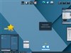
i, RobotUpdated Dec 22, 2005 by coolfire92 |
||||||||
 |
|
Page 2 of 2 |
|---|
kingairball
Comment #22 Saturday, December 24, 2005 5:20 PM
Comment #22 Saturday, December 24, 2005 5:20 PM
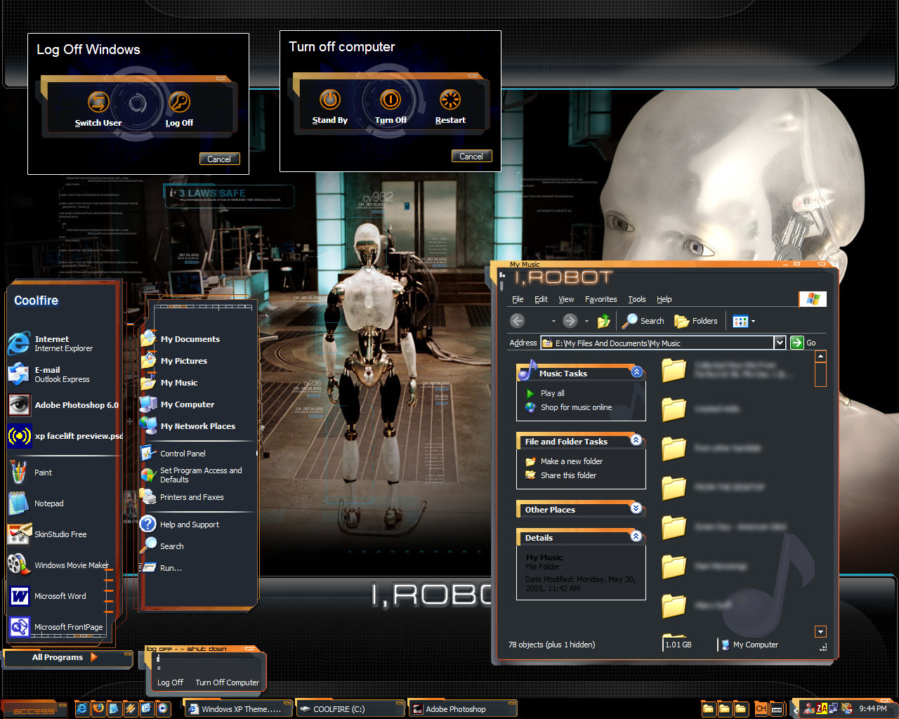
VERY cool idea, but it has some flaws that keep me from using it:
1) The often used Programs on the start menu display a black background, not see-through.
2) There are black bars between these programs ^
3) The I,Robot in every window is annoying, and, even though it goes with the theme, the small close/ minimize buttons are hard to use.
I think with some technical repairs, this could be one of the coolest skins out there!

BoXXi
Comment #23 Saturday, December 24, 2005 8:09 PM
Comment #23 Saturday, December 24, 2005 8:09 PM
This is very nice. I have the start menu problem too, but I'm sure I can fix it when I find the time to open it in skinstudio. It's probably just a margin setting or something. Good work! look forward to seeing more. 

PoSmedley
Comment #24 Saturday, December 24, 2005 11:13 PM
Comment #24 Saturday, December 24, 2005 11:13 PM
The design and concept are AWESOME! I don't know how to make a WB, so it's hard for me to say or describe what's wrong. I do have a large black box on the start menau that looks out of place, but everything else seems fine so far. Working with the FREE version, I understnad your limitaions. Do not be discouraged. I really like this skin!!!!!!!!!!!!!!!!! 

-scion-
Comment #25 Sunday, December 25, 2005 1:34 AM
LOOK AT ME!! LOOK AT ME!! IF I POST MEANINGLESS COMMENTS CAN I GET ATTENTION TOO?
Comment #25 Sunday, December 25, 2005 1:34 AM
| Hey Coolfire92, I guess I was wrong. I take back what I said earlier. Turns out my deaf and blind uncle thinks this is the best skin he has ever SEEN |
LOOK AT ME!! LOOK AT ME!! IF I POST MEANINGLESS COMMENTS CAN I GET ATTENTION TOO?
Hapkido
Comment #26 Sunday, December 25, 2005 2:24 PM
What this says to me is that your deaf and blind uncle's judgment far exceeds yours. You do have my sympathy as I have known a few others who have suffered likewise from that same disease you apparently have been struck with, aka: "Cranial Rectosis"!
Comment #26 Sunday, December 25, 2005 2:24 PM
| internetworld7 wrote in sheer ignorance: Hey Coolfire92, I guess I was wrong. I take back what I said earlier. Turns out my deaf and blind uncle thinks this is the best skin he has ever SEEN |
What this says to me is that your deaf and blind uncle's judgment far exceeds yours. You do have my sympathy as I have known a few others who have suffered likewise from that same disease you apparently have been struck with, aka: "Cranial Rectosis"!

PoSmedley
Comment #27 Sunday, December 25, 2005 11:47 PM
It's distressing to see these kinds of comments. Especially from someone who has not contributed any skins of their own, and put there own talent (or in internetworld7's case, perhaps 'lack of talent') on the line.
I hope this does not discourage you, Coolfire92. The skin is good, and I am sure you will find the help here to tweak it. Personally, aside from the start menu bug....I wouldn't change anything else. The 'I, ROBOT' doesn't bother me like I thought it would...and the size of the close buttons and all are good for me.
Comment #27 Sunday, December 25, 2005 11:47 PM
| Hey Coolfire92, I guess I was wrong. I take back what I said earlier. Turns out my deaf and blind uncle thinks this is the best skin he has ever SEEN. |
It's distressing to see these kinds of comments. Especially from someone who has not contributed any skins of their own, and put there own talent (or in internetworld7's case, perhaps 'lack of talent') on the line.
I hope this does not discourage you, Coolfire92. The skin is good, and I am sure you will find the help here to tweak it. Personally, aside from the start menu bug....I wouldn't change anything else. The 'I, ROBOT' doesn't bother me like I thought it would...and the size of the close buttons and all are good for me.
tameddragon
Comment #28 Monday, December 26, 2005 3:20 PM
Comment #28 Monday, December 26, 2005 3:20 PM
Definately an interesting concept. However, having read the comments, I'll look for the update before downloading it. Hence, no useful suggestions except these: keep trying and pay absolutely no mind to the immature comments from the peanut-gallery. 

Grey Bird
Comment #29 Tuesday, December 27, 2005 1:42 PM
Comment #29 Tuesday, December 27, 2005 1:42 PM
Cool skin! I do see the black box in the start menu though. On my machine, it starts on the first entry below my name and surrounds the next 8 items in the left-hand column. (I have eleven in that column, 5 of them above the dividing line.) The left side of the box is at screen edge, and the right side is about mid-way between the two columns. I don't have any problems with the min, max, or close buttons since the animation clearly shows which of them the mouse is over. I look forward to your update.
dj cole
Comment #30 Tuesday, December 27, 2005 7:12 PM
Comment #30 Tuesday, December 27, 2005 7:12 PM
I THINK YOU DID A GREAT JOB IN DESIGNING THE SKIN HOEVER IT'S NOT TO EASY TO USE USE.
FIRST. REDUCE THE SIZE OF YOUR EDGES IT MAKES THE WINDOW TO LARGE FOR THE SCREEN.
SECOUND. MAKE THE PROGRAM LIST ABOUT 2.5 INCHES WIDE THAT SHOULD SOLVE THE PROBLEM
WITH THE START MENU.
THIRED. ADD MAXIMIZE AND RESTORE BUTTONS.
I HOPE YOU FIND THIS HELPFULL
FORTH. I AM HAPPY I SIGNED ON TODAT I STARTED WORKING ON A SIM SKIN
NOT QUIT AS TECHNICAL AS YOUR SKIN BUT I WAS PLANING ON USEING THE SAME WALLPAPER
IN THE PREVIEW LOL.
LOOKING FORWARD TO THE UPDATED VERSION
FIRST. REDUCE THE SIZE OF YOUR EDGES IT MAKES THE WINDOW TO LARGE FOR THE SCREEN.
SECOUND. MAKE THE PROGRAM LIST ABOUT 2.5 INCHES WIDE THAT SHOULD SOLVE THE PROBLEM
WITH THE START MENU.
THIRED. ADD MAXIMIZE AND RESTORE BUTTONS.
I HOPE YOU FIND THIS HELPFULL
FORTH. I AM HAPPY I SIGNED ON TODAT I STARTED WORKING ON A SIM SKIN
NOT QUIT AS TECHNICAL AS YOUR SKIN BUT I WAS PLANING ON USEING THE SAME WALLPAPER
IN THE PREVIEW LOL.

LOOKING FORWARD TO THE UPDATED VERSION
xgh0stce11x
Comment #31 Tuesday, December 27, 2005 8:42 PM
Comment #31 Tuesday, December 27, 2005 8:42 PM
very nice skin, the only thing i don't like is the I, ROBOT logo in every windows dialog box, i think it takes away from the design of the skin.
Patriots
Comment #33 Friday, December 30, 2005 2:34 PM
Comment #33 Friday, December 30, 2005 2:34 PM
Love the idea, but scrollbars and start menu messed up on my puter.
dj cole
Comment #34 Friday, December 30, 2005 6:51 PM
Comment #34 Friday, December 30, 2005 6:51 PM
hi coolfire!
i took the liberty of fixing the start menu for you it seems you added magic pink
to replace the list seperator i removed it and the magic pink from your start menu
so that the parts have transparent backgrounds. added a substyle
with a translucent start menu.
i sent you the WB zip about 4 days ago.
check your email
dj cole
Comment #35 Friday, December 30, 2005 6:56 PM
Comment #35 Friday, December 30, 2005 6:56 PM
ohh by the way you can do tranlucent stat menu's with the free version.
you can do the whole start menu with it by selecting start panel effects in the right hand window
and change them to normal per pixel alpha and then check the transperant and tranxlucent boxes
under the help button by moving the bottom of the preview window.
good luck
you can do the whole start menu with it by selecting start panel effects in the right hand window
and change them to normal per pixel alpha and then check the transperant and tranxlucent boxes
under the help button by moving the bottom of the preview window.
good luck
Jafo
Comment #36 Sunday, January 15, 2006 11:09 PM
Comment #36 Sunday, January 15, 2006 11:09 PM
There's been a 'little' tidy-up here....too many people being disrespectful...on both 'sides'.
Skin comments are for skin comments, not flame-wars....
Shinju Anya
Comment #37 Sunday, January 29, 2006 10:59 PM
Comment #37 Sunday, January 29, 2006 10:59 PM
I have been all over this site for an innovative skin using these kind of colors, and I have to say this is honestly the closest thing to perfect I have seen. I hope that the startmenu bug is fixed Were it not for that little lack box, I would be a very happy person right now.(Try as I might, there was no way that i could do it myself!!) I will be back, I am sure, wishing for an update.
In all, great job!
In all, great job!
Arauthator
Comment #38 Tuesday, January 31, 2006 8:45 AM
Comment #38 Tuesday, January 31, 2006 8:45 AM
Appears to have some serious issues with WB 5.0. Looks great on the older version of WB though.
Please login to comment and/or vote for this skin.
Welcome Guest! Please take the time to register with us.
There are many great features available to you once you register, including:
- Richer content, access to many features that are disabled for guests like commenting on the forums and downloading files.
- Access to a great community, with a massive database of many, many areas of interest.
- Access to contests & subscription offers like exclusive emails.
- It's simple, and FREE!
|
|
Page 2 of 2 |
|---|


![2006 Windows Xp Facelift [version 2.3]](http://skins14.wincustomize.com/23/13/2313083/1/5464/preview-1-5464-100x75.jpg?d=1134749526)


Comment #21 Friday, December 23, 2005 8:43 PM