Comment #42 Thursday, February 16, 2006 5:19 PM
i'm not sure what would be causing the issue you're having with the start panel. i've tried troubleshooting the skin on this end and haven't come up with any "odd" issues. all i can suggest at this point is to download the current build of WB5 from Stardock Central and see if that clears it up. if you've done that already then i would have to say it's an issue with the video card. my question is if you're running an on-board graphics adapter. at this point please contact me at solsen4@new.rr.com rather than handle it here in the comments section. same for anyone else having "technical" issues.
Comment #43 Friday, February 17, 2006 2:22 AM

Comment #44 Friday, February 17, 2006 2:26 AM
great job you did

i report a bug with Aten about #22
to fix that star panel issue you should change TopHeight in [StartPanel.ProgList] & [StartPanel.PlacesList] , its too high.
for example:
[StartPanel.ProgList]
Image=Aten\AtenStartPanelProgList.tga
LeftWidth=93
RightWidth=25
TopHeight=252------>52

Comment #45 Friday, February 17, 2006 2:51 AM
now the but....well not a but, just a minor observation in the quest for perfection.
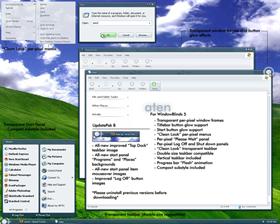
I think its calles the tooltip box...shows for brief time over task pannel when open my internt connection etc....image below

Can the top right bit, on standard settings it is an x, be tidied up on the next (if there is one) up-date.
Otherwise anyone else know what needs to be altered?
cheers
Comment #47 Friday, February 17, 2006 7:03 AM
Comment #49 Friday, February 17, 2006 12:05 PM
1. the huge round glow on the glyphs and the start button with mouseover
2. with the skin applied it makes text in the tabs of firefox almost impossible to read in the inactive state
Other wise it looks great.
Comment #50 Friday, February 17, 2006 12:19 PM
as for the button glows. this is a "love it or hate it" feature. it is also a feature that is staying in the skin. if you wish to have a version with no button glows you can simply edit them out in skinstudio. from this point on, please refrain from comments pertaining to the button glows.
thank you all so much for the kind words and suggestions so far...they really make all of the time and effort pay off!!


Comment #51 Friday, February 17, 2006 12:19 PM

Comment #52 Friday, February 17, 2006 1:11 PM
Well done, I look forward to seeing more from you.
Comment #53 Friday, February 17, 2006 5:08 PM
| as for the button glows. this is a "love it or hate it" feature. |
I love it... and thanks for sorting the tooltip thing out....

Cheers
Comment #54 Friday, February 17, 2006 7:10 PM
Go to display properties--> appearance--> effects-->click on "use large icons"
Hope every1 can enjoy using Aten like me~~ Thanz scion, great job indeed..

Comment #55 Friday, February 17, 2006 7:40 PM
that's what i've been telling others to do via email. thanks for posting the fix!!!

Comment #56 Friday, February 17, 2006 8:03 PM

Keep 'em coming Scion, you are on your way to skinning superstardom...

Comment #57 Friday, February 17, 2006 9:59 PM
Comment #58 Friday, February 17, 2006 10:20 PM
| I have the same problem with the start menu, my wb5 is completely updated.. i tried opening it in skinstudio but I too see nothing wrong. Very strange... |
again, change the start panel icons from small to large (or vise-versa) and change them back and the problem will be fixed.
hahaha okay folks...last time i'm going to say this...neither the toolbar icons or the button glows are "issues"...they are part of the design and are meant to be that way. for real. love them or hate them, they are there to stay. you can always edit them in photoshop and shinstudio if you'd like. that being said, please please please refrain from comments pertaining to those particular items. lol by now i'm well aware that some people may not like those parts of the skin...lol i can't think of a nicer way to say it than that.
aimzzz, hus, pixelpirate, josephs...all of you...thank you for the kind words, it is greatly appreciated!!

Comment #59 Saturday, February 18, 2006 5:44 AM
One thing I don't like about the skin is the glow on the buttons.
4.5/5

Comment #60 Saturday, February 18, 2006 1:57 PM

Please login to comment and/or vote for this skin.
Welcome Guest! Please take the time to register with us.
There are many great features available to you once you register, including:
- Richer content, access to many features that are disabled for guests like commenting on the forums and downloading files.
- Access to a great community, with a massive database of many, many areas of interest.
- Access to contests & subscription offers like exclusive emails.
- It's simple, and FREE!


Comment #41 Thursday, February 16, 2006 3:39 PM
I don't know if the video card/drivers may be the issue, but this is the card I'm using (Link) along with this driver (Link).
Also, should I turn Cleartype off? I ask because the fonts don't look as sharp as you have them in your screenshot. Mine much smaller and don't look anything like the digital font that was included. Thanks!