Comment #62 Saturday, February 18, 2006 9:45 PM

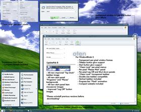
And the lights beside the small windows are very lovely and unique!
Thank you!

Comment #63 Sunday, February 19, 2006 2:23 PM
Comment #64 Sunday, February 19, 2006 8:29 PM
However I was just working in Microsoft word and I noticed that I couldnt see a few things like the little button that switches between what kind of inded you want to put on your paper (the one with the L, backwards L, upsidedown T, etc...)
But this shouldbe easy to fix. Great job regardless.
Comment #65 Monday, February 20, 2006 8:07 PM
Comment #66 Tuesday, February 21, 2006 7:37 PM
Button glows - with the skin containing 3 substyles (4 including the default)...removing these for an update would require an additional 4 substyles to accomodate every user. i had thought of creating one default substyle with no glows but that would leave out the compact start panel users, as well as the top dock users...so in reality, to accomodate all of you it would require 8 substyles and a MASSIVE download. the time it would take to edit and test those substyles would also be considerable.
WB 4x version - with the release of WB5, all of my design focus has gone to the new software. in other words, they are designed from the gound up specifically for WB5. it's difficult to design from a neutral standpoint with much more capable software available. it's simply "more fun" when not tied down by the limitations of WB4.x. i'm well aware that many users have not made the switch to WB5, or simply can't make the switch. i'm not intentionally ignoring those users, but for me it's just more fun to create a WB5 skin. again, sadly there will be no WB4.x version.
Start panel issue - Simply change the start panel icons from small to large (or vise-versa) and change them back and the issue is corrected.
Firefox issues - Firefox uses alot of "System" settings from Windows XP. in other words, firefox uses settings from XP's code rather than from windowblinds. from my understanding the issue is centered around the tabs, which are blue. there are two ways to fix this, you can either create a firefox specific skin to match the windowblinds skin, or you can change the system text color in skinstudio (which changes just about every font color in windows). not a good thing. in the end, i thought it was livable the way it was. it was either sacrifice design or usability, in this case i chose design.
Toolbar icons - another choice of design over function. quite simply i liked the clean look of the blank icons in context with this skin. Nebula had the same design scheme for the icons. With XP there is always something telling you what you're clicking on either via a tooltip, or text labels under the icons. the fact that i liked the clean icons coupled with the fact that something will tell you what it is, i didn't feel the need to have little "pictures" depicting what is being spelled out on the screen.
i certainly appreciate all of the feedback (good and bad) and will certainly apply all of it to my next project "Galaxy Two". each time you post a skin, you learn a little more about the various ways people use their computers and how they apply to what you've created. the good, great, bad and the ugly...every bit of feedback helps.
Thank you all for your support and the feedback!!


Comment #67 Wednesday, February 22, 2006 2:52 AM
skin would be perfect without the glow imo

Comment #68 Wednesday, February 22, 2006 7:50 AM
Jafo wanders in..... does the odd 'promotion thing' .....wanders out again....
[blame Good Morphing]...
Comment #69 Wednesday, February 22, 2006 2:02 PM
thank you jafo and wincustomize team for the promotion...i truly am honored!!

Comment #70 Monday, February 27, 2006 10:54 AM
The design is classy. I like the small, easy to read fonts and the conservation of screen real estate.
Great job!
Jerry
Comment #71 Monday, March 20, 2006 10:45 PM
Comment# 44 By Citizen juneyong - 2/17/2006 2:26:36 AM hi -scion- great job you did i report a bug with Aten about #22 to fix that star panel issue you should change TopHeight in [StartPanel.ProgList] & [StartPanel.PlacesList] , its too high. for example: [StartPanel.ProgList] Image=Aten\AtenStartPanelProgList.tga LeftWidth=93 RightWidth=25 TopHeight=252------>52 |
Thanks juneyong, that fixed the strange transparent start menu issue and I can now use this excellent skin! FYI, not only did I have to change the TopHeight value in the [StartPanel.ProgList] section, I also had to change it in the [StartPanel.PlacesList] section (I changed both values to 25).
-scion-: You did an amazing job on this skin, cheers!
Comment #72 Monday, July 31, 2006 7:50 PM
it would be much aprichiated
Please login to comment and/or vote for this skin.
Welcome Guest! Please take the time to register with us.
There are many great features available to you once you register, including:
- Richer content, access to many features that are disabled for guests like commenting on the forums and downloading files.
- Access to a great community, with a massive database of many, many areas of interest.
- Access to contests & subscription offers like exclusive emails.
- It's simple, and FREE!


Comment #61 Saturday, February 18, 2006 3:58 PM
I noticed you posted on my screenshot useing Aten scion. The thing I like
the most about this Windowblind is that it goes with EVERY blue background
that I can find. It is so difficult to choose just one wallpaper because
everything looks so good.