Comment #22 Thursday, May 18, 2006 2:13 AM

Comment #23 Thursday, May 18, 2006 2:48 AM
Only one question, why didn't you include all of these wba files as substyles in one skin?
And there is a font installing feature in WB that automatically installs fonts included with skins.
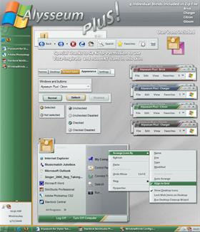
| Fabulous skin! One note, however. I originally had "smooth edges of screen fonts" set to 'Standard', and the font used appeared very jaggy. I changed it to 'ClearType', and it suddenly looks 100 times better. I'm sure most people use ClearType, so it won't be an issue, but for those who don't: it helps a lot to have it on for this skin. |
This is because the font is one of the new fonts Microsoft designed for Windows Vista and is optimized for ClearType.
Anyone interested in typography should drop by their blog http://blogs.msdn.com/fontblog/default.aspx. Loads of good information there.
Comment #24 Thursday, May 18, 2006 9:46 AM

Comment #26 Thursday, May 18, 2006 3:55 PM
Comment #28 Thursday, May 18, 2006 4:52 PM

Cause when I loaded StealthOS, the button was not appeared.
Comment #29 Thursday, May 18, 2006 4:54 PM
Application grids will no longer display the lines.
Drop down combo button matches to the text input boxes.
Comment #30 Thursday, May 18, 2006 4:56 PM
[I'm not optimisitic about getting a response. Do skin artists avoid explaining their rationales and aesthetic theories because they are safeguarding trade secrets, because they are unreflective, because they are above talking to non-skinners, or what?)
Comment #31 Thursday, May 18, 2006 9:18 PM
Very easy to use, great colors, great graphics, five stars skin.
Comment #33 Thursday, May 18, 2006 11:49 PM
| In the original version, the page received a different subtle tint, depending upon the substyle chosen. In this version, every substyle has an identical subtle tint (aqua, turquoise, blue-green, whatever you want to call it.) What was your thinking behind this change? A change in your taste, a change in skin fashion? On the surface at least, the change seems like a change backwards (as opposed to being a "plus" version). |
I have no idea what you are talking about... Page tint?
Comment #35 Friday, May 19, 2006 2:03 PM
| I have no idea what you are talking about... Page tint? |
If you go Display:Appearance:Advance:Other Advanced Controls, and click on the white page area, you can set the coloration for the page. Using Windowblinds, this color is set by the skin. In Skin Studio, it can be set by going to the "Classic Colors" tab and clicking on the "Background page" in the preview. You set this value differenly in Alysseum and Alysseum Plus. In Alysseum, the value is a faint version of the substyle's basic hue. In Plus, the value is a faint aqua.
Now do you know what I'm talking about?
Comment #36 Friday, May 19, 2006 11:43 PM
| If you go Display:Appearance:Advance:Other Advanced Controls, and click on the white page area, you can set the coloration for the page. Using Windowblinds, this color is set by the skin. In Skin Studio, it can be set by going to the "Classic Colors" tab and clicking on the "Background page" in the preview. You set this value differenly in Alysseum and Alysseum Plus. In Alysseum, the value is a faint version of the substyle's basic hue. In Plus, the value is a faint aqua. Now do you know what I'm talking about? |
The desktop Color... you can set that however you want, I don't see what the issue is...
Display > Desktop > Color
Comment #37 Saturday, May 20, 2006 6:01 PM
I have no shadows under menus... Is it a bug? Or is something wrong with my WB?

Comment #39 Saturday, May 20, 2006 6:53 PM
Comment #40 Sunday, May 21, 2006 9:37 AM
 Smaller scrollbars, darker fonts, menus with shadows... and of course a litestep theme.
Thank you Gabriel for this awesome skin.

Please login to comment and/or vote for this skin.
Welcome Guest! Please take the time to register with us.
There are many great features available to you once you register, including:
- Richer content, access to many features that are disabled for guests like commenting on the forums and downloading files.
- Access to a great community, with a massive database of many, many areas of interest.
- Access to contests & subscription offers like exclusive emails.
- It's simple, and FREE!


![Paippr [ Beta v. 1 ]](http://skins11.wincustomize.com/1/18/118835/1/6031/preview-1-6031-100x75.jpg?d=1171004066)
![Paippr [ Wallpapers ]](http://skins13.wincustomize.com/1/18/118835/8/30253/preview-8-30253-100x75.jpg?d=1171003398.517)


Comment #21 Wednesday, May 17, 2006 11:40 PM