


 |
|
Page 7 of 15 |
|---|
ColedTouch420
Comment #122 Tuesday, July 25, 2006 9:24 AM
Comment #122 Tuesday, July 25, 2006 9:24 AM
if not the best skin ever on my computer. its sleek and sexy like my girl. thanks bro
roysan
Comment #123 Wednesday, July 26, 2006 4:56 PM
Comment #123 Wednesday, July 26, 2006 4:56 PM
so booring, no need to look for better skins... i found the best looking right here =D Good job..
derrick56
Comment #124 Thursday, July 27, 2006 6:25 AM
Comment #124 Thursday, July 27, 2006 6:25 AM
Nice one! i love it.
BUt i don't know how to install it. Can you help me?
BUt i don't know how to install it. Can you help me?
artweasloh
Comment #125 Thursday, July 27, 2006 10:47 PM
If you have Windowblinds https://www.stardock.com/products/windowblinds/ then
1. Just click the download link provided in this page.
2. Once downloaded, double click the file and it will automatically install itself.
3. A notification in the system tray tells you a new skin is installed.
4. Click the icon and the skin will apply itself.
If you don't have Windowblinds yet, you have to download and install it first in your system to get these amazing skins working.
Comment #125 Thursday, July 27, 2006 10:47 PM
| Nice one! i love it. BUt i don't know how to install it. Can you help me? |
If you have Windowblinds https://www.stardock.com/products/windowblinds/ then
1. Just click the download link provided in this page.
2. Once downloaded, double click the file and it will automatically install itself.
3. A notification in the system tray tells you a new skin is installed.
4. Click the icon and the skin will apply itself.
If you don't have Windowblinds yet, you have to download and install it first in your system to get these amazing skins working.

skinz2nice
Comment #126 Friday, July 28, 2006 7:22 PM
Comment #126 Friday, July 28, 2006 7:22 PM
This is an excellent skin. Transparency at its best. I love it. Plz keep making skins. This is one of my favorites so far. Excellent job dude. 


wmsolid
Comment #127 Saturday, July 29, 2006 6:43 AM
Comment #127 Saturday, July 29, 2006 6:43 AM
Impressive skin! But the menu bar is too wide in Firefox (default theme). Hope it could be fixed.
whiterabbit007
Comment #128 Saturday, July 29, 2006 11:01 AM
Comment #128 Saturday, July 29, 2006 11:01 AM
This is an excellent skin. In fact, it's the first skin I've found that made me want to switch from KoL's vista skin (which I managed to snag before they took it down  ), and after couple of weeks with it I'm not switching back.
I only have four small nitpicks
- I find the contrast between text and bg on tooltips a bit weak, if the text were a few shades darker it would be perfect.
- I think the start button would work better if it were just the E (obviously a bit bigger), preferably in a spherical button.
- The text for non-focused windows is too close in brightness to the focused windows. You can see it if you look for it but during casual use it's sometimes hard to tell what's in focus and what's not.
- Finally the E in the explorer window (the one right under the close button) is a bit small I think, sitting there all alone in the big grey box
Thank you for this skin
 ), and after couple of weeks with it I'm not switching back.
I only have four small nitpicks
- I find the contrast between text and bg on tooltips a bit weak, if the text were a few shades darker it would be perfect.
- I think the start button would work better if it were just the E (obviously a bit bigger), preferably in a spherical button.
- The text for non-focused windows is too close in brightness to the focused windows. You can see it if you look for it but during casual use it's sometimes hard to tell what's in focus and what's not.
- Finally the E in the explorer window (the one right under the close button) is a bit small I think, sitting there all alone in the big grey box
Thank you for this skin
sakitba
Comment #129 Sunday, July 30, 2006 3:12 AM
Comment #129 Sunday, July 30, 2006 3:12 AM
hi, please help me rename "eminence" in the start menu button
i would like to change it from my own name....
i would like to change it from my own name....
 Switched instantly! LOL
derrick56
Comment #131 Monday, July 31, 2006 2:52 AM
Comment #131 Monday, July 31, 2006 2:52 AM
OH man, thanks loads. I've got it now.
The only thing i don't really like is the scroll bar, but it's overall nice!
Love it! =DD ROCK ON.
Make more skins.
The only thing i don't really like is the scroll bar, but it's overall nice!
Love it! =DD ROCK ON.
Make more skins.
derrick56
Comment #132 Monday, July 31, 2006 3:30 AM
Comment #132 Monday, July 31, 2006 3:30 AM
Uh~ sorry again.
I've got 2 problems or should i say questions? =/

The things at my taskbar is gone! Everything. eg: msn.
I've tried going to the control panel and changed the taskbar settings, but it's still like that.
Another thing.. Why is the start menu thing abit different from the one i see on the top?
i mean the internet explorer logo and stuffs, yep. =D

whiterabbit007
Comment #134 Monday, July 31, 2006 10:34 AM
Comment #134 Monday, July 31, 2006 10:34 AM
@derrick56: Regarding the second question about the start menu. The start menu on the screenshot uses different icons for items, these are setup separately from a windows skin. You could ask the author what icons he/she's using and then put them up yourself either manually or using IconPackager.
Mr AwdBawl
Comment #135 Monday, July 31, 2006 10:54 AM
Comment #135 Monday, July 31, 2006 10:54 AM
I love the skin, and the wallpaper...but I don't like that I am literally FORCED to use the wallpaper you've supplied with the skin. Every time I start my computer up, your wallpaper's back. I enjoyed the skin to a much higher degree when I was free to use the wallpaper of my choice. Perhaps you could still supply the background, but bring back the ability to use other wallpapers that you had in previous installments?
SHOTT3R
Comment #136 Monday, July 31, 2006 4:57 PM
Comment #136 Monday, July 31, 2006 4:57 PM
I love the skin, and the wallpaper...but I don't like that I am literally FORCED to use the wallpaper you've supplied with the skin. Every time I start my computer up, your wallpaper's back. I enjoyed the skin to a much higher degree when I was free to use the wallpaper of my choice. Perhaps you could still supply the background, but bring back the ability to use other wallpapers that you had in previous installments?
Go into your Windowblinds Basic Settings, and uncheck the box that says "Use any wallpaper supplied" and it should be fine.
Go into your Windowblinds Basic Settings, and uncheck the box that says "Use any wallpaper supplied" and it should be fine.
SHOTT3R
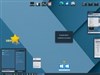
Comment #137 Monday, July 31, 2006 5:23 PM
Comment #137 Monday, July 31, 2006 5:23 PM
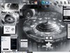
Last and final thing, can rjsmith2007 (or anyone who knows) tell me what value to tweak in Skinstudio so that my taskbar menu font is somewhat readable with the transparency? I might have to constantly alter the text colour depending on the background. It's barely visible on dark backgrounds, and totally invisble on light ones. See pic below


tehZERO
Comment #138 Monday, July 31, 2006 9:25 PM
Comment #138 Monday, July 31, 2006 9:25 PM
@Derek
In the screenshot I am using the Mad-B Shiny Black icon pack for Icon Packager.
The icons are gone because the content margins are (for some odd reason) too small for them to appear. I would unload windowblinds, restart the computer, and finally apply Eminence.
That should fix the problem, if not let me know by email. r_j_smith20007_at_gmail.com. (take out the underscores, and at=@)
@shott3r
I am not sure right off hand what changes that font color. Maybe some of the more experienced could help *cough *cough?
Zero
derrick56
Comment #139 Tuesday, August 1, 2006 4:10 AM
Comment #139 Tuesday, August 1, 2006 4:10 AM
Unload as in uninstall the whole windowblinds or just change it to something not Eminence?
Heheh, i'm so sorry for flooding you question.
Heheh, i'm so sorry for flooding you question.
dgla
Comment #140 Tuesday, August 1, 2006 12:02 PM
Comment #140 Tuesday, August 1, 2006 12:02 PM
Amazing, thanks for this beautiful skin. I'm sorta new to this, can I make my windows transparent or just the toolbars? Thanks again, this looks great.
Please login to comment and/or vote for this skin.
Welcome Guest! Please take the time to register with us.
There are many great features available to you once you register, including:
- Richer content, access to many features that are disabled for guests like commenting on the forums and downloading files.
- Access to a great community, with a massive database of many, many areas of interest.
- Access to contests & subscription offers like exclusive emails.
- It's simple, and FREE!
|
|
Page 7 of 15 |
|---|


Comment #121 Monday, July 24, 2006 3:17 AM
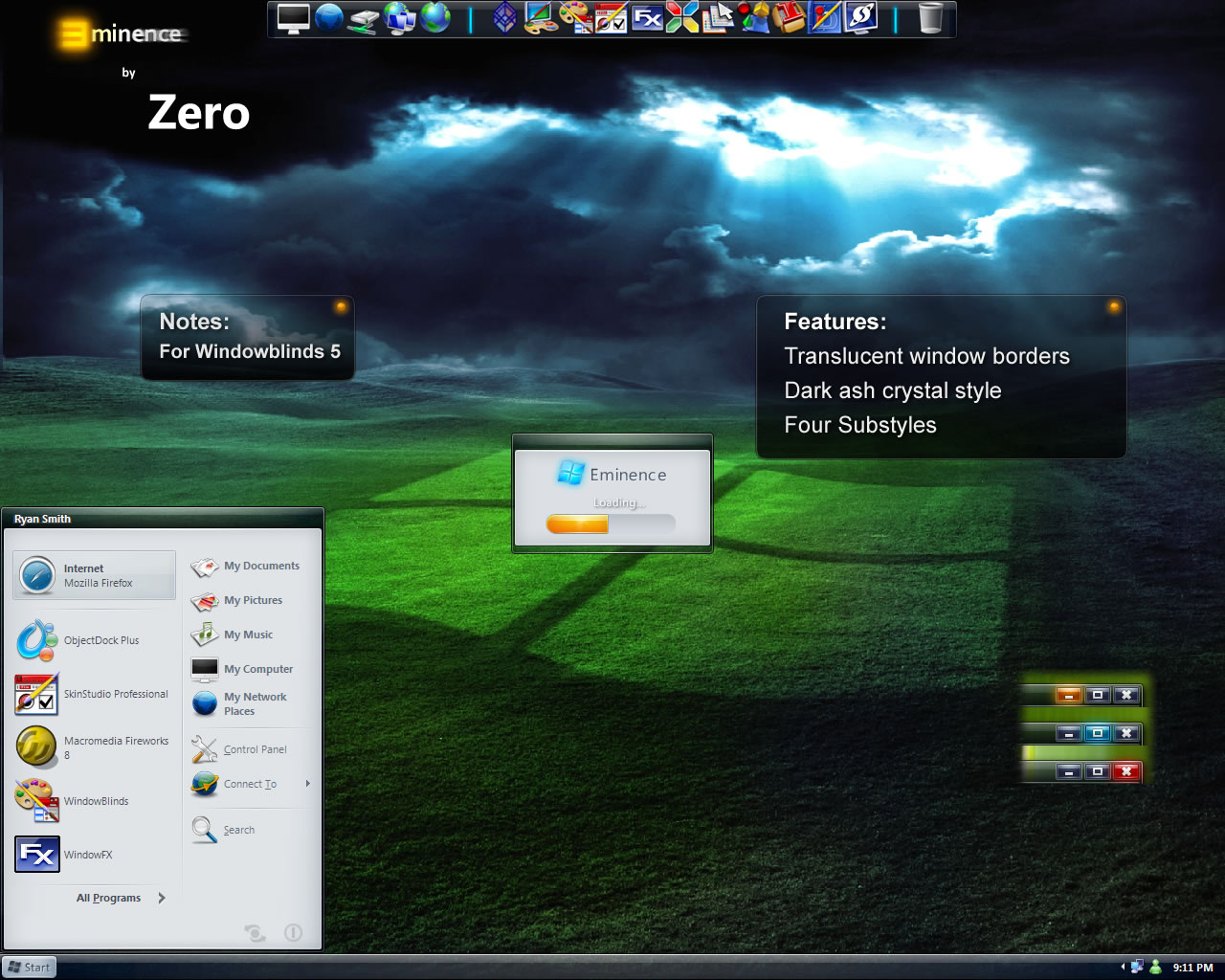
A few comments though, I'm not a fan of start buttons with text and I'm sure there are others too so creating a substyle with a Windows flag and just the "E" would be great.
The highlight for the minimize and window buttons is not very clear either (i.e. when you mouseover it). A different colour like blue or orange for at least one button would look better in IMO.