Comment #22 Saturday, December 2, 2006 5:02 PM
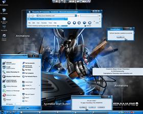
The WB is great. I've used the old Trangloss a LOT. Unfortunately, I think the animations take away some of the class from the look of the new Transgloss.
The animations should be more subtle. Also, instead of the cirles, I think you should animate a nice smooth shiney gloss instead. It would look much nicer and it would fit the theme of the WB much better, too.
Comment #24 Saturday, December 2, 2006 7:57 PM
Re: the wallpaper...the clue is in the bottom right of the screen. It is available on Alienware's wallpaper site.
infideldawg
Comment #25 Saturday, December 2, 2006 8:01 PM
Re: the wallpaper...the clue is in the bottom right of the screen. It is available on Alienware's wallpaper site.
infideldawg
Comment #26 Saturday, December 2, 2006 8:02 PM
Re: the wallpaper...the clue is in the bottom right of the screen. It is available on Alienware's wallpaper site.
infideldawg
Comment #28 Sunday, December 3, 2006 3:05 PM
*chagrin*
Comment #29 Sunday, December 3, 2006 8:40 PM
| I swear I only pushed the button once...honest. |
once...once...once...

Comment #30 Sunday, December 3, 2006 11:53 PM
Looks good...nice job
I like low impact animations

Please login to comment and/or vote for this skin.
Welcome Guest! Please take the time to register with us.
There are many great features available to you once you register, including:
- Richer content, access to many features that are disabled for guests like commenting on the forums and downloading files.
- Access to a great community, with a massive database of many, many areas of interest.
- Access to contests & subscription offers like exclusive emails.
- It's simple, and FREE!


Comment #21 Saturday, December 2, 2006 2:53 PM