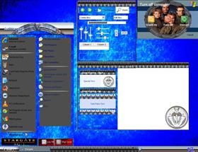
Stargate SG-1a
Average Rating: 2
Yours: -1
File Size: 2.14MB
Downloads Today: 0 Downloads Total: 5542

Stargate SG-1a

Updated Jul 24, 2007 by Jeditharcus


First Previous Page 1 of 2 Next Last
bilbo1930
Comment #1 Tuesday, July 24, 2007 5:01 AM
Stargate windowblinds skin to exist: from vStyler
Please rename yours
Jeditharcus
Comment #2 Tuesday, July 24, 2007 5:12 AM
I respect vStyler and his work but he does not have the copyright on the name Stargate SG-1 to my knowledge. I'm sure that he doesn't mind if there are two skins with this name as they look nothing alike and since he is in no way affiliated with Stargate SG-1 and is a fan of the series like me, they are just two different tributes to the series.Unless there is a rule that I don't know about the name will stay the same.
Jeditharcus
Comment #3 Tuesday, July 24, 2007 5:43 AM
Oh also you don't have to worry if you have vStyler's Stargate SG1 blind as mine will not overwrite his as mine installs into the folder Stargate and his installs into the folder Stargate SG1
KorperArts
Comment #4 Tuesday, July 24, 2007 7:32 AM
If ugliness could be summed up as a windowblinds style, than this would be the perfect embodiment. Horrible graphics. Yuck
lgspence
Comment #5 Tuesday, July 24, 2007 7:43 AM
I think it looks good...Not to crazy about the wall tho.�
Jeditharcus
Comment #6 Tuesday, July 24, 2007 7:44 AM
Thank you lgspence I am happy you like it
OFFICA WoD
Comment #7 Tuesday, July 24, 2007 7:50 AM
jedi, dude....

i totally respect that you are having a go at making blinds, but surley you must see that they need work.
There's text in the screen shot you cant even read, and its basically "too busy".

Ive seen comments before about you should take your time, so why not step back, take a look, and smooth things out before posting a finished product.

(and you really should rename, just out of respect).... "my stargate" or "Startgate SG2" or "SG1"

Offica
Jeditharcus
Comment #8 Tuesday, July 24, 2007 8:01 AM
I can read all of the text in the screenshot,Maybe it is the size of monitor you have.Anyways,the blind always looks better than the screenshot.Remember you have to convert the screenshot to jpg to submit it.They won't accept any other format here and I have tried to make the quality better but I can't seem to do it. I use Corel Photoshop Pro X1 and am just learning how to use the program,so please be patient and I am sure I will make one you like sooner or later.I do seem to be getting the hang of it mostly
MSethWeisberg
Comment #9 Tuesday, July 24, 2007 2:49 PM
Usually I leave nice comments, but with this one all you have done is replaced images. And you haven't even done a good job with that. Maybe it's time to step back and look at a different area of skinning.
vStyler
Comment #10 Tuesday, July 24, 2007 4:51 PM
I also tried to give you some constructive advice, it seems you didn't heed any of it. I would have appreciated it also had you named the skin something different.

People are going to continue to un-appreciative of your works until you listen to their critique and try to impelment it.

This skin needs a huge amount of attention.
messiah1
Comment #11 Tuesday, July 24, 2007 5:23 PM
The naming thing can become a problem for folks. If there is a skin with the same name already, just append your file with something...like for me I just use _m1 at the end of a file name if it's the same. I try not to use same names anymore unless it can't be helped cause some folks can get confused...Not knockin' you or anything. Just some friendly advice on the nameing. ��
kin242
Comment #12 Tuesday, July 24, 2007 5:43 PM
Some more constructive criticism...

1. Invest in a proper graphics program and learn how to use it. Photoshop is excellent and you can get elements which is OK for dirt cheap. Alternatively use the GIMP which is totally free and absolutely excellent. Your graphics look like they have been done in paint. No offense meant, but honest to god they look like they have been done in MS Paint!
2. Font work- again I cannot stress how important your choice of font is.
3. Theme theme and theme!!!! SG1! A few bitmaps here and there do not make a theme.
4. Cohesion and planning. There's more to a skin than a few repeating bitmaps. Thing about the global view. About how it will look on different resolutions, about how things will stretch and how it will all fit together.
5. Spit and polish!!! A published skin should shine- lots of work and something people will want to use and which at the end of the day outshines the basic desktop... not something which looks worse than what you started with.

At the end of the day what is seriously lacking here is quality control. I suggest instead of publishing every skin you create, you take a month and work hard on ONE unique skin, building it up, refining the look until you have something worthwhile and which shines.


Regards


kin242
Plop2
Comment #13 Tuesday, July 24, 2007 6:17 PM
sorry man but your submissions need a lot of work. I appreciate all of the hard work and effort that skinners put into these things but all of yours seem to have been done as quickly as possible. Take some more time and I think you could put out some quality blinds.

slagny
Comment #14 Tuesday, July 24, 2007 6:35 PM
Stargate windowblinds skin to exist: from vStyler
Please rename yours


Ditto!! Out of common courtesy you should rename it!
Nimbin
Comment #15 Tuesday, July 24, 2007 6:45 PM
then out of common courtesy to the actual program, vstyler should rename his WB. it's just a name but i do agree, this one does need a lot of work. but at least this bloke is having a go
Vampothika
Comment #16 Tuesday, July 24, 2007 7:27 PM

Jedi...

keep trying, your doing a good job...

is there a stretch issue on the top frame?

Drzues
Comment #17 Tuesday, July 24, 2007 9:35 PM
Hey Korper...if ugliness could be summed up in anything...it would be your comments. Submit a better skin....submit anything at all before you start throwing out insults at someone you don't even know. Once again Jedi, don't let comments from idiots like that dissuade you. Keep them coming, your improving by the day. Use the CONSTRUCTIVE criticism to your advantage.
GhoS
Comment #18 Tuesday, July 24, 2007 10:53 PM
I am usually not very critical of skins, but this one is horrible. It is useless and not very well themed. And although you present your rebuttals professionally, it appears you neglect to heed the advice of many.

Shame for not at least trying to listen.
Jeditharcus
Comment #19 Tuesday, July 24, 2007 11:30 PM
kittymalone, actually the pattern for the topframe is the design on the stargate on the outer edge just after the symbols.It should look like the taskbar but there is no way I know of to control the stretching of the top so it looks different with every window size.

Actually GhoS I do heed the advice of the other skinners but remember I have only been doing these for a very short time.I am using a very good program but I just haven't figured out how to use it to it's full potential yet but I will soon.
jlockhart
Comment #20 Wednesday, July 25, 2007 5:08 AM
I've been using window blinds since practically day one and I've never made a post before but I feel compelled now. I come to this site and look forward every time to seeing what's new...who's been working their butt off so I can grab the skin and enjoy the labors.

These last two you've posted made me think "the skinners have stopped trying".


Please login to comment and/or vote for this skin.

Welcome Guest! Please take the time to register with us.
There are many great features available to you once you register, including:

  • Richer content, access to many features that are disabled for guests like commenting on the forums and downloading files.
  • Access to a great community, with a massive database of many, many areas of interest.
  • Access to contests & subscription offers like exclusive emails.
  • It's simple, and FREE!
Downloads remaining: 5
User Level: Visitor

Featured WindowBlinds

Popular WindowBlinds

Top WindowBlinds Skinners

Yesterday  |   Last 30 Days  |   All Time
1. LightStar 6903
2. don5318 4358
3. Vampothika 3649
4. SimplexDesigns 3184
5. adni18 2611
6. 2of3 1372
7. retiredmaster 1205
8. AeroPurple 899
9. SemoB 656
10. DaveBax 609
11. IceBabee 584
12. gmc2 574
13. BoXXi 541
14. Dcrew57 444
15. jazzymjr 345


web-wc01