|
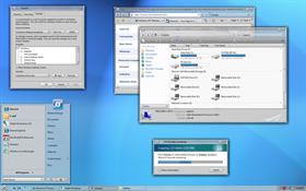
SolarionUpdated Oct 26, 2007 by Stardock Design |
||||||||
Comment #2 Thursday, October 4, 2007 10:07 AM
Comment #3 Thursday, October 4, 2007 10:12 AM

Got really confused looking for the window close button

Miss being able to resize in any direction from any corner (upper right the most)

LOVE! LOVE! LOVE! the look of the skin.
Comment #5 Thursday, October 4, 2007 10:19 AM

Comment #6 Thursday, October 4, 2007 10:24 AM
 ��
�� �
�Comment #7 Thursday, October 4, 2007 10:27 AM
Comment #8 Thursday, October 4, 2007 10:49 AM
It's totally all a marketing ploy. j/k
Actually, we are testing the waters to see how popular this type of content is. If it is something that the community and customers really really appreciate, then we will start devoting resources to making more content for WC, WB users, and Object Desktop subscribers.
Comment #10 Thursday, October 4, 2007 11:00 AM
KarmaGirl said . . . It's totally all a marketing ploy. j/k
Actually, we are testing the waters to see how popular this type of content is. If it is something that the community and customers really really appreciate, then we will start devoting resources to making more content for WC, WB users, and Object Desktop subscribers.
KG - stop with the Stardock skin madness! I've changed my skin four times in the last three days. People are starting to refer to me as Chameleon.

Seriously, though, I think it's great that Stardock is pushing some of its own free content to mark the release of the new WB. Keep 'em coming!
Comment #11 Thursday, October 4, 2007 11:04 AM

Comment #12 Thursday, October 4, 2007 11:08 AM
Comment #13 Thursday, October 4, 2007 11:09 AM
Comment #14 Thursday, October 4, 2007 11:11 AM
Comment #15 Thursday, October 4, 2007 11:15 AM
Thanks, everybody. 
JRSCCivic98, that's not a skin bug. That is just the way WindowBlinds handles the All Programs area. It doesn't change the text or arrow image when it is clicked.
Comment #17 Thursday, October 4, 2007 11:25 AM
Not really the place for this discussion (may I suggest a forum post?) but that being said; WB is what people want the most and what probably brings in the $$

More WB subscribers means more $$ to spend on other projects.
MikeB314, wouldn't it make more sense to remove the arrow then?
Comment #18 Thursday, October 4, 2007 11:28 AM
Comment #19 Thursday, October 4, 2007 11:40 AM
but that close button is really hard to get used to. Please , if you can re-issue the skin with the close button on the right. �
 ��
�� ��
�� �
�Comment #20 Thursday, October 4, 2007 11:46 AM
Please login to comment and/or vote for this skin.
Welcome Guest! Please take the time to register with us.
There are many great features available to you once you register, including:
- Richer content, access to many features that are disabled for guests like commenting on the forums and downloading files.
- Access to a great community, with a massive database of many, many areas of interest.
- Access to contests & subscription offers like exclusive emails.
- It's simple, and FREE!


Comment #1 Thursday, October 4, 2007 9:55 AM