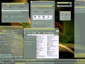
Granular
Average Rating: 8
Yours: -1
File Size: .71MB
Downloads Today: 0 Downloads Total: 16579

Granular

Updated Dec 25, 2007 by Daiwa


First Previous Page 2 of 3 Next Last
adni18
Comment #21 Thursday, December 27, 2007 2:27 AM
Very beautiful skin!
CarGuy1
Comment #22 Thursday, December 27, 2007 6:23 AM
CarGuy1 - Could you take a small screenshot of the start button glitch & send it to me


You've got mail.�
lypnjtu
Comment #23 Thursday, December 27, 2007 7:14 AM
So great:)
JordanCS
Comment #24 Thursday, December 27, 2007 8:58 AM
Excellent skin...one of my new favorites! Clean, well put together, and quite attractive. I've never been a fan of the flashy skins, so you've made me happy!
Daiwa
Comment #25 Thursday, December 27, 2007 10:41 AM
CarGuy1 -

I encountered the same issue in development, so I made that portion of the Taskbar opaque. The balance of the Taskbar has native transparency. The gradient portion of the button image (the "edge of the hole") will show when you use WB Config to change Taskbar transparency since that setting doesn't change the Startbutton trans, just the Taskbar trans. I tried a variety of tricks to get around that, but nothing worked that would look decent with a double-height Taskbar.

Try it with default transparency & see how you like it - I set it @ ~70% as I recall.

Thanks for taking the time to send me the shot.
drkshdw4u
Comment #26 Thursday, December 27, 2007 11:05 AM
top notch only troubles i have is on some of my programs white text comes out on white background and cant read it any way to fix this ?
vStyler
Comment #27 Thursday, December 27, 2007 11:50 AM
A technically sound and fine looking windowblind skin from you Daiwa.. only real criticism i have is the toolbar button text could be a tad darker.

Great job ! and (you knew this was coming) Bout time !! �
Daiwa
Comment #28 Thursday, December 27, 2007 12:26 PM
drkshdw4u -

You can change the Classic Colors menu text color using SkinStudio to get around this - I have the same problem with a couple of apps that have self-skinned menu backgrounds or highlights but still pull the text color from Windows.

vStyler -

Thank you for your kind compliment, John. As for "Bout time," I'm good for one of these every couple of years or so. However, I actually have a much brighter variant of this skin I plan to upload within the next week, once I get an issue with the logoff buttons fixed.
Daiwa
Comment #29 Thursday, December 27, 2007 12:59 PM
sonyadas -

Thanks for posting the link to the wall. Used to be in WC's library, too.
Bulbeni42
Comment #30 Thursday, December 27, 2007 2:06 PM
Very nice, works well ,
drkshdw4u
Comment #31 Thursday, December 27, 2007 5:12 PM
thanx Daiwa ill give it a try not sure how tho but try too lol
great skin anyway
Daiwa
Comment #32 Thursday, December 27, 2007 6:19 PM
drkshdw4u -

I'll do up a version for you with lighter menus & dark text. Gimme a little time to put it together.
drkshdw4u
Comment #33 Thursday, December 27, 2007 6:23 PM
wow thanx allot for that daiwa that would be great thanx so much !!!!!
i cant wait for it if u need my email its drkshdw4u@yahoo.com
Daiwa
Comment #34 Thursday, December 27, 2007 10:31 PM
drkshdw4u -

You've got mail.
drkshdw4u
Comment #35 Thursday, December 27, 2007 10:56 PM
great job wow works great thanx so much Daiwa !!!!
I.R. Brainiac
Comment #36 Friday, December 28, 2007 4:16 PM
Almost a sandblasted look on the translucent elements.�
Sea Hourse
Comment #37 Saturday, December 29, 2007 3:46 AM
This is very nice. Simple clean appearance and I really like the texture. And, wonder of all wonders, for once I don't have to change the size of the fonts so I can see things! Wow! That alone makes this a winner. Thanks for the nice "present". It will be put to good use.
nairb13
Comment #38 Monday, December 31, 2007 12:36 PM
Great work, thanks for sharing
LaBalenaBianca
Comment #39 Monday, December 31, 2007 7:17 PM
Wow, this skin is absolutely fantastic! This is definitely my favorite. One comment: I'm finding the text on the IE7 toolbar buttons and the Vista taskbar to be a bit difficult to read against the background. This could be due to my inexpensive laptop display and/or old-timer vision loss, but it may not be a bad idea to darken the text a bit (or offer an alternate version that does, for we, the old and cheap). Maybe this is only a Vista-specific thing, too. You definitely have a clear talent for usable style! ���
ladyj55
Comment #40 Monday, December 31, 2007 7:22 PM
Daiwa, I loved this blind it's my favorite�� for a while.Can you please tell me what Icons and Cursors your using.�����

Please login to comment and/or vote for this skin.

Welcome Guest! Please take the time to register with us.
There are many great features available to you once you register, including:

  • Richer content, access to many features that are disabled for guests like commenting on the forums and downloading files.
  • Access to a great community, with a massive database of many, many areas of interest.
  • Access to contests & subscription offers like exclusive emails.
  • It's simple, and FREE!
Downloads remaining: 5
User Level: Visitor

More From This Author

Featured WindowBlinds

Popular WindowBlinds

Top WindowBlinds Skinners

Yesterday  |   Last 30 Days  |   All Time
1. LightStar 7353
2. don5318 4450
3. SimplexDesigns 3221
4. Vampothika 3188
5. adni18 2928
6. 2of3 1267
7. retiredmaster 1208
8. AeroPurple 761
9. SemoB 606
10. IceBabee 576
11. gmc2 570
12. BoXXi 542
13. DaveBax 513
14. jazzymjr 429
15. Dcrew57 422


web-wc01