|
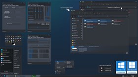
SteamPoweredUpdated Mar 09, 2023 by SimplexDesigns |
Comment #22 Friday, March 3, 2023 7:20 PM
I'm on 10 but I'll keep that in mind when I upgrade. Thanks for the response! After I tweaked it a bit I'm all good now.
Comment #23 Friday, March 3, 2023 7:43 PM
Button stuck out really far on windows that did not have any other buttons other than close. Moved it next to the close button so that it lined up properly.
Comment #24 Saturday, March 4, 2023 6:59 AM
Wish you would have just resized and kept the old order, but that's your prerogative.
Comment #25 Saturday, March 4, 2023 8:16 AM
It was not a size issue but an issue with where it was placed when all other caption buttons were not displayed. Its hard coded to one position so it does not know when those buttons are gone. Results in the button being almost halfway across smaller windows like the run dialog and other apps that I use that have even smaller windows. I can revert it back but it just looks odd like that. PM'd you a preview build of the next version.
What it would do before:
What it does with this change:
Comment #27 Thursday, March 9, 2023 9:01 AM
Haha, guess the update system bugged out.
Comment #28 Tuesday, March 21, 2023 3:36 AM
Great Skin awaited my return. I am using it on all my machines.
Thank you. HawkPunk7
Comment #30 Thursday, March 30, 2023 9:56 PM
I'm using Stardock Blinds and the Steam Powered theme. I've made some changes to match the color scheme, but some color updates aren't working. I love this theme because it has rollup and pin built-in, along with rounded edges. However, I'm having trouble getting the gradients to work and the inactive title bar colors are too dark. I've tried changing the colors in Stardocks skin editor, but it's not helping.
I'm using multi-monitor 10k screens with a 350% force scale, which has caused some issues. The start bar icons are too tall and the grey highlight when I mouse over a button is not what I want. I would prefer to invert the icon color or highlight it with a bright color. The big grey box around each icon/tab on the bars is also bothering me, and I want the text to change to a bright color when I mouse over it. I can't shrink my start bars any further to the left.
Can anyone help me with these issues?
Corrupt screenshots removed by moderator.
Comment #31 Friday, March 31, 2023 7:06 AM
If you can please edit your original comment and remove the gabled mess from a glitch in Wincustomize. Post a link to the image from a site like imgur. unable to see what you are talking about.
Comment #33 Friday, April 28, 2023 4:44 PM
This is the kind of theme you marry, and I thank you for it. It has made some really ugly Windows 95-style programs I must use into real pleasures to work with.
My only question, which is not so much a theme issue as much as it reflects my inexperience with WindowBlinds, is how to make all text white. The dark blue on the dark background can be pretty illegible in some windows and between the colors tab, custom fonts, and advanced settings, I can't figure out how to change it.
Any advice would be most appreciated.
[url=https://postimages.org/][/url]
Comment #34 Sunday, April 30, 2023 7:50 AM
I made it dark blue due to a limitation of windows. There are some instances where the application uses a white background (file explorer likes to do this a lot). So I made it that color. If you were to set it to white, it will be unreadable on applications that do not pull the darker bg colors (white on white is a no go). No way around it im afraid.
This is exactly why you dont see many dark themes here on wincustomize. Its very hard to get right with the imposed Os limitations. In my instance, the theme works well for all that I use.
Comment #35 Sunday, April 30, 2023 11:40 AM
Is there an end-user parameter to make it, say, medium gray? I might be able to find a, er, happy medium if it is variable. In any case, a great skin-- made me re-up my WB subscription.
Comment #36 Thursday, May 4, 2023 10:44 AM
I was actually able to tweak it in WindowShade to be usable for my edge case.
Not perfect, but I believe that's the nature of the beast.
Comment #37 Friday, July 28, 2023 2:02 AM
What colour option would I need to change to make the circled text a lighter colour?
This is an amazing skin, but as it is, these three circled parts make day to day use almost impossible.
https://imgur.com/a/RxZUZfM
Comment #38 Wednesday, August 2, 2023 8:19 PM
Unfortunately stardock says those are hard codded. We are unable to change them. Thats why you dont see many dark themes on here due to that. Even the statusbar text in file explorer is black.
Please login to comment and/or vote for this skin.
Welcome Guest! Please take the time to register with us.
There are many great features available to you once you register, including:
- Richer content, access to many features that are disabled for guests like commenting on the forums and downloading files.
- Access to a great community, with a massive database of many, many areas of interest.
- Access to contests & subscription offers like exclusive emails.
- It's simple, and FREE!
Comment #21 Friday, March 3, 2023 3:42 PM
Re v.4: Was there a specific reason for changing the position of the roll up button?