Windows 7 Superbar Stomps the Old Taskbar – Part 1
Tuesday, January 19, 2010 by Island Dog | Discussion: Personal Computing
In Windows, one aspect of the user interface that most people see all the time is the taskbar. It is obviously one of the most useful pieces as it contains the tools to launch and monitor applications and other sorts of various data. In the skinning world it’s also one of the most important areas to skin as it’s a huge part of the overall UI. The evolution of the Windows taskbar has come a long way, but Windows 7 has taken it to the extreme and literally stomps all over the old style taskbar found in Windows XP and Vista.
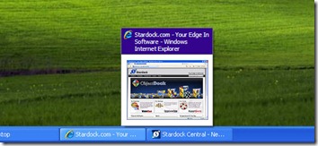
First, lets take a look at the Windows XP taskbar.
It’s pretty simple, it does what it was intended to do. There wasn’t much advanced functionality here, at least not by default. It was possible to add some very cool features using something like WindowFX, which in the screenshot below, it was able to add previews for minimized windows in the taskbar.
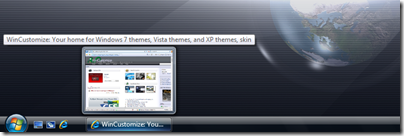
In comes Vista, which brought some much needed improvements in the taskbar area, but overall it wasn’t that much different as far as functionality. The most exciting update was live previews in the taskbar as shown below. It was a nice addition but still nothing groundbreaking to speak of.
With the release of Windows 7, we saw a huge update in the Windows taskbar, now dubbed the “Superbar”. Not only was this a visual change to a point, it also introduced more functionality than we have ever seen before.
Lets take a look at some of the new offerings.
Jump Lists
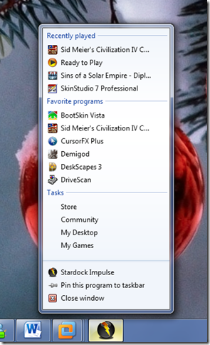
If I had to pick a personal favorite, this would be near the top. Right-clicking a program icon in the taskbar gives you an expanded menu with a variety of options depending on the application itself. This is a quick way to access items like recent files, quick tasks, application functions, etc.
Take the jumplist for Impulse for example:
Right-clicking the icon gives you quite a choice of options. You can select recently played games, favorite applications, common tasks like going to the Impulse Store, and more. Not all applications support jumplists yet, but more and more are being updated all the time.
Taskbar Buttons
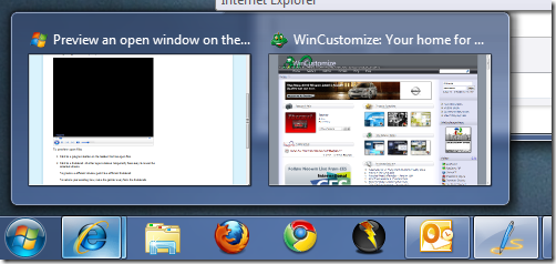
Visually, this will be one of the most noticeable changes in Win7. Gone are the days of the taskbar with the optional small quick launch icons. Now the icons are bigger, and more accessible. One of the most handy features here is Aero Peek. If you work with a bunch of different windows open like I do, you will appreciate this.
Just move your cursor over the icon of an open window icon and you will see a thumbnail of that open file and can easily switch between windows without having to minimize or move any of them. It also works well with applications like Internet Explorer, which will show each open tab as a separate window which you can go directly to.
Today we have covered the basics of the Windows taskbar, and just a couple of the cool new features in the Windows 7 Superbar. Stay tuned for part 2!
Reply #2 Tuesday, January 19, 2010 11:01 AM
Personally I can't stand the default behavior of the combined running tasks and quicklaunch, with no text. Forcing users to mouse over things to identify them is one of the cardinal sins of usable interface design ("mystery meat navigation"). Enabling labels alone only makes it worse, because then you've got full taskbar buttons interspersed with quicklaunch buttons, which get randomly shifted back and forth depending on what's open (Where's the shortcut? Oh, it's over between the fifth and sixth taskbar buttons this time...).
The only properly usable solution is to set it back to the old style and not use quicklaunch at all, which is annoying to say the least. At least there's always Objectdock.
Reply #3 Tuesday, January 19, 2010 11:32 AM
forcing users to mouse over to identify? come on! you can't recognize what is open by its icon? the superbar is far and way superior to the taskbar of xp and vista. there was a debate about that before 7 was launched and people said they prefer the old style bar. guess what. how many pics of current screenies of systems using 7 do you see using anything but the default superbar? i've seen the grand total of 0.
Reply #4 Tuesday, January 19, 2010 11:36 AM
The primary apps I use daily, sure. But Microsoft has a tendency to completely change the icons for all of windows' various bits and bobs with every version, as do a number of app companies. And there are all those other less commonly used apps as well. I use a computer to get stuff done, not to play memory game.

Additionally, if you've got multiple instances of a particular app open at once, the new system forces you to hover and look. Whereas with the old one you can tell which is which at a glance from the title and pick the right one the first time, every time.
Reply #5 Tuesday, January 19, 2010 11:59 AM
Yeah, I hate that too.
Reply #6 Tuesday, January 19, 2010 12:13 PM
+1 to what kryo said. One of the things putting me off upgrading to 7 is the new taskbar. Jump lists look nice but I couldn't stand taskbar grouping in XP, and this looks like an even worse version of it.
Reply #7 Tuesday, January 19, 2010 12:34 PM
whatever. i'll take the superbar over the previous taskbars anytime. i also use my computer to get things done and i consider the superbar superior in every way. things change with each new version of operating systems and apps. some people think the changes are advances (i'm one of those people) and others don't. to each their own, i guess.
Reply #8 Tuesday, January 19, 2010 12:56 PM
my thoughts exactly. It's a real shame that microsoft has started giving in to the "apple nerds" (no offense intended...well, ok...maybe a little). It's one thing to pull off a major visual overhaul, but it's another to hamper functionality to improve the look to the foolish user.
you can get the old quick launch back. look here for the steps: http://www.howtogeek.com/howto/windows-7/add-the-quick-launch-bar-to-the-taskbar-in-windows-7/
Windows just isn't Windows without quick launch....ok fine...that's a bit of a...huge...stretch... ![]()
Reply #9 Tuesday, January 19, 2010 1:43 PM
Kryo, I agree with you. And here's something that may help:
Enable Quick Launch in Windows 7
Use this little trick and un-pin all your apps. Then set your taskbar to "small icons" and "always show labels" and you're all good!
Kind of annoying that you have to go through all that, though.
**EDIT**
Haha! I just noticed Dsep basically offered the same info. oops! ![]()
Reply #10 Tuesday, January 19, 2010 2:18 PM
Have to say I'm a fan of the new taskbar......then again I never used QuickLaunch....prior to 7 QL was for wussies who didn't Right Click ![]()
I admit I'd prefer to be able to set certain programs to group and others not to group but that's my only complaint.
Now if Stardock could just come up with the replacement for RightClick all would be right with the world again. ![]()
Reply #11 Tuesday, January 19, 2010 2:37 PM
I like the new taskbar.. I like it even more now with no text but then again thats how I like it.
what I don't like is the way they renamed stuff in the control panel but that is off topic a bit.
here are some more off topic I don't like the UAC coming up all the time asking do you want this program to run well No Sh!t I want it to run or I would not have clicked on it. MS need to add a box that says remmber this program!!
Yes I know I can turn UAC off or down, Just have not done it yet... Should not have to go throught all that, it is annoying and WOW it even comes up with MS programs too you would think their programs would be the exception.. so MS don't trust their owne stuff to run.
the no ability to sort my folder the way I want them and No room in between top and bottum side by side or the empty spot to the right to click in an empty spot Example in XP I could move the Folder any where I wanted them and had room to click in an empty spot...
don't get me wrong I like Se7en right after XP and use them both on xp now..
have not used the jump list yet, well that i know of.
I find it is easier in XP if I need to more stuff around then in Se7en or edit the contents of a folder
Hiding 3D flip in 7 I like 3D flip So I had to bring it out of hiding.
not being able to open your user folder A.K.A. DiturbedComputer (username) you have to take owner ship to do so it's my folder I should have access without taking ownership and that go's for the start menu folder to.
I would say the average uses would not know how to do this stuff.
Reply #12 Tuesday, January 19, 2010 2:46 PM
I prefer the new taskbar as well.I actually like the hover feature.
In my case I usually have more than 6 windows explorer windows open at a time along with a few other programs so the writing on the old taskbar buttons wouldn't be visible anyway.
Reply #13 Tuesday, January 19, 2010 3:46 PM
Reply #14 Tuesday, January 19, 2010 4:05 PM
Tweak 7 YET? I did quote it and it did not quote
I have it installed does that count
oh never mind I hit the rply not the Quote
Reply #15 Tuesday, January 19, 2010 5:05 PM
"Gone are the days of the taskbar with the optional small quick launch icons. Now the icons are bigger, and more accessible."
Not on my Windows 7 setup. I made the taskbar small and use small icons.
Reply #16 Tuesday, January 19, 2010 6:54 PM
Is there any way to eliminate the delay on preview windows? I don't mind mousing over to find the window I want, but I don't want to have to wait to select a window.
Reply #17 Tuesday, January 19, 2010 7:07 PM
AGree with Kyro, I find just about all of it completely useless, just more of a pain in the ass to skin as far as I can see and a reason MS uses to tout and sell yet another OS. They don't know how to leave well enough alone.
Mine is set to single row, small icons.
Reply #18 Tuesday, January 19, 2010 8:38 PM
At first I thought I would hate the big superbar, but I actually like it and have it set to large icons. The first thing I did though was change the setting to NEVER combine, always show labels. And I don't use quicklaunch/pinned programs either, that's what OD+ is for. But overall, I'm liking it.
Reply #19 Tuesday, January 19, 2010 8:48 PM
I found out the same thing Bebi did, it's okay and I use OD+ also. Not anything to really work up a sweat over. ![]()
It's not like you are slow dancing with you sister or brother. ![]()
Oh boy, now that's a picture that is going to last for a while. ![]()
Please login to comment and/or vote for this skin.
Welcome Guest! Please take the time to register with us.
There are many great features available to you once you register, including:
- Richer content, access to many features that are disabled for guests like commenting on the forums and downloading skins.
- Access to a great community, with a massive database of many, many areas of interest.
- Access to contests & subscription offers like exclusive emails.
- It's simple, and FREE!


Reply #1 Tuesday, January 19, 2010 10:51 AM
Great information, ID. Looking forward to part deux.