Windows 7 Superbar Stomps the Old Taskbar – Part 1
Tuesday, January 19, 2010 by Island Dog | Discussion: Personal Computing
In Windows, one aspect of the user interface that most people see all the time is the taskbar. It is obviously one of the most useful pieces as it contains the tools to launch and monitor applications and other sorts of various data. In the skinning world it’s also one of the most important areas to skin as it’s a huge part of the overall UI. The evolution of the Windows taskbar has come a long way, but Windows 7 has taken it to the extreme and literally stomps all over the old style taskbar found in Windows XP and Vista.
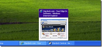
First, lets take a look at the Windows XP taskbar.
It’s pretty simple, it does what it was intended to do. There wasn’t much advanced functionality here, at least not by default. It was possible to add some very cool features using something like WindowFX, which in the screenshot below, it was able to add previews for minimized windows in the taskbar.
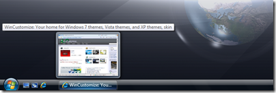
In comes Vista, which brought some much needed improvements in the taskbar area, but overall it wasn’t that much different as far as functionality. The most exciting update was live previews in the taskbar as shown below. It was a nice addition but still nothing groundbreaking to speak of.
With the release of Windows 7, we saw a huge update in the Windows taskbar, now dubbed the “Superbar”. Not only was this a visual change to a point, it also introduced more functionality than we have ever seen before.
Lets take a look at some of the new offerings.
Jump Lists
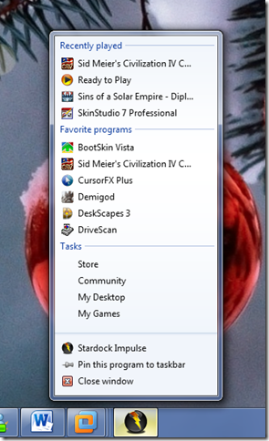
If I had to pick a personal favorite, this would be near the top. Right-clicking a program icon in the taskbar gives you an expanded menu with a variety of options depending on the application itself. This is a quick way to access items like recent files, quick tasks, application functions, etc.
Take the jumplist for Impulse for example:
Right-clicking the icon gives you quite a choice of options. You can select recently played games, favorite applications, common tasks like going to the Impulse Store, and more. Not all applications support jumplists yet, but more and more are being updated all the time.
Taskbar Buttons
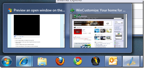
Visually, this will be one of the most noticeable changes in Win7. Gone are the days of the taskbar with the optional small quick launch icons. Now the icons are bigger, and more accessible. One of the most handy features here is Aero Peek. If you work with a bunch of different windows open like I do, you will appreciate this.
Just move your cursor over the icon of an open window icon and you will see a thumbnail of that open file and can easily switch between windows without having to minimize or move any of them. It also works well with applications like Internet Explorer, which will show each open tab as a separate window which you can go directly to.
Today we have covered the basics of the Windows taskbar, and just a couple of the cool new features in the Windows 7 Superbar. Stay tuned for part 2!
Reply #22 Wednesday, January 20, 2010 1:44 PM
I don't know, I must be the only one that hates the new Windows 7 taskbar, or I just don't know how to use it. I used to group programs together in my old XP start menu, where all my burning / ripping apps (Nero, DVD Decryptor, Exact Audio) would be in one folder, all system utilities (Anti-virus, drivers), office apps (Adobe, MS Office, etc), would be sorted properly. I don't want to dump every program I use on the taskbar, but now it's a pain to go look for that rarely used app when I want to run it. Does anyone know if the Windows 7 taskbar / start menu can be organized in any way that doesn't mean pinning every single program to the taskbar?
Reply #23 Wednesday, January 20, 2010 3:34 PM
Yes but Note It is a Pain-in-the-azz
you have to do it in the start menu it self and NOT in the START MENU FOLDER if you move stuff around in the FOLDER it will mess stuff up
and Note when moving one to a folder on some you have to have ownership Link will be provided at end
ok go to start menu then all programs (NOTE) you can't add a new folder so when you move a program to another folder DON'T delete the empty folder just rename it to what you what it to be (Note you can add a folder but you have to open the stat menu Folder and do it in all Users or Default User or username) note On username only if you'er the only user that will use that program
you can delete all the Uninstalls if you want and all the other BS if you want.
Example I got all my spy removers and the like in one floder call Defenders

By [URL=http://profile.imageshack.us/user/null]null[/URL] at 2010-01-20
the first link is the easy one
Reply #24 Wednesday, January 20, 2010 10:27 PM
Quoting Teucrian, reply 16Is there any way to eliminate the delay on preview windows? I don't mind mousing over to find the window I want, but I don't want to have to wait to select a window.
Click on the taskbar button rather than simply hover 'n wait.
Heh... now I feel stupid. Thanks. ![]()
Reply #25 Thursday, January 21, 2010 2:57 PM
That about sums it up. ![]()
I've done everything I can to make it look more like Vista except adding QL which I plan on doing eventually. No rush since I'm staying with 32 bit Vista for now. Why,you may ask? Because it works without jumping through 64 bit hoops to try to get programs to run.
Reply #26 Thursday, January 21, 2010 4:04 PM
I simply have too many programs I want to have at the ready since I'm too lazy to click (or nowadays type) through the start menu. If I pinned them all to my taskbar, it would be quite crowded (I hate stacked taskbar entries). So I turned my Win7 taskbar just the same way my XP taskbar used to be. One row for the opened programs and one row for quick launch with small icons. If the QL icons had the jumplist feature, that would be cool, but of course that doesn't work. For me the only really nice new feature is the possibility to manually sort the items on the taskbar. Everyting else is more or less useless or badly implemented IMHO.
Reply #28 Thursday, January 21, 2010 7:29 PM
Big icons in quick launch for XP / Vista:
1. Unlock your taskbar (right click -> lock taskbar, )(if it is locked of course)
2. Right click to the left of the dotted lines
3. View -> Large Icons
Not really a new feature, they just made the icons slightly larger than the large setting by default.
I kind of like the way it organizes your windows. They sort of imitated the Mac but made it much more organized and less homosexual.
Reply #29 Friday, January 22, 2010 2:18 AM

Reply #30 Sunday, January 24, 2010 7:35 PM
I agree %100. The new taskbar rocks. No regrets at all about going 7. ![]()
Please login to comment and/or vote for this skin.
Welcome Guest! Please take the time to register with us.
There are many great features available to you once you register, including:
- Richer content, access to many features that are disabled for guests like commenting on the forums and downloading skins.
- Access to a great community, with a massive database of many, many areas of interest.
- Access to contests & subscription offers like exclusive emails.
- It's simple, and FREE!


Reply #21 Tuesday, January 19, 2010 9:51 PM
Of course you did, Kona.