


Icon making & Windows Vista
The labor and effort diminishes the supply
Thursday, August 23, 2007 by Frogboy | Discussion: Icons
I admit it. I'm an iconphile. Back in the Windows 3.0 days, I used to go and change all my Windows icons by hand. I thought this was pretty impressive. Admittedly, it didn't help me pick up women for some reason.
Since then, icons have come a very long way. A VERY long way. With Windows Vista, the end-user icon experience out of the box is beautiful. But from an icon creator's point of view, the lack of backward compatibility and effort to support has gone up tremendously. As a result, we've seen a lot fewer custom icons made for Windows Vista than one might have expected.
Microsoft made three decisions with Windows Vista that will forever affect the way we look at icon making on Windows.
Microsoft Decision #1: 256x256 icons First, Microsoft created a new icon size -- 256x256. For users, that's great. Having icons that are 256 pixels by 256 pixels means you will have beautiful icons that are incredibly detailed. But from an artist's point of view, it means that each and every icon is basically a work of art.
Years ago, I used to make icons. At 32x32 for the "big" icons and 16x16 for the "small", even someone with only moderate art skills could make pretty decent looking icons. Today, not only does such high resolution icons mean that only talented artists can make them, it takes talented artists with a lot of time to dedicate to them.
A full set of icons for Windows Vista is around 120 icons. You can get away with as "few" as 40 icons for most casual users but someone who wants a complete desktop makeover needs well over 100 icons. that's a serious amount of time and effort.
In the Pirate Suite, over 120 icons were made all supporting 256x256 pixel icons. The effort involved in going from 128x128 was more than double because now you have to create some serious artwork. How do you think this will affect hobbyist icon packages going forward?
Microsoft Decision #2: No Desktop Scaling
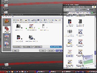
The second decision Microsoft made that has affected icon creation is the decision to have programs displayed with either a down-scaled 256x256 icon or an un-scaled 48x48 icon. This decision is baffling for many reasons.
Check out this screenshot. See how the Windows Vista icons are noticeably bigger than the third-party icons? That's because the third-party icons don't supply a 256x256 icon. But here's the kicker -- the "large" icons are only displayed at 96x96 and will use the 48x48 icon size even if a 128x128 icon is available.
For instance, see the Galactic Civilizations II icon? You can see how it's smaller than the new Vista icons. This inconsistency is visually maddening to me. But what is even worse is that the GalCiv II icon has a 128x128 alpha blended icon in it. They could have used the 128x128 icon! In Windows XP, Microsoft encouraged ISVs to use the "new" 128x128 icon size. Many did. And in Windows Vista, they've been orphaned. They're not used.
Would it have really been difficult for Microsoft to downscale 128x128 icons like they do 256x256 ones? As a result, every single program will need an updated icon and every icon made will need an updated version or face being displayed as a stunted looking icon.
It gets even more obnoxious: Even though the icons on your screen are displayed at 96x96 pixels when you choose "large icons" on Windows Vista, it will not use the 96x96 icon that is in there. See here for what I mean.
To sum this up: Windows Vista will display either a down-sized 256x256 icon if you have large icons or it will simply display a 48x48 icon (or 32x32) inside of a box. It will do this even if the icon in question has an exact match for the display size.
Microsoft Decision #3: "Live Folders" One of the coolest visual parts of Windows Vista in my opinion are the Live Folder Previews. When I look at a selection of folders, I can see some of the files that are inside. It looks really cool.
But on the other hand, it also makes changing folder icons impossible without third-party software if you want to keep the live previews and still change the folder.
Since the Windows 3.0 days, I've liked changing my folder icons. Sometimes I did it for purely cosmetic reasons, other times I did it because I wanted a particular folder to stand out. But on Vista, you lose those live previews.
On Windows Vista, you can change folder icons as follows by right clicking on folder, choose customize and press the change icon button. See here for what I mean.
Now, if you can find a stand-alone icon (because Windows Vista breaks Windows XP .ICL files) you will lose the customization and have an icon that is probably smaller than your other icons.
The Impact
There's no denying that aesthetically, Windows Vista is light-years ahead of Windows XP in the icon department. The icons that come with it are beautiful. And by forcing developers and others to make 256x256 sized icon or have their icons displayed in second class citizen mode will likely result in a much more visually impressive Windows experience for end-users -- eventually.
But during the transition, it means we'll be seeing an awful lot of stunted looking icons on our desktops that, to me, seems completely unnecessary. Ignoring 128x128 icons entirely seems to be a big missed opportunity. The difficulty for users to create and use customized icons on Windows Vista has meant a slow-down in the number of customize Windows icons.
Hardly the end of the world but for those of us who like pretty, consistent icons, it's a bummer at how it was implemented. What's your take? Icons schmicons or do you too like changing your icons around?
New Vista Icons
Windows Vista Changes How Icon Customization Works
Tuesday, April 17, 2007 by Zoomba | Discussion: Icons
![]() Windows Vista has a lot of little visual tweaks and changes versus it's older sibling, Windows XP. Where XP's icons are simple and straight-forward in their design and presentation, Vista's icons require more design work, and have a bit of technical flash to make them fit in with the rest of the improved visuals of the recently-released operating system.
Windows Vista has a lot of little visual tweaks and changes versus it's older sibling, Windows XP. Where XP's icons are simple and straight-forward in their design and presentation, Vista's icons require more design work, and have a bit of technical flash to make them fit in with the rest of the improved visuals of the recently-released operating system.
In Windows XP, icons are typically a maximum of 128x128 pixels, with most people viewing them at 32x32 size on their desktop. If you wanted to change the size of your icons, you had to dig through preference windows and dialogs to try and manually set the sizing. Sure, there were a few preset views (large icons, small icons) but those didn't give you a great deal of choice when tweaking your display. There's also no dynamic scaling. So you can't easily/quickly test icon sizes on your screen to see how they look. Add to this the fact that many applications don't necessarily have high-quality larger icons defined in their .ico file (this is especially typical of shareware type software, or older apps from the Win9x/2k days) so if you run with higher icon sizes, some icons look gritty, pixelated and down-right ugly. Woe to the person who has a very large monitor or poor eyesight.
Of course, there's a certain benefit to how icons work in XP, you have a few preset sizes you have to worry about, anything else is something strange only a handful of users would every try anyway. So as an icon artist, your life is just a little bit easier. 16x16, 32x32, 64x64 and 128x128 are all you need to hit 99% of what users will try/see.
![]() Now there's Windows Vista. Vista not only takes icons up to 256x256, it does dynamic icon scaling, adds dozens of new system icons for icon package artists to design for when creating new themes, and adds a completely new type of icon; the Live Icon. These changes present a completely new set of challenges to artists trying to make complete system icon packs, or for ones looking to update their XP pack for Vista. First, lets look at the dynamic scaling. While there are still a few presets for users to click through, there's also a convenient slider in the view menu that will, in real-time, alter the sizing of any icons on your screen.
Now there's Windows Vista. Vista not only takes icons up to 256x256, it does dynamic icon scaling, adds dozens of new system icons for icon package artists to design for when creating new themes, and adds a completely new type of icon; the Live Icon. These changes present a completely new set of challenges to artists trying to make complete system icon packs, or for ones looking to update their XP pack for Vista. First, lets look at the dynamic scaling. While there are still a few presets for users to click through, there's also a convenient slider in the view menu that will, in real-time, alter the sizing of any icons on your screen.
Icon scaling is a nice feature that will make life much easier for those of us with either poor eyesight, or impossibly huge monitors. Vista's icon scaling also is done per-window, instead of across-the-board like in XP. In XP, you set the icon size once, and that was the size across every single window you opened. In Vista, you set icon size independently in every window you open, and even on the desktop. This level of built-in choice is nice for users who only have a few very important icons on their desktop, and for usability purposes want those to be large and easy to spot, while keeping other icons on their system small and neat,
![]() Possibly the coolest icon change in Windows Vista is its support for the display of "Live Icons" when browsing through folders. If your files have an appropriate thumbnail handler, you'll be able to see a richer preview of the file in question as opposed to just a static icon set by type.
Possibly the coolest icon change in Windows Vista is its support for the display of "Live Icons" when browsing through folders. If your files have an appropriate thumbnail handler, you'll be able to see a richer preview of the file in question as opposed to just a static icon set by type.
This support is also present when viewing subfolders in an Explorer window. For instance, if you have a subfolder filled with images, the Live Icon support will attempt to show the first couple as part of the folder icon to give you an idea of the folder contents.
On top of scaling icons and live icons, Windows Vista throws a lot of new items into the mix that you now have to build new icons for. Artists who tried to theme out even the Control Panel icons for XP will find that not only have many of those Control Panel items changed, but there are also more than a handful of completely new ones to make icons for now. Windows XP has roughly 30 Control Panel icons on a default install. Windows Vista Ultimate? 53.
With this brave new icon world stretching off into the distance, there comes the question of tools for both the artist and the user. Customization junkies that are making the leap to Vista no doubt are looking for the same level of control they enjoyed with Windows XP. For artists, the world of tools is much like it was just a few short months ago. Tools such as Eclipsit's Microangelo Toolset 6, Stardock's IconDeveloper, and IconWorkshop from Axialis still exist and work just fine for creating all the new icons needed for Windows Vista.
![]() On the user end, it's a little more difficult to find software that lets you switch out your icons for something newer and cooler looking. By default in Vista, users technically have the ability to change every icon they use by selecting them individually, digging through their properties and changing them one by one. A step up from that comes with tools like Microangelo Librarian which let you change them out with simpler to follow menus. However, if you want to completely switch out your icons and replace them with completely new Windows Vista icons, your only option on the market is Stardock IconPackager, which added full support for Windows Vista and Live Folders in version 3.2. IconPackager lets artists bundle their icon sets into one easy to use file, and users can substitute in that entire set, replacing all of their main Vista icons with just a few simple clicks.
On the user end, it's a little more difficult to find software that lets you switch out your icons for something newer and cooler looking. By default in Vista, users technically have the ability to change every icon they use by selecting them individually, digging through their properties and changing them one by one. A step up from that comes with tools like Microangelo Librarian which let you change them out with simpler to follow menus. However, if you want to completely switch out your icons and replace them with completely new Windows Vista icons, your only option on the market is Stardock IconPackager, which added full support for Windows Vista and Live Folders in version 3.2. IconPackager lets artists bundle their icon sets into one easy to use file, and users can substitute in that entire set, replacing all of their main Vista icons with just a few simple clicks.
Live Icons, real-time scaling of icons on the desktop, and numerous altogether new icons make Windows Vista a new and interesting challenge for both artists and users. Just another example of some of the cool new opportunities presented by Vista.
Note:
If you're interested in seeing how the Live Folder Icons go together, we have a set of template images for you to take a look at when building your own icons for Windows Vista. Grab the example files here.
Icon-A-Day: making the final IconPackage!
A video wrap up and guide to making our final IconPackage
Sunday, June 26, 2005 by mormegil | Discussion: Icons
| Making the final IconPackage. So, its been several months now since we started working on the Icon-A-Day project. I have officially finished all of the icons as of yesterday. However I still have several icon tutorials to post, but they can come out over the next few days. The icons are done, and that means its time to make the Final IconPackage. To make the final Icon-A-Day IconPackage, I am using two programs, IconDeveloper 1.1 and IconPackager 3.0. Both of these programs are pretty cheap, considering how much the software I used to design the icons cost, and besides, if you own Object Desktop you already have them. Rather then do a step by step image tutorial I have recoded a video showing the entire process of assembling the pack. I will sum it up here but make sure you watch the video. | ||
| Step 1: First I use IconDeveloper to batch convert all the PNG's we have made; 119 of them if you can believe it. This allows us to quickly make Windows XP style icons in all the resolutions we want. (Watch the Video for more)
|
Step 2: Now we use IconPackager 3.0's new Package Builder to quickly drag and drop all of our icons into their proper places. |
Step 3: And last but not least we save our pack, as well as go through and make some personal tweaks to make use of some of our bonus icons. |
| Click Here to Download the Final IconPackager Pack! | ||
|
This brings us to the end of the Icon-A-Day tutorial series. I will be posting a few more tutorials that got skipped, but they will all be linked in the Icon-A-Day Index. I might even be posting a few more bonus icons in the future, as requests come in. | ||


Icon-A-Day, Icon # 103, Recycle Bin - Full
The last of our IconPackager 2.5 Icons.
Monday, June 6, 2005 by mormegil | Discussion: Icons
| Icon 103 (Recycle Bin - Full) Today we will finish up our IconPackager 2.5 icons with the "Full" Recycle Bin. We will do this primarily by using many elements from our file icons, as well as making a few minor tweaks to our Empty Recycle Bin icon. This will work out to be several steps, but they are all pretty simple for the most part. | ||
| Step 1: First we start by making a copy of our "Empty" Recycle Bin icon from last week. .jpg) |
Step 2: Now we are going to do some layer management. I have not talked much about this during the tutorials, but I have an extensive tutorial on it in the Corel For Skinners videos. I have 3 layers that we will use. .jpg) |
Step 3: I group all the objects that make up the back of the Bin, and move them to a layer in my file called "Folder Backs" .jpg) |
| Step 4: Now I Group all the parts of the front of the Bin, and place them on a layer called "Folder Fronts" .jpg) |
Step 5: |
Step 6: Now I ungroup the file icons and start stealing pieces from them. I start by taking the Document file, removing the bitmap from it, then using the Perspective Tool to slant it back. Because it is one "Folder Content" Layer it aromatically sits between the font and the back of the bin, making it look like they are inside the bin. .jpg) |
| Step 7:
Now we repeat the last step, but with the BMP file. I have to remove the Bitmap, and the Mesh fill on the tile of the file, because they will not work with the Perspective Tool. I will put them back later. |
Step 8:
Now we continue, placing our pieces-parts in the Bin. Next we add the Sharpie, rotating it and skewing the shadow a bit to make it look like it is being cast on the files. |
Step 9:
I have a green Shear in the PNG file. I take it and place it behind the files in the back of the bin. |
| Step 10:
Once more we grab our music note from the Wav file and place it inside the Bin. This one looks fine just how it is, so it is simply set in the proper place and we call it done.
|
Step 11:
Now I want to stick in one more element, so we take the paint brush, rotate it and flip it and place it inside the bin.
|
Step 12:
Last I take the bitmap from our BMP file and skew and crop it a bit and place it behind the brush and note. So it is back at home on our BMP file.
|
| Step 13: Now by turning off the visibility of our "Folders Front" I can look clearly at what's inside the bin, and make sure it is what I want. When I am happy with it I simply turn the layer back on. .jpg) |
Step 14: Now I need a new reflection, so I take our existing reflection bitmap, turning off the transparency that I gave it before. Then copy all the bin Context, flip it, and using our reflection Techniques, we give the new bin a nice shadow. .jpg) |
Step 15:
Last we need to add a bit to the bins shadow. We do this with our standard Drop Shadow Techniques. |
|
Finished Icon Image. |
||
|
.Well, that wraps up our IconPackager 2.5 Icons. If you have an Icon package, and you have not already done so, you can simply open it up, go to package builder mode, and assemble a completed pack. | ||
.jpg)
.jpg)
.jpg)
.jpg)
.jpg)
.jpg)
.jpg)
.jpg)
.jpg)
Icon-A-Day, Icon #102, Recycle Bin (Empty)
Let us sum up what we have learnd, and make a important Icon.
Thursday, June 2, 2005 by mormegil | Discussion: Icons
| Icon 102 (Recycle Bin - Empty) At last we come to the much anticipated and much dreaded (by me) "Recycle Bin". This icon is always somewhat daunting since it is seen the most of any, with exception of the folder perhaps. You can count on people judging your entire pack by it. The pressure is not so bad in this pack, since it is not being done to "wow" but rather to instruct, but still we want to do something nice. This is the second to last icon for a standard IconPackager 3.0 icon pack, and since many of you have been following along closely I decided to be a bit more thorough on this one, using it as a kind of summery of what has been shown through out the tutorial series. We will use almost all of our techniques in this one, and I will show a bit more detail on some of the fanciers steps. So without further ado, I bring you, da, da, da... The Recycle Bin. | ||
| Step 1: As has almost always been the case, we start with some rectangles and the Mesh Tool. You can see here how we start to give the bin some shape. At this point we only have four shapes, two of them are almost entirely hidden behind the others. |
Step 2: Now the theme of this set has become, more or less, Metal and Glass. So what I have decided to do is make the body of the bin glass, and the bottom and rim metal. So I create a few more mesh rectangles and start shaping them to our needs. You can see that the top and bottom are actually only one shape each, even though they show two sides of the can. |
Step 3: Now to get our glass we do a few things. First I edit all of our glass sections with the Mesh Tool to give them some gradients, like in our first gloss tutorial. Then using the Interactive Transparency Tool, I set the rear piece of glass to a 50% uniform opacity, and give the two front pieces nice Transparency Blends; each slanting away from the other, to give the illusion of dimension. |
| Step 4:
Now we give the front, and side faces of the bin some simple glare. Just like in our Gloss tutorial. |
Step 5: |
Step 6: Now we go in and do some more detailed mesh editing, making sure that we are keeping with the paneled style we have established thoughout the icon pack. In this case, I make an end panel on the rim and tint all the nodes slightly darker. |
| Step 7:
I more or less repeat this same thing on all the edges of our rim, giving it the same kind of panel effect we have used in most of the metal icons of the pack.
|
Step 8:
We move down, doing the same thing to the bottom of the bin, except in this case I only add two two grooves.
|
Step 9:
One mesh shape to note here is the back of the bottom of the tray. It is pretty simple, but since it is beside the glass, it adds a lot of believability to the overall image. The little details can make or break the "reality" of an icon.
|
| Step 10:
Now we have the basic Empty Bin done, we need a shadow. Since we want our shadow to reflect that the bin is made up of two different materials, glass and metal, I draw a few template shapes where I want my shadows to end up.
|
Step 11:
Now I put a 50% shadow on the gray piece, which is the shadow of my glass. Then I pull a 100% shadow off my black shape, which is the shadow of my metal pieces. Once I have this, I delete the template pieces, select both of my new shadows, and convert them to one bitmap. I also send it to the back of our image.
|
Step 12:
Last we take our resulting bitmap and bleed it out with the Interactive Transparency Tool.
|
| Step 13: One thing we have on all the metal of this pack is the brush texture. So I copy our rim, and bottom shapes, give them a grey fill, and a Brush Transparency. See Icon # 1 and the Interactive Transparency Tool tutorial for more on this. |
Step 14: Now we need our reflection. This will be done with our standard reflection techniques, but I wanted to point out a few details. In this case we could not simple mirror the image because it has a lot of dimension to it. So I had to copy the can and skew and edit the new image quite a bit to make it match up with the bottom of our bin. |
Step 15:
Last we convert the resulting image to a bitmap. Crop it to the bottom of our guide box, and blend it out with the Interactive Transparency Tool. |
|
Finished Icon Image. |
||
|
This has turned into one of the longest, and most detailed tutorials in our series so far. Hopefully it will be useful. Tomorrow we will add some more detail and color in the "Full" version of the Recycle bin. This will use all the techniques we used today as well as everything else that we did not cover. | ||
Icon-A-Day, Icon # 101, Briefcase
Almost there, 3 more to be done with the 2.5 Package
Wednesday, June 1, 2005 by mormegil | Discussion: Icons
| Icon 101 (Briefcase) Well, we are almost done believe it or not. My original plan was to end with the full and empty Recycle Bin icons. However, due to popular demand I have made a few tweaks to my schedule. IconPackager 3.0 is scheduled to come out next week and my plan is to release the finished icon package at the same time. For that we still need about 10 icons. I realized that there were only three (3) icons left to have a completed IconPackager 2.5 icon pack, and since most of the people who have been following these tutorials have been building an icon package as we have gone, I figured we should jump ahead a bit. So today we will start wrapping up the last of the IconPackager 2.5 icons with the Briefcase, tomorrow we will do the Empty Recycle Bin, and Friday we will finish up the 2.5 pack, with the Full Recycle Bin. After that we will go ahead and polish up the rest of the IconPackager 3.0 pack and finish up in about a week more with a Tutorial and Video on building the final IconPackager 3.0 icon package. I am going to use IP3 because it has a very cool new Packager Builder, which will save me tons of time and make life a lot easier for us all. With that, let us begin. | ||
| Step 1: As usual we will start with some mesh rectangles. .jpg) |
Step 2: Now we start molding our Mesh Rectangles with the Mesh Tool. .jpg) |
Step 3: Here is a bit more detail of how the meshes are being done. .jpg) |
| Step 4:
Once we get a nice look to the body of the briefcase we go ahead and give it a nice Brush Texture, using our Transparency Techniques. |
Step 5: |
Step 6: We need to give our briefcase a handle; we do this with 3 more rectangles, the mesh tool, and a bit of Gloss. .jpg) |
| Step 7: Here is a closer look at our handles done with the Mesh Tool. .jpg) |
Step 8: Once we have the handle, we give the case a nice drop shadow, using our Drop Shadow techniques. .jpg) |
Step 9:
As usual we will finish up with our Reflection Technique. |
|
Finished Icon Image. |
||
|
Check in tomorrow for the much anticipated, Recycle Bin. | ||
.jpg)
.jpg)
.jpg)
.jpg)
Icon-A-Day, Icon # 98, PST File
A bonus Icon no more.
Monday, May 23, 2005 by mormegil | Discussion: Icons
| Icon 98 (PST File) Tonight we will continue on with our IconPackager 3.0 File icons. This icon is one I had intended doing as a bonus icon - part of the Office icon sets - but now it is supported in the defaults file types. I will do just the file tonight. Tomorrow I will do the Bonus Application icon and Folder as well. This will more or less be the same as the Access and Word files we did way back toward the middle. | ||
| Step 1: We will start by copying the MDB file and removing the Access Overlay. We also change the base colors to Outlook's signature golden yellow. Also we change the title to PST. .jpg) |
Step 2: Now I have an Outlook logo in my scrap graphics, so I import it and give it our standard perspective. .jpg) |
Step 3: Now we give the Logo a poor mans bevel with the Contour tool. .jpg) |
| Step 4:
We give the bevel some gradients to make it match. I also give the face of the logo some gloss. |
Step 5: |
Step 6: Last using our shadow techniques we give it a nice custom shadow. .jpg) |
| Step 7 During the process of making this file, I had a nice crash and had to start over. So once again I have to change the title back to PST. .jpg) |
Finished Icon Image. .jpg) |
Download the Completed Icons here. |
|
Tomorrow we will make a nice bonus pack of the Outlook Application icon and an Outlook Folder. | ||
.jpg)
.jpg)
Icon-A-Day, Icon # 97, PDF File
Good times with file extentions.
Sunday, May 22, 2005 by mormegil | Discussion: Icons
| Icon 97 (PDF File) One of the most common file types that has been added to IconPackager 3.0 file format is the PDF file. PDF files are mostly used for documents, but they can contain text and graphics, so I try and make sure there is a bit of everything in the file. On top of this we will overlay an Adobe Acrobat logo. | ||
| Step 1: First we copy the Write file. Remove the pen and tweak the copy with the Text Tool. .jpg) |
Step 2: Now to set it apart a bit I change the background title bar to black. .jpg) |
Step 3: Now I need an Acrobat logo, so I draw one with the Bezier Tool. .jpg) |
| Step 4:
Now that I have drawn the logo as a line, I use the Artistic Brush tool to give it a calligraphic effect. |
Step 5: |
Step 6: I give our new shapes some fills to flesh out our logo. And place it in front of our file. .jpg) |
| Step 7 Now we give the logo a shadow and break it apart and crop it, so it only falls on the file. .jpg) |
Step 8 We pull one more shadow off the logo and fade it out, so it falls behind the file. .jpg) |
Step 9 Last we once more give our new file a new reflection. .jpg) |
Finished Icon Image..jpg) |
Download the Completed Icons here. | |
|
We are approaching the end of our pack; more file types to come. Tomorrow we will do anther new IconPackager 3.0 File type. | ||
.jpg)
.jpg)
Icon-A-Day, Icon # 96, TIF File
Back form E3, back to work.
Saturday, May 21, 2005 by mormegil | Discussion: Icons
| Icon 96 (TIF File) Well, I'm back from E3 alive and kicking, though just barely. Today I want to get back into the new IconPackager 3.0 default file types. When we left off we were doing the PNG file. Today we will do one of the new image files: the TIF file. This will be done in almost the same way as the PNG file with a few exceptions. Once more this is a good example of how the same techniques can be used over and over and yet achieve quite different results. | ||
| Step 1: First we copy our PNG file, remove the overlay graphics, and change the title to TIF. We also remove the existing reflection. .jpg) |
Step 2:
Now again with the techniques from Gloss Tutorial we make a nice cyan colored lens shape. |
Step 3: Now I pull a simple drop shadow with a nice dark cyan color to give it a more glassy look. .jpg) |
| Step 4:
Now we simply copy our cyan shape, and change the colors to Yellow. |
Step 5: |
Step 6: And one last copy in black. .jpg) |
| Step 7 Now we go through and convert the four shapes to bitmaps giving them a slight transparency so they look more glassy. .jpg) |
Step 8 Now I tighten up the color shapes to a formation I like and place them above the file. .jpg) |
Step 9 Once more our last step is to give the new file a new reflection. .jpg) |
Finished Icon Image..jpg) |
Download the Completed Icons here. | |
|
Tomorrow we will do anther new IconPackager 3.0 File type. | ||
.jpg)
.jpg)
.jpg)
Icon-A-Day, Icon # 88 - 93, Optical Disks
A Bonus Pack of Disks, just for fun
Thursday, May 12, 2005 by mormegil | Discussion: Icons
| Icon 88 (Optical Disks) I have missed a few days, so I wanted to make up with a bonus pack. While Windows includes all these types of disks inside the the Shell32.dll I do not know of anyway of changing them on a system level, other than a hack. Hopefully IconPackager will find a way to do so before to long. One more reason to do these disks is that CandyBar for OS 10 supports them. So just for fun, and because they are all pretty simple, I figured what the heck. So with no further ado, I give you the Optical Disks. | ||
| Step 1: So this will be pretty simple, First we get ourselves a nice copy of the CD icon. .jpg) |
Step 2:
Now we copy over one of our pens from any one of our file icons that we have made already. |
Step 3: Now we create two simple rectangles, set a 50% Transparency setting; one in a color and one white for a nice line. .jpg) |
| Step 4:
Now we simple use the Text Tool to add the type of drive access to the colored bar, making sure it is placed behind the glare. |
|
Step 5: Now we need one more element to make the rest of our Disk Types: a pencil. This we start by mocking up a pencil with some mesh rectangles. .jpg) |
| Step 6 Now with our standard Mesh Tool Techniques we start molding our pencil. .jpg) |
Step 7: More mesh editing... .jpg) |
Step 8: And still more mesh editing. .jpg)
|
| Step 9: Last we use our Shadow and Reflection techniques to finish off our pencil. .jpg) |
Finished Second Icon. Note: The rest of our types we do with exactly the same steps, but changing the colors, and the text. .jpg) |
SS.jpg) Download the Completed Icons here.
|
|
Now that we have a all the common Optical Disk types, we will move on. We have a few other bonus Disk types that we will polish off before we move on toward the end of our pack. | ||
.jpg)
.jpg)
.jpg)
.jpg)