


October 13th Skin Thoughts and Reviews
Monday, October 13, 2008 by wulfn1 | Discussion: Community
This week, with the GUI Championships upon us, I wanted to find something special.
I didn't have to look very far. The very first page had a great blind that stood out and , really I think should have been entered. (But I'm glad it wasn't!).
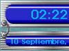
Azul HI-def in 3d by the AVMAN is a brilliant skin with features you won't see in other blinds. For one, the start menu gives the illusion of being offset and made of something more solid than a bitmap. The colors are blended in a way that is really easy on the eyes.

The menus of this skin are outstandingly skinned. The individual sections for each menu item makes it much easier to find what I am looking for in a long list of stuff. One of the nicer parts of this skin is the min/max/close buttons are situated on the left. Being a lefty I have to enjoy that.

CursorFX theme is Prototype 01 by J. Aroche I adjusted the hue slightly to bring out the deeper blue tones.
Slider by SkinHit , recolored to blue is the IconPackage I used .The slight tilt to the icons worked well with the blind's look. I had to recolor Firefox Midnight by Mirsguy again for this one. And I recolored and converted Thunderbird 2005 icons by Jairo Boudewyn from Object Dock pngs.
My Dreaming Night by PhoeniXLegends is a great wall, with three different styles and three different sizes. This setup looked great with each of the styles, but because it's october I thought maybe something a bit darker was in order.
for my ObjectDocks , first I chose a single dock again with the Stardock ODNT icons all from some Hazard icons by David Brelo , really a detailed group of icons, unfortunately he did them one at a time!

The second Dock, is BlackRose Tabbed and Side docks by WebGizmos with the blue hue allowed for each tab, just slightly different blue.
I tossed in Mini Calendar by Vad_M just because I could. Blue of course.
Right click is BlackBlue by Cavan1. It's a great skin and the coloring is spot on.
Windows 7 it is...now for my wish list
Monday, October 13, 2008 by Frogboy | Discussion: Personal Computing
So it's official, the successor Windows Vista is Windows 7.
Windows 7 is designed to be all the things Windows Vista wasn't including:
- It's faster. MUCH faster.
- It's cleaner. The UI has been cleaned up a lot.
- It's easier to use. A lot of the functionality is more streamlined
- It's richer. The ribbon seen in Office becomes part of the OS allowing app developers to have a standardized way of taking their apps to the next generation UI (I love the ribbon).
- The UAC is...a little bit better. I still think Microsoft should have a setting to allow signed applications to be always okay'd by users if they want.
- It apparently has a new Start menu and taskbar.
- The included applets are modernized
- It may come with native VHD (virtual hard disks) support
- Better system tray handling
That's all well and good but I have a few other things I'd like to see added to the list:
- Make it 64-bit only. PLLEEASE!
- Give us better and cleaner access to manage the junk that loads on boot-up. (Stardock TweakWindows 7 will certainly do this otherwise)
- Make it a LOT easier to share drives over the Internet
Let me talk about 64-bit a little bit. A lot of people don't realize just how much effort developers have to go through to support 64-bit and 32-bit. It's a mess. Windows 7 is a great opportunity to cut the umbilical cord on legacy 32-bit. Most modern PCs are already 64-bit. They're just running a 32-bit OS which is a shame. Drivers, desktop enhancements, and all kinds of other things have to do special versions for 64-bit because most people run 32-bit OSes on their 64-bit hardware.
Memory is incredibly cheap and yet we're still stuck with a 2 gig limit on program memory use (a pain for game developers trying to have lots of rich textures). My next PC is going to have 16 gigs on it minimum.
Moreover, the handle issue of 32-bit NT OSes pretty much goes away at 64-bit. It's just a vastly more robust experience.
I'm typing this on a Thinkpad T400 which is running Vista 64 and the experience has been phenomenal (and it only has 4 gigs but I end up with an extra gig of disk caching).
Consider the performance ramifications of a system that has massive amounts of memory. You leave your PC on long enough and you could end up with massive amounts of it stored in a huge disk cache. Windows is using 2GB for caching my system right now and the performance difference is noticeable - very noticeable. If I could get 8GB for this machine, I would.
So hopefully, we'll see Windows 7 get a lot more 64-bit users.
This Week in Skinning – October 10th
Skin Roundup for 10-10-08
Friday, October 10, 2008 by Island Dog | Discussion: OS Customization
Well it’s Friday, and next week we will see the start of the GUI Champs ‘08. Also, don’t forget to check out This Month in Dreams which features some of the best animated wallpapers submitted to WinCustomize in September. I’m also starting to see some really cool Halloween inspired skins coming in. Look for more features of those soon.
Now for this weeks picks!
 |
Unlock the Darkness by sydneysiders A really creepy bootskin to get your desktop ready for Halloween. |
 |
Arran by BoXXi BoXXi brings us some cursors for the Arran skins, and it’s a really nice minimal style that works well with many themes. |
 |
Waterworld DX by PuterDudeJim I just really like the colors and design of this DX theme. |
 |
ChaNinjaStyle SubZero by ChaNinja This .dream was made to match the SubZero WindowBlinds skin, and it’s great to see ChaNinja back in the community. |
 |
TombStone by bk13GarbageMan This RightClick skin immediately caught my eye, and it’s a must-have download for a Halloween desktop. |
 |
Pumpkin Man by sandpiperw A great Halloween wallpaper for your desktop. Very nice. |
 |
Stardock 2009 by DEVJIT This is a really cool design, and just works well as a wallpaper. |
 |
SD Desktop (vista) by Vad_M Vad_M has completed the SD Desktop WB skin, which will go great with all his SD gadgets he has been making. Great job! |
 |
Autumn’s Arrival by jazzymjr A beautiful skin to along with the changing seasons. Be sure to check out the matching wallpaper as well. |
See you next week!
Get More From Your Screenshots with Snagit 9
Thursday, October 9, 2008 by Island Dog | Discussion: Personal Computing

As you might know, taking screenshots is a big part of my daily work. Whether it’s taking screen captures of applications, games, skins, etc., having the ability to easily take these screenshots is a must. The old “print screen” button works just fine for taking screenshots every once and a while, but if you want to take it to the next level then you need to grab a copy of SnagIt 9 from TechSmith. Even if you are a previous user of SnagIt, the upgrade is a must-have, and new users will be hooked on all the features it has.
Let me start off by showing what is new in version 9.
- New User Interface. The interface and workflow has undergone a complete makeover. It’s a huge difference than previous versions, but it takes not time at all to become familiar with this one.
- Auto-storing. When you take a screen capture, SnagIt automatically saves it until you decide on what to actually do with it. Perfect for when you need to take several screenshots, and you don’t have to worry about saving each one until you are done.
- Combine images. This is one of my favorite new features. The SnagIt Editor just became even more powerful, so now I can do editing right in SnagIt that I once had to use an external image editor for. You can now take multiple captures, and combine them by simple drag and drop
- Search and Organize. SnagIt 9 has a great integrated visual search and tagging/flag features to make organizing and finding your screen captures as simple as can be.
There are just a ton of options and configurations for SnagIt regarding captures and outputs, but they are easy to understand and configure. There are a bunch of capture profiles included. Some of these include taking screen captures of regions, full screen, scrolling windows, webpages, and more. SnagIt also allows you to create your own personal capture profiles to easily tailor the capture to your specific needs.

You can also select a profile from the system tray, along with quick access to other common functions. Once you are ready to take your screen capture, you can do it via a configurable hotkey setup, through the system tray, or through the main interface. The hotkey option is definitely the best way to go.
After you capture is done, you can either take more or use the SnagIt Editor to do a variety of things with the images. The SnagIt Editor is a very powerful tool, and TechSmith really poured some extra effort into making it a full fledged image editor. I have actually found myself turning to the SnagIt Editor instead of higher-end graphics applications when needing to edit an image. The Editor has a ribbon-like interface, with tabs which give you quick access to the many editing features that are available.

A brief overview of the functions of the tabs:
- The Draw tab allows you to get access to the clipboard, drawing tools such as adding text, callouts, shapes, arrows, etc.
- The Image tab gives you tools like crop, resize, rotate, etc. It also has an ‘image style’ section where you can apply a variety of edge effects, shadows, and other image styles. This section also gives you the options to add blur, color effects, filters, and much more.
- The Hotspots tab lets you add hotlinks, tooltips, and flash popups to your images.
- The Tags tab lets you add keywords to your images, set flags for the images, and gives you a detailed description of the captured image.
- The View tab gives you control over zooming, windows arrangement, and help/training sections.
- The Send tab is where you can take your finished image, and send it to a huge variety of outputs like e-mail, FTP, applications like Word, and even upload directly to Flickr.
I just wanted to focus on a couple of my favorite features which I use regularly. When I take a screenshot of say an application or website, I often need to make ‘notes’ about a specific part of the captured image. I used to have to break out Photoshop and add some arrows and text boxes, but no more. I can do this in seconds with SnagIt. All I have to do is select a Callout image, add my text, and then add an arrow. It can’t get much easier than that!
 |  |
Once I have my image ready, now I can tag with some keywords, so if I need to find it later, I can find it via the search pane either through keywords, websites, date, and more.

When everything is done, I just now need to figure out where to send it to. You can of course just save it as an image file, but there’s so much more you can do with it if needed. If you need to send it to an application like Word, Excel, or Powerpoint, you can do that with a simple click. E-mail and FTP uploads are just as easy, and you can visit the SnagIt Accessory page for more outputs that can be downloaded. My favorite option is the ability to upload the images directly to my Flickr account. Uploading through SnagIt saves a bunch of time on my part, and it’s a welcomed feature.
I could really go on and on about all the features, but the bottom line is SnagIt is worth every cent. If you need to take screen captures of any type, then there is no substitute, SnagIt is the way to go.
You can find more information, and a free trial download at http://www.techsmith.com/screen-capture.asp.
Stardock Ubiquity Commands
Put this Firefox extension to work with Stardock's sites
Thursday, October 9, 2008 by Shirley | Discussion: Software Development
For those who haven't used it yet, Ubiquity is a firefox extension that takes advantage of several web services to improve productivity in a huge way. Best to watch the video to truely understand it:
Ubiquity for Firefox from Aza Raskin on Vimeo.
I've been using Ubiquity for some time now and decided it was time to dust off my programming skills and do something with it. My original idea was to just write a plugin to search the WinCustomize gallery, but a cross between boredom, enthusiasm, and some suggestions from ZubaZ pushed me to do more with it. So, if you have Ubiquity installed, head to the following sites and subscribe to the commands. There is a list of what they include on each site.
WinCustomize Galleries Search
http://sd.stardock.com/curthendzell/wc.html
Stardock Forums Searches
http://sd.stardock.com/curthendzell/forums.html
Comments? Suggestions? Let me know!
Shirley out.
Impulse Gets an Update
Thursday, October 9, 2008 by Island Dog | Discussion: Demigod Journals
 Have you been to Impulsedriven.com in awhile? Well if you have, you'll notice that we've done some redecorating to not only the website but the store itself.
We've made the website much more informational with the homepage now adding a featured title section highlighting a major software or game, a latest news section showing off recent releases, and a recent articles section authored by people from the Impulse community. You'll also find the navigation to be a lot more friendly with the left hand-side search bar and menu. 
When you're ready to search through our library of games and software, you'll notice a whole new look to the Impulse store. First, check out the featured tab that lists all the latest and popular additions with our new "lightening bolt" popularity ranking. Sorting through all your favorite games is now as easy as simply clicking on the Category name you want to sort by i.e. product name, popularity, release date, or price. If you choose to see a bigger list, you can click on the +/- button to expand your list and see all that there is to offer.
Need some help? We've also added a support tab where you can easily find answers to some of our most frequently asked questions, or if you don't see what you're looking for, you can contact support directly through our email system. 
If you haven't checked out Impulse yet, visit www.impulsedriven.com to get your exclusive free download of Stardock's new digital distribution platform.
Animated Wallpapers: September '08 Edition
Tuesday, October 7, 2008 by Island Dog | Discussion: OS Customization
This month in dreams is back, and with some really good ones as well. Don’t forget the GUI Champs ‘08 starts this month, and .dreams are one of the categories. You can get more info at www.guichamps.com.
Now for this months video!

To use .dreams (animated wallpaper) you need to have Windows Vista and Stardock's DeskScapes installed. If you are an Object Desktop subscriber, you have beta access to DeskScapes 2.0 which will run on virtually any version of Vista.
The .dreams featured in this months video can be found at the links below.
- Black Hole by CarGuy1
- Cloud Surfing by CarGuy1
- Sea of Burning Dreams by Chris Bary
- dark_energy by muckyman
- Julian LHC by flyersfan
- Red Vines by TheMasterBaron
October 6th Skin Thoughts and Reviews
Monday, October 6, 2008 by wulfn1 | Discussion: Community
This week, I concentrated on simplicity and decided not to have too many things on my desktop. I found this is a good thing, as I have to look up each of the icons I chose for Object Dock+.
I used the WindowBlind October by NighTrain. I thought it was fitting. This blind is a warm pumpkin color with stylish window frames. It really does say October!

I decided to use Element by skinhit for my IconPackage. There are quite a few orange hued icon sets, but the backlighting of this set really looks sharp against the startmenu.
The wall is Orange Blossom by AzDude I edited it in my PaintShopPro 7 program to reverse the pattern and flip it. I didn't like the way the graphic was hidden by the start menu and placing it to the upper right made all the difference.
CursorFX theme is Silex by the AVMaN. I have used this theme in the past , in my reviews,but I felt it was the right cursor for this grouping.
Now, for the docks.
I recently had to redownload all of my docks and icons, and I made the tragic mistake of not saving each link I downloaded from for the reviews. Now I am paying for that , and am having to hunt down each icon all over again to capture the link. It's unfortunate that the icons don't all have titles which would make it easy for me to find them. But I will do my best to list all of them today. If I missed someone's icon, please post the link in comments for those who might like to download it.
The first dock ,is TransBrass by Cavan1 I used the tray file from this dock and because it's a side dock it changed the whole look of the dock. If you prefer you can alter the look to show properly within properties by clicking "stretch background proportionally. I like the way it resembles a display you might see in a store so I left it as is.
I really don't care for the Wincustomize icon that is standard with the program, so I changed it to WinCustomize Chameleon by Bandit4edu.
I hope someone soon makes a calendar docklet to replace the current one. It's boring and the blue color isn't all that flattering for most groupings.
The Power docklet is 2d battery meter docklet 2006 by Havell. You would think something this clean and pretty would be standard on the objectdock package but the one that comes with it is rather plain and the colors are harsh. I really like the three dimensional look of this one.
I used the pccube icon from the WhiteFire2 Dock Icons by basj to make a flyout menu for my computer items. I didnt' show it because I have two flyouts this week and the Stardock flyout is really prettier.
Speaking of the Stardock flyout menu,.. This dock I chose to be a single dock. I wanted my Stardock programs available at a single click , on the desktop. A flyout menu was the best way to obtain that goal. I chose a dock from my menu called sglass tile. I can't find the link to this one, so if anyone knows , please tell me so I can post it.

The icons are Cosmos by PixelPirate (thanks so much to Winstar4 for helping find these!!!) These icons are bright, clean and professional and I am really enjoying using them.
The Stardock Logo icon is part of a Liquidox set, Which is a premium suite and can be found here Liquidox Theme
The tabbed dock at the top , is alegnA by Messiah1 I had set it to accept color in configuration , and that brought the hues closer to the orange I've used here.
This Week in Skinning – October 3rd
Skin Roundup for 10-3-08
Friday, October 3, 2008 by Island Dog | Discussion: OS Customization
A new month, and the first TWiS is quite a good one. I have a feeling October is going to be a really great month. We have the GUI Champs ‘08 starting, we have a Halloween coming up which is a great time for skinning, and hopefully cooler weather.
Now for this weeks picks!
 |
SciFi Sky by gropull This is a really cool image that is used as a bootskin. |
 |
ChalkboardMp3 W by Doubird This media player widget has a simple, but really cool design. This appears to be Doubird’s first submission, so I can’t wait to see more. |
 |
Julian LHC by flyersfan This .dream immediately caught my eye, and putting on my desktop was a pleasure. Great job. |
 |
Wraith IP by SKoriginals This came in late last week, but definitely deserved to be mentioned this week. No description is necessary, it’s just that good. |
 |
Skin it ALL by PoSmedley Sometimes, you just have to go with the message. Skin it all! |
 |
Gridlok by MikeB314 We had a couple of WindowBlinds Master skins this week, and one of my favorites is Gridlok. It’s just a really great skin, be sure to check this one out. |
See you next week!
Screencast: Impulse Interface Walkthrough
Thursday, October 2, 2008 by Island Dog | Discussion: Personal Computing
We have been putting out updates to Impulse quite often, so I thought now would be a good time to do a quick walkthrough of the user interface in Impulse. Impulse is Stardock’s next-gen digital distribution platform. You can get the free download and more information at www.impulsedriven.com.