Top WindowBlinds Skins from the 2008 GUI Champs
Monday, December 15, 2008 by Island Dog | Discussion: OS Customization
This years GUI Champs was huge, and icon packs definitely took center stage, but there was also an incredible showing in the WindowBlinds category as well. We saw entries from veteran skinners, and saw plenty of new faces. Hopefully, these users will stick around and start submitting over to WinCustomize.com as well.
With that being said, lets take a closer look at some of the beautiful WindowBlinds skins submitted to the 2008 GUI Championships. These skins also are the finalists in the Best Overall category.
These skins are free to download at www.guichamps.com
Best Overall WindowBlinds Skins
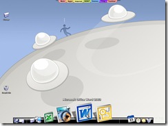
Dream Loricae by bingxueling
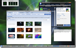
FLASH – Live System by 1MrPAul1
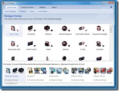
iSpire Vista/XP by Night Train
'Find the Stardog' Hunt Begins!
Monday, December 15, 2008 by Island Dog | Discussion: Personal Computing
The hunt for Stardog begins at 12pm EST today. Hunt down Stardog throughout our various sites for a chance to win a $100 gift certificate to the Impulse Store. There will be a winner each day!
How to play:
Entrants must register for an Impulse account in order to play. If you already have an Impulse account, you don't need to do anything else before the contest begins. Each day during the contest there will be a new scavenger hunt with a different winner for every day.
The first clue will always be shown on the Stardog page. Clues are identified by an image of Stardog hidden somewhere on the page. To reveal the clue, click on the image of Stardog, and he will give you a hint for your next destination, where you will need to look for his new hiding spot.
Everytime you find a clue there will be a letter in Stardog's paw print. Keep track of the letters in each clue.
Once you have found the final clue and solved the scrambled word, you will be asked to enter your Impulse account information. This information will be sent to the prize department and they will contact you with information on how to receive your prize. The dynamic chart above will show how many contestants have found each clue and when the daily winner has completed the hunt. Once the winner has been found, the hunt will end for that day.
Make sure you have your Impulse account setup, and get ready to play!
Read more at https://www.stardock.com/stardog/
Weekend Impulse Buys!
Thursday, December 11, 2008 by Island Dog | Discussion: Personal Computing
Everyone likes a sale, right? Well from December 11th to December 14th we have a HUGE sale going on in the Impulse Store!
- Project Aftermath - $9.99
- Galactic Civilizations I: Ultimate - $3.99
- Political Machine 2008 - $3.99
- Space Rangers 2 Complete - $3.99
- Supreme Commander - $9.99
- Galactic Civilizations II: Dread Lords - $9.99
- MyColors: Winter Wonderland - $9.99
- World of Goo - $19.95
It’s a chance to pickup some great games and software at an incredible discount. Don’t forget you can also purchase a gift for someone else, and they can download via Impulse, and do not have to wait for a package to arrive.
Top Icon Packs from the ‘08 GUI Champs
Thursday, December 11, 2008 by Island Dog | Discussion: Personal Computing
The 2008 GUI Championships is an international skinning and graphic design competition where graphic artists from around the world compete for thousands of dollars in prizes. This year, one of the most popular categories was Icon Packages. There were tons of submissions and after many hours of reviewing and judging, the nominees for Most Usable and Most Original have been decided.
These icon packs, along with other desktop skins, are available for download at www.guichamps.com. These nominees represent some of the best icon creations this year.
Most Usable Icon Packs
Blue Memory 2 by dtu is an outstanding icon package that is very complete. Full Vista support, if these icons showed up as the default Windows 7 icons, I wouldn't have thought twice.
Eliminator by TYCUS is one of the most complete icon packages in the contest. Bonus points for supporting all kinds of files including Office 2003 and Office 2007.
Evolution by Xiaomaohua is a somewhat traditional but with a more modern feel. One could imagine Windows 8 having icons something like this.
Non-mainstream 2008 by iconboy
Most Original Icon Packs
Ancient Legend by Zuo Zhiyu is one of my favorites in teh contest. Good Vista support. It makes me wish IconPackager's live folder support was a bit more flexible. The artistic quality here though is really good.
Lineless Design by bingben_penGUIn
Lineless Design is one of the most original concepts in the contest. First, they are really outstanding in terms of art quality. It doesn't support Vista but the sheer creativity shown here makes this a must-have for XP users
Non-mainstream 2008 by iconboy
Non-Mainstream 2008 by iconboy is one of the most complete icon packages I've seen. Bonus points for lots of file type supports. It's an excellent theme for XP and Vista.
On the road by Dooandjen_penGUIn
Plastic Fantastic by Tiggz may be the best entry of this year in my opinion. It's extremely original and extremely usable. My only gripe is that there's no Office support built into it (support for Office icons) but otherwise this is about as good as it gets.
Weird Creature by edwin_penGUIn
Get Ready for the "Find the Stardog" Contest
Wednesday, December 10, 2008 by Island Dog | Discussion: Personal Computing
We have a new contest we are launching next week, and your mission will be to find Stardock’s new mascot, Stardog.
This contest is a scavenger hunt, and will be played as followed:
The first clue will always be shown on the Stardog page. Clues are identified by an image of Stardog hidden somewhere on the page. To reveal the clue, click on the image of Stardog, and he will give you a hint for your next destination, where you will need to look for his new hiding spot.
Once you have found the final clue and solved it, you will be asked to enter your Impulse account information. This information will be sent to the prize department and they will contact you with information on how to receive your prize. The dynamic chart will show how many contestants have found each clue and when the daily winner has completed the hunt. Once the winner has been found, the hunt will end for that day.
What do you get for this adventure? Well each day a winner will get a $100 gift certificate which they can spend on anything in the Impulse Store. The contest will run from December 15-19, and will start each day at 12pm EST.
In order to participate, you must register an Impulse account. If you don’t already have one, follow the link below and get yourself setup.
Get all the other rules and information at the Stardog website at https://www.stardock.com/stardog/.
GUI Championships 2008: WindowBlinds
Tuesday, December 9, 2008 by Frogboy | Discussion: Personal Computing
This is the 4th GUI Championships and in that time we've seen some great skins made. WindowBlinds is a program that allows users to change the look and feel of the Windows XP, Vista, and Windows 7 graphical user interface (title bars, Start menu, push buttons, borders, checkboxes, etc.).
I am one of the 3 judges for the contest. Our votes help determine the 10 finalists who will be voted on by users. My criteria are the following:
1. Originality. How creative a concept is it? The benchmark is Luna, the default skin of Windows XP.
2. Usability. Does it allow me to use my computer effectively? That's a big part of it but it also has to be something I would want to use too.
3. Overall. This is largely a combination of the two but often times a skin is more than the sum of its parts. Using Windows XP's Luna as the middle benchmark, if a skin gets higher than a 5, it's better than Luna in my opinion. If it gets less than a 5, it's not as good as Luna.
Supporting Vista isn't required in the contest but obviously, if the skin doesn't work on Vista at all it's going to take a hit given that a quarter of the users out there are using it and that's only going to grow.
Now before people get upset with all the "low" scores let's remember that we're using Windows XP's default look, Luna, as the baseline for 5. It took countless meetings and effort for Microsoft to create Luna so anything that gets over a 5 is pretty impressive. Most scores are going to be less than 5.
Example of Luna (XP's default visual style running on Vista)
Luna from Microsoft is what you get when a committee designs a skin. It's quite usable thanks to good use of contrast and the title bar buttons are very large. It's not particularly pretty but it gets the job done. The borders aren't alpha blended so there are jaggies around the edges, no shadows, and the overall look is a bit of a drab blue. It's not ugly by any means in my opinion so I'm okay running it but it's also not particularly compelling.
Originality: 5
Usability: 5
Overall: 5
An example of a skinned OS:
Dragon from Stardock Design is a very original and well executed concept. The actual Windows title bars, borders, etc. have dragon scales on it. The dragon on the start menu is actually animated and extremely fluid. No included wallpaper in the skin, no dialog background texture but a very good explorer texture is provided. Very good use of colors keeps it highly usable and makes me, as a user, want to use it.
Originality: 10
Usability: 8
Overall: 9
...And it begins...
Agua is very original as a concept with an animated title bar and start menu. Unfortunately, it's not as usable as it could be because of the text color choices in various places makes it hard to read.
Originality: 7
Usability: 3
Overall: 3
Aqua XP is an interesting idea but the technical execution keeps it from being competitive. It's very hard to read the text and the art level and design quality aren't competitive as some of the elements don't remotely match.
Originality: 5
Usability: 1
Overall: 2
Aqueus makes good use of the Aero style but strikes me as being a bit too derivative of Aero to be considered original. Moreover, the lack of contrasting in the skin (it's all a blue-ish green) make it hard to use overall.
Originality: 4
Usability: 4
Overall: 4
BBK is a pretty creative idea that makes use of animation in the please wait dialog, the start menu and in the title bar. The constant flashing of the active window, however, makes it less uasable and the currently selected window in the taskbar is hard to find. Some of the text color choices keep it from being as usable as it could be too. The explorer background it includes is quite nice and it provides a consistent look and feel. Has a Vista version but it defaults on Vista to the XP version. A very good skin overall.
Originality: 8
Usability: 4
Overall:5
Black Cat is a cat inspired theme though other than a few claw parts it's not clear what's cat like about it. It's more complete than some of the other skins in that it has support for IE 7 buttons. It is also quite distinctive. Color choices make it less usable than it could be though.
Originality: 6
Usability: 3
Overall: 4
Cappuccino is a reasonably good effort. Both XP and Vista substyles included.
Originality: 4
Usability: 3
Overall: 3
Ce has some cool animation parts and is a good effort. Multiple substyles are included for XP and Vista. The usability is very limited due to some color choices but the skin is very complete.
Originality: 5
Usability: 3
Overall: 3
Cherry Chocolate is a fine effort that is a lot like Cherry Coke, it is probably an acquired taste. The IE 7 controls are pretty awful but the explorer background and some of the header images are really good.
Originality: 6
Usability: 4
Overall: 4
Denim is a very clever concept that is quite well executed for the most part. The Start menu text isn't as readable as it could be but that taskbar is really well done.
Originality: 8
Usability: 4
Overall: 4
Dream Loricae has one of the coolest start menus I've seen. It has some other pretty clever controls and makes very good of UIS2 on Vista. It's not really my type of skin but I can admire what it was going for.
Originality: 7
Usability: 5
Overall: 5
eXoroid is a very original idea marred by poor technical execution. The title bar text falls off the title bar area. In many respects, one coudl imagine this as an msstyles file that was ported over to WindowBlinds. It's a good effort overall though.
Originality: 5
Usability: 1
Overall: 2
Flash has a full-screen please wait screen which is something I wish more skinners would do as it helps create a more complete experience in my opinion. The skin itself is very creative with good support for XP and Vista.
Originality: 8
Usability: 3
Overall: 5
Flouxytine is a relatively clean skin but has aesthetics that could use some work particularly with the push buttons which could have benefited from being mono-color. It's a clash of styles with some parts being flat and other parts being seemingly rounded.
Originality: 6
Usability: 3
Overall: 4
Free Area is one of the best skins of the contest. It has a simple, clean style to it that makes it very usable but also very attractive. This is a skin I would use.
Originality: 6
Usability: 9
Overall: 8
IceBlue is one of those skins that falls into the trap a lot of skins use of picking a color and having everything be a hue of that color without concern with the effect on usability. The art style is also not competitive with th eother antries but there are some clever design concepts in it.
Originality: 3
Usability: 2
Overall: 1
iDive is a nice effort but suffers from some technical failings such as not controlling the title bar text and some inconsistent color choices.
Originality: 6
Usability: 3
Overall: 3
iSpire is a skin done by someone who knows how to skin WindowBlinds quite well. Good use of colors and active an inactive window colors demonstrates a great deal of technical expertise. The art quality and in particular the art direction are not strong. The Explorer buttons, for instance, are a completely different style from other areas of the skin -- crisp versus non-crisp. The use of colors in the skin also takes away from any consistent theme. There are some elements of the skin that are really tight that I like like the URL window controls. But then you'll have something like the tab controls which completely clash. Thus far, this is the best technically implemented skin. One could imagine the author teamed up with a professional graphics designer to create a skin that dominates. Still, I'd use this over Luna. Also loved the please wait animation.
Originality: 7
Usability: 5
Overall: 6
Kiwi has one of the cutest please wait dialogs in the contest. But holy cow is this skin hit or miss in its design. Definitely one of the most original skins I've seen in awhile, it's technical implementation could use some work. The inactive menus, for instance, completely clash (see the notepad menu). It's a combination of genius concept with sloppy implementation that keeps it from being the game winner it could be.
Originality: 9
Usability: 4
Overall: 4
Linea Roja is an extremely original skin. It's definitely one of the most original in the contest. It's a pity it doesn't have Vista support as a good explorer background would have bee nice and a dialog texture could have made the effect more complete. The use of animation in the Start menu is creepy and good. The usability of the skin isn't very good but it definitely is something a lot of people would likely want to use, especially with some customization.
Originality: 10
Usability: 3
Overall: 6
Lotus is a very fine concept marred by a few usability bugs (title bar text not being controlled) and some cosmetic issues on Vista. But the usability of this skin, assuming a fix to the title bar text, is very good.
Originality: 3
Usability: 8
Overall: 7
Mammas Boy is one of the better skins in the contest easily. Good use of color and art direction good Vista support, a roll-up button and a slick design make this a definite finalist.
Originality: 7
Usability: 8
Overall: 7
Mera has some parts that are really well done and other parts that make my eyes bleed. The choice of fonts, font sizes, and font colors in some places make me cry. The title bar buttons are terrible as well as the scrollbar controls. And yet it has terrific push buttons, a nice start menu and many other elements that make it quite nice.
Originality: 4
Usability: 2
Overall: 3
Metal Stone is an interesting XP-centric theme that is a good idea with some minor execution issues. I like the Start menu in particular but it also makes me think of how good the title bar and frames could have been with the same kind of creativity. This skin is basically an msstyles that looks like it was ported to WindowBlinds or more to the point, it looks like an msstyles to me which is a shame because the concept is so clever it could have been a really ground breaking skin.
Originality: 5
Usability: 4
Overall: 4
O Stage has one of the more clever please wait screens. Very technically well executed, it does suffer from some art direction issues (tabs and buttons should be as functional as possible). It's still a very good effort and demonstrates what is technically possible. I like the explorer background it comes with too.
Originality: 6
Usability: 4
Overall: 5
Pad is a very clever concept that takes the LCAR design and envisions it as a windows GUI. Unfortunately, its usability is severely limited because of some of the choices made. If I were doing LCARS, I probably would have forgone the metalic border entirely and had the border be simply a 1 pixel colored edge. That would free me to work with more of a black background. Here, the author has to battle way gray and black backgrounds which don't work so well.
Originality: 6
Usability: 3
Overall: 4
Panels is a good effort in many respects but in other areas it causes me pain to look at because of some of the mixes and matches in color It defaults to XP on Vista but once you get around that, you can see some great ideas and some painful art design choices. When people say "WindowBlinds skins are ugly" what they really mean is that WindowBlinds gives authors a lot more rope to hang themselves with because it is so much more powerful than uxtheme. This is a case where the author would probably have benefited from less rope. The Please wait screen is very clever though.
Originality: 4
Usability: 2
Overall: 1
Plastic Fantastic has one of the best please wait dialogs in the contest. Like the icon package of the same name, it may be the best entry in this year's contest. A few technical bugs. Near-perfect technical implementation, good art direction make this a must-have.
Originality: 10
Usability: 8
Overall: 8
Psycho II is a pretty neat skin. Good technical execution and a plainly awesome Start button and Start menu. Like many skins, it does suffer from GUI controls (buttons, scrollbars, etc.) that are not as committed to the design as they could be. Overall a fine effort.
Originality: 9
Usability: 5
Overall: 5
Rainbow is one of the few skins that actually attempts to do something different with the title bar buttons. In this case, the result, while original and creative, is not quite as usable as it could be. Like many skins, in some parts, it's extremely creative. In other parts, it's blurry and inconsistent. A very good effort overall though.
Originality: 9
Usability: 2
Overall: 4
Razor X doesn't mess around with its design. The Start menu is very up front and personal. With the right wallpaper combination this could be an extremely compelling experience. Definitely one of the better skins of the contest.
Originality: 7
Usability: 5
Overall: 6
Santa Toy box is a cute theme for the holidays that implements it better than most. Again, like many skins, it falters on the actual GUI controls like push buttons and scrollbars. But overall, it's a very nice design.
Originality: 8
Usability: 5
Overall: 6
Shimmer is a fine effort that suffers from the belief that "more is more" in all cases. Sometimes, less is more. It has some really nice parts including the title bar buttons but the title bar itself is somewhat distracting. The start bar is pretty well done but again, the taskbar buttons tend to be harder to read due to all the glassy effects.
Originality: 4
Usability: 4
Overall: 4
SkyUI is a fine effort though not really my taste but worth checking out.
Originality: 3
Usability: 4
Overall: 3
Synthetic is a clever idea that could use a little more more in the art direction area. A fine effort though.
Originality: 6
Usabiltiy: 3
Overall: 3
Tattoo is a really original concept that I really like in some ways. The Start bar and Start menu are really neat. I twould benefit from a Vista version but it is still really quite cool. It still suffers from what many skinners suffer from -- poor GUI controls in the push button and other GUI controls.
Originality 9
Usability: 4
Overall: 6
Under the Gun demonstrates good technical execution but middle level art direction. Unlike most WindowBlinds skins in the contest, it has pretty good GUI controls, the push buttons, radio buttons, checkboxes are quite usable. The title bar buttons aren't really usable because they require the user to know what the buttons do based purely on their position but at least it has a roll-up button. One of the better entries this year.
Originality: 6
Usability: 6
Overall: 6
I like WVS quite a bit. Definitely one of the best entries this year and one of the very few to have push buttons that are both cool looking and still usable.
Originality: 8
Usability: 8
Overall: 8
Comparison: Winter Wonderland from Stardock Design Winter Wonderland is a skin made by Stardock Design that is available as a MyColors suite. It's done by pros so one expects it to be of higher quality. The start menu is animated, the snowman falls down from the top nicely, the color and art direction is top notch and it combines originality and subtlety in just the right amounts. Originality: 10 Usability: 8 Overall: 9 |
White is a pretty traditioanl design that has a lot of promise but actually is broken on Vista because the per pixel frames are actually not complete (there are no title bar buttons). I had to run it with no per pixel support to get it work. That said, it's a reasonably good skin. My only complaint is how the title bar buttons actually work in practice, they're so squished together that it's easy to click on the wrong one mistakenly.
Originality: 4
Usability: 5
Overall: 5
Windows Mini Pro continues the trend of dark skins with a blue hue. Title bar text isn't constrained so in many ways it reminds me of an msstyels. But it's still a fine effort.
Originality: 5
Usability: 3
Overall: 3
X-Rumax is a interesting concept that has some really nice title bars and borders but the area with the actual title bar buttons feels a bit out of place. Some of the controsl don't really match with the rest of it but overall it's a nice effort.
Originality: 6
Usability: 4
Overall: 4
Yellow is an example where glass is not always your friend. Sometimes, it really is okay for a skin to be fully opaque. Yellow is a case where that is definitely the case. A very nice design overall that could be fixed up to be even better with some customization, it's a fine entry overall.
Originality: 7
Usability: 6
Overall: 6
Green Arista. Very creative but not very easy to use but a pretty well made skin.
Originality: 7
Usability: 2
Overall: 3
Called "Leonbox" in WindowBlinds but uploaded as "Serenity" this is a very usable skin other than a few minor bugs. Fairly traditional XP style.
Originality: 3
Usability: 7
Overall: 6
More to come...
GUI Championships 2008: Icon Packages
Tuesday, December 9, 2008 by Frogboy | Discussion: Personal Computing
This year for the GUI Championships, an international contest to find the world's best graphics designer for computer interfaces, we have GUI design with WindowBlinds and icon design with IconPackager as well as a new fun category this year, animated wallpaper via DeskScapes.
For the icon package judging, my job is to take a look at how good the icons are in real world use from an originality point of view, from a usability point of view and overall. The screenshots for the icons are fantastic but how good are they in actual use?
Each of the 3 judges has their own criteria for deciding what the best icons are. My criteria works as follows:
Base score of 1 through 10.
Bonus points for supporting control panel icons and lots of different file icons.
A penalty point for not supporting Windows Vista folders and another penalty point for not supporting live folders.
I also look at the icons in both their large and small sizes to see how usable they are at different resolutions. I'm using a new Stardock program called Fences that is currently in beta to organize my desktop for the screenshots.
Note that in my screenshots the short cut image doesn't get changed. Looking into that.
Brad's judging:
Red Ghost by Leilei looks pretty good artistically but lacks Windows Vista support
Originality: 5
Usability: 3
Overall: 4
1 by lelei
All My LIfe by Beli is an interesting concept. It doesn't really change enough icons though to be very complete and there's not quite enough variety to make it competitive but I like the style.
Originality: 4
Usability: 4
Overall: 4
Ancient Legend by Zuo Zhiyu is one of my favorites in teh contest. Good Vista support. It makes me wish IconPackager's live folder support was a bit more flexible. The artistic quality here though is really good.
Originality: 8
Usability: 7
Overall: 7
Blue Memory 2 by dtu is an outstanding icon package that is very complete. Full Vista support, if these icons showed up as the default Windows 7 icons, I wouldn't have thought twice.
Originality: 3
Usability: 9
Overall: 7
Bronze Age by chuigang is a good effort. It doesn't fully support Vista but is has live folder support. I really like the folder look on this.
Originality: 6
Usability: 6
Overall: 6
Brush & Ink Stick by Jason Joanne is a pretty creative idea. If you have Windows XP, this is a pretty good package. If you have Windows Vista, you might as well skip it.
Originality: 7
Usability: 2
Overall: 5
Carving Time by Tongzhenming is a lot better than this screenshot looks. It is one of the more complete Windows XP icon packages with lots of file types changed. It's also quite creative.
Originality: 7
Usability: 5
Overall: 6
Shadow Fight by CJShadow is a pretty original concept that is reasonably complete for Windows XP but not for Windows Vista.
Originality: 7
Usability: 2
Overall: 5
Colorabo has an interesting design but I can't help but think that there's no particular overarching theme to it other than a jumble of colors. The artistic quality is quite high, I like the Audio CD icon in particular. No Windows Vista support.
Originality: 5
Usability: 5
Overall: 5
Colorful by Motozhang is a nice effort but there aren't enough icons in it to be competitive. The art quality of what's there is very good though.
Originality: 3
Usability: 2
Overall: 2
Colorful paint by kidaubis is a very stylized oriignal concept that is quite original. Bonus points for being such a complete XP package (lots of file types supported). The 16x16 version of the icons are remarkably distinct too. If this were the 2004 GUI Championships, this would likely be a finalist but the lack of Vista support is going to make it tougher this time.
Originality: 7
Usability: 7
Overall: 7
Cosy Style by Knightpan is a fairly traditional design that is well executed. It has some support for Vista with live folders. It feels like an alternative OS concept. It is well executed. Bonus points for being a particularly complete XP package. Vista support is a bit weak.
Originality: 3
Usability: 8
Overall: 7
Crayin by PiscDong studio is a very nice concept that is also very well executed. Bonus points for being very complete for Windows XP. If this were the 2004 contest, this would be a definite finalist. Vista support is incomplete but this is definitely one of the best XP packages.
Originality: 7
Usability: 8
Overall: 7
Deepblue by BottleBaby is like the name describes, very blue. Good XP support, incomplete Vista support (no live folders).
Originality: 4
Usability: 6
Overall: 5
DeepSea Blue is a bi this and miss. It's not real useful on Vista but it's pretty decent on XP. Some of the icons are quite good like the hard drive and network drive icons but overall it needs more polish and more icons to be competitive.
Originality: 4
Usability: 4
Overall: 4
Delta by Javier Aroche is possibly the most original and still complete icon packages in the contest. The art quality and variation could be better but when actually using it, it feels quite unique but complete.
Originality: 8
Usability: 7
Overall: 7
demax by Rosielle highlights the need of a future IconPackager 5 to support more variations on live folders as this package clearly has folders that would work out nicely on Vista IF we had more control over live folders. Limited Vista support.
Originality: 4
Usability: 6
Overall: 5
Dislocation by 13m is a pretty clever concept. No Vista support but lots of file type support. Usability hampered by how similar the various icon types can be.
Originality: 6
Usability: 2
Overall: 4
Dreamesp by emile is a fairly traditional icon concept. No Vista support but a nice effort.
Originality: 4
Usability: 4
Overall: 4
Element by Austin is also a pretty traditional icon design that shows some good graphics design ability.
Originality: 4
Usability: 4
Overall: 4
Eliminator by TYCUS is one of the most complete icon packages in the contest. Bonus points for supporting all kinds of files including Office 2003 and Office 2007.
Originality: 7
Usability: 9
Overall: 8
Evolution by Xiaomaohua is a somewhat traditional but with a more modern feel. One could imagine Windows 8 having icons something like this. Big bonus points for not just having lots of file type icons but particularly good file type icons (see the Exel icon in the screenshot). Vista support is partial in that live folders are there but the special icons for contacts and links and such are generic.
Originality: 8
Usability: 8
Overall: 9
Flash LIve System by Gucalov Pavel is one of the better icon packages in the contest. It's a little lacking in the number of file types it supports. This one really shines on Windows Vista but is probably a little weaker on XP due to fewer file types supported.
Some of the file types it does support though look great on XP such as the .GIF and .JPG file icons.
Originality: 7
Usability: 9
Overall: 8
Flat World by Augustleo is a fine effort. But it doesn't adhere to a consistent theme really. It's essentially a collection of good artwork with a unified folder and document concept. Definitely worth trying out though.
It's worth noting that many of this year's entries, even the less competitive ones, are still better than nearly all the entries from last time which were really quite good for their time.
Originality: 4
Usability: 5
Overall: 4
fo is a very good effort and another good Windows XP based icon package. It doesn't have much support for Vista. It is quite original.
Originality: 6
Usability: 5
Overall: 5
Fortune Box by sc5vtuqi is one of the better Windows XP icon packages but is not really useful on Windows Vista. Extra points for good XP file type support.
Originality: 6
Usability: 5
Overall: 5
Glazage by PiscDong studio is a fine effort, another Windows XP centric icon package. Art style isn't really my taste but it adheres to its style well.
Originality: 5
Usability: 4
Overall: 4
Growth by Jack Nolan is one of my favorite icon packages in the contest. Very bright, easy to read at multiple resolutions, has a clean, unique look. Is highly useful on Windows XP and Windows Vista.
Originality: 8
Usability: 9
Overall: 8
Hemosiderosis by Vic Xu is an XP centric theme that has basic support for Windows Vista (Live Folders and basic personal folders).
If you have Windows XP, this is a must have. It has a very strong usable look to it whether you're on XP or Vista. Extra points for outstanding file type support (even has a unique .TIF icon!). I wish Office was supported however.
Originality: 6
Usability: 8
Overall: 7
Hybrid Nights by Kitty Malone takes some risks by being largely monochromatic. IT's a pretty original style but the subtle distinction between files makes is very hard to use. It has reasonable file type support and the artistic quality is high.
Originality: 7
Usability: 1
Overall: 5
Ice Crystals by qiuui is a nice effort for Windows XP users, no Vista support. When I say that I don't mean it doesn't work on Vista but rather that it doesn't support Vista specific icons. Very limited file type support.
Originality: 5
Usability: 3
Overall: 4
IconStore by Lillian is another good effort at creating a Windows XP centric theme. Vista support is very limited.
The art quality is first rate but there just aren't enough icons to be competitive.
Originality: 4
Usability: 2
Overall: 3
Junior by Treetog is a fine effort from one of the community's best known skinners. It has full support for XP and Vista and tremendous file type support.
Treetog's work I think could benefit from better utilizing art tools or moving to full 3D as the artwork quality is not competitive with many of the other entries (it makes up for it in completeness).
For instance, the folders are pretty unimaginative. The items in folders are first rate but the integration of items into folders seems roughly done with inconsistent perspectives used making the entire scene not quite right. It's like you can tell that the desktop image that's inside the desktop folder were thrown together. This strikes me as a limitation in whatever tools Treetog uses. Ironically, the one folder that is really well done here is the live folder.
Extra points on usability for the really good Office 2003 support (look at the Excel icon).
Originality: 5
Usability: 8
Overall: 6
Luban by Kinsen is an interesting concept of icons as gold idols. It's a clever concept but not terribly usable and no Vista support. Limited file icon support on XP.
Originality: 6
Usability: 1
Overall: 3
Koo'er by kiwi-penguin is an intersting concept but somewhat unevent in its implemtation. I like some parts of it like the hard drive and other simplistic parts but other parts are too busy to be easy to tell what they are.
Originality: 5
Usability: 5
Overall: 5
Lineless Design is one of the most original concepts in the contest. First, they are really outstanding in terms of art quality. It doesn't support Vista but the sheer creativity shown here makes this a must-have for XP users
Originality: 10
Usability: 4
Overall: 6
LittleBee is a really cool concept by Tiger that once again makes it pretty obvious that for IconPackager 5 we need to have more sophisticated live folder support in order to support better designs. This theme isn't terribly useful on Vista. But on XP it's a must have.
Bonus points for supporting lots of file types.
Originality: 8
Usability: 5
Overall: 6
Marker is anothe rentry from Mixar Penguin. An excellent XP-centric theme with limited Vista support.
Originality: 6
Usability: 7
Overall: 6
Moon Marilyn is a nice effort that takes a chance on monochromatic but it works. It's quite usable and very complete for a Windows XP theme.
Originality: 8
Usability: 7
Overall: 8
MyLife by Mi is a pretty classic style design. I don't tend to be a fan of monochromatic themes that don't have much contrast and this theme relies very heavily on blue. But it's a good effort.
Originality: 4
Overall: 4
Overall: 4
Non-Mainstream 2008 by iconboy is one of the most complete icon packages I've seen. Bonus points for lots of file type supports. It's an excellent theme for XP and Vista.
Originality: 8
Usability: 8
Overall: 8
Olympiad by Glen has unusually high art quality and very good art direction. It's got very limited support for Vista.
Originality: 8
Usability: 6
Overall: 6
Orange Alarm by Bottlebaby is one I really like but I can't put my finger on why I like it so much. It doesn't really support Vista very well but it is very complete for XP. It's not terribly useful on smaller icons (16x16 for instance).
Originality: 6
Usability: 4
Overall: 6
PaperPlane is a nice effort from Lihu1267. If this were the 2004 edition of the contest, this would be a finalist for most original. I could picture a net book with this style of icons for instance. No Vista support.
Originality: 7
Usability: 6
Overall: 7
Partikle from mommatree is a very complete icon package for XP and Vista. It's really not my style but I admire the work on it. It's not terribly useful because it's hard to tell what the icons are for.
Originality: 8
Usability: 6
Overall: 6
Peipir by PiscDong studio is another very good effort of a distinctive style. Live folder support on Vista but otherweise it's an XP theme. Very complete XP support.
Originality: 8
Usability: 7
Overall: 7
Pirate's logbook by Mojo is extremely original with decent file type support but no real Vista support. A good effort.
Originality: 7
Usability: 2
Overall: 5
Plain Trust by willouye is a great theme that supports XP and Vista fully. Limited file type support and a fairly conventional design keep it from being particularly original but its high production values and completeness will probably make this a finalist in the usability and overall categories.
Originality: 4
Usability: 8
Overall: 7
Plastic Fantastic by Tiggz may be the best entry of this year in my opinion. It's extremely original and extremely usable. My only gripe is that there's no Office support built into it (support for Office icons) but otherwise this is about as good as it gets.
Originality: 10
Usability: 10
Overall: 10
Plesant by harwen is a fairly traditional UI design that has high quality artwork included. It's not as complete as I'd like i tto see, even on XP and it doesn't support Vista.
Originality: 2
Usability: 6
Overall: 5
Pure from Silencemira is another fairly traditional icon design for Windows XP. It is fairly complete for XP including a fairly nice ZIP file icon.
Originality: 3
Usability: 6
Overall: 5
Pure handwork by tongzhemming is a fantastically original concept that is simply beautiful. I really like the drive icons in particular, the USB removeable drive one looks particularly cool.
XP only but still wonderful.
Originality: 9
Usability: 5
Overall: 7
Purple Night is an interesting concept. It has partial Vista support )live folders). The problem is that it is difficult to tell with small icons what the different files are because the shapes are so similar.
Original: 5
Usability: 4
Overall: 5
Purple Silver by kidaubis is a very nice XP effort. Extra points for so many good file type icons. If you have XP, you will definitely want to try this.
Originality: 6
Usability: 8
Overall: 7
Reality, also by Kidaubis, isn't quite as good as purple silver artistically but still a very good XP effort.
Originality: 4
Usability: 5
Overall: 5
Realight Reooo by Meilexart is a traditional icon design executed with good consistency.
Originality: 4
Usability: 4
Overall: 5
ReverseIP by Digital CHET is a grayscale concept that personally I think might have been better off as a colorful icon package. The problem with grayscale is that it tends to decrease contrast which can reduce usability. The art quality is top notch.
Full XP and Vista support, users looking for a more minimalistic theme that's easy on the eyes will definitely like this.
Originality: 7
Usability: 7
Overall: 7
Sifourd by PiscDong studio is an interesting idea though not quite my taste. Good XP support. Live folder support on Vista. Extra points for good file type support. The art direction and quality is a bit weak though.
Originality: 6
Usability: 6
Overall: 5
SilverBlue is another great theme from Kidaubis who has created another top notch work here. Like his other entries, it's XP centric so anyone with XP should definitely check this out.
Originality: 4
Usability: 6
Overall: 6
SilverShark by J.max is a unique concept with good file type support. I am not sur ehow usable it is, at smaller sizes, they are hard to discern but it's defintely a highly original effort.
Originality: 8
Usability: 7
Overall: 7
Simple by Wangzhijun is a fairly traditional XP icon package. It's a good effort but could use more art direction to provide a more consistent theme to help it stand out from the others. A good work overall.
Originality: 3
Usability: 5
Overall: 5
Simple Life by Ruyimao is a traditional XP centric icon package. A lack of distinctive icons keeps it from being as competitive as it could be.
Originality: 3
Usability: 5
Overall: 4
SketchX by Delacro is an interesting XP package that is worth checking out.
Originality: 4
Usability: 2
Overall: 3
Sky and Technology ProRed by bloody is a fun XP theme that has some neat ideas. The main problem is the lack of distinction between the icons lowers usability substantially and there aren't enough icons to make it competitive with the other entries. Art quality is good, however.
Originality: 4
Usability: 2
Overall: 3
Slantwise is a pretty decent icon package from henrysky. The icons work well at both small and large sizes and it supports live folders on Vista.
Originality: 6
Usability: 7
Overall: 7
FLASH BACK: Local Flavor from the 2004 GUI Championships. How would it do today? Originality: 10 Usability: 8 Overall: 9 Bear in mind, this is from four years ago. |
Star by Suskey is a very original and beautiful icon package for Windows XP. File type support is a little bit on the light side which is unfortunate since any time you have something that is this radical, you want to have as many files as possible taken care of.
Originality: 8
Usability: 4
Overall: 6
Suskey is a little more traditional than his other theme "Star". It's also considerably more complete and has an icon style that would allow users to extend it to Vista on their own. No live folder support but it is a very cool icon package.
Originality: 6
Usability: 6
Overall: 6
Tang Dynasty by OMEGA features some truly outstanding arwork. The Computer short-cut for instant is a true work of art. But as an icon package, it's not ideal. The lack of shape distinctions means it is hard to differentiate icons from one another when they are smaller and the file type support is spotty and largely derivative. This is an example where one needs to run the icon package and not go by the screenshot. Great artwork but would have done better with some UI help. XP only.
Originality: 6
Usability: 3
Overall: 4
Tangram by PengLoooming is a very interesting concept that makes use of colors in a pretty unique way. Unfortunately, the folder design is so noisy that they are distracting and there is a lack of variation. Still a very good effort.
Originality: 6
Usability: 2
Overall: 3
The Magic Space by Sean King is one of my favorite XP-centric themes of the contest. The icons are bold and look good both small and large. There is quite a bit of work to make different file types stand out from one another. I do wish there were more file types and I wish there was Vista support as these icons would really shine there I think.
Originality: 7
Usability: 8
Overall: 7
The Stone Age by JasperLiu is a wonderful icon package. With the right wallpaper in particular, these would be just amazing. Good file type support, consistent design and a good blend of UI design and art skill make this one of the best XP centric themes in the contest.
Originality: 9
Usability: 8
Overall: 8
PRO THEME SPOT LIGHT: Dragon So how do these entries compare to the pro themes created by Stardock Design. I looked at Dragon. So how does it compare? Very complete XP and Vista support. Good, though not great file type support (no Office 2003 or Office 2007 support, no .reg file support, etc.) But in terms of something that is original and can actually be used, Dragon is hard to beat. Originality: 10 Usability: 9 Overall: 9 |
Toy by Kingyo is fantastic. This is the fourth GUI Championships I believe and this is the first time someone has made an icon package based on a toy theme I believe. It seems obvious in hindsight and yet here we are.
Definitely one of the best icon packages submitted. It's clean, it makes good use of colors. It's not just got a really cool theme but it carries it out very well. It has somewhat limited file type support but it supports XP and Vista very well.
Originality: 10
Usability: 10
Overall: 10
Toy Factory by Silencemira has the misfortune of being in the contest at the same time as Toy which allegedly has a similar theme. I say allegedly because as nice as the artwork is on this theme, there's nothing "toy factory-ish" about it. It's a pretty traditional icon design overall. It also suffers from too many similar shaped icons making them hard to discern when they are 16x16.
Originality: 4
Usability: 3
Overall: 3
Weird Creature by Edwin is a very good XP-centric theme that is original and pleasing to the eye. It has very limited file type support, no Vista support but is fairly complete for XP users other than the lack of file type icons which is pretty jarring since the theme is dramatically different than the default XP look. That said, an enhanced version of this theme with more icons would likely be in the finals and the originality of this is still good enough that I could see it make it into the finals.
Originality: 9
Usability: 3
Overall: 6
Late Additions (ones I missed originally)
CaicaiWendy by Wendy (Penguin) is a very original take on icon design. It's very interesting to look at. XP only. Very limited file support.
Originality: 6
Usability: 2
Overall: 4
Tea Life 2 by OnLing is a very original concept for Windows XP that has terrific art, very good file type support, and is reasonably complete. I like this one better than most of them by the sheer subtlety of the design. The short-cut and sharing overlays, however, are much too large (not pictured here).
Originality: 8
Usability: 4
Overall: 7
Duqi by Doo and Jen (On the road) is a really creative XP icon package. Like many of the icon packages in the contest, the name of the package when you're running it (duqi) doesn't match the uploaded file name.
The art quality is very good and the icons do a good job matching what they're supposed to represent (a lot of these might as well be just clip art thrown together but at least these do a good job matching). Pretty limited file type support. Good XP Start menu support.
Originality: 8
Usability: 4
Overall: 6
IconManiac by Lifelens is an interesting concept for XP. The elements of it don't really match as well as they could. I could almost imagine this as clipart that was put together to form icons based remotely on what they represent. When they're small, they're very hard to read. But the art style is very nice and it's a good effort.
Originality: 6
Usability: 3
Overall: 5
Plump by Zerode is a very good icon package that sticks to its theme well. One thing I really want to stress to users when they're voting on these and looking at screenshots is that these are supposed to be icons - not clipart. While one can imagine a really beautiful looking rendered image of a computer or of a recycle bin, the question is, do these elements go together? This is an example of one that goes together very well.
It has Live Folders for Vista though it doesn't have full support for the Vista folders. The icons look good at large and small size. This is one of the best icon packages of the contest.
Originality: 6
Usability: 9
Overall: 9
--
MORE icon packages that I initially missed
Yuuminco by dReamxis is a pretty good effort with nice file type support. It supports Vistavery well.
Originality: 7
Usability: 7
Overall: 7
Budha in my heart (Fo) is a very good XP effort that is very original. It does seem like it is a little light on the color palette (like it uses fewer colors than it should) but it is very good.
Originality: 9
Usability: 7
Overall: 7
Easy to Use by Kendy is a nice design that's fairly traditional but has very good art direction. XP only.
Originality: 4
Usability: 7
Overall: 6
Fight is a very creative concept that isn't terribly usable nor does it support XP. But the creativity and art quality is top notch.
Originality: 7
Usability: 2
Overall: 5
One Piece is one of the better icon package designs in the contest. Fantastic file type support, complete XP support but no Vista support. Great work though.
Originality: 6
Usability: 9
Overall: 9
The Magic Space is an outstanding XP centric icon package that adheres to its theme very well. Highly original. I wish it supported Vista but a must-have for XP users.
Originality: 9
Usability: 7
Overall: 8
And to finish up...
NightLit3 is a very good effort that in the right circumstances (right wallpaper in partiular) is very compelling.
Originality: 8
Usability: 7
Overall: 7
------
Some final thoughts...
First, I want to say how impressive the icon packages are this time. A lot of our contestants are coming from China and they really know how to create some wonderful icons over there because there are some beautiful works here.
To everyone who participated, thank you very much. I am only one of the three judges and we only decide who makes it into the finals, the users decide who actually wins but I think there are some icons that really do stand out amongst this impressive field.
Suggestions for the future...
First, IconPackager 5 needs to support more options on Windows Live folders. I don't know how we'll do it but it's a must really as the current setup is too limiting to icon artists.
Second, I was really surprised at how many icon packages didn't support Vista. Some of the XP only icon packages were so good that they made up for not having a Vista version but it still surprised me given how long Vista has been out now.
Third, I was also surprised that not one package supported changing the Vista Control Panel icons. A few of them changed the classic (mostly XP) icons but still, an opportunity lost I think.
Fourth, a suggestion: I think most people running Windows these days have Office installed. I was surprised at how few of the icon packages change the Office icons (2003 or 2007).
Fifth, as cool as large icons are for showing off ones prowess, making icons also involves graphics design. A great big icon may look weird or unintelligible at 16x16:
(Weird Creature actually had better than average 16x16 icons compared to Plastic Fantastic which doesn't just look great large but is very crisp at 16x16)
Sixth, Photoshop, Illustrator, and Corel Draw I think are starting to see their final days as the tools of choice. The icons being made in 3D Studio, Maya and other 3D programs tend to look a lot better I think.
Seventh, PLEASE PLEASE DO NOT judge skins or icons based on the contestant's provided screen shot. Use the ones in this article or better yet, download them and try them for yourself.
Eighth, I'm still surprised how many ugly icons Microsoft still has in Windows Vista. Thank you to icon designers from around the world for taking a good shot at making icons that in many cases surpass what Microsoft produced.
Looking for Help with Skinning?
Tuesday, December 9, 2008 by Island Dog | Discussion: OS Customization
I’m seeing and hearing from tons of new users, many of which are completely new to the world of skinning. It’s great to see new faces around, but I also see some of these users not knowing where to start, or how exactly to use many of the skins found on WinCustomize.com.
I wanted to compile a quick list of helpful resources that will be helpful to new users in the quest to make their PC as personal as it can get.
- WinCustomize Wiki – The WC Wiki is a huge repository of tutorials, application information, and more. You can probably find answers to most of your questions here.
- WinCustomize Download Guide – Downloaded something from WinCustomize, and not sure what you need to use it? Check out the WC Download guide which will tell you what download need what software (if any).
- WinCustomize Upload Guide – Hey, it’s not all about downloading. Want to contribute works the site as well? Then check out the upload guide on how to do just that.
- WinCustomize Help Section – The Help tab on WinCustomize.com has links to various tutorials, and essential resources to get you up and skinning.
- Forums – Have a question that you just can’t find an answer to? Just ask on the community forums where plenty of users can lead you in the right direction.
This Week in Skinning – December 5th
Skin Roundup for 12-5-08
Friday, December 5, 2008 by Island Dog | Discussion: OS Customization
I don’t know about you, but this week seemed very long. I thought Friday would never get here. Well anyways, the end of the week has become part of a regular feature on WinCustomize, which is This Week in Skinning.
Now for this weeks picks!
See you next week!