


 |
|
Page 1 of 2 |
|---|
BluesStringer
Comment #2 Saturday, April 10, 2004 10:33 AM
Comment #2 Saturday, April 10, 2004 10:33 AM
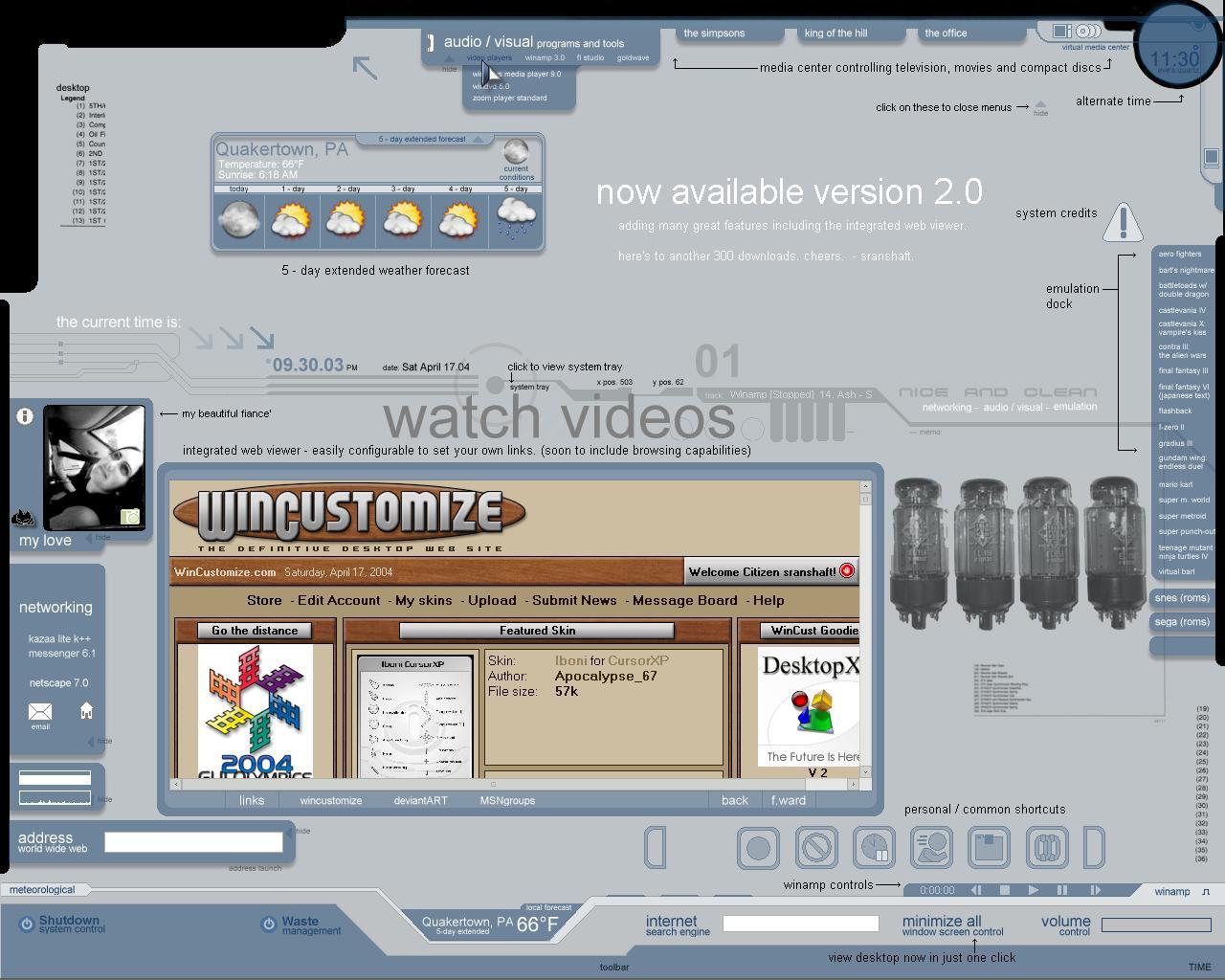
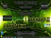
Wow man, looks like a guy could poke around in here for days and still not find everything! Looks interesting. I'll have to try it out!
Sranshaft
Comment #3 Saturday, April 10, 2004 2:10 PM
Comment #3 Saturday, April 10, 2004 2:10 PM
Cool  glad everyone's liking the new theme. Look for updates to come soon. (Current version lacks start button (i just r-click), calander, and improved user-end custimization. Maybe even color-changes are possible if there's interest.)
And remember comments not only help me but help you in getting the best there is to offer. So keep those comments coming.
 glad everyone's liking the new theme. Look for updates to come soon. (Current version lacks start button (i just r-click), calander, and improved user-end custimization. Maybe even color-changes are possible if there's interest.)
And remember comments not only help me but help you in getting the best there is to offer. So keep those comments coming.

Vetto
Comment #4 Sunday, April 11, 2004 12:10 AM
Comment #4 Sunday, April 11, 2004 12:10 AM
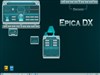
Great Desktop!! This is what DX was made for.
 Clicking the "bookend" on the right side of the common shortcut bar brings in some other icons that overlap the common ones making both unreadable.
Keep it up, looking forward to more stuff.
This is what DX was made for. Clicking the "bookend" on the right side of the common shortcut bar brings in some other icons that overlap the common ones making both unreadable.
Keep it up, looking forward to more stuff.
Sranshaft
Comment #6 Sunday, April 11, 2004 2:08 AM
Comment #6 Sunday, April 11, 2004 2:08 AM
thanks! i'm playing around with some more icons and functionality, possibly even a built-in netradio/mp3 player...that's down the line though. if anyone has any ideas as to features they'd like to see, me a line.
Vetto - i know about that, it was a bit of laziness on my own part, i'll have to think of a way to close the other icons as those pop up. i'll see what i can do and upload a new version soon. maybe some sort of hide/show function. *shrugs* as for now, sorry.
i'm playing around with some more icons and functionality, possibly even a built-in netradio/mp3 player...that's down the line though. if anyone has any ideas as to features they'd like to see, me a line.Vetto - i know about that, it was a bit of laziness on my own part, i'll have to think of a way to close the other icons as those pop up. i'll see what i can do and upload a new version soon. maybe some sort of hide/show function. *shrugs* as for now, sorry.
dabe
Comment #7 Sunday, April 11, 2004 9:28 AM
Comment #7 Sunday, April 11, 2004 9:28 AM
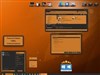
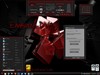
This is a very desktop. I haven't configured anything specific yet, but not meaning to be overly picky, I find the need to add my 2 cents, just because I like this so much.
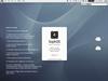
First, I really don't like the black edges. Looks like something is missing or didn't install properly.
Second, the text is way too small on my 1280 screen. I'd have to memorize stuff before I can use this with ease.
Third, a question.... did you design this so the taskbar can sit on the bottom? If so, very good. Esserant's Dojo WB is beautiful with this. If not, I'm missing something.
Fourth, the round media player in the upper right corner seems to not quite "go" with the rest of this theme.
Finally, I like gef's DX themes because I can get to links so easily. This one would require minimizing stuff first, which isn't what I'd personally like, which is why I like the taskbar active.
Having said all of the above, this is really inovative. In my opinion though, it just needs refinement. Great job!
desktop. I haven't configured anything specific yet, but not meaning to be overly picky, I find the need to add my 2 cents, just because I like this so much.First, I really don't like the black edges. Looks like something is missing or didn't install properly.
Second, the text is way too small on my 1280 screen. I'd have to memorize stuff before I can use this with ease.
Third, a question.... did you design this so the taskbar can sit on the bottom? If so, very good. Esserant's Dojo WB is beautiful with this.
 If not, I'm missing something.
 Fourth, the round media player in the upper right corner seems to not quite "go" with the rest of this theme.
Finally, I like gef's DX themes because I can get to links so easily. This one would require minimizing stuff first, which isn't what I'd personally like, which is why I like the taskbar active.
Having said all of the above, this is really inovative. In my opinion though, it just needs refinement. Great job!

Sranshaft
Comment #8 Tuesday, April 13, 2004 12:20 PM
Comment #8 Tuesday, April 13, 2004 12:20 PM
thanks for your comments Dabe, this is what i'm looking for. now on to the answers...
1. the black edges were for my own benefit, the screen i'm working on isnt' quite what it once used to be and the edges are a bit - tweaked. this just cleans them up.
2. yeah, i'm running on a 1280 screen too. *scratches chin* it was a personal decision. i originally had the text, especially in the shortcuts, larger but felt it cluttered the screen too much. i guess i could bump the font size up a little, for the visually impared
3. no, you're not missing anything. the bottom was left for the taskbar, either with windowblinds/xp running, or there's one that comes with it - it' a hiding taskbar.
4. i've been saying that to myself for the past week. it's a graphics issue. the other graphics have a 50% transparency so it changes the hue slightly. i'll be fixing that in the new release soon.
as for the getting to stuff easier, i've been toying around with a layover screen that'll popup when windows are in full screen or if a button is clicked. it'll be -semi-transparent so you'll be able to see everything you need to and also get to the links also.
hopefully that'll be better.
i thank you again for your comments. they've given me some things to think about for future versions.
now on to the answers...1. the black edges were for my own benefit, the screen i'm working on isnt' quite what it once used to be and the edges are a bit - tweaked. this just cleans them up.
2. yeah, i'm running on a 1280 screen too. *scratches chin* it was a personal decision. i originally had the text, especially in the shortcuts, larger but felt it cluttered the screen too much. i guess i could bump the font size up a little, for the visually impared

3. no, you're not missing anything. the bottom was left for the taskbar, either with windowblinds/xp running, or there's one that comes with it - it' a hiding taskbar.
4. i've been saying that to myself for the past week. it's a graphics issue. the other graphics have a 50% transparency so it changes the hue slightly. i'll be fixing that in the new release soon.
as for the getting to stuff easier, i've been toying around with a layover screen that'll popup when windows are in full screen or if a button is clicked. it'll be -semi-transparent so you'll be able to see everything you need to and also get to the links also.
hopefully that'll be better.
i thank you again for your comments. they've given me some things to think about for future versions.
Average Gatsby
Comment #9 Wednesday, April 14, 2004 5:34 AM
Comment #9 Wednesday, April 14, 2004 5:34 AM
Awesome! I wrote a ton about it but I lost it.  What is your email? I would like to ask a question Or is there a way to send you a private message?
 What is your email? I would like to ask a question Or is there a way to send you a private message?
Sranshaft
Comment #10 Wednesday, April 14, 2004 9:36 AM
Comment #10 Wednesday, April 14, 2004 9:36 AM
email's saranshaft@comcast.net you can leave me any question you'd like there if you'd like. a ton hey?  happen to remember any of it? i love feedback
 happen to remember any of it? i love feedback
Sranshaft
Comment #11 Wednesday, April 14, 2004 5:06 PM
Comment #11 Wednesday, April 14, 2004 5:06 PM
damn, two 'if you'd likes' *scratches chin*
EDITOR'S NOTE: Must add button.
EDITOR'S NOTE: Must add button.
Nasir Kamal
Comment #13 Tuesday, April 20, 2004 5:22 AM
Comment #13 Tuesday, April 20, 2004 5:22 AM
It's very nice.Thanx to wincustomize all team
thundr51
Comment #14 Tuesday, April 20, 2004 7:19 AM
Comment #14 Tuesday, April 20, 2004 7:19 AM
I agree with craig139 1600x1200 would be nice. Adding the ability to hide all windows is great plus the built integrated web viewer is really nice
The theme works well if all you're using your machine for is entertainment. I don't know what it is but the desktop still seems cluttered a bit...but it's probably just me
still, a very nice theme
The theme works well if all you're using your machine for is entertainment. I don't know what it is but the desktop still seems cluttered a bit...but it's probably just me
still, a very nice theme
Nomad529
Comment #15 Wednesday, April 21, 2004 8:43 AM
Comment #15 Wednesday, April 21, 2004 8:43 AM
~ Very nice, functional and creative. Top marks!!
~ Thanks for thinking of us with larger screens regarding the 1600 version.
~ Thanks for thinking of us with larger screens regarding the 1600 version.
Sranshaft
Comment #16 Wednesday, April 21, 2004 3:07 PM
Comment #16 Wednesday, April 21, 2004 3:07 PM
736 downloads!!!  really makes me want to do more themes
vetto had plans on porting this to 1600 res. but, i haven't heard back on anything definite. i'm currently working on a new theme but with any hope i'll be able to get back and possibly make that resolution jump for all of you soon.
still tinkering around with things though on this, so don't think i've abandoned this project. had an idea and needed to get that out of my system before getting back to this theme.
thanks to everyone's that downloaded and enjoyed the theme. look for more updates soon and that other theme that should be available soon, entitled 'minimalistic avocado'.
 really makes me want to do more themes
 vetto had plans on porting this to 1600 res. but, i haven't heard back on anything definite. i'm currently working on a new theme but with any hope i'll be able to get back and possibly make that resolution jump for all of you soon.
still tinkering around with things though on this, so don't think i've abandoned this project. had an idea and needed to get that out of my system before getting back to this theme.
thanks to everyone's that downloaded and enjoyed the theme. look for more updates soon and that other theme that should be available soon, entitled 'minimalistic avocado'.
GCube
Comment #17 Saturday, April 24, 2004 9:29 PM
Comment #17 Saturday, April 24, 2004 9:29 PM
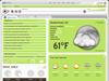
any chnace of porting the weather theme individually??? I love this one!!
I would use the theme as well, but am on 1080.....
I would use the theme as well, but am on 1080.....
Sranshaft
Comment #18 Sunday, April 25, 2004 12:48 AM
Comment #18 Sunday, April 25, 2004 12:48 AM
sure, i'll be uploading that now actually. check for it as soon as it clears the judges
Vetto
Comment #19 Sunday, April 25, 2004 3:38 PM
Comment #19 Sunday, April 25, 2004 3:38 PM
Scranshaft, I have a 1600 port done:D, but I wound up modding alot of it;p...(weather object for example in my ver has some forcast mouse overs and daily temps displayed...When/if I get permissions from the script writers, I will email it to you and you can decide whether to put it up or not.
Please login to comment and/or vote for this skin.
Welcome Guest! Please take the time to register with us.
There are many great features available to you once you register, including:
- Richer content, access to many features that are disabled for guests like commenting on the forums and downloading files.
- Access to a great community, with a massive database of many, many areas of interest.
- Access to contests & subscription offers like exclusive emails.
- It's simple, and FREE!
|
|
Page 1 of 2 |
|---|

Comment #1 Saturday, April 10, 2004 8:56 AM