


|
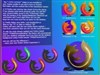
Half Life 2 PackUpdated Apr 23, 2004 by UpsidedownGC |
||||||
BigDave-UK
Comment #3 Saturday, April 24, 2004 3:35 AM
Comment #3 Saturday, April 24, 2004 3:35 AM
What the hell is this? This is basically my icon you cheeky git 

UpsideDownGC
Comment #4 Saturday, April 24, 2004 3:40 AM
Comment #4 Saturday, April 24, 2004 3:40 AM
Nope it isnt This is pretty differnet if oyu look. I made sure to make it different, and the bronzed is nothing like it
Rech-Designs
Comment #5 Monday, April 26, 2004 4:43 AM
Comment #5 Monday, April 26, 2004 4:43 AM
I understand you BigDave-UK...
I CAN'T NOT SEE A DIFFERENT?!?
/Rechain
I CAN'T NOT SEE A DIFFERENT?!?
/Rechain
UpsideDownGC
Comment #6 Monday, April 26, 2004 11:56 AM
Comment #6 Monday, April 26, 2004 11:56 AM
Well maybe only some of the difference can be seen by rechain and big dave. Try to look for other things that are of the same thing yet made by different people and look the same a lot of them are available for download and mine is one of the few that contains a completely d ifferent aestheics than the others. Look at it closely and see the large difference
WSE2
Comment #7 Thursday, April 29, 2004 3:45 AM
Comment #7 Thursday, April 29, 2004 3:45 AM
The lighting and shadows are different. Thats about it.
UpsideDownGC
Comment #8 Thursday, April 29, 2004 11:50 AM
Comment #8 Thursday, April 29, 2004 11:50 AM
Nope I also created the bronze version which is darker and fatter. You try to make somethign different. Why don't you download it first and see them!
horizon
Comment #9 Saturday, May 1, 2004 8:38 PM
Comment #9 Saturday, May 1, 2004 8:38 PM
Here's an idea, how about ALL of you take a second to click on this link http://www.sierra.com/product.do?gamePlatformId=470
thats the official sierra website. If you'll notice the logo is the same shape as the ones you BOTH made then congratulations, "hard" parts over. So assuming you both use "Sierra's" logo as a starting point, how much of a difference CAN there be. Color,shading...well looks like we about ran outta things. Of course they're both similar, but yeah it takes little more than a close glance to see they're "different", at least from each other.
thats the official sierra website. If you'll notice the logo is the same shape as the ones you BOTH made then congratulations, "hard" parts over. So assuming you both use "Sierra's" logo as a starting point, how much of a difference CAN there be. Color,shading...well looks like we about ran outta things. Of course they're both similar, but yeah it takes little more than a close glance to see they're "different", at least from each other.
UpsideDownGC
Comment #10 Saturday, May 1, 2004 10:07 PM
Comment #10 Saturday, May 1, 2004 10:07 PM
I know that I used Sierras log but thats obvious because the shape is the main identifier of the game as it is not out yet. The style is personal style.
UpsideDownGC
Comment #11 Sunday, May 2, 2004 12:44 AM
Comment #11 Sunday, May 2, 2004 12:44 AM
Thanks to whomever has rated my things I owe you!
horizon
Comment #12 Tuesday, May 4, 2004 10:05 PM
Comment #12 Tuesday, May 4, 2004 10:05 PM
Point exactly, you need to keep familiarity with the authentic logo so it's easily recognized. Recognition is the most important thing for any icon, there are plenty of ways to do that of course. The point however is it's a fight between creativity Vs. functionality. And you're welcome.
Please login to comment and/or vote for this skin.
Welcome Guest! Please take the time to register with us.
There are many great features available to you once you register, including:
- Richer content, access to many features that are disabled for guests like commenting on the forums and downloading files.
- Access to a great community, with a massive database of many, many areas of interest.
- Access to contests & subscription offers like exclusive emails.
- It's simple, and FREE!


Comment #1 Friday, April 23, 2004 11:26 AM