


|
Flare FramedUpdated Apr 14, 2004 by queezendorf |
||||||
 |
|
Page 1 of 2 |
|---|
queezendorf
Comment #3 Wednesday, April 7, 2004 6:34 PM
Comment #3 Wednesday, April 7, 2004 6:34 PM
Thanks No Rules and WOM .. I'm trying new stuff 

Beesley
Comment #4 Thursday, April 8, 2004 6:27 AM
Comment #4 Thursday, April 8, 2004 6:27 AM
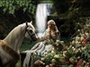
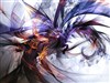
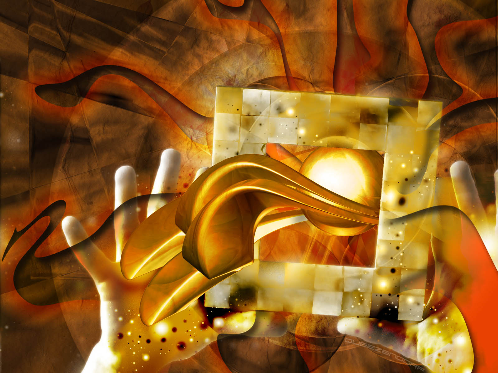
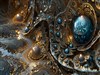
when I actually enlarged your screenshot, it looked incredible! The texturing and the detail is great. The only thing I would have to be questionable about it the gold thing. It looks great coming out of the box but when it gets to the left hand, it seems to lose it's flow with the rest of the picture. I don't know if it's because of the texture difference or the design or what. By the way, what does that gold thing represent?
Overall, a GREAT wall. This is definitely going to sit on my desktop. If you do any updates, make sure you post them!
Overall, a GREAT wall. This is definitely going to sit on my desktop. If you do any updates, make sure you post them!

Beesley
Comment #5 Thursday, April 8, 2004 6:27 AM
Comment #5 Thursday, April 8, 2004 6:27 AM
People HAVE to view the ENLARGED preview to get the full affect of this (I just said that here in case people didn't want to read the novel I just wrote) 

teddybearcholla
Comment #7 Wednesday, April 14, 2004 3:54 AM
Comment #7 Wednesday, April 14, 2004 3:54 AM
Outstanding! Your update is much more powerful than the original!
Beesley
Comment #8 Wednesday, April 14, 2004 7:16 AM
Comment #8 Wednesday, April 14, 2004 7:16 AM
ta-da . . . this is great! The update seals the perfection at work. impressive, impressive, impressive. My hat is truly off to you on this one!
chyleppr
Comment #10 Wednesday, April 14, 2004 7:52 AM
Comment #10 Wednesday, April 14, 2004 7:52 AM
I like the colors. The only thing that I would like to see different would be darker coloring on the hands. Other than that, I now will have to check out all your wallpapers because I'm afraid that I may have missed some grat stuff!
damuhong
Comment #11 Wednesday, April 14, 2004 8:09 AM
Comment #11 Wednesday, April 14, 2004 8:09 AM
an art like that ive never see before, very imaginative.keep it up!
blink_182ska
Comment #12 Wednesday, April 14, 2004 10:17 AM
Comment #12 Wednesday, April 14, 2004 10:17 AM
I liked the other one a bit more. I dunno, I guess I'm a dull person. 

Old_Crab
Comment #13 Wednesday, April 14, 2004 2:59 PM
Comment #13 Wednesday, April 14, 2004 2:59 PM
I'm with blazz. Good surreal type of WP is needed. Good Stuff! LOL
Crab rated: 8.26
Crab rated: 8.26

queezendorf
Comment #14 Wednesday, April 14, 2004 4:41 PM
Comment #14 Wednesday, April 14, 2004 4:41 PM
Wow! Thanks everyone for your comments! I'm glad this has worked out It was a lot of fun to make. Thanks again everyone!!!
It was a lot of fun to make. Thanks again everyone!!!
songman
Comment #15 Wednesday, April 14, 2004 6:07 PM
Comment #15 Wednesday, April 14, 2004 6:07 PM
I looked at this twice before downloading it. Each time I found myself trying to "figure it out". I gave up trying because it's just so well done I wanted it. I would be interested to know if it has a deeper meaning... 

Apocalypse_67
Comment #16 Wednesday, April 14, 2004 6:34 PM
Comment #16 Wednesday, April 14, 2004 6:34 PM
It's really good to see your work again Queezendorf. I really like what you did on this design. Very original and a little puzzling, which is what makes it stand out more. The choice of color and overlays are brilliant.


queezendorf
Comment #17 Wednesday, April 14, 2004 7:56 PM
Comment #17 Wednesday, April 14, 2004 7:56 PM
Thanks Songman... a deeper meaning hmm.... well if I had to define it.. it might loose its interest Apocalypse, i think the reason it's puzzling, and at the same time original... is because the hands were never meant to be used this way. I had a picture in the frame of a close friend that lives in Austin, TX... and i was showing him what picture and what frame i had put together to display in my living room... and it dawned on me. I got a spark and used it... it was off the "wall", but it worked out well Thanks again!
Apocalypse, i think the reason it's puzzling, and at the same time original... is because the hands were never meant to be used this way. I had a picture in the frame of a close friend that lives in Austin, TX... and i was showing him what picture and what frame i had put together to display in my living room... and it dawned on me. I got a spark and used it... it was off the "wall", but it worked out well Thanks again!
Hunny Bee
Comment #18 Monday, April 26, 2004 2:13 AM
Comment #18 Monday, April 26, 2004 2:13 AM
Great wall... I've always followed your wall's on here - and I admire all of your work. Really good job with this one, there is so much that is appealing to the eye, but at the same time it all works so good together. I wouldn't add one thing and I wouldn't take one thing away - its just right Good Job
Good Job
blazeaway
Comment #20 Monday, April 26, 2004 1:11 PM
Comment #20 Monday, April 26, 2004 1:11 PM
Pretty Bizzare to me but then again most "Scorps" are.Must be the intense color and mind picking theme. NICE JOB!
Please login to comment and/or vote for this skin.
Welcome Guest! Please take the time to register with us.
There are many great features available to you once you register, including:
- Richer content, access to many features that are disabled for guests like commenting on the forums and downloading files.
- Access to a great community, with a massive database of many, many areas of interest.
- Access to contests & subscription offers like exclusive emails.
- It's simple, and FREE!
|
|
Page 1 of 2 |
|---|


Comment #1 Wednesday, April 7, 2004 5:16 PM