


 |
|
Page 1 of 2 |
|---|
Cavan1
Comment #2 Saturday, February 5, 2005 7:26 AM
Comment #2 Saturday, February 5, 2005 7:26 AM
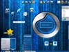
It is different, I like the effect, a monitor inside my monitor, sound effects are great. Maybe a smaller top image so not as much screen
space is used, is not bad on my 17 inch monitor but anything smaller would not have much screen left.
As for comment about Windows puts buttons out of reach, sounds like someone has dragged windows to taskbar rather than use maximize.
Had windows explorer on restore size, opened it 18 times, 1 window was under taskbar but could still use buttons.
jord043
Comment #3 Saturday, February 5, 2005 10:01 AM
Comment #3 Saturday, February 5, 2005 10:01 AM
I like it! Time for something different..  I can see the you have taken sometime to design this.
Good stimulation for the brain as well,seeing how we are so use to going to the top of the screen for the buttons

Keep up the Good work..
 I can see the you have taken sometime to design this.
Good stimulation for the brain as well,seeing how we are so use to going to the top of the screen for the buttons


Keep up the Good work..

TN Brat!
Comment #5 Saturday, February 5, 2005 11:37 AM
Comment #5 Saturday, February 5, 2005 11:37 AM
I'm not sure, myself, but I'm gonna try to see.
PhrozenMenace
Comment #6 Saturday, February 5, 2005 11:40 AM
Comment #6 Saturday, February 5, 2005 11:40 AM
amazing, one thing i always know when Crissy makes a new windowblind, its gonna be original and uniquely executed, another great blind, thanks
mmekota
Comment #9 Saturday, February 5, 2005 4:47 PM
Comment #9 Saturday, February 5, 2005 4:47 PM
Dont assume that I need a CD from the Video Professor.
The Windows UI spec says buttons go on top, and the OS assumes that's where they are when it cascades new windows. Open the File menu, click "New Window". Notice how the new window is positioned slightly lower and to the right to make both taskbars accessible?
I suppose it somewhat depends on how big the windows are, how you set your taskbar, and and where the parent window is. Now buttons on the wrong side of the window (like Mac fanatics do it) "takes getting used to", but having to drag a window up by the titlebar to get to the buttons on the bottom is just bad user interface design. So is having the buttons on the opposite side from menus and toolbars.
Sorry. This skin looks terrific but is too annoying to use.
The Windows UI spec says buttons go on top, and the OS assumes that's where they are when it cascades new windows. Open the File menu, click "New Window". Notice how the new window is positioned slightly lower and to the right to make both taskbars accessible?
I suppose it somewhat depends on how big the windows are, how you set your taskbar, and and where the parent window is. Now buttons on the wrong side of the window (like Mac fanatics do it) "takes getting used to", but having to drag a window up by the titlebar to get to the buttons on the bottom is just bad user interface design. So is having the buttons on the opposite side from menus and toolbars.
Sorry.
 This skin looks terrific but is too annoying to use.
crissy14
Comment #10 Saturday, February 5, 2005 7:13 PM
Comment #10 Saturday, February 5, 2005 7:13 PM
mmekota
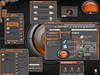
Yours (and everyones) comments are well taken. I welcome constructive crisisim. This skin's layout is not set in stone, I can always update and change things around, but when I set out to make this skin. I wanted to try something different. I too found it a little annoying to travel my mouse to the bottom of the window for the buttons (we're conditioned to finding them at the top of the window), but even so, I wanted to keep it this way to see what others think. An experiment if you will... So please keep the comments coming By the way, for those interested, there is a "minimize to tray" button on the right of the top title bar.
Yours (and everyones) comments are well taken. I welcome constructive crisisim. This skin's layout is not set in stone, I can always update and change things around, but when I set out to make this skin. I wanted to try something different. I too found it a little annoying to travel my mouse to the bottom of the window for the buttons (we're conditioned to finding them at the top of the window), but even so, I wanted to keep it this way to see what others think. An experiment if you will... So please keep the comments coming By the way, for those interested, there is a "minimize to tray" button on the right of the top title bar.
RockinMike
Comment #11 Saturday, February 5, 2005 10:34 PM
Comment #11 Saturday, February 5, 2005 10:34 PM
I like it, been using the skin for the last few hours and thus far it's really quite cool. Great work Crissy14.
Poddytat
Comment #13 Sunday, February 6, 2005 12:12 AM
Comment #13 Sunday, February 6, 2005 12:12 AM
Crissy,
I think this is a great idea, even if the bottom buttons are a bit strange at first. The only things I would change are I would lose the "glare" on the tasks captions and maybe tone down the blue a little so it matches the whole techie feel. Great job, you can tell a lot of work went into this. Your skins are always fresh and different, wish I had half your talent..
I think this is a great idea, even if the bottom buttons are a bit strange at first. The only things I would change are I would lose the "glare" on the tasks captions and maybe tone down the blue a little so it matches the whole techie feel. Great job, you can tell a lot of work went into this. Your skins are always fresh and different, wish I had half your talent..
Saturrn
Comment #14 Sunday, February 6, 2005 7:47 PM
Comment #14 Sunday, February 6, 2005 7:47 PM
Hi Crissy,This is most Unusual.Getting used to it,if possible could u try some other colours? but please not blue there are a zillion blues out there.Pastels would be a good idea..
butch123
Comment #15 Sunday, February 6, 2005 9:20 PM
Comment #15 Sunday, February 6, 2005 9:20 PM
crissy14
I think this is a great skin.Unorthodox,but i like that..
I think this is a great skin.Unorthodox,but i like that..
teddybearcholla
Comment #16 Monday, February 7, 2005 8:45 AM
Comment #16 Monday, February 7, 2005 8:45 AM
I really like the idea of the buttons being at the bottom, change is good, it stimulates the mind!
I see by the comments that I am the only one having the following problem. The bottom bars on ie and outlook express are both pink. If you would like me to send you a screenshot, my email address is in my about/guestbook page,I have the first comment and it is in there. Other than that this is a truly unique skin!!!

I see by the comments that I am the only one having the following problem. The bottom bars on ie and outlook express are both pink. If you would like me to send you a screenshot, my email address is in my about/guestbook page,I have the first comment and it is in there. Other than that this is a truly unique skin!!!


Yo_Adrian
Comment #17 Monday, February 7, 2005 11:30 AM
Comment #17 Monday, February 7, 2005 11:30 AM
I've been using this for a day now and I think it is pretty cool. The concept is great; the buttons on the bottom don't take that long to get used to. The subtle purplish gray colors are very easy on the eyes. I loved the "surprise" circuit board dialog background. The only two areas that might need some tweaking (IMHO) are the scrollbar and the highlighted menu "pressed" buttons (both blue) I know they fit the theme but if I could tweak anything; it'd be those two. THanks for sharing
crissy14
Comment #18 Monday, February 7, 2005 11:59 AM
Comment #18 Monday, February 7, 2005 11:59 AM
teddybearcholla
Yes, It would be very helpful if you send me a screenshot. You can send it to: crissy146@hotmail.com. Be sure to note what screen res. you are using, because somehow I think that may be your problem. Have you tried the skin in any other res? I never use OE, so that is one program I never thought to try when I was testing the skin. I have to say I am amazed! Most of the ppl who have commented so far seem to be OK with the bottom buttons. I guess us "creatures of habit" can shift gears for a some changes. Now, Im curious to see if in the long run, this change will make our windows OS go totally bonkers
I keep expe
Yes, It would be very helpful if you send me a screenshot. You can send it to: crissy146@hotmail.com. Be sure to note what screen res. you are using, because somehow I think that may be your problem. Have you tried the skin in any other res? I never use OE, so that is one program I never thought to try when I was testing the skin. I have to say I am amazed! Most of the ppl who have commented so far seem to be OK with the bottom buttons. I guess us "creatures of habit" can shift gears for a some changes. Now, Im curious to see if in the long run, this change will make our windows OS go totally bonkers

I keep expe
tattoo113
Comment #19 Monday, February 7, 2005 12:59 PM
Comment #19 Monday, February 7, 2005 12:59 PM
I just installed this skin, it works great on my screen. Also works good with all my wallpapers. No truble with taskbar on bottom. Brightens my screen up not dull looking anymore
Firedogs Ron Son Jose
Comment #20 Monday, February 7, 2005 9:24 PM
Comment #20 Monday, February 7, 2005 9:24 PM
Great Sounds!!!!! Interesting... Keep going!
Please login to comment and/or vote for this skin.
Welcome Guest! Please take the time to register with us.
There are many great features available to you once you register, including:
- Richer content, access to many features that are disabled for guests like commenting on the forums and downloading files.
- Access to a great community, with a massive database of many, many areas of interest.
- Access to contests & subscription offers like exclusive emails.
- It's simple, and FREE!
|
|
Page 1 of 2 |
|---|


Comment #1 Saturday, February 5, 2005 6:57 AM
I would love to see a new version of this skin with the buttons on top.