|
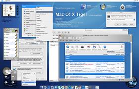
Mac OS X TigerUpdated Mar 25, 2005 by Steve Grenier |
||||||||
Comment #82 Tuesday, February 22, 2005 4:00 PM
Why on earth did it end up showing 3 posts?
Anyway sorry about that... dunno how did it happen.

Comment #83 Tuesday, February 22, 2005 5:40 PM
Comment #84 Tuesday, February 22, 2005 6:37 PM
The top bar is my taskbar, the bottom is ObjectDock, wallpapers will be coming soon, if Wincustomize will not host them I will host them myself and provide a link for them.
I will create a suite package containing all the extra's that don't need any extra or non-stardock applications.
There are no plans for a Msstyle, mainly because they cannot be as accurate to the true Mac feel than Windowblinds can. You should try it for Windowblinds, I'm sure you won't regret it.
Comment #85 Tuesday, February 22, 2005 7:10 PM
 I downloaded it, and I changed my ObjectDock Theme to match it
Comment #86 Tuesday, February 22, 2005 7:23 PM

Comment #87 Tuesday, February 22, 2005 7:23 PM
By the way, can someone tell me where can I find that CD Cover player (top left of the screenshot) please?
Thanks in advance!

Comment #88 Tuesday, February 22, 2005 8:01 PM
Comment #89 Tuesday, February 22, 2005 8:45 PM
 What is the font??? Is it include in the theme?
Thx and this theme is the best i've seen so far for windowblinds... Gratz!
Ravel
Comment #90 Tuesday, February 22, 2005 9:01 PM
Comment #91 Tuesday, February 22, 2005 9:13 PM
Comment #92 Tuesday, February 22, 2005 9:32 PM
Comment #93 Tuesday, February 22, 2005 9:32 PM
Comment #94 Tuesday, February 22, 2005 10:47 PM
For starters Butch, there are logoff/shutdown buttons on the regular start menu, thw apple menu (AM) isn't supposed to have the buttons, instead you manually (that is the key word here) add them yourself. There are also no icons in that version of the start menu because it isn't meant to have any. It's supposed to be a straight text list. If you want icons use the regular start menu, that's why I included both. Another problem some might have is using large icons when using the apple menu, it will make everything look screwed up, so make sure your using small icons.
I created the preview in Photoshop by taking screenshots of my desktop and merging them into one big image. I made the theme itself also in Photoshop, but it was a little bit different

The font is the same and it is
Comment #95 Wednesday, February 23, 2005 12:03 AM
Gr8 work steve !
keep the good work & best luck !
it really is coooooool


Comment #97 Wednesday, February 23, 2005 3:28 AM
 It is the best Mac skin I've ever seen before!
and there still some problem about the font I want to make it clean... The fonts in your screenshot is nice but it totally different in mine. Are there any website for this type of font?
And, I'm a Chinese, in apple menu the Chinese font seems strange...

Can you help? or you can e-mail me crazyboyclub@hotmail.com
Comment #98 Wednesday, February 23, 2005 9:59 AM
I tried changing the hue but that didn't help. Anyone have any ideas? All that is needed is for the font to be darker... In all other areas (new messages, other programs, etc.) this is the case.
Thanks in advance.
Ben
Comment #99 Wednesday, February 23, 2005 10:01 AM
Please login to comment and/or vote for this skin.
Welcome Guest! Please take the time to register with us.
There are many great features available to you once you register, including:
- Richer content, access to many features that are disabled for guests like commenting on the forums and downloading files.
- Access to a great community, with a massive database of many, many areas of interest.
- Access to contests & subscription offers like exclusive emails.
- It's simple, and FREE!


Comment #81 Tuesday, February 22, 2005 3:56 PM