


 |
|
Page 1 of 5 |
|---|
Mrrste
Comment #2 Wednesday, February 22, 2006 11:42 PM
Comment #2 Wednesday, February 22, 2006 11:42 PM
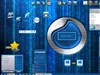
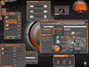
orignial and very cool  i see what u mean by the screenshot, the skin looks like its called Wire and Ass. Thats gotta hurt lol by the way the zip needs to be turned into a .wba
 i see what u mean by the screenshot, the skin looks like its called Wire and Ass. Thats gotta hurt lol by the way the zip needs to be turned into a .wba
treetog
Comment #3 Thursday, February 23, 2006 12:18 AM
Comment #3 Thursday, February 23, 2006 12:18 AM
I like original skins and this one for sure is! 

Tecumseh
Comment #4 Thursday, February 23, 2006 12:50 AM
Comment #4 Thursday, February 23, 2006 12:50 AM
Classy.  One suggestion ... eliminate the user pic and center, or stretch, the user name bar. It's time for the user pic concept to bid adieu. It just doesn't fit with the newer, sleeker WB5 skins.
 One suggestion ... eliminate the user pic and center, or stretch, the user name bar. It's time for the user pic concept to bid adieu. It just doesn't fit with the newer, sleeker WB5 skins.
LittleBearJason
Comment #5 Thursday, February 23, 2006 1:30 AM
Comment #5 Thursday, February 23, 2006 1:30 AM
This is very different for sure , a refreshing surprise and visual look. 5 Stars!
starkers
Comment #7 Thursday, February 23, 2006 2:16 AM
Comment #7 Thursday, February 23, 2006 2:16 AM
I like it as well...nice graphics and design, colours and effects.....great job all round
Priester1970
Comment #8 Thursday, February 23, 2006 2:29 AM
Comment #8 Thursday, February 23, 2006 2:29 AM
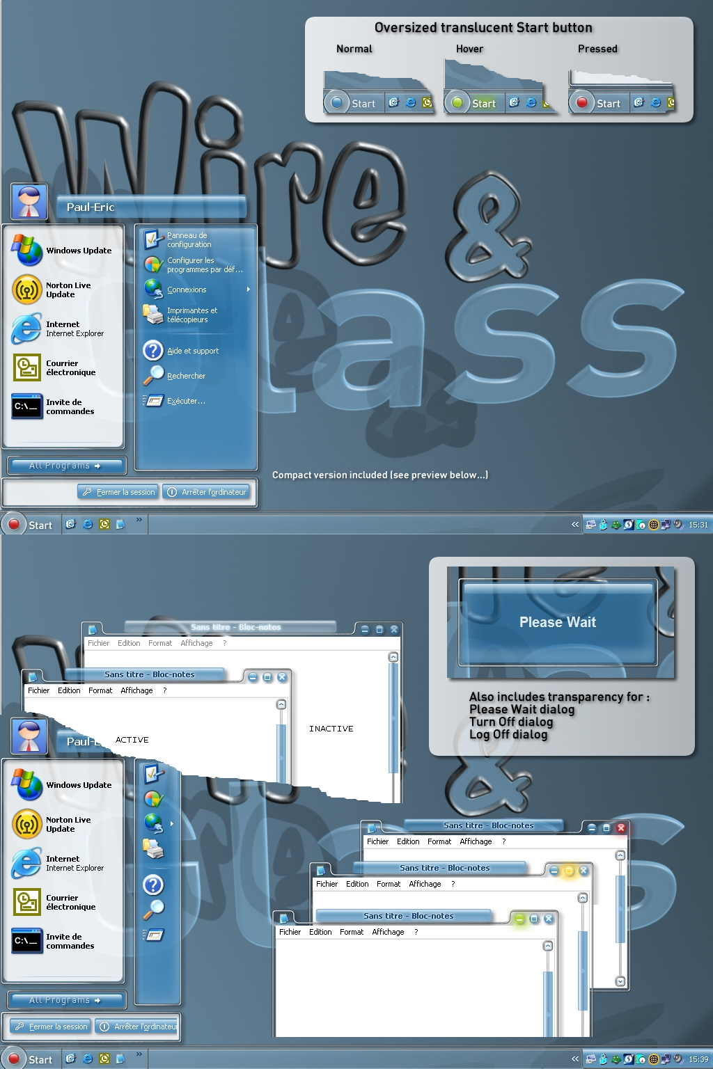
Very nice job Paul. I like your glassy styles. Only the All programs button is surrounded, by activation, with an oversized blue field. 

ebennett
Comment #9 Thursday, February 23, 2006 5:14 AM
Comment #9 Thursday, February 23, 2006 5:14 AM
I really like this, too. I do, however have two qualms: I wish the title bar was slightly more detached from the window. I also wish it came ina grey hue as well as a blue hue.
PaulEric
Comment #14 Thursday, February 23, 2006 6:46 AM
Comment #14 Thursday, February 23, 2006 6:46 AM
Thank you all for your support !! 
Tecumseh >>
Will try this if I update the skin. You might be right...
Priester1970 >>
Yeah... I hate this thing, but I can't find a way to avoid it...
If anyone has a clue...
Symbiosis9756 >>
You can adjust skin colours from WB panel and also turn them into greyscale (tick the "Greyscale colours in skin" checkbox).

Tecumseh >>
| eliminate the user pic and center, or stretch, the user name bar. It's time for the user pic concept to bid adieu. |
Will try this if I update the skin. You might be right...
Priester1970 >>
| Only the All programs button is surrounded, by activation, with an oversized blue field. |
Yeah... I hate this thing, but I can't find a way to avoid it...

If anyone has a clue...
Symbiosis9756 >>
| I also wish it came ina grey hue as well as a blue hue. |
You can adjust skin colours from WB panel and also turn them into greyscale (tick the "Greyscale colours in skin" checkbox).
Priester1970
Comment #15 Thursday, February 23, 2006 7:03 AM
Comment #15 Thursday, February 23, 2006 7:03 AM
Hi Paul.
With the All programs button. Perhaps treetog can help you about this.
With the All programs button. Perhaps treetog can help you about this.
NightTrainthedark
Comment #16 Thursday, February 23, 2006 8:02 AM
Comment #16 Thursday, February 23, 2006 8:02 AM
Really nice job here. A suggestion for the all programs. Because you have transparnet borders on the image, the mouseover blue will always be trouble. Try taking your all programs arrow image and adding it to the all programs background image. The adjust the content margins on the background image to be inside the borders of your arrow image. Change the mouseover color (classic colors/menu highlighted background XP)to something that looks good. With the skin design it is tricky but I think it looks alot better. Good luck, great skin!
A suggestion for the all programs. Because you have transparnet borders on the image, the mouseover blue will always be trouble. Try taking your all programs arrow image and adding it to the all programs background image. The adjust the content margins on the background image to be inside the borders of your arrow image. Change the mouseover color (classic colors/menu highlighted background XP)to something that looks good. With the skin design it is tricky but I think it looks alot better. Good luck, great skin!
blazeaway
Comment #18 Thursday, February 23, 2006 10:14 AM
Comment #18 Thursday, February 23, 2006 10:14 AM
--- First of all,Let me start by renaming your skin to "The 21st Century Experience".That's what impresses me the most.The 'LOOK'.The design of the borders and use of transparentcy are done in such a way that it's quite a departure from the norm.It has a theme about it that really makes you think,futurama with it's glass and steel skyscraper feel and although I prefer dark themes,the skin has that warmth of the bright blue sky that surrounds that shiny skyscraper.With that said,the skin should be rewarded with an "ATTABOY" for outstanding design and innovation. The shut down is trick too. Great Job!!!--- --
--
glowdarkly
Comment #19 Thursday, February 23, 2006 10:19 AM
Comment #19 Thursday, February 23, 2006 10:19 AM
My absolute favorite of all the "glass" skins to date.I did change the titlebar text color to white with black shadow for these tired eyes, but aside from that its very nice indeed. The "picture" dosent appear on my start menu section but I have it dismantled, so thats good. Now to see what it looks like in various color configs. I loved your first glass skin nd this one is even better. Bravo!
PaulEric
Comment #20 Thursday, February 23, 2006 10:34 AM
Comment #20 Thursday, February 23, 2006 10:34 AM
blazeaway & glowdark >>
WOW !! Thanks a lot for these compliments !!
Night Train >>
Thanks for the advice. Tried that while developping the skin, but I wasn't satisfied at all with the result... Seems I won't be able to get rid of this blue (or whatever the colour) field
WOW !! Thanks a lot for these compliments !!
Night Train >>
Thanks for the advice. Tried that while developping the skin, but I wasn't satisfied at all with the result... Seems I won't be able to get rid of this blue (or whatever the colour) field
Please login to comment and/or vote for this skin.
Welcome Guest! Please take the time to register with us.
There are many great features available to you once you register, including:
- Richer content, access to many features that are disabled for guests like commenting on the forums and downloading files.
- Access to a great community, with a massive database of many, many areas of interest.
- Access to contests & subscription offers like exclusive emails.
- It's simple, and FREE!
|
|
Page 1 of 5 |
|---|

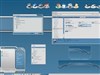
Comment #1 Wednesday, February 22, 2006 11:21 PM
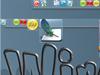
There's a funny thing about the screenshot where the start menu hides the first 2 letters of glass