|
Elfin2 | WindowblindsUpdated Apr 27, 2007 by Chrisdarwin |
||||||||
Comment #43 Sunday, May 20, 2007 2:19 AM
Comment #44 Sunday, May 27, 2007 11:05 AM
Just not many �
 �
�Comment #45 Saturday, May 5, 2012 11:29 PM
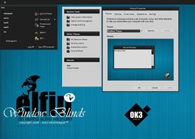
I dl'd this to form my own opinion of it and I have to say that I agree more with IR Brainiac/vstyler in that it truly is not much more than a bunch of gray rectangles/boxes. I like some of the minimal styles/themes but no this one. Those others also put more details in them such as different nav buttons (not the standard xp ones); different start orbs (this one's OK); and nice details on the start menu. There's minimal and there's some that basically do little to change the basic skin which comes with Windows. Here's another example of one that basically took the standard Win7 skin and changed a couple things and uploaded it:
http://browse.deviantart.com/customization/skins/windows7/visualstyle/#/d4yoohu
And here's an example of a nice WB port of a really nice vs from Djabytown:
http://browse.deviantart.com/customization/skins/?qh=§ion=&q=dark+agility#/d35fdaa
The latter shows a lot more creativity.
Please login to comment and/or vote for this skin.
Welcome Guest! Please take the time to register with us.
There are many great features available to you once you register, including:
- Richer content, access to many features that are disabled for guests like commenting on the forums and downloading files.
- Access to a great community, with a massive database of many, many areas of interest.
- Access to contests & subscription offers like exclusive emails.
- It's simple, and FREE!


Comment #41 Sunday, May 6, 2007 10:36 AM
Don't let the two trolls get you down. They aren't the "be-all end-all" around here. They're just a couple of skinners with heads far too big for their talent. Some would call your work minimal, some would call their work gaudy.