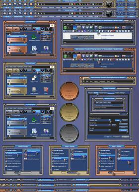
Stainless Steel
Average Rating: 7
Yours: -1
File Size: 8.2MB
Downloads Today: 1 Downloads Total: 27897

Stainless Steel

Updated Jan 06, 2009 by knofsky


First Previous Page 3 of 5 Next Last
Economico
Comment #41 Sunday, August 17, 2008 12:25 PM
Void. I can't delete this. Excuse me
Economico
Comment #42 Sunday, August 17, 2008 12:28 PM
Excellent, very very good. I wish the link for wallpaper. My windows is XP Prof, IE7. Thank You, and Congratulations for the great work. Rio de Janeiro, Brasil.
Economico
Comment #43 Sunday, August 17, 2008 3:12 PM
Hello, Something happens here with the All Programs. As your request, there is a something that is not well. I hope you understand that. A hug, Economic. PS. Please see the image: http://i339.photobucket.com/albums/n446/PauloSchulz/Other/bug.jpg
knofsky
Comment #44 Sunday, August 17, 2008 4:09 PM
Hello Economico. You don't indicate whether you are using Vista or XP. After looking at the photo you made, I'm going to guess Vista. Please see comment #18, as he seems to be experiencing the same problem on Vista. I don't have Vista, so the following solution may or may not work. Open Skin Studio 6, open Stainless Steel, click on Edit Start Menu, click on Edit Start Menu again in the new window, and then click on More Programs Arrow. Then click on Painting Margins. In the window for the left margin (green), experiment to see if you can effect change. My suggestion is to try and enter a negative number to see if you can get the panel to move to the left (notice: it may not let you enter a negative number. Sometimes it does, sometimes not.). After entering EACH number you try, the only way to see if it changed for better or worse, is to click on Apply, then open the Start menu by clicking on the Start Button. Unfortunately there is no preview, so keep trying until you have it positioned as needed (change margin, apply, open start menu, etc, etc). If any other Vista users have come up with a solution or workaround, please let us know what you did. Thanks.
ladyj55
Comment #45 Monday, August 18, 2008 2:42 PM
I meant to comment on your blind when it first came out,but I got caught up with other things, I just wanted to say this is very well put together. It looks so nice and when the wall is thrown in, it becomes poetry. Thanks for sharing your talent.�����
Tom Casner
Comment #46 Tuesday, August 19, 2008 2:41 PM
Who's going to do a matching right click skin to go along with this nice blind?
dug_98304
Comment #47 Saturday, August 23, 2008 8:02 AM
it all looks great here,good depth in the piping,well balanced, only thing missing (personal taste) is a compact start menu
grump11
Comment #48 Saturday, August 23, 2008 8:50 AM
Can't see the print on white pages, [white on white I guess]. Had the same problem with hong kong.
knofsky
Comment #49 Saturday, August 23, 2008 9:43 AM
Grump, see comments #4, 7, 10, 11 and 14 to resolve this. And thanks to all for the supportive words.
grump11
Comment #50 Sunday, August 24, 2008 5:28 AM
There we go.....#11 did the trick....Now I can use it.
dug_98304
Comment #51 Thursday, September 4, 2008 9:23 PM
inspireation i think all new skinners should go to page 39,40,41 ofWB those ppl created great graphics 99,00,01,02 with compairatively little toools to work with mostly just there imagineations keep up the good works (5 from me to help bring it up to a solid 4)
Tom Casner
Comment #52 Monday, October 27, 2008 5:29 PM
Is there any chance for a right click skin for this awesome blind? I hope so. Thank you, Tom
cplair
Comment #53 Friday, October 31, 2008 4:52 PM
��������� You've got enough comments already but I had to tell you that you've done an absolutely stellar job with this RJ! Thanks so much! Cp ���������
knofsky
Comment #54 Friday, October 31, 2008 7:43 PM
jcdein
Comment #55 Friday, October 31, 2008 8:40 PM
awesome blind! but I am having troubles with the fonts dissapearing as well. I am using IE7 and cannot find any way to change color settings. Can you help?
skibadee
Comment #56 Friday, October 31, 2008 9:07 PM
many thx nice skin
sunkuin
Comment #57 Friday, October 31, 2008 11:06 PM
Good stappling work!�
RLBWunUniqMan
Comment #58 Saturday, November 1, 2008 6:26 AM
Sorry, I love this theme alot but on my Vista it would not let me read my Gmail. I also wasn't able to read what was posted on this part of this site because all the letters were faded white. Once again I love this skin and I hope you make it for Vista.
DrJBHL
Comment #59 Saturday, November 1, 2008 6:43 AM
I like the "pipe" idea, but I tend toward darker skins....I do like the skin's idea and applaud the skill!
jicorrila
Comment #60 Saturday, November 1, 2008 10:49 AM
Very Cool!�

Please login to comment and/or vote for this skin.

Welcome Guest! Please take the time to register with us.
There are many great features available to you once you register, including:

  • Richer content, access to many features that are disabled for guests like commenting on the forums and downloading files.
  • Access to a great community, with a massive database of many, many areas of interest.
  • Access to contests & subscription offers like exclusive emails.
  • It's simple, and FREE!
Downloads remaining: 5
User Level: Visitor

Featured WindowBlinds

Popular WindowBlinds

Top WindowBlinds Skinners

Yesterday  |   Last 30 Days  |   All Time
1. LightStar 7353
2. don5318 4450
3. SimplexDesigns 3221
4. Vampothika 3188
5. adni18 2928
6. 2of3 1267
7. retiredmaster 1208
8. AeroPurple 761
9. SemoB 606
10. IceBabee 576
11. gmc2 570
12. BoXXi 542
13. DaveBax 513
14. jazzymjr 429
15. Dcrew57 422


web-wc01