


 |
|
Page 1 of 2 |
|---|
Comment #3 Friday, March 18, 2011 9:15 PM
You may have nailed it dude. Nice and clean. Good luck in the contest. 
Comment #4 Friday, March 18, 2011 11:03 PM
Damn it Ross! It's was hard enough deciding without you throwing this one in! 
Comment #5 Saturday, March 19, 2011 3:47 AM
Wow Ross!!! knew your entry would be pure magic! i want a piece of cake though, tea just isnt the same without cake!!......hahahha
Comment #6 Saturday, March 19, 2011 10:20 AM
Very nice Z71 and thank you for doing an entry. 
Comment #7 Saturday, March 19, 2011 10:53 AM
ABSOLUTELY STUNNING!!! LOVE IT! PLEASE BRING MORE GORGEOUS COLORS!!!!!
Comment #8 Saturday, March 19, 2011 11:34 AM
I'm probably the only one honest enough to tell you the truth, Ross.
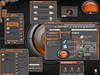
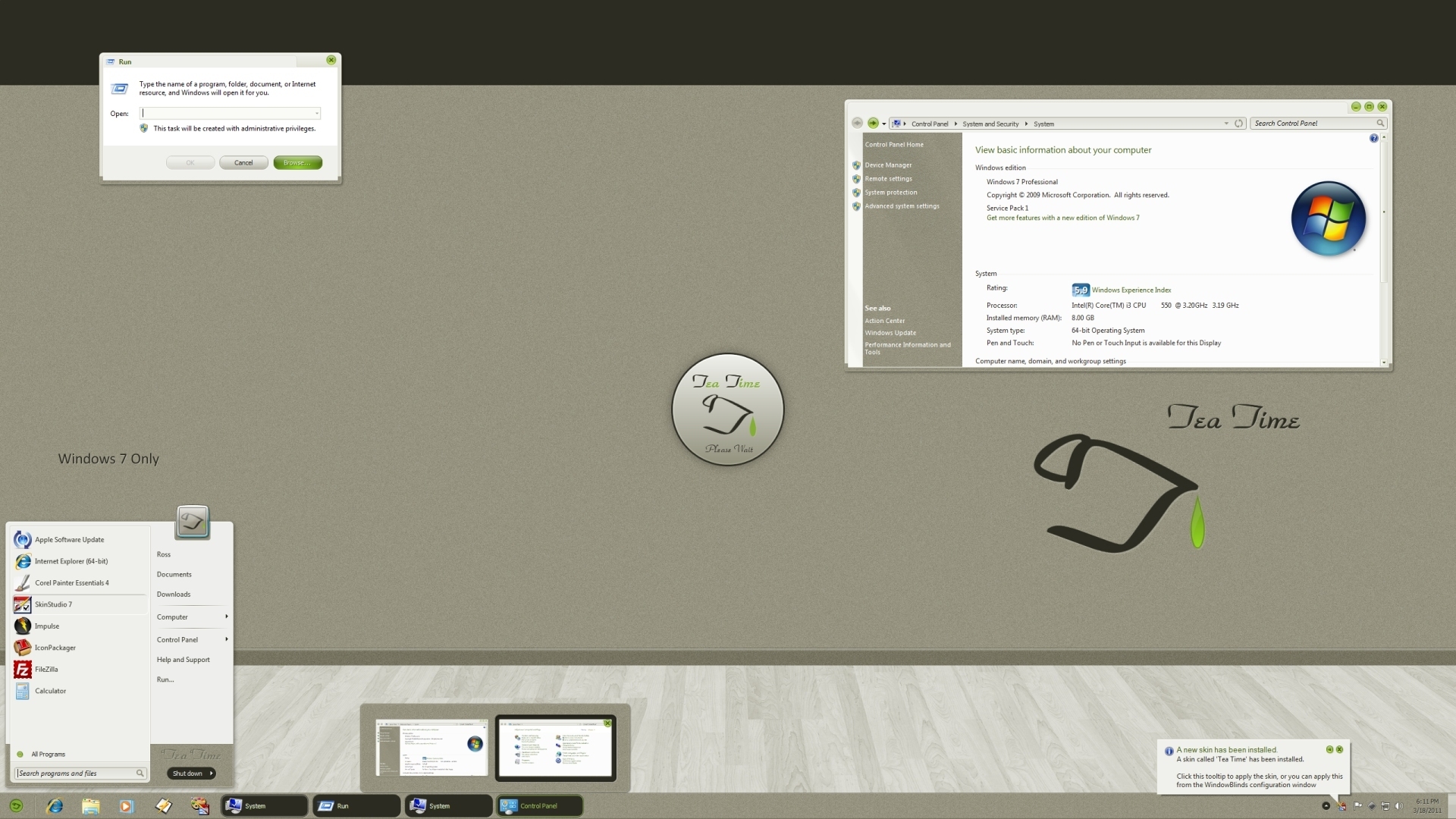
1. Startpanel seach mode: unskinned......looks bad.
2. Startpanel expand mode: unskinned......the graphics get all whacky.
Otherwise it's an OK skin. 

Comment #10 Saturday, March 19, 2011 1:31 PM
Very, very nice. Excellent. Love-love it and this from a coffee drinker!!
Comment #11 Saturday, March 19, 2011 2:41 PM
I like this a lot! There are some little bugs to squish (as 2of3 noted) but otherwise I love this design. Clean, elegant, great use of color, exceedingly usable. I plan to change a few things (the start icon and removing the tea time name) but that is only personal preference.
Super job overall.
Comment #12 Saturday, March 19, 2011 2:51 PM
Thanks everyone for the nice comments and over looking the fact this was done in just 11 days. So, some things might have been over looked in my haste.
Those few, small things shouldn't hurt people from using it on a daily basis.
Oh, and if it gets picked, I'll update and "maybe" add the other OSs..... 
2of3, I'll try harder, next time, when time isn't breathing down my neck. Sorry for the just OK skin. 
Comment #13 Saturday, March 19, 2011 2:53 PM
Bravo. Very nice pleasant colors. Thank you, once again another excellent blind.

Comment #15 Saturday, March 19, 2011 10:46 PM
There are some techniques in use in this skin that you should expand on in other skins- awesome! Not having the "problems" that 2of3 is having either- looks great.
Comment #16 Sunday, March 20, 2011 8:23 AM
Ah...just noticed what Tim mentioned. When I opened the startmenu and moused over something to expand it the user icon disappeared and the background behind it split and moved over. Just though you'd want to know Ross. Other than that I like the skin. 

Comment #20 Wednesday, March 23, 2011 3:12 AM
Looks original but folks need to start skinning the userpic frame too!
Please login to comment and/or vote for this skin.
Welcome Guest! Please take the time to register with us.
There are many great features available to you once you register, including:
- Richer content, access to many features that are disabled for guests like commenting on the forums and downloading files.
- Access to a great community, with a massive database of many, many areas of interest.
- Access to contests & subscription offers like exclusive emails.
- It's simple, and FREE!
|
|
Page 1 of 2 |
|---|

Comment #1 Friday, March 18, 2011 8:20 PM
You certainly made this worth the wait. I bow to your superiority! ("we're not worthy, we're not worthy!)