This Week in Skinning – September 12th
Skin Roundup for 9-12-08
Friday, September 12, 2008 by Island Dog | Discussion: OS Customization
It’s been a busy week, but I still wanted to make a quick This Week in Skinning. Here are this weeks picks!
|
|
DXDragDropExtended by Littleboy Not so much a skin, but a very useful tool for anyone creating things with DesktopX. |
|
|
I-Tech by gef This latest Master DX theme from gef is another clean, sleek style that everyone should try. |
|
|
Cloud Surfing by CarGuy1 This .dream puts your desktop on top of the clouds. |
|
|
Waterfall and Koi Pond by OutdoorPicture This Vista logon is just a really beautiful scene. |
|
|
AMA by Richard Mohler Another fantastic wallpaper from Richard. |
|
|
Mysteria by KittyMalone This WindowBlinds is great. A beautiful design that you definitely need to check out. |
See you next week!
Example of WindowBlinds Layer Blending
Friday, September 5, 2008 by Island Dog | Discussion: OS Customization
In case you missed the news the other day, WindowBlinds 6.3 and SkinStudio 6.3 betas were released via Impulse and Stardock Central the other day. One of the most notable features was the layer blending feature, which opens up a bunch of creative possibilities for skinners. It allows you to create some high quality skins using layer blending, which saves some time and trouble. Layering in SkinStudio was a great feature, but it has now been enhanced by using features like Multiply, Screen, and Overlay modes.
Neil provided some images for me, and I wanted to post them to show you exactly what layer blending can do.
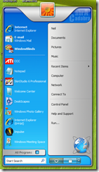
The first image here is an existing skin, with no layer blends at all.
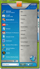
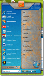
These next two images are the same start menu. One has a layer blended on color pixels, and the other is blended on greyscale pixels. This was also done using the Multiply mode. All that was done was taking two tiling images and adding them in tiling mode as new layers.
For more information about WindowBlinds and SkinStudio, visit the websites below. If you don’t already have an Object Desktop or subscription, you can also get a special bundle with both WindowBlinds and SkinStudio included.
This Week in Skinning - September 5th
Skin Roundup for 9-5-08
Friday, September 5, 2008 by Island Dog | Discussion: OS Customization
Finally it’s Friday! So many skins this week, including a couple of Master skin releases in the WindowBlinds category. A quick reminder that the 2008 GUI Champs Starts in just over a month. You can get more details here, and there is plenty of time to get skins started. Now for this weeks picks!
|
|
Outer Limits for CursorFX |
|
|
Leatherbound DX for DesktopX Themes PuterDudeJim is cranking out these DX themes. I like the way he uses textures and styles to make unique themes. |
|
|
ecological meters widget for DX Widgets Another great addition to the set of accessories for the ecoLogical WB skin. |
|
|
Sea of Burning Dreams in Dreams This is a really beautiful .dream with a subtle animation. Looks great on the desktop. |
|
|
Wraith Tabbed Dock for ObjectDock This is one of several sets of dock backgrounds for the Wraith WindowBlinds skin. Great work! |
|
|
Srg138 in Wallpapers This wallpaper really caught my eye. It has a simple design that goes with many skins. |
 |
Wraith for WindowBlinds by SKoriginals The latest Master skin from SKoriginals is another winner. A great, black WB skin that is usable for everyday use. |
Great job to everyone featured, and thanks to everyone who submitted skins to WinCustomize this week. See you next week!
This Week in Skinning – September 5th
Friday, September 5, 2008 by Island Dog | Discussion: OS Customization
Finally it’s Friday! So many skins this week, including a couple of Master skin releases in the WindowBlinds category. A quick reminder that the 2008 GUI Champs Starts in just over a month. You can get more details here, and there is plenty of time to get skins started. Now for this weeks picks!
 | Outer Limits for CursorFX |
 | Leatherbound DX for DesktopX Themes PuterDudeJim is cranking out these DX themes. I like the way he uses textures and styles to make unique themes. |
| ecological meters widget for DX Widgets Another great addition to the set of accessories for the ecoLogical WB skin. | |
 | Sea of Burning Dreams in Dreams This is a really beautiful .dream with a subtle animation. Looks great on the desktop. |
| Wraith Tabbed Dock for ObjectDock This is one of several sets of dock backgrounds for the Wraith WindowBlinds skin. Great work! | |
| Srg138 in Wallpapers This wallpaper really caught my eye. It has a simple design that goes with many skins. | |
 | Wraith for WindowBlinds by SKoriginals The latest Master skin from SKoriginals is another winner. A great, black WB skin that is usable for everyday use. |
Great job to everyone featured, and thanks to everyone who submitted skins to WinCustomize this week. See you next week!
SkinStudio 6 Tutorial: Table of Contents
Thursday, September 4, 2008 by Island Dog | Discussion: OS Customization
The SkinStudio 6 tutorial has many sections, most with plenty of screenshots to help show the process of creatin![]() g your own WindowBlinds skin. We tried our best to create a thorough Table of Contents which will make it easy for you to find the specific section you might want to reference. Obviously, I would recommend reading through the whole tutorial first, especially if you are setting out to create your first skin.
g your own WindowBlinds skin. We tried our best to create a thorough Table of Contents which will make it easy for you to find the specific section you might want to reference. Obviously, I would recommend reading through the whole tutorial first, especially if you are setting out to create your first skin.
I posted the links below, for reference, but you can find the full TOC here.
1. An Introduction to SkinStudio
What are Skins?
What is WindowBlinds?
What is SkinStudio?
The Elements of a Graphical User Interface
2. A Brief Overview of SkinStudio
Choosing What Kind of Skin to Make
The SkinStudio Categories
The Elements of the Start Bar
The Elements of Start Menu
Making a New Start Button
Importing the Image into SkinStudio
4. Creating Images for the Start Bar
Horizontal Taskbar
System Tray
Taskbar Group Menu
Vertical Taskbar
Creating a Start Menu
Start Menu Logoff Images
Start Menu Popup Windows
7. Changing the TitleBars and Borders
The Elements of the Title Bar and Windows Borders
Understanding per-pixel frames vs. UIS1 vs. UIS2
Making a New Title Bar
Creating and Importing Buttons
UIS1 and UIS2 TitleBars/Buttons
Minimized and ToolWindows Window
Creating Borders
9. Skinning Windows Buttons and Other Controls
Buttons and Controls
Combobox Controls
HeaderBar Controls
Menus and Menu Bars
ProgressBar Controls
Scrollbars
Spin Controls
Statusbar Controls
Tab Controls
Toolbar Controls
Trackbar Controls
Treeview +/- Controls
10. Windows XP Specific Elements
Windows XP Shell
Logoff and Shutdown Screens
Toolbar Icons in Explorer and Internet Explorer 6
Control Panel Shell Styles
Shell Style Icons and Pictures
XP File Animations
Vista Specific Elements
Explorer/IE Shell Parts
Internet Explorer 7
Task Dialog Controls
Vista Explorer Parts
Additional Vista Parts
Changing Skin Fonts
Changing Skin Colors
Creating and Managing Sub-Styles
Backgrounds
Re-Coloring Skins
Theme Part Details
Start Menu Animation Builder
Animation Compression
Misc. Tips & Tricks
DesktopX: Making Desktop Gadgets
Wednesday, August 27, 2008 by Island Dog | Discussion: OS Customization
I wrote an article showing you how to create and export DesktopX widgets/objects so they will work on the Windows Vista Sidebar. I personally like using the Vista Sidebar on my Vista PC’s, but what if you are on XP, or just don’t like to use the Vista sidebar? Well, DesktopX can help you there too. Not only does DesktopX Pro export to Vista sidebar gadgets, it can also export to stand-alone gadgets. Stand-alone Gadgets will work on any Windows XP/Vista PC regardless if DesktopX is installed or not. This exporting feature is only available in the Pro version of DesktopX.
There are several tutorials and guides available on how to create your own objects and widgets with DesktopX.
- WinCustomize Wiki – DesktopX
- WinCustomize Wiki – Tutorials
- DesktopX Step-by-Step Tutorials
- DesktopX Documentation
I’m going to start at the point where your widget or object is created, and ready to be exported. Widgets and objects created with DesktopX need to have a version of DesktopX installed to use. The gadgets we are going to export do not require that, and should run on any Vista/XP PC.
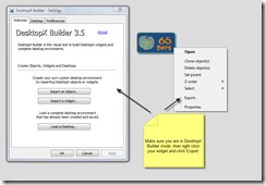
When you are in DX Builder mode, just right-click your widget and click “Export”. The following screens will guide you through creating your gadget.
After the export is done you should have you gadget that you can now use yourself, or distribute to the community with sites like WinCustomize.com. For more information visit the DesktopX website.
Icon-A-Day 2.0, Supplemental, One Last Hurrah for LaST.
Tuesday, August 26, 2008 by mormegil | Discussion: OS Customization
| ||
| Bringing LaST up to date | ||
| Vista User Folders: One of the biggest charges in Vista is the addition of several new User folders, as well as the new User folder structure. Several of the existing folders still worked; My Pictures, My Music, etc. However, I had to go through and create several new icons that are only used in Vista, such as Downloads, and Contacts. | ||
| Live Folders: The Live folders were the biggest obstacle in updated this iconpack, since the folder form factor is so non-traditional. So I had to do some tweaks, and I ended up simply creating a version of the Last folder on its side. With a few more tweaks I was able to make the Live folders work, though they obscure a bit more of the thumbnails than I like, but because the folder is translucent it still worked out ok. | ||
The original LaST icons we designed for a Mac icon contest, and then brought over to 9x, and XP, so it contains many icons that are not used by default in Windows Vista. But since I have all the original icons saved in nice, clean 384x384 PNGs. I was able to create new Vista style icons of even the most obscure Windows 98 icon. I can say that this new pack includes every LaST icon I was able to fit in it. Even though I stuffed this iconpack with all the LaST icons I could, I there are still many more miscellaneous icons, that I currently have posted over in the Object Dock Library. I will be updating them to the new Vista standard soon. | ||
| Wrap Up: Since I created these icons I have learned a great deal, including ways to automate many of the steps required to create sub-packs. I have always wanted to create some other color versions of these icons; Black, Ruby, and such. I am considering putting these together, but I am going to wait to see if people use these. I know they are a bit dated in style. Let me know weather you would like to see a few more LaST Iconpacks, and if so what colors you would like. About Me: You can find all my skins, tutorials, and articles, on my Wincustomize Homepage, at http:\\mormegil.Wincustomize.com. Questions on icon use and techniques, can be emailed to mormegil@gmail.com. Twitter users can find me with the user name: Mormegil. | ||
| Download the LaST 2.0 Iconpack: |
Icon-A-Day 2.0, Day 6: Looks like we need a new Index.
Monday, August 25, 2008 by mormegil | Discussion: OS Customization
| ||||||||||||||
| This index will give us a convenient home for the Icon-A-Day 2.0 project. As the project continues I will update this index with links to each of the tutorials. Unlike in 2.0, this index will be organized by day, not by icon. | ||||||||||||||
| | ||||||||||||||
| Wrap Up: | ||||||||||||||
|
Icon-A-Day 2.0, Day 15, In Search of a Proper Drop Shadow.
Monday, August 25, 2008 by mormegil | Discussion: OS Customization
| ||||||
|
| ||||||
| ||||||
| Wrap Up: Tonight's icon, will be the last Icon-A-Day icon until next Thursday, since will be on vacation. I will, however, be back tomorrow with a special Icon-A-Day supplemental. Check in tomorrow night for a special surprise. About Me: You can find all my skins, tutorials, and articles, on my Wincustomize Homepage, at http:\\mormegil.Wincustomize.com. Questions on icon use and techniques, can be emailed to mormegil@gmail.com. Twitter users can find me with the user name: Mormegil. | ||||||
| Download Search Folder Icon: |
Icon-A-Day 2.0, Day 14, Video free Videos Folder.
Friday, August 22, 2008 by mormegil | Discussion: OS Customization
| ||||||||
|
| ||||||||
| ||||||||
| Wrap Up: With the Videos folder we come to the end of week 3 of our Icon-A-Day 2.0 tutorials. I'll be back Monday with another User folder, and since we are just about out of the classics we will need to create something new from scratch. About Me: You can find all my skins, tutorials, and articles, on my Wincustomize Homepage, at http:\\mormegil.Wincustomize.com. Questions on icon use and techniques, can be emailed to mormegil@gmail.com. Twitter users can find me with the user name: Mormegil. | ||||||||
| Download Videos Folder Icon: |


