Icon-A-Day 2.0, Day 7, Folders Within Folders.
Wednesday, August 13, 2008 by mormegil | Discussion: OS Customization
| ||||||||
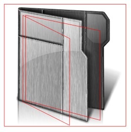
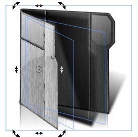
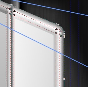
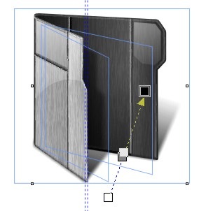
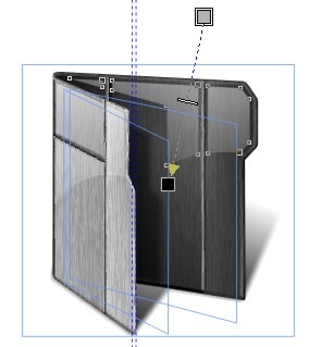
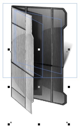
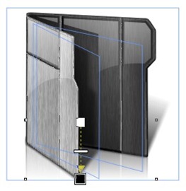
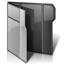
| Like the Open folder, and the Live folder, we will be able to use our pervious work to create the Data folder, in fact we will be using the Open folder almost without change for the exterior folder. The bulk of our work will be to create the interior folder, and fill that folder with a file. We will pretty much be following the same exact formula Microsoft uses to accomplish this. | ||||||||
| ||||||||
| Wrap Up: | ||||||||
| Download the Data Folder Icon: |
Icon-A-Day 2.0, Day 5. How to bring life to your Live Folders.
Friday, August 8, 2008 by mormegil | Discussion: OS Customization
| ||||||
| In Windows Vista, if you have your folders displaying at any size above 48x48, just about any folder you see is a Live Folder. These folders are one of the more useful and visually appealing new features in the Vista UI, however they have created a few problems for those of us who dabble in OS customization. What makes a Live Folder? First, you will notice that both the front and back images have built-in shadows. The back is the most strange, in that it has a shadow of nothing shooting off the side. This is because Windows does not use the Live Folder unless there is something in it that can be thumbnailed. If it is empty it will use the Closed Folder icon. If the folder only has one item in it, it will generate the rear thumbnail first. This makes sure that there is always something casting that shadow. It will also right-justify it to make sure that even if it is thin and tall it will cast the shadow correctly. You will also note that the shadow on the front is very feathered and ends before it would hit the first thumbnail. This is to make sure that the shadow does not have to fit correctly on the thumbnails. The next thing you have to account for is the fact that the foremost thumbnail generates its own shadow. This is one of the reasons you pretty much always have your shadows falling to the right in Live Folder icons. Though you can not tell in the images above, Windows will distort the thumbnails if they are to small, tall or thin to make sure that it's shadows still fit. | ||||||
Finished Icon: | ||||||
| Wrap Up: I would like to thank everyone for the welcoming back the Icon-A-Day project so warmly. With your support, we should be able make the Icon-A-Day 2.0 icon package a must-have. | ||||||
| Download the Live Folder Icons: |
This Week in Skinning - August 8th
Skin Roundup for 8-8-08
Friday, August 8, 2008 by Island Dog | Discussion: OS Customization
Now for this weeks picks!
|
|
Odessy for Bootskins by bng This certainly doesn't look like a normal bootskin, and this one will definitely have people asking what it is. |
|
|
Hot Metal for CursorFX by theAVMAN There are just so many cool cursor themes coming out, it's hard to keep up. theAVMAN is really cranking some great one's out. |
|
|
Mini Player in DesktopX Widgets by Vad_M Vad_M has upload this as a tutorial widget, but this thing is slick and if will definitely help you along with creating your own player. |
|
|
Windows Vista Ultimate Aurora HD in Dreams by wondae This is a simple .dream, but has a very elegant look to it. Very nice. |
|
|
Boulder Tabbed Docks for ObjectDock by WebGizmos These docks are made for the WinCustomize subscriber skin, Boulder. There is also a set of side docks, so check his gallery for more. |
|
|
Simplistic 1 for ObjectDock by messiah1 Nothing wrong with keeping it simple, and these dock backgrounds are a perfect example. |
|
|
Summer Work in Wallpapers by kenwas Summer is quickly coming to an end, but it's wallpapers like this that keep it going. |
|
|
Glass Orb in Wallpapers by Audon Leal The colors and beautiful design immediately caught my eye. |
 |
Tightwire Sailing in Wallpapers by ahabkaba I really enjoy the designs of these wallpapers. They always have a very unique look. |
Be sure to stop by the personal pages of all the skinners featured here, and check out all the other works in their galleries. This was also a great week all around, so be sure to check the galleries on WinCustomize as well. See you next week!
Icon-A-Day 2.0, Day 4. Open Folder, Live Folder, what's the difference?
Thursday, August 7, 2008 by mormegil | Discussion: OS Customization
| ||||||||
| In the original Icon-A-Day series, we only had two types of Windows folders. Closed, and Open. In Vista we have four types, consisting of five different icon files. Closed Folder, Open Folder, Live Folder (Front), Live Folder (Back), and Data Folder. This does not even include the User Folders, which in Vista are given a different style in order to set them apart from the normal system folders. Today we are going to be keeping it simple and take care of the Open Folder icon. The problem is that these will more or less be the same, visually, as the Live Folders, so today's and tomorrow's tutorials may seem a bit redundant. Open Folders: I will be using a new guide that I created to make sure that our folder works with the Live Folders; I will go into how and why I created this in tomorrows post when we create the Live Folder icons. | ||||||||
| ||||||||
| Wrap Up: Today we were able to take yesterdays work, and quickly create our Open Folder. Tomorrow we will use our work from today to quickly create our Live Folder icons. While we are at it, I will try and explain how Vista Live folders are created, and the special challenges they inflict on icon designers. | ||||||||
| Download Open Folder Icon: |  |
Icon-A-Day 2.0, Day 3. Seems like I've done this before.
Thursday, August 7, 2008 by mormegil | Discussion: OS Customization
| ||||||||||
| The funny thing about the Closed Folder icon is that by default, in Vista it is no longer closed, it is just an open, empty folder. I must admit that I kind of like this convention, but if you have a logo or something you want to showcase you lose one of the most often seen blank surfaces in Windows. So in icons, like the My Colors NBA Icons that I did last year, I made the folders completely closed. To further complicate things, in Vista we have Live Folders, so unless a folder is empty, you pretty much never see the default Closed Folder anymore. It is still seen in the tree view in Explorer, but only at 16x16. I want to keep more or less the same feeling that we had in the original Icon-A-Day icons; the same Sci-Fi brushed metal finish, but we have to make sure that they fit into the new Vista scheme of things. What all this means is that the Closed Folder will more or less be our blueprint for the Live Folder icons that we will be tackling on Day 5. One Last Important Note: I am going to jump right into these tutorials where we left off, in that I will be assuming people have seen the original series. These tutorials are more to help people understand how to create high quality icons, not a "How to use CorelDRAW" tutorial set. I have one of those, it is called CorelDRAW for Skinners and even though it is also a few years old, it you can use it to better understand some of the terms I toss around. I will be updating it as well, as this project picks up steam. But in the mean time I will be keeping some of the technical aspects pretty basic. If you have CorelDRAW questions, or questions about my techniques, please ask in the comments and I will try and answer; at the least it will give me ideas for new CorelDRAW for Skinners videos. With that said, lets get this party started. | ||||||||||
| ||||||||||
| Wrap Up: As I get back into the flow in the creation of these tutorials, and as I get to know who is reading them, and what they are interested in hearing about, I should be able to streamline. But I seems kind of fitting that our 2.0 Closed Folder took the same amount of steps as the original. Once again, I welcome feedback. As a mater of fact I am relying on it, so please comment. Join me tomorrow as we make our new Open Folder icons. | ||||||||||
| Download Closed Folder Icon: |
Animated Wallpapers: July '08 Edition
Animated Wallpapers from July '08
Wednesday, August 6, 2008 by Island Dog | Discussion: OS Customization
August is here, so now its time to take a look back at some of the featured .dreams (animated wallpapers) that were submitted to WinCustomize throughout the month of July.
Now for this months video!
To use .dreams (animated wallpaper) you need to have Windows Vista and Stardock's DeskScapes (free) installed. If you are an Object Desktop subscriber, you have beta access to DeskScapes 2.0 which will run on virtually any version of Vista.
The .dreams featured in this months video can be found at the links below.
-
Fire Storm by TheMasterBaron
-
SpyroGyro by CarGuy1
-
Lagerfeuer by Marco820
-
Fish Tank by preechor
-
Dead Planet by AgustSigurdsson
-
sunset_at_fairyglade by muckyman
-
Stardock Cloud Logo by Seabass
-
Asteroids by TheMasterBaron
Icon-A-Day 2.0, Day 1. Not ready for the wrecking ball.
Tuesday, August 5, 2008 by mormegil | Discussion: OS Customization
Like last time, I want to use the first day to let you know what the goal of the project will be, and how we will be going about it. First off, despite the name "Icon-A-Day," I will often be posting multiple icons each day, and there will probably be days were I don't get a final icon posted. I do hope to get a post up each day, with at least a short tutorial, even if the resulting icon is not final. This is one reason why I will be naming each post with the day and a title, rather than the the icon # and name. And finally, I have had to admit that there is just not enough time in the day. Unlike last time, I will only be posting on the weekdays; Monday - Friday. I will also be skipping most holidays. Icon-A-Day 2.0, will be Part 1 of a new series of icons. Part 1 will be going through the original Icon-A-Day icons and making them ready for the Vista World. Part 2, will be a brand-spanking-new icon set, one that is only a sparkle in my eye at the moment. So you can think of Part 1 more as Icon-A-Day 1.5. I do these tutorials for my own pleasure, however I LOVE to get feedback; please comment and let me know what you like and don't like. I will be taking feedback seriously, and want to make sure that both the updated Icon-A-Day package and the new icon set are some of the best icons on the net. Once again, I will be doing these icons, in CorelDRAW. I just recently updated to X4, and have been happy with it. For those of you who want to follow along, and don't have X4, you should be able to do so with any version newer than version 9, since I will be using a lot of Mesh Fills. You can also get the Trial Version from Corel here. If you find yourself loving it as much as I do, you can buy it at your local retailer, or even get it Directly from Impulse. (Stardock Plug). For those of you who don't care for vector graphics, or who love Illustrator, or Photoshop, you might find some interesting techniques that you can borrow, and might find the tutorials more useful than you think. That's enough exposition for day one, lets move on the the reason we are here. | ||
| ||
| As I mentioned above, part one of this new series will consist of updating the original Icon-A-Day icons. When I started the original icons in January of 2005, Vista was still called Longhorn, and was still a mythical OS that would do everything for everyone. Early screenshots were leaking out, most of which were not at all what we ended up with in Vista, but I did know that we were most likely going to end up with 256x256 icons. So even then I was pretty sure I would need to upsize the icons, and when I exported them I did so at 384x384. This has made it possible for me to quickly create Vista quality icons of the original images. Even three years later I am still quite proud of the Icon-A-Day icons, and think that many of them only now, in Vista, can truly shine. So today, rather then jumping into creating any new icons, I will start going through all the existing icons and updating those that are not ready for the wrecking ball. Most of the icons that will need drastic updates will be the folders, since we will be rotating them so as to take advantage of Vista's Live Folder feature. We will also be creating many new folders to fit in better with the new user folder structure. I will however be updating many of the system and file icons, since some of them are obsolete, or just dated. Today we will start with the System icons that I feel stand up to vista's 256x256 scrutiny. These can be divided up into two groups, icons that I think are still look great in Vista, and icons that look good, but are not often seen in Vista. I will be updating them despite this, because I want the final 2.0 pack to be as complete as possible. | ||
| Internet Icons: I still love this globe, even if it is kind of simple, so we will be keeping it, as well as most of the Icons that are derived from it. | ||
| Drives: The hard drive was one of the first icons in the Icon-A-day series, and I think that it stands up well. Even if it is technically an external. In 1.0 we also made several of the less common drive types. I think these all stand up to time, and I am sure we will have to add several more as we work our way through the 2.0 update. | ||
| Other System Icons: I am still quite proud of this Recycle Bin, and I think people like it since I have seen it ripped more times than I can remember. The rest of these system files I don't really think need updating; some are just too basic, and some are only used in XP, or even 2000/98, so I will simply be making Vista versions for the fun of it. | ||
| System Icons that Will See Updates. As much as I liked the My Computer icon for 1.0, it is a bit dated, and I want to give it some love. This will mean that many of the other system icons will be getting updated as well; My Network, Control Panel, etc. We will also be adding several new System, and Control Panel icons, as the project continues. | ||
| Wrap Up: I think that is enough for Day One; I will back tomorrow, and we will get the File icons that are still in vogue updated. I will be posting the above icons into the Miscellaneous Icons category, all ready for Vista. I will be compiling all the icons with the complete complement of of size, from 16x16 to 256x256, so they should work with just about any system or application you want to use them on. Have fun! | ||
| |
Download Updated Icons: |
All Icon-A-Day artwork, copy, and Icons, are copyrighted by Paul Boyer © 2008, and may not be used with out express permission.
Icon-A-Day 2.0, Day 2. Files, Files, and Files.
Tuesday, August 5, 2008 by mormegil | Discussion: OS Customization
| ||
| One of my favorite things about the Icon-A-Day File Type icons, is the glassy reflective style. I want to keep that theme throughout the update as well. This is going to save me a lot of work, and give me the opportunity to expand the file selection with the time that I save. | ||
| Old Favorites: Despite this I don't see any reason not to update almost all the original File Type icons for those of us who still enjoy a sight-seeing trip though the file system every now and then. | ||
| Missing in Action: | ||
| Wrap Up: Once again I will be posting the above icons into the Miscellaneous Icons category; all ready for Vista. I will be compiling all the icons with the complete complement of of size, from 16x16 to 256x256, so they should work with just about any system or application you want to use them on. Have fun! | ||
| |
Download Updated Icons: |
All Icon-A-Day artwork, copy, and Icons, are copyrighted by Paul Boyer © 2008, and may not be used with out express permission.
This Week in Skinning - August 1st
Skin Roundup for 8-1-08
Friday, August 1, 2008 by Island Dog | Discussion: OS Customization
Now for this weeks picks!
|
|
DECEPTICON Cobra Edition for Bootskin by nimbletongue How cool is it to boot up Windows and see this come up? |
|
|
Prototype III for CursorFX by Libardo Libardo is just cranking these cursor themes out, and here is another in the Prototype series. |
|
|
EvolveFX for CursorFX by TYCUS The detail in this cursor theme is amazing, not to mention the animation. Check it out. |
|
|
Starry Starry Night in Dreams by CarGuy1 This .dream goes perfect with a darker WindowBlinds skin, and has a nice subtle movement. |
|
|
Gaiety Tabbed Docks in ObjectDock Backgrounds by WebGizmos Gaiety is a really fantastic WindowBlinds skin, and now WebGizmos has shared a collection of dock backgrounds to match. |
|
|
Palms View in Wallpapers by Rahul29 I really like the colors and scenery in this wallpaper. Nice work. |
|
|
Butterfly Effect in Wallpapers by DEVJIT This is another wallpaper that makes great use of color, with a very minimalistic approach. |
| LED3: Dot Matrix for WindowBlinds by vStyler This Master Skin for WindowBlinds is one of my new favorites. It's just a great design all around, so be sure to pick this one up. |
Have a great weekend and remember if you have a skin in progress, feel free to post a teaser preview in the "What are you working on" thread. See you next week!
Harley-Davidson Raw MyColors Walkthrough
Thursday, July 31, 2008 by Island Dog | Discussion: OS Customization
The Harley-Davidson Raw MyColors Theme was recently released, so as usual, I want to take you through a walkthrough of what is featured in this theme. This is a theme designed for MyColors, and to find more information about MyColors, you can read through a walkthrough or view a screencast with more information.
Visual Style and Wallpaper
The visual style for the Harley-Davidson MyColors theme is a bit hard to describe, but the “Raw” name is one of the first things that come to mind. The start button is of course the Harley-Davidson logo, and the rest of the skin has a dark, but well designed feel to it.
The wallpaper is also in tune with the “raw” look as well. Pictures of Harleys take the space along with what I would call graffiti-like artwork across a wall backdrop. If you want to change to a different resolution, just look in the Wallpapers tab in the MyColors Theme manager.
Icons
These icons are really awesome. They are just filled with all types of Harley-Davidson goodness! The Mailbox icon is probably one of my favorites from this group.
Gadgets
The Harley-Davidson MyColors Theme include 3 gadgets for use on the desktop. Gadgets are mini-applications and this theme includes a weather gadget, clock, and calendar all staying true to the Harley-Davidson Raw style.
The Harley-Davidson Raw MyColors theme is available for both Windows Vista and XP. If you are a subscriber to Object Desktop then you are eligible for a discount for MyColors themes. For more information visit the Harley-Davidson Raw MyColors page.


