Premium Themes Gives Your Desktop a Custom Look and Feel
Wednesday, February 5, 2014 by Island Dog | Discussion: OS Customization
There are a lot of Object Desktop users out there, and while there are some great resources available for skins and themes like WinCustomize.com, but some people just want a custom theme pack that can give them a new desktop look. We have a bunch of premium themes designed and built by the top skin artists available, and they include a premium WindowBlinds skin, icon package, wallpapers, and useful desktop gadget. When you purchase a premium theme, you will receive a .zip file that contains all related files you will need.
As mentioned, you will need Object Desktop or at least the major components like WindowBlinds and IconPackager which is needed to apply skins and icon packs. The description of each theme will let you know exactly what you need, and these premium themes are designed for Windows 7/Vista/XP.
While you can browse through all the great premium themes at the link above, I wanted to highlight a few of my favorites that I think you will also like.
Pirate Theme
This is one of my favorites. I mean who doesn’t like pirates, right? This theme includes a pirate-themed visual style complete with a pirate flag, matching wallpapers and pirate icons which will give your boring desktop a completely new look.
Spring Theme
As the name implies, this theme is all about the Spring season with vibrant colors that is sure to get your out of the Winter rut and ready for a warmer season. This theme includes a WindowBlinds skin, icon pack, custom wallpaper, and a desktop gadget.
Dragon Theme
This has been one of the more popular premium themes over the years. One of the reasons could be the awesome animated start menu with a fire-breathing dragon on top! Like the others, this theme comes with all the components you need to makeover your desktop with the likeness of a mythical creature.
Get a Holiday Desktop with Stardock Apps and WinCustomize Skins
Tuesday, December 3, 2013 by Island Dog | Discussion: OS Customization
The holiday season is here! Whether you celebrate Christmas or Hanukkah, or just like to give your desktop a winter inspired look, I wanted to give some tips on how to achieve a festive look. There are thousands and thousands of skins and themes available here on WinCustomize, and the holiday season is one that has a lot of skins available. Whether you want just a festive wallpaper, or a complete theme for your desktop, we have it covered.
Holiday WindowBlinds Skins
If you want a complete change to the way Windows looks, then look no further than WindowBlinds. There are lots of holiday themes available and they also serve as a great base for other customization tools.
TIP: New to WindowBlinds? Here's an informative walkthrough.
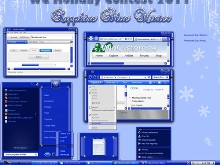
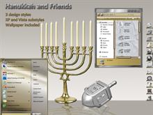
Here are some recommended holiday-inspired skins:
ObjectDock Backgrounds and Icons
ObjectDock is one of the best desktop tools to organize your frequently used app shortcuts, site urls, and more. It’s also customizable by changing the background and adding custom icons to the dock.
TIP: Learn how to change the ObjectDock Background theme here.
Cool holiday themes for ObjectDock:
Animated Holiday Wallpapers with DeskScapes
DeskScapes gives users the ability to have animated wallpapers on their desktop. There is something really cool and fun with having an animated holiday display right on your Windows desktop. On WinCustomize there are animated wallpapers of lighted Christmas trees and an animated fireplace that you can use.
TIP: Learn more about using DeskScapes here.
Some animated wallpapers to try out:
Change Your Cursor to a Holiday theme with CursorFX
You follow the cursor around on your desktop all day, so why not change it to a custom animated theme? CursorFX lets Windows users change their cursor to one of thousands available. Many of these have some fantastic animations and many are made to match several popular WindowBlinds skins so you can get the complete look you are after.
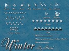
Holiday CursorFX themes to check out:
The Most Popular WindowBlinds Skin of All Time!
Thursday, November 21, 2013 by Island Dog | Discussion: OS Customization
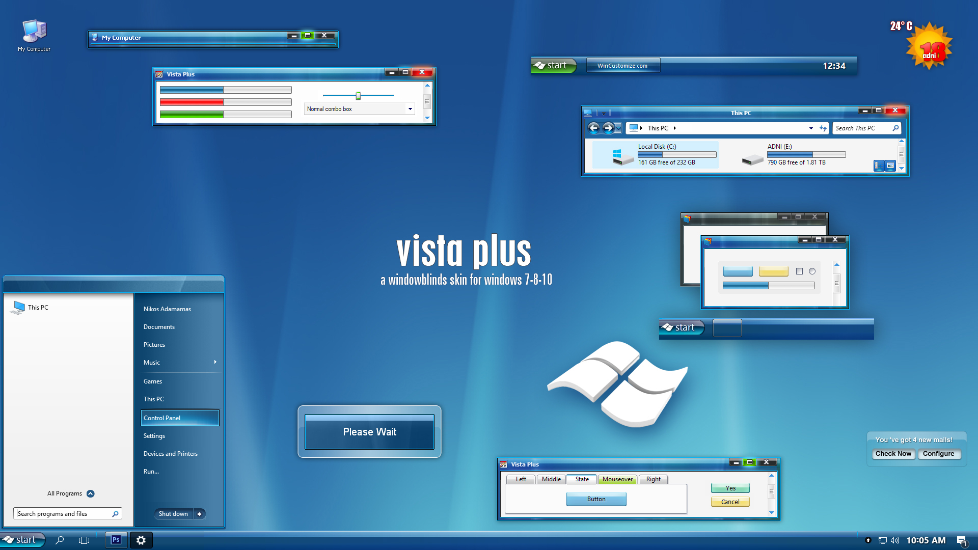
Since we’re spending this month celebrating 15 years of skinning WindowBlinds, I wanted to find out what was the most popular download on WinCustomize.com. From the best I can tell and confirm, Vista Plus Version 3 comes in with over 900,000 downloads since it was released in 2006.
Vista Plus Version 3 by adni18
It’s a little funny a Vista skin has been one of the most downloaded, but as some of you might remember the glassy look was really popular and many skinners created a bunch of skins with that look during that time. This was a skin that was designed to be used on XP to get that look, and as with all of adni18’s skins, he did a remarkable job at creating this style.
WindowBlinds 15 years in pictures
Wednesday, November 13, 2013 by Frogboy | Discussion: OS Customization
WindowBlinds 1.0 was released in November 1998! Since then, it’s gotten over 100 MILLION downloads! Over on CNET’s Download.com version 8 has received over 18 million downloads.
It was the first program to enable users to customize the look and feel of the Windows GUI. 15 years later it is still going strong. Let’s take a look at its evolution in pictures.
Version 1
Changed window frames, menu bars.
Yea, this was the config UI we had..cough..
Version 2
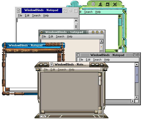
Adds per-window skinning, semi-transparent explorer windows, skin colorizing
Desktop light sourcing
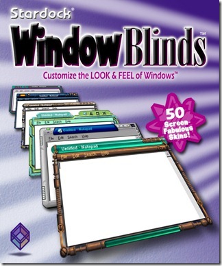
WindowBlinds gets into retail!
WindowBlinds used to send data back to us on what skins people had. We took this out because users were unhappy about their “privacy” (anonymous data being sent). Seems quaint now.
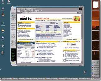
WindowBlinds skins supported adding buttons and other objects into the frames (such as this stock ticker).
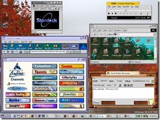
Remember AOL? Their client was a huge pain the skin correctly. Also, look at the BeOS skin.
MacOS’s “Aqua” look for its newly launched MacOS X helped make WindowBlinds incredibly popular for Windows users who suddenly recognized how ugly Windows NT/2000 were.
In fact, making Windows look like other, less ugly, OSes was a big deal.
Version 3
Designed with Windows XP in mind, 3.0 was the first version that could skin every part of the Windows GUI. The competition had stiffened as Microsoft had released uxtheme.dll that, once hacked, allowed people to create GUI skins freely. WindowBlinds thus had to provide significant value-add to justify $20.
The quality of the skins had to really go up to compete with the bland but free uxtheme skins.
Third-parties began licensing WindowBlinds for marketing purposes (Nvidia here)
(Nintendo)
(The Microsoft XBox team here – one wonders what the Windows team felt about this at the time)
Sometiems it was just a matter of making Windows XP look a bit nicer than Windows XP defaulted to.
Other times it was about reminding power users just how gimped the Windows XP “Luna” UI made Windows.
Version 4
Version 4 was the point where WindowBlinds “won” the contest versus uxtheme.dll in that it could not only do everything it could do and more but version 4 made use of DirectX draw acceleration to make WindowBlinds substantially faster (i.e. noticeably faster) than using Windows XP without it.
However, this popularity would come at a price – the quality of the average skin submitted became substantially lower. WindowBlinds skins acquired the reputation for being ugly, gaudy, fat.
WindowBlinds 4 added a lot of neat controls for controlling how coloring worked.
Version 5
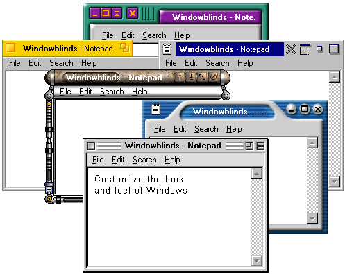
The era of Aero had arrived. Microsoft was finally taking the aesthetics of Windows seriously and created a new glassy looking UI called Aero. WindowBlinds 5 was designed to support per-pixel alpha blending, toolbar button changing, progress animation improvements, animated per-pixel Start menus, title bars, etc.
Aero all the time
Our own take on Aero
However, the problem Stardock and its community faced was that a “complete” skin was a significant amount of labor. Thus, a lot of the most talented skinners began finding other things to spend their time on. It wasn’t “fun” anymore.
Version 6
WindowBlinds 6 added the ability to apply effects such as Gaussian blurs to skins in real-time. However, the biggest change came in the new configuration because it was becoming clear that the number of high quality new skins was dwindling (while the user base continued to increase). The new config allowed end users to heavily modify their skin library.
That dragon is fully animated and so is the title bar.
The new config allowed users to do all kinds of crazy things to their skins and then save them as a sub-style
The official World of Warcraft skin got a second life with WindowBlinds 6
The Elemental skin for WindowBlinds 6
Version 7
It is with some irony that WindowBlinds 7 was ready in time for Windows 7 (the versions being the same was coincidence). WindowBlinds 7 introduced a new type of skinning format called UIS0 which allowed users to just modify the existing Aero skin. This made WindowBlinds a lot more popular for people who liked Aero but wanted a bit nicer look and feel to it.
A new, simpler and just as powerful config window.
Stardock began contracting professionals to make skins to ensure that there were some good, new, benchmark skins available.
Mac inspired skins remained popular
So with UIS0, you could apply a texture and color to the existing Windows 7 Aero making it look, imo, much nicer.
Version 8
Version 8 was mostly about getting WindowBlinds to work on Windows 8. Microsoft essentially gimped the underlying window theming system they had – they killed Aero! No Aero, no UIS0. They replaced it with the stripped down UI seen in Windows 8 and 8.1.
Once again, a new and improved configuration UI.
BEYOND 8
WindowBlinds 8 is still very new, what but the challenge going forward is coming up with new and interesting ways to skin the Windows GUI that make it attractive for new users! Visit www.windowblinds.net to learn more about WindowBlinds!
Add a quick launch bar to Windows 8 with Stardock’s Launch8
Wednesday, November 6, 2013 by Frogboy | Discussion: OS Customization
Windows 8 comes with the new Start screen which is, especially if you have a tablet, a good way for people to organize their apps. What it doesn’t come with, which is a bit surprising, is a quick launch bar (like iOS and Android have). Launch8 addresses it.
If you have Windows8, definitely give it a try.
Make Windows 8 function like Windows 7 but with the improvements of Windows 8
Thursday, May 23, 2013 by Frogboy | Discussion: OS Customization
As a tablet OS, Windows 8 is pretty decent. I don’t have a problem with the Start screen in theory. But I spend 8+ hours a day in front of a PC doing real work and that means using a desktop OS.
Windows 8 includes the desktop but it relegates that to being a program you run from the Start screen. What we really want is to get the good stuff in Windows 8 (faster performance, new Modern app support, etc.) without the negatives. That’s where Object Desktop comes in!
So with Object Desktop, the beta of WindowBlinds 8 is now available which brings back “Aero glass” to Windows 8 users on the desktop. Plus with ModernMix, Start8, Fences and the other goodies you can have the best of both worlds.
Here’s the UI of WindowBlinds 8:
We include some “skins” that are timeless favorites plus a few that represent what we thought (hoped) the Windows 8 UI might have been like to choose from. Plus there are thousands of skins available at WinCustomize.com.
If you want to get our whole package, you can get Object Desktop at www.objectdesktop.com. When you buy it you also get a 1-year subscription to ObjectDesktop.net which gives you access to everything new we add for a subsequent year (Object Desktop is always improving and changing as the needs of PC users change).
5 Tips for New WindowBlinds Users
Tuesday, August 21, 2012 by Island Dog | Discussion: OS Customization
Every so often I like to focus on the new users of WindowBlinds, as although it’s very easy to use, there are some things that a new person skinning their desktop could miss. Some people just apply skins and go no further, and while that’s perfectly fine, WindowBlinds can let take things a bit further to enhance that experience even more.
Lets take a look at 5 of my favorite tips for new users.
Get WindowBlinds – www.windowblinds.net
1. Make Finding Installed Skins Easier
If you have a lot of skins installed in WindowBlinds, the skin list can obviously become quite large. There’s a couple of ways to easily navigate through all your skins. First, you can swipe through the skin list to move through the installed skins very quickly. Just grab a part of the skin gallery area and swipe your mouse to the left or right. If you know the name of a skin, there’s also a search box that you can use also. Another tip is that you can filter skins by their rating. This is a real useful feature for finding your favorite skins in a big list.
2. Re-color a skin
I think this is one of the coolest features of WindowBlinds and easily lets you customize a skin with just a few clicks. There are tons of WindowBlinds themes available in all sorts of colors and styles, but WindowBlinds gives you the ability to take a favorite skin and re-color it to match your wallpaper, a theme, or just whatever you like. Just select the Colours tab and select a color. There are also sliders where you can adjust the settings. Please note that some skins color better than others, and not all skins will re-color.
3. Apply Random Skins
If you like to change skins a lot, you can set WindowBlinds to automatically change skins each time you login or apply a skin. Click Settings then go to the Random skins tab for the option.
4. Adjust Transparency
Skinners typically do a great job at putting the right amount of transparency in their skins, but as always, some people might like a bit more. WindowBlinds gives you the option to the adjust the transparency of a skin. You can apply it to the Start menu, taskbar, Window frames, and more. If you don’t like what you changed, just hit the Reset all button and go back to the normal transparency.
5. Get More Skins!
WindowBlinds includes some great looking skins, but there are so many more out there available for download. WinCustomize.com is the spot to get them, and you can either visit the site directly or click the ‘Get More Skins’ button in WindowBlinds which will take you directly to the WindowBlinds gallery.
This Week in Skinning-June 22nd
Skin Roundup for 6-22-12
Friday, June 22, 2012 by Island Dog | Discussion: OS Customization
![]()
Welcome back to another edition of This Week in Skinning! It’s nice to see that people aren’t slowing down much summer in regards to skinning. Typically, summer is a slow time for skinning but that doesn’t seem to be the case as the uploads keep rolling in. Hopefully we’ll have some more GUI Champs 2012 news coming up soon as we are hard at work behind the scenes getting things ready.
Now for this weeks picks!
|
|
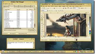
Submerge FX by neone6 |
|
|
Alien Killer by H4RDSTYLER Nice to see an addition to the IconPackager gallery. This is a detailed set of icons made to match the WindowBlinds skin of the same name. |
|
|
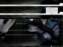
NiteBar 2.0 by AvernusTriad This is a cool skin for Rainmeter for people looking for something minimal, but displays useful information. |
|
|
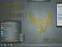
Phoenix 2012 by 2of3 This is a great skin, and I especially like the taskbar and titlebar design. Nice work! |
| ElectroSexual by Vampothika Another addition to the ElectroSexual suite, this time for SysMetrix users. A great skin series for sure! |
Living with Fences 2 Beta
Wednesday, June 6, 2012 by Frogboy | Discussion: OS Customization
I’m playing with the latest internal build of Fences 2. I can describe it in one word: WOW.
Let me show you some screenshots that will explain what I mean:
Folder Portals:
At first glance, this looks like Fences 1. But look closely… See the Videos and My Pictures? Those portals to folders. This is huge. Think of all the people you know that dump every picture and such onto their desktop. With Fences 2, people can put pictures where they belong – in their pictures folder. Then, using Fences, just create a portal fence on the desktop.
Pages:
This screen looks really busy right? Here’s the thing: It’s a Fences page. I got to it by clicking on the edge of the screen and dragging the screen to the next page. I use this page because I often have to interact and/or move stuff between these three folders. I bet I’m not the only one who gets pretty tired of having to open up folders, place them around the screen to drag and drop things between them.
Let me video this to really drive it home:
Easier to use
Fences 2 installs as a Control Panel item rather than its own proprietary UI..thing. So you can always get to it through the control panel and the UI works the same as any other control panel.
Also, for people (like me) who just want a clean desktop, Fences is still the world’s best solution for this: Double click on the desktop and your icons go away (double click to bring them back).
More powerful
The power-user features of Fences 2 are presented in a way that they’re easy for power users to make use of but don’t scare off casual users. For instance, in the above screenshot, I’ve got my pictures displayed as details while my videos are showing their items as large video items. I’m also configuring a new fence to be the place that intercepts things trying to add their junk to my desktop.
Besides the obvious addition of being able to have different sized icons on your desktop, it lets you use your desktop as it was originally intended – your portal for all your stuff. If you’ve used Windows 8, you can really appreciate how important it’s going to be to be able to use your desktop more effectively than ever and for everyone else, it lets you craft your desktop to work the way you want it to.
Fences 1 is, as some know, the world’s most popular desktop enhancement (by far). Fences 2, is more than a mere evolution of the fences concept. It’s is the realization of two decades of what the desktop can be when given the right tools. Fences is a simple program that has profound benefits.











![wb5-3[1] wb5-3[1]](https://draginol.stardock.net/images2012/819c80f84130_ED02/wb5-31_thumb.jpg)


