


Icon-A-Day, Icon # 19, My Network
Once more we find new homes for the icons we have done already.
Tuesday, January 25, 2005 by mormegil | Discussion: Icons
| Icon 19 (My Network) Now we move on to our My Network icon. I would like to think of some really cleaver convention for this, but I have not had any luck so far. What I, and most other icon makers seam to do, is a computer with a globe or two computers together. Since we have a neat looking globe I figured we go with it one more time. |
||
| Step 1:
We will get started by copying our My Computer icon, and shrinking it down about 80%. .jpg) |
Step 2: Now we Copy our Internet icon over, and shrink it down and place to the lower right of our guide box. I also delete the cord and its shadow. .jpg) |
Step 3: Now I make a new cord, leaving our plug on the globe and running off behind the Computer. I do this with the Mesh Fill tool. .jpg) |
| Step 4: I pull a shadow off the new cord, and break it apart. Then I crop it down to make sure it looks right, using the Node Edit tool. .jpg) |
Finished Icon Image..jpg) |
Click here to download the finished icon. |
|
This is an important icon, though it was pretty simple to
make. Tomorrow we will move on to the Web folder. |
||
Icon-A-Day, Icon # 18, Network Drive - Offline
A few more tweeks and we have one more Icon.
Monday, January 24, 2005 by mormegil | Discussion: Icons
| Icon 18 (Network Drive - Offline) Today's icon is pretty much the same as yesterdays icon but with some tweaks. I almost included it with yesterdays icon, but there is a bit more work to it than I had thought, so I decided it was worthy of its own day. |
||
| Step 1:
First thing we do is copy our Network Drive icon from yesterday. .jpg) |
Step 2: I move the cord out of the way, and Convert the globe to one bitmap. Then I make it slightly Transparent. I will tweak this later. .jpg) |
Step 3: Now I move my globe out of the way, and with the Mesh tool I add some length to the cord, and bring it around to the back of the drive. .jpg) |
| Step 4: With my Mesh Tool I polish up the cord and pull a drop shadow off of it. I want the cord to look like it is missing the globe. .jpg) |
Step 5 I Crop and Fade the shadow and cord so they do not run out of our guide box. I move our globe back in position and adjust the Transparency until I can see the cord through it. I bring back our plug from the other icon and make its center blue instead of red. .jpg) |
Finished Icon Image. .jpg) |
|
Click here to download the finished icon. |
||
|
That finishes up the Default Hard Drive icons in our
pack. We still might do some more as bonus icons, but that will be
later. |
||
Icon-A-Day, Icon # 17, Network Drive.
let us get started on our Network Icons.
Sunday, January 23, 2005 by mormegil | Discussion: Icons
| Icon 17 (Network Drive) Over the next few days I should have some pretty simple icons. I want to knock out most of the Internet or Network related icons in one fell swoop, so here we go. |
||
| Step 1:
The first thing we need to make our Network Drive is the Hard Drive icon we already made. Copy it, take away the cord, and size it down about 80%. .jpg) |
Step 2: Now we Copy the globe from our Internet icon, size it down, and remove the cord from it as well. .jpg) |
Step 3: Now we put them together. .jpg) |
| Step 4: We need to trick out the cord a bit and make it a bit larger. .jpg) |
Step 5 I give the cord a little shadow then break it apart and crop it down to fit a bit better with the Node Edit tool. .jpg) |
Finished Icon Image. .jpg) |
|
Click here to download the finished icon. |
||
|
Tomorrow we will do the Network Drive (Offline) icon. |
||
CorelDRAW For Skinners, Part 2.
Drop Shadows & Reflections
Saturday, January 22, 2005 by mormegil | Discussion: Tutorials
| CorelDRAW for Skinners. Part 2: Drop Shadows & Reflections. | |
| I have gotten a lot of positive feedback from last weeks CorelDRAW for Skinners and a lot of requests for more videos, so this week we have 2 more. I will try and cover all requests as time allows. This week I am covering the two most asked for techniques that I am using in the Icon-A-Day icons, Reflections & Drop shadows. Both these videos ran a bit longer than I wanted, but they cover all the basics, and should allow for a better understanding of some of what is being done it the written tutorials. This weeks videos: Dropshadows 101 Reflections 101 Stay tuned for more; I will try and get 2 more in next weekend. Requests encouraged, and appreciated. |
|
Video
# 3: Drop Shadows 101 |
Video #4:
Reflections |
|
|
|
Icon-A-Day, Icon # 16, HTML File.
Now we start on the Network Icons.
Saturday, January 22, 2005 by mormegil | Discussion: Icons
| Icon 16 (HTML File) Now that we have the Internet icon, Icon # 15, we can use it to help us several of the icons in the pack. |
||
| Step 1:
First thing we do is copy our TXT file, to use as a template. I remove the Text and Reflection, as they will be replaced in the new icon. .jpg) |
Step 2: Now we copy the Globe icon, shrink it down to about 70% - also I remove the cord - I am going to make a new one for this icon. .jpg) |
Step 3: Now using the mesh fill I quickly take two rectangles and make new cords out of them. .jpg) |
| Step 4: The trick to doing the cord is to set all the nodes to "Smooth", this will round it and do a lot of the work for us. I will cover this in the next Mesh Fill Tool Video. .jpg) |
Step 5 Now we copy our globe, Crop it, and give it some Transparency for the reflection on the file. .jpg) |
Step 6: Now using standard Rectangles and Text I mock up a more HTML looking text for out file. Once I like what I have I copy it and make our reflection. .jpg) |
|
Step #7 Now I move all of our elements back together. And make sure it all looks good together. .jpg) |
Finished Icon Image. .jpg) |
Click here to download the finished icon. |
|
Over the next few days we shall do all the Internet
Related icons, so check back in soon. |
||
Cordelia's Choices 01-19-05
Wednesday, January 19, 2005 by Cordelia | Discussion: OS Customization
Which gallery items do you like the best? I find it difficult to choose among so much good work out there, but here are some of my current favorites. Which skins do you recommend? Which widgets do you love? Let us know!
Skins:


Wallpaper:


BootSkins:


LogonSkins:


DesktopX Widgets:


Here is my current screenshot:

You can find all of these items and a few more on my recommendations page: Link.
Share some of your favorites!
BlueDev's PC media player smackdown - Part II
the verdict is in!
Tuesday, January 18, 2005 by BlueDev | Discussion: iTunes
Also, since audio quality will be a large factor in every player's evaluation it is worth noting that testing was made using professional Bose headphones.
Today I will probably be a little more succinct with the entries as I am attempting to cover more ground. So bear with me. These entries are what I refer to as the dark horses: players that are perhaps not as well known as the ones I mentioned previously, but they deserve a good look as well. So here they are, in a bit of a random order, but also based on how well I know the program (ones I don't know as well come first).
CoolPlayer: A free, open source little audio player that has a fair number of fans. I had checked out CoolPlayer a while back and thought it was a pretty solid audio player, but very stripped down (At the request of dabe I decided to take a look at it again). CoolPlayer has a lot of capabilities for such a small file. Freeform skinning, plenty of file types supported (especially with plugins since it is open source), it starts up nice and fast, and is simple to use. The graphic equalizer is nice as well.
Pros:
- Freeform skinning
- Small file that runs very quickly and uses little system resources
- Good audio codec support
- Open source (this always earns bonus points with me)
- No media library management
- All playlists must be created by the user (as opposed to WMP, iTunes and Winamp that can generate dynamic playlists from your library based on artist/genre/album etc.)
- Sound quality is while not terrible, is not terrific either. Lacking in clarity in the higher frequencies and depth in the lower frequencies
Pros:
- Efficient resource use by only loading the components you need as opposed to everything
- Wide range of supported codecs (if it is audio dbPowerAmp probably can play it)
- Freeform skins
- Installation locked my system from responding to volume control hotkeys. Maybe this isn't a big deal to others, but I hate having to open the volume control on my taskbar when I have nice little keys on the front of my laptop that do it for me. It also would not respond to Fn F5 or F6. This was not limited to when the program was running. I had to uninstall it to restore function
- Sound quality is muddy and weak, even with excessive equalizer tweaking
- The media library does not group well according to album, making media library management cumbersome
Pros:
- Many high quality skins available
- Good plugin support to extend the capabilities of the player
- Poor audio quality was QCD's biggest downfall. It would have stayed on my system if it didn't sound so muted an gummy.
- Media library management was lacking. You can add many files, but the playlist just isn't set up to handle a long playlist and keep it nicely organized.
Pros:
- Good skinning capacity (from the shots I have seen, haven't had a chance to use them myself)
- Good media library management
- Good sound quality, but still lacking in the clarity of the high frequencies
- High resource use. Using the default skin I am hitting nearly 40 megs of RAM while not minimized
- Sound still lacks some clarity
- They do cripple the player a bit, wanting you to purchase the pro version (this isn't the only player to do so, and isn't major, but worth mentioning)
Pros:
- Clean, efficient layout and library management makes these both easy to work with
- Open source
- Poor sound quality, even with equalizer tweaking
- Resource management issues. Musik Cube only used around 11 megs of RAM when not minimized, but was using an outrageous 60-80% CPU at all times. Bad sign
Pros:
- Sound quality is what Apollo is all about (even though I was non-plussed)
- Looks very ugly, ignoring even Window Blinds
- Very poor handling of large playlists
- No media library management
Pros:
- Very good looking player. Lots of eye candy here
- Jet Cast is fun (but I was never sure about the legality of it and so never really broadcast)
- Difficult media library management
- Poor sound quality, sounding shallow and muddy no matter how I tweaked it
Pros:
- Excellent sound quality
- Low resource use
- No skinning whatsoever (though at least this will us Window Blinds skins)
- No media library management
Pros:
- Amazing audio quality. Second to none in all the players I tested
- Very resource lite
- Can handle media library management nicely once the database is set up
- Extremely customizable
- Plain and boring to look at (at least until you tweak it, then it can look pretty nice - see examples)
- Because it is so customizable it can be a little daunting to jump right in and start using


The Final Verdict: So after all this I feel that I must elect a winner. I am afraid I cannot say without hesitation which one is the best though. I am going to have to direct myself at two different groups. First, if all you want is an all purpose audio player that works well, manages your music with minimal effort and sounds good I have to give the nod to Windows Media Player. However, if you aren't afraid to get your hands dirty a bit, play around with things, sacrifice a bit of eye candy, and have the best sounding player out there then I recommend foobar2000 without hesitation. Taking into consideration my personal preferences I would call foobar2000 the overall winner. It is simply an outstanding player, with the best sound quality and customizable to my hearts content.
If you stuck through and actually read this entire thing, just let me take this last line to say thank you.
WinCustomize User Page Focus: Yangge
The WinCustomize User Focus Articles
Monday, January 17, 2005 by joeKnowledge | Discussion: Community
 On Yangge user page you will find more than just a few icons... how about a whole lot of icons!
 Yangge has made countless icons and icon sets for those who visit on WinCustomize as well as elsewhere and those icons seem very desirable to the public considering the download count awards on his WinCustomize front page. If you like the glassy look then you will like this colorful icons.
Take a look at some of the recent uploads:
- NotePad by yangge for Misc. Icons
- Desktop X by yangge for Misc. Icons
- Aqua2004 by yangge for IconPackage
- xToon by yangge for IconPackager
- Black Apple System by yangge for IconPackager
Yangge has a few follower as well if the information on his Stats page is correct. Is it ok for people to stalk you? Man! Even mormegil has taking a liking to this guy.
Yangge has contributed in other ways as well. Comment on skins uploaded by other people is a good way of helping or encouraging other skinners and the like to be involved and keep skinning. Encouragement is always a good thing.

Until the next WinCustomize User Page Focus, I'm joeknowledge/joetheblow
Links ARCHIVE: LA Times - Will People Give Up On Computers?
Fed up over problems stemming from viruses and spyware, some computer users are giving up or curbing their use of the Web.
Monday, January 17, 2005 by joeKnowledge | Discussion: Internet
SOURCE: LA Times
No More Internet for Them
Object Desktop: The Year in Review
A look back at 2004
Sunday, January 16, 2005 by Frogboy | Discussion: OS Customization

2004 Year in review..
Our story so far...
Object Desktop is a suite of programs that lets users customize the way Microsoft Windows looks, feels, and functions. As the capabilities of Windows changes, so does Object Desktop. It was originally released in December 1999 and has evolved dramatically since then.
When a user purchases Object Desktop, they get everything already on it plus everything we create for it during the subsequent year. If a user wants to keep getting new updates and new features, they can re-subscribe to ObjectDesktop.net to continue getting new updates (if you don't renew you keep everything you already have).
Since updates during the year are a big deal to users who are considering renewing their access to ObjectDekstop.net, what comes out in a given year is worth talking about.
A Guided Tour of what's been improved...
2004 has been a turning point in Object Desktop's career. It was the year when many elements of it finally came together: Mature programs, documentation, and support.
Stardock Central
For example, when Object Desktop first came out, users had to get their updates through a program called "Component Manager". This program "did the job" but was kind of clunky in use and many users had frustrations in terms of backing up and having to constantly re-download things.
Stardock Central completely replaces it.

Stardock Central.
What Stardock Central does is combine forums, chat, downloading, and other features all together into a single program. And when users download updates, they only download the parts they don't already have. Instead of 10 megabyte downloads they may only have 100K downloads.
WindowBlinds

For users of WindowBlinds (and IconPackager,) 2004 was the best year ever. WindowBlinds 4.4 runs rings around the bundled Windows XP visual style engine both in terms of performance and in memory use even as it skins a lot more parts of the Windows GUI.
And IconPackager has had a renaissance this year as great new icons have come out for it this year. The GUI Olympics really delivered some fantastic new skins and icons.
Below are some screenshots from this year.


And in icons..


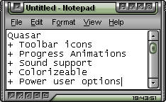
This year WindowBlinds also added some new features such as progress animations and toolbar icon changes:

Progress Animations

Toolbar icons.
Not only did WindowBlinds 4.4 add support for changing toolbar icons in Internet Explorer and Explorer as well as support for changing progress animations, it also was 40% faster in many areas than previous versions of WindowBlinds. Most users should notice an immediate performance boost when moving from the included Windows XP look and feel to WindowBlinds.
Learn more on WindowBlinds at www.windowblinds.net.
SkinStudio
SkinStudio 4.4 came out this year and it supports the new WindowBlinds features such as toolbar creation and progress animations but it also added the ability to create more advanced shellstyles (Windows explorer task panels).
For instance, normally in Windows the explorer task panels on are on the left side. But now with WindowBlinds 4.4, you can have them on the top:

See how the task panels are on the top of the window? SkinStudio supports this.
SkinStudio also makes it easy to make use of the Microsoft .msstyles format. So those .msstyles that are out there can be used just like any other skin format if you have SkinStudio installed. It's totally seamless. And what's nice is that WindowBlinds will run msstyles faster and on more programs than if they were using Microsoft's skin applying system.

SkinStudio in action
SkinStudio's home page it www.skinstudio.net.
Keyboard LaunchPad
For users looking to dramatically increase their productivity, there's The Keyboard LaunchPad. This is a relatively new addition to Object Desktop that allows users to assign a hot key to pretty much anything they might want to do.

Actions such as clipboard contents, website URLs, program launching and more. We here at Stardock use it a lot for saving clipboard contents (canned replies for instance and saved screenshots). We also use it to navigate to very common websites and support sites. This program doesn't get nearly as much attention as it deserves even though it's one of the most useful programs ever made.
Theme Manager

Theme Manager is the successor to WinStyles. It provides the single point access to all the Object Desktop GUI customization programs (plus other programs as well) for changing skins, themes, icons and wallpapers and more.
You can use Theme Manager to just change your icons. Or you can build your own "suites" of skins/themes/icons together that create an entire desktop. Think of a suite as a desktop screenshot that has all the stuff included in it to get back to that screenshot.
DesktopX
 One of the biggest stories for Object Desktop this past year has been DesktopX 2.x. DesktopX spent its first couple of years of existence as being a kind of neat technology experiment. It was this year, however, that DesktopX really
  became very useful for even casual users.
With DesktopX you can still build entire desktops, but it's become very popular for creating mini-applications called widgets. In fact, Stardock used DesktopX to create the user interface in The Political Machine and is currently using it to create the screens for Galactic Civilizations II. It's phenomenal technology.
Widgets are basically little programs that exist on your desktop. They can be as simple as clocks or as complex as a game. They have less overhead than a stand alone program tends to have which makes them ideal for doing things like playing music, monitoring system resources, displaying local weather, providing news feeds, etc.
With DesktopX 2.2, widgets can now be activated with a hot key. So even if you have them covered by a bunch of windows, you can easily bring them to top with the press of a button.
|
Photo Album of DesktopX for 2004
|


IconX
 IconX was born because as icon quality has increased, the ability to get the most out of those icons was limited.
Here's the deal: In Windows you can set your icon size globally. That is a problem because if you want to have nice big icons on your desktop, you also get huge icons everywhere else.
IconX lets you have huge icons just on your desktop if you want as well as all kinds of cool effects such as zooming icons (icons grow when you put your mouse over them), sound effects, shadows, and other goodies. And it lets you also have .PNG files as icons as well as make images into thumbnails if they're on your desktop.
The same is true of icon labels which can be really big and thick -- just on your desktop.
WindowFX
WindowFX plodded towards 3.0 this year -- slowly. But it did gain a pretty remarkable new feature that is waiting until 2005 to fully be explored: Scaleable windows:

When turned on, a user can hold down the shift key while minimizing a program to put it into scaled window mode. For users with limited real-estate, this can be quite useful. Or for people who want to casually monitor chat or other things but not have it eat up too much space, it's very useful for that as well.
New Programs of Object Desktop in 2004
IconDeveloper
Object Desktop also added icon creation support with IconDeveloper. IconDeveloper is designed to make it easy to take images and turn them into icons.

When it comes to making icons, IconDeveloper really does make it easy for people to create and adjust icons all at once. Stand-alone programs of this nature cost $30 and IconDeveloper is just another program that is part of Object Desktop.
Learn more of it at www.icondeveloper.com.
RightClick
 RightClick is a new program that went into beta at the tail end of 2004. It is a very straight forward program - it replaces the right-click desktop menu.
It can automatically inherit your WindowBlinds visual style and have all kinds of useful functionality in it (including embedding widgets!).
People who have started running it have found it extremely useful.
RightClick could be used to let power users do away with their actual Windows start bar if they want (it even supports having the system tray in it). It can also be set to have a hot key to bring it up. So unlike the "real" desktop right click menu, RightClick can be brought up even if there are windows obscuring the Windows desktop.
Coming Attractions in 2005...
WebExplorer (tentative name)
Stardock is working on an Internet Explorer based web browser. It's basically Internet Explorer with a tabbed based interface. That's it. Nothing fancy. It's not going to try to reinvent the web browser as we know it. We simply want users to be able to have a tabbed base Internet Explorer.
Enhanced File Dialog
This new feature will extend most common Windows file dialogs to have a lot more features.

All kinds of customization will become possible to the standard Windows file dialog.
Screenshots of it in action:
PowerTune
PowerTune is a significant departure from the whole "customization" portion of Object Desktop and back to the utility aspects. The idea behind PowerTune is relatively straight forward - it's getting too complicated to keep your PC optimized.
There are some great utilities out there that can help optimize your PC but they usually cost quite a bit and are usually overkill in terms of features. The main features of PowerTune will include:
-
Duplicate File Finder/Remover
-
Advanced Disk Space Recovery
-
Temporary Internet file manager
-
Registry Repair/Clean
-
Windows Task List extensions
-
Windows memory, CPU, and video performance optimization
-
Windows stability analysis and monitoring
This isn't a complete list but the general idea is to allow power users as well as casual users keep their systems running well without having to spend very much effort doing it. PowerTune is due in late 2005 in beta form.
ControlCenter 2 / ObjectBar 2
ControlCenter and ObjectBar are slowly being merged together. The idea is to make it easier for people to have virtual desktop managers that are easier to use and more productive than at present. The beta is already available of ObjectBar 2.
Conclusions
Object Desktop has come a long way since its inception. And it continues to get better and better over time. The existing key features such as WindowBlinds, DesktopX, IconPackager and so forth have become more robust and more fully featured. And new features add new value and abilities to the package as a whole. We hope you like the direction we're going and the improvements we've already put into it.
We also think it is probably the world's best software deal. For $49.95 a user gets all these things plus everything we make for an additional year. Imagine the user who purchased Object Desktop in say 2003 and decided to renew their access to get new programs and updates for the year 2004 for $34.95. The new programs and updates listed they would have received as part of that! That's less than $3 per program and update.
| Object Desktop | |||||||||||||||||
|