Comment #3 Tuesday, March 29, 2005 4:24 PM
Comment #4 Tuesday, March 29, 2005 4:32 PM


Comment #5 Tuesday, March 29, 2005 5:24 PM
This is the most practical, usefull theme that I have ever seen. Quite a step outside of the same-ol-same that has been around. Fantastic job.
Had a bit of an issue trying to unload it. Right clicked on the systray icon, chose exit and nothing happened. Had to unload desktopX to get it off.
I can't begin to rate this high enough, so 5 stars will have to do.
Thanks!!
Comment #6 Tuesday, March 29, 2005 5:28 PM
[Good job, I knew you'd keep reading]
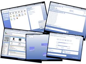
Desktop tab: Wouldn't change a thing. I especially loved the way the search targeted the Browse tab.
Information tab: The weather forcast might be a toggle. Why shoudl IO move my nouse to close a window if I am not going to interact otherwise.
Note tab: Would like option to change font via interface. Would like the edit window to appear where my mouse is. Again, why make the user move?
Music tab: Perfectly functional. I don't quite understand the purpose of showing what the player is. Either I know or I don't care. But that's me.

Browser tab: Perfectly functional.
The color scheme is
Comment #7 Tuesday, March 29, 2005 5:53 PM

Comment #8 Tuesday, March 29, 2005 6:07 PM
Thought I had finally found the theme I was
going to stick with until Now - a Desktop that
is functional & Great looking. You will be added
to my watch list - That is if you can improve
on this one.

Comment #9 Tuesday, March 29, 2005 6:22 PM
Comment #10 Tuesday, March 29, 2005 6:37 PM
Martin >> still awesome an hour later. That's about 58 minutes longer than most DX desktops last for me.

Comment #11 Tuesday, March 29, 2005 7:54 PM
| Had a bit of an issue trying to unload it. Right clicked on the systray icon, chose exit and nothing happened. |
Ditto.

Comment #12 Tuesday, March 29, 2005 9:14 PM
Thanks,
-DrDrrae
Comment #13 Tuesday, March 29, 2005 9:15 PM
Comment #15 Wednesday, March 30, 2005 2:33 AM

The "Exit" and "Autorun" does need fixing - apologies - it was going to be a widget, but widgets won't stay at desktop level which kind of ruined the plan and I forgot to amend this. I'll see if I can incorporate some of the requested features such as custom folders to navigate to.
As for the media playing - it uses DXPlayer which can be configured to use iTunes or WMP or whatever you want. ALthough I appreciate that there are advanced features I could incorporate by using specific players, I won't be doing so as I want to keep the work level down. Keep the comments coming - I'll do what I can to incorporate what you want time permitting.
BTW - it should be resolution independant from about 1024x768 upwards, but if anyone notices anything out of place then let me know.
Comment #17 Wednesday, March 30, 2005 3:13 AM
*lost for words*

Comment #19 Wednesday, March 30, 2005 6:07 AM


Comment #20 Wednesday, March 30, 2005 7:03 AM
Two, would it be possible in your browser tab to have a "links" section?
Otherwise, rock on!


Please login to comment and/or vote for this skin.
Welcome Guest! Please take the time to register with us.
There are many great features available to you once you register, including:
- Richer content, access to many features that are disabled for guests like commenting on the forums and downloading files.
- Access to a great community, with a massive database of many, many areas of interest.
- Access to contests & subscription offers like exclusive emails.
- It's simple, and FREE!


Comment #1 Tuesday, March 29, 2005 2:24 PM