|
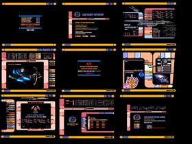
Lcars Computer net 5.5Updated Jul 14, 2007 by HG_Eliminator |
||||||
Comment #24 Wednesday, August 29, 2007 10:28 AM
 �I too am a little dissappointed that resolution problems are an issue. I understand it may be too much work to make this theme for every res possible. Me having 1440x900 and lower widescreen resolutions can be a royal pain at times when trying these themes. Anyways, love your efforts, keep it up. �
 ��
�� ��
�� �
�Comment #25 Saturday, September 1, 2007 11:21 PM
Comment #26 Saturday, September 22, 2007 1:36 PM
I use 1280 x 1204 and while say 1600 x tend to shrink down ok 800 x 600 is just to grainy to survive being enlarged.
Comment #27 Tuesday, October 30, 2007 12:15 PM
Comment #28 Tuesday, December 18, 2007 7:53 AM
if it dont show a change target option in the dropdown menu then go to the DX systray icon and right clik and start DX builder.. from there try the above steps.. it should work there..
Comment #29 Tuesday, January 15, 2008 3:30 AM
Comment #30 Sunday, August 10, 2008 11:29 AM
Comment #31 Tuesday, March 10, 2009 8:52 PM
Thank you for continuing my work on this ambitious and unique theme, you've done a great job keeping it going, I know how confusing the back-end can be a times, I'm amazed that people have been able to follow my work.
I really wanted to create something different from the predictable themes that you see every day, and to create a truly futuristic desktop environment. I had a lot of plans for this theme, but time was always against me. Supporting different resolutions is really hard, I had a resolution independent prototype interface, but it was really difficult to get it to work, without the use of scripts, which is not my thing. I guess I just wanted to create something that made people go wow, without any flashy scripts, just relying on a complex layers of mouse overs and graphic layers.
Well if you carry it best of luck
Cheers
Adam
Comment #32 Wednesday, March 11, 2009 6:13 PM
ur bud
HG
Comment #33 Sunday, November 15, 2009 4:35 PM
Comment #34 Monday, March 22, 2010 9:48 PM
Comment #35 Tuesday, December 28, 2010 12:51 AM
Man, my laptop is a natural 1360 x 768. As a result, it pretty much fails to ever have any wallpaper fit properly without stretching it to distortation, cutting out parts, or having big black boarders in centered version.
It seems to have even worse effects on your LCARS desktop. Most of the items are either overlapping, or else it appears too low on my screen and ends up cutting off half of the image.
Sadness.
Please login to comment and/or vote for this skin.
Welcome Guest! Please take the time to register with us.
There are many great features available to you once you register, including:
- Richer content, access to many features that are disabled for guests like commenting on the forums and downloading files.
- Access to a great community, with a massive database of many, many areas of interest.
- Access to contests & subscription offers like exclusive emails.
- It's simple, and FREE!


Comment #21 Friday, July 27, 2007 12:43 PM
I think some of the resolution issue could be solved with some changes as to how it uses the wallpapers, it might work better to make "objects" with the images and then center them, or split them into their respective pieces, and then you could have each section be able to be moved, etc. Just an idea, this looks incredibly complicated, and works very good.
Great work!