First screenshots of WindowBlinds Vista
Windows Vista gets skinnable!
Wednesday, August 30, 2006 by Frogboy | Discussion: WindowBlinds
ObjectBar 2.0 in about 2 weeks
A quick preview...
Monday, August 28, 2006 by Frogboy | Discussion: ObjectBar
ObjectBar 2.0 is finally complete. Stardock will be releasing ObjectBar 2.0 on September 12th. So what is ObjectBar and what has taken so long to go from 1.6 to 2.0?
What is ObjectBar
 ObjectBar is essentially a GUI construction kit. With it, users can create their own alternative interfaces of Windows XP (and soon Windows Vista). After all, Apple and Microsoft aren't the only ones with ideas on how the desktop interface should be done.
ObjectBar can pretty much emulate virtually any existing desktop interface out there as well as add new twists to them or enable users to create their own. Creations can be exported as actual programs that others can use (or the bar theme itself can be exported for those who want to trade and modify each other's designs).
ObjectBar: Two groups of users
ObjectBar content is much more involved than what is the norm in skinning. ObjectBar content can be split up in two pieces: The actual bar theme and then the skin for the bar. One could imagine the Windows Sidebar in Windows Vista or the Start Bar or the Mac finder as being examples of bar themes. But beyond that, those themes can also be skinned independently.
ObjectBar skins are best when designed for the bar in question but ObjectBar can also automatically inherit your WindowBlinds skin. The bar themes themselves are very customizeable. If the person who creates the bar theme exports it as an EXE, the user of the EXE (as long as they have ObjectBar installed) can use that bar theme as a stand alone program with a much simplified interface for adding content and tweaking what's there. It's powerful and yet simple.
ObjectBar 2: Years in the making
 For a long time, ObjectBar 1.x was quite popular with power users. The problem Stardock ran into was one of support and expanding its market and deciding where it should go. It seemed to be stuck between worlds. Google, Microsoft, and tons of other companies have gotten into the "sidebar" business. That is, having a vertical bar on the right side of the screen that users can insert various things into (clocks, gadgets, RSS feeds, short cuts, etc.).
Such specialized programs tended to do what they did very well. ObjectBar, by contrast, has been a generalist -- you could create a Sidebar with it. A fully skinnable sidebar at that. And since ObjectBar 2 supports embedding DesktopX widgets, you could create some pretty spectacular sidebars. But here's the problem with that -- the widgets and skins would have to be made with that particular sidebar theme in mind.
So what Stardock has done is re-imagine how ObjectBar is likely to be used. First off, it made it so that the people who spend the time to create the bars can export them as programs. Secondly, it has begun to try to separate the skinning from the bar creation part. To that end, Stardock has made creating new bars somewhat more technically challenging but resulting in far more powerful and interesting bars. On the other hand, customizing and modifying those bars has been made much easier. Before, it was just somewhat hard to do most things but never easy to do anything.
The ObjectBar 2 Strategy
 With ObjectBar 2, Stardock intends to provide a series of high quality template bar themes created by Jeff Bargmann and Treetog. Then make it relatively easy for users to create skins for those bars. The WinCustomize gallery will be set up so that users can upload skins that are distinct from bars. A skinning guide has been developed and will be made available.
Since ObjectBar is a super-set of anything that any sidebar or similar program can do, it is our hope that by focusing initial effort on a handful of bar themes and then branch out from there as others create new bar themes that we can build a strong customization community for ObjectBar 2.
The key is for users to recognize that there are two elements at work here: Bar themes and skins. And while a bar theme will include a skin (by default) that users can create skins on their own. So picture dozens of Sidebar skins or Finder bar skins or other types.
ObjectBar 2.0 on September 12th. Stay tuned!
Vista 5536: Is there time to fix it?
A short review of Windows Vista build 5536
Saturday, August 26, 2006 by GreenReaper | Discussion: Windows Vista
As the developer in charge of Stardock's Vista labs, I'm one of the few who gets to "play" with the new builds right away. Up until now this has meant several hours of reinstalling software over the top of a fresh install. This time I tried an upgrade from 5472 to 5536, and as it's the way many of you will be introduced to Vista I thought I'd share the results with you. I also wanted to see whether or not I agreed with blogger Robert McLaws, one of those who has been playing around with the interim builds and who has been predicting great improvements ( http://www.longhornblogs.com/robert/archive/2006/08/24/Windows_Vista_Pre_RC1_Is_Available_Now.aspx ). Is he right? Read on for my take . . .
Impressions of 5536...
The setup has started to include the "info cards" - in this case, little messages promising that you, too, can be a great director, famous (PowerPoint) presenter, or maybe even pilot the space shuttle with Windows Vista. Again, Microsoft is trying to push the "experience" on you - and giving you something to look at while you wait for its performance ratings to complete. I'm told a clean install is not that bad, but you have to wonder how many end users are going to be doing a clean install. In truth, the upgrade didn't take more than around 45 minutes for me, though I've had others say it took them over an hour. I could see upgrading from XP taking longer, if only because most upgrade candidates will have big registries and more cruft for the installer to sort through.
So what's the score once you're upgraded? On my dual-core E1505 laptop (labeled "Windows Vista Capable" by Dell, though that's pushing it for their lower models), it takes about 30 seconds from the start of the Windows booting process, 50 to the desktop and 1:00 to the Welcome screen . . . and after that it's hard to tell because other things kick in, but you can start working straight away. It's not slow, though I suspect this relies significantly on having half a gig of memory around to throw at the boot process. My total boot load was a shade over 550Mb, which compares less-than-favourably with the 230Mb of XP on the same laptop. Admittedly, I'm not running the Tablet PC service on that (nor will regular Vista users have to), and it trimmed about 50Mb off the working set over time. Still, I wouldn't want to actually use Vista in less than 1Gb, particularly since every single open window carries the cost of the DWM's buffering.
One of the things that really does keep going is Windows Defender and the Windows Firewall. They appear to make significant disk accesses totaling (on various boots) 50-100Mb by the first five minutes just after loading up the desktop. Security! The joke that the second core was added to check up on the first one is getting a little too close to truth, though the real cost is waiting for the disk. Good thing I got a 7200 rpm disk. On the whole, though, performance is definitely far closer to that which I'd expect from an operating system that's meant to be released in, yes, two months.
There's a few nice little user interface tweaks that make things just a little bit more friendly; for example, the way the "other logoff options" button is actually large enough to hit this time around. Progress remains to be made: on my laptop's high-DPI screen (an upgrade which I readily recommend) all the column headers in were incorrectly sized, making it harder to see what was actually being displayed. If Microsoft expects its ISVs to expend the effort to solve such problems, it needs to get its own software following best practices first. And yes, Windows Media Center looked great - except I didn't have a cursor!
Some things seem set to remain obscure to most users with Vista, like how badly your disk is defragmented (requires use of a command-line tool in administrator mode), and exactly how much help that USB key is as a ReadyBoost device. Perhaps that's for the best, considering Vista's main target market, but "you don't need to know" still rankles to a techie like myself. Worse, I've heard they want to make the logon sound mandatory ( http://scobleizer.wordpress.com/2006/08/24/the-startup-sound-in-vista/ ). Guess what, Microsoft? It's our computer, and you're the guest. Learn to live with that restriction on your branding efforts, and put in a usable "off" switch, or we'll do it for you.
Drivers remain an issue, too. At least now there are drivers for most components, though some features are lacking (including Vista-compatible help for Device Manager itself). OpenGL still isn't all the way there, even though my X1400 drivers were built just 10 days ago. This is partly Microsoft's fault, because they didn't finalize a high-performance interface for OpenGL until it was almost too late to have one at all. Maybe they were concentrating too closely on DirectX 10, overlooking all the great consumer applications that make use of the competition - like, oh, Second Life, which still bombs out in this build.
That wasn't the worst flaw. On a hunch, I shut the lid. 7 seconds to sleep - not bad, though it could be better. I opened it back up, and . . . whoops. The screen powers up, but it's not showing anything, and the system is non-responsive. Scratch one for the RC - this is a laptop, it needs to be able to sleep. Others here at Stardock have had other serious problems that appear to be linked with display drivers, and it's clear we're going to continue to need to see significant improvement in this area. I'm sure the driver crews are working flat-out at NVIDIA and ATI AMD.
Edit: As of 2 September, ATI has released drivers that fix this problem.
The company has been dragging its heels for a while, pushing little features into the product to make up for all the big names (remember WinFS?) that didn't quite make the cut. It seems they've mostly gotten past that, though you know they're going to want to spring a feature or two on us for the RC (Virtual PC Express, for a start - http://blogs.zdnet.com/BTL/index.php?p=2649 ). Speaking on behalf of the development community, I'm glad to be entering the finishing straight. We need a stable set of features to build our own programs on.
The Verdict
So are the latest builds really any better? Despite the problems, a I'd have to say a qualified yes. It's about time - there's precious little of it left to fix the very real bugs that remain, let alone the "features" being forced in by Microsoft Marketing. We're going to need a release candidate out soon in order to find all the niggling little compatibility issues. That requires Vista to be solid enough for beta testers to want to use it as their main OS, and from my experiences it's not quite there yet.
Microsoft's developers have a little over two months to deliver on what they've promised - a next-generation operating system that can provide a solid base for years to come. This build is a sign that they may finally be in gear: but I worry that it may be too little, too late. Will they rise to the challenge, and deliver something they can be proud of? For all our sakes, I hope so.
Sometimes, Companies Get Customer Service RIGHT
...and even more shocking, this time it's a computer hardware company!
Tuesday, August 22, 2006 by Zoomba | Discussion: Personal Computing
When the latter happens, we grow frustrated, and even though we may be a day or two past that magical 90 day timeframe, we still try and call tech support. However, for the past several years, it's been very common to encounter a know-nothing tech support worker in India when calling for help in bringing back to life that card, drive, monitor etc that you shelled out hundreds of dollars for and feel should have lasted perhaps a bit longer than three months. Now from time to time you'll be (un)lucky and the equipment will die before the warranty expires. Unfortunately, that does not make the support experience any more bearable as you'll struggle to get your far off friend to understand even the most rudimentary description of your problem. It only gets worse if you actually KNOW what's wrong and needs to be fixed since you'll still be forced to go through the inane checklist of common problems that tier 1 support is required to go through before transferring you to someone who actually has a clue. Yes, I have tried rebooting, cycling the power, reseating all the connections, sacrificed the chicken, spun around three times and spit over my shoulder... I work in IT, this is all SOP to me, THE DAMN THING IS BROKEN NOW FIX IT!
So it was with the dark memories of dealing with support lines from Dell, Gateway, HP, and any cable company I've ever had, that I took to assess my recent situation...
My video card was dying.
In March, I bought an eVGA GeForce 7800GS OC 256MB AGP card from Newegg.com to coincide with the release of The Elder Scrolls IV: Oblivion (I also picked up an extra two gigs of RAM... I wanted to make sure the game ran as good as it could on my system). It's a phenomenal card and performs as well as I can possibly expect any AGP card to. It's essentially the top line card I can get for my aging AGP based system. So, for five months I was in relative gaming bliss as I was able to get some of the best graphics out of all the latest games and all was good with the world. Then, shortly after moving to Michigan last month, things started to go awry. I noticed weird "stuck" pixels on my monitor when playing any 3D game. This was strange because I have an old CRT monitor and those don't get stuck pixels. But it was very consistent with which pixels were fried so at first I thought it was my monitor, but no tests I ran showed any issues, and I saw the same problems with my spare LCD monitor. Additionally, I was seeing odd geometry drawing issues where polygons would have one vertex suddenly stretch off into the distance, and strange colored splotches appeared on more complex textured surfaces. This brought me to the remaining possible culprit, my video card.
I've had video cards die on me in the past, fans went out, the ability for the card to draw enough power went away etc. However, my cards typically tend to last a year or two before shuffling off their mortal coil. I ran power tests to make sure all my rails were pushing the right amount, and that came clean. I even went so far as to toss in my aging ATI 9800XT 256MB card I had sitting in a box to make sure it wasn't a board or power issue. That card worked like a charm (though MUCH slower in new games since it's so old). Now, with my options exhausted, it was time to face the music, pay the piper, bite the bullet, confront my demons and.... CALL SUPPORT!
The dread and fear were palpable, it was like a thick fog that clung all around me, ethereal and slimy all at the same time. Would it just be easier to go out and buy a completely new card, forsaking this one? Surely the frustration and agony of dealing with phone support wasn't worth $300. Well, I don't have any cash at the moment, so I had to suck it up and pick up the phone.
So, since I bought the part through a reseller, I had to call the manufacturer, eVGA.
I call... press my way through the automated option system until I reach the "speak to a goddamn human" option and get into the hold queue.
And wait...
About a minute. Wow, that was fast. A cheerful voice greets me in a perfectly normal and understandable accent. This guy is a native English speaker! Oh dear sweet lord, surely I have somehow died while waiting on hold and passed on to heaven, this being but part of my eternal reward for endlessly enduring the stupidity of users and the rivaling stupidity of outsourced tech support. I check my pulse, pinch my arm and determine that I am in fact still alive, my time to pass from this realm had not yet come... and that meant that I had actually gotten a real English-speaking support rep on the line after virtually no wait on hold.
For the sake of this article, lets say the rep's name is John (I don't remember what it was, I didn't think to write it down at the time) and he was very polite, cheerful, and responsive. He asked me if I had registered my video card on the eVGA website. I had. He then asked for a description of my issues, which I supplied. Then came the question I was dreading the most "When did you buy your card and from who?" to which I said "March" fearing for the standard 90 day warranty to bite me in the arse. Nope, no problem, he informs me that eVGA cards have lifetime warranties. If the card dies for any reason short of being the result of stupid human tricks, eVGA will replace the card no problem. Only catch is, they don't cross-ship, meaning I have to ship my card to them before they'll process it and send me a replacement. This means I'd have to be without my beloved 3D card for a full week or so... of course it's not like it was giving me much performance at this point anyway with the rainbow colored randomly expanding polygons in most of my games. So I send in an RMA request, a day later it's approved and I ship my card off to eVGA in California.
And a week later, the replacement card lands on my desk, all packed up in a nice little plastic protective bubble. It's a newer build of my same card so hopefully the old issues won't come back. I get the card home, plug it in, and I'm getting performance in games I haven't seen for several months! Implying that the card had been on a steady decline for quite some time now. I've had the card in my system now for a day and I'm back up to speed playing all my favorite games, and even loaded the Battlefield 2142 beta which is running without a glitch!
Despite the card dieing so soon after purchase, which I'm given to believe is an anomalous glitch, the support from eVGA was so responsive, and easy to understand (yay English!), coupled with the lifetime replacement policy, eVGA has won my graphics card business for a long time to come. This is especially good for them considering I am building out a new system come next spring and will be considering going SLI and PCIe. I will recommend them to anyone who asks for a good reliable card manufacturer.
An Interview with .Zer0.
Skinner of the Month Series for August 2006
Monday, August 21, 2006 by Zoomba | Discussion: Community
| .Zer0. Interview Late last month I was able to take a bit of time to chat with .Zer0., author of XP Format and Eminence for WindowBlinds over IM. We chatted about his two very popular skins, how he got started in skinning, what he has coming up next for us, and of course an obligatory Monty Python reference. As was announced last week, .Zer0. is the first one to be featured in our Skinner of the Month series. [Zoomba]First off, I just wanted to say how much I'm enjoying your skin, Eminence. I'm a minimalist when it comes to my desktop, so your skin is perfect for me. [.Zer0.] Thanks. Care to see what I'm currently working on? Definitely! I really like the lighter look you have going in the first screen. Tell me, how long now have you been skinning? Four months. But I've been doing graphic design for two years. Wow, so XP Format was your first attempt at a skin? Well, XP Format was my first [posted] skin. There was one right before that, but I didn't finish it, nor would I consider it a true skin. More of a get-to-learn SkinStudio thing. Was the original skin the same style of Eminence and XP Format? Um, more Vista-ish. I think I was going to call it Vista XPed. I found/find SkinStudio a bit hard to navigate. It's buggy sometimes when slicing images. Were there any particular resources you used to learn the program and overcome some of its oddities? I used a lot of other popular skins and disected them to see how they worked. That was the major way I learned. I already knew about transparencies and things like that from doing web design. So I kind of transitioned into skinning from web design. Was the transition a hard or easy since you already had some experience designing user interface elements? The concept was easy, but learning to use the new software was frustrating at times.
Eminence looks a lot like XP Format in form and style. How many elements from Format were moved over into Eminence? A lot of the gloss was moved over and maybe the window button glyphs. Was there anything on Eminence that didn't turn out as well as you had hoped? Well, Eminence started out as a light and happy skin. But most of the things I wanted came out. The shellstyle hasn't worked out yet. Animations are needed, and I would like to work with the taskbar. A light and happy skin? Why the change? I was just messing with the skin and thought it [the dark coloring] looked better than the white. What's your favorite WindowBlind out there at the moment? I like Thallos, Royale Vista and many others. I probably change my skin every other day. Do you have any particular skinners that you prefer? I like kol's style most of the time, and JJ Ying's some of the time. Dobee has some nice skins lately, but kol has been my favorite for a while. The inner parts of his Thallos inspired Eminence. What is the average air speed velocity of an unladen swallow? 8 meters per second You looked that up on Google, didn't you? Yeah I did...
http://www.style.org/unladenswallow/ You obviously have an eye for aesthetics, and you said you've done web design. Do you plan to pursue a degree and/or career in some area of visual design? I would like to do software programming or interface design. Coding huh? Have you considered combining your art skills and interest in programming to try your hand at building DesktopX widgets? I have, I just don't know the coding structure, so there is the learning curve again. Last question. If you could change one thing about WinCustomize.com, what would it be? The theme. I don't like the baby blue. Thanks to .Zer0. for agreeing to take the time and answer questions to kick off our Skinner of the Month series. Be sure to check out his Eminence and XP Format WindowBlinds and keep an eye out for his upcoming skin later this summer. Expect to see a new skinner highlighted each and every month. If you're a skinner (WindowBlinds, icons, ObjectDock themes, DesktopX etc...) and would like to have your work featured, or if you know someone in the community who you feel deserves more attention, drop me a line at mikec [ at ] stardock.com with the subject "SotM Suggestion" |
 |
DX Tutorial #6: Date/Time Widget - PART 1
Creating your first DX Widget Step-by-step! - PART 1
Wednesday, August 16, 2006 by RomanDA | Discussion: DesktopX Tutorials
My goal is to make a set of tutorials for DekstopX. If you have ideas on what you would like to see, please email me at DXTutorials@RomanDA.org
Time/Date & more - PART 1:
I have been asked about a dozen times how to get this or that date info into an object. So I will try and cover that here.
This is not my typical tutorial, this will be a STEP-BY-STEP Creation of a widget, not just some code.
DOWNLOAD THE ZIP FILE FOR THIS TUTORIAL FIRST!
DekstopX can use JavaScript or VBScript as its language, I am a LOT more familiar with VBScript then JS so that is what I use.
As always, I'm sure there are other, if not better ways to do this, but this is my way.
| The Players: | |||||||||||||
| Here are the objects we will be setting up: (forgive me Danniloc as some of this was from our conversation - the graphics are mind but look like the one your working on): | |||||||||||||
| |||||||||||||
Creating the Objects: | ||
| For those of you that have never used DX this is not hard, I will walk you through creating the above object. LOAD DekstopX and go into the CREATE mode: * if you do not have DekstopX (builder) you will need to download it. | ||
| BASE OBJECT: | ||
| Create the BASE object by | ||
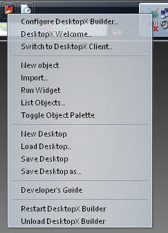 |
RIGHT-CLICK on the DekstopX Icon in the system tray.
Select "New object" <-- See this for more info | |
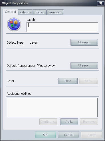 |
The Object Properties Dialog will show up.
Click the "States" Tab | |
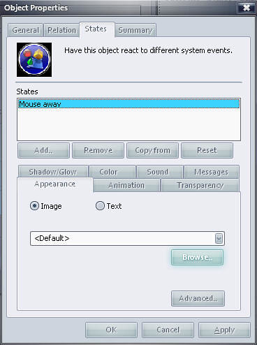 |
Click the "Browse" Button. | |
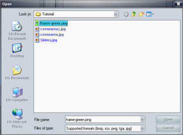 |
Select the "Frame-Green.png" File from the 6-DateWidget.zip file here.
Select "Open" Click "OK" in the "Object Properties" Dialog box. | |
 |
You should now see your FRAME or BASE object.
| |
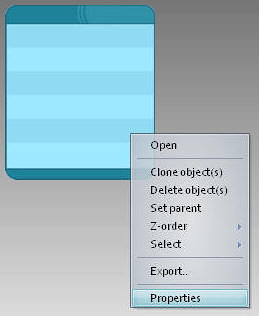 |
RIGHT CLICK on this object and select "Properties". | |
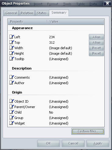 |
In the Object Properties dialog, select the "Summary" tab
In here we will change the following: Object ID: BASE Group: DateWidget Widget: DateWidget If you want you can add your name to the "Author" Section.
When done editing these, click the "OK" Button. | |
| OTHER OBJECTS: | ||
| We will follow the same above steps to create the TEXT objects but there will be a few minor change. I'm not going to re-post all the same images, see above if you get lost. DayOfWeek Object | ||
 |
RIGHT-CLICK on the DekstopX Icon in the system tray.
Select "New object" | |
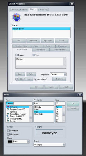 |
Select the "States" Tab
In there select "TEXT" not "IMAGE" from the Appearance Tab. Type in "Monday" in the provided text area Select Alignment: CENTER Click on Font and select a font you like, I like Tahoma, you can pick whatever you want, be advised the size, and font will make some of the next screen shots look strange, for now pick Tahoma and 12 and bold, you can come back later and change it. Select OK on the Font Dialog. Select the Color Button, select a dark color something that will look good on the white background (or gray), I'm picking a dark gray.
| |
 |
In the Object Properties dialog, select the "Summary" tab
In here we will change the following: Left: 0 Top: 20 Width: 150 Height: (image default) Object ID: DayOfWeek Parent/Owner: BASE Child: YES Group: DateWidget Widget: DateWidget
When done editing these, click the "OK" Button. | |
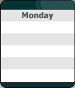 |
This should be your new widget
Congrats, its beginning to look like something. | |
| MonthName Object | ||
| Follow the exact same steps from above except this time you will put in:
"August" in the text area, and the following in the Summary Tab: | ||
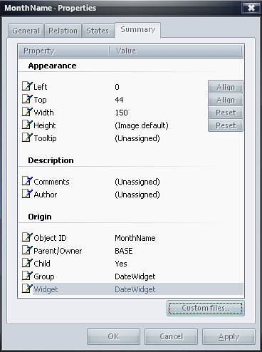 |
In the Object Properties dialog, select the "Summary" tab
In here we will change the following: Left: 0 Top: 44 Width: 150 Height: (image default) Object ID: MonthName Parent/Owner: BASE Child: YES Group: DateWidget Widget: DateWidget
When done editing these, click the "OK" Button. | |
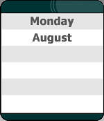 |
Your new object should look like this now. | |
| Date Object | ||
| Follow the exact same steps from above except this time you will put in:
"16" in the text area | ||
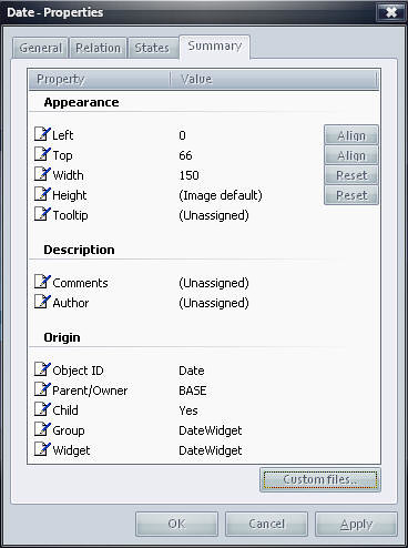 |
In the Object Properties dialog, select the "Summary" tab
In here we will change the following: Left: 0 Top: 66 Width: 150 Height: (image default) Object ID: Date Parent/Owner: BASE Child: YES Group: DateWidget Widget: DateWidget
When done editing these, click the "OK" Button. | |
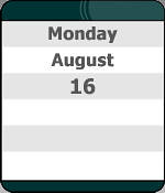 |
Your new object should look like this now. | |
| Year Object | ||
| Follow the exact same steps from above except this time you will put in:
"2006" in the text area | ||
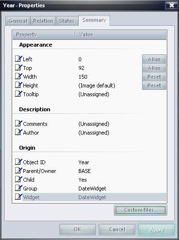 |
In the Object Properties dialog, select the "Summary" tab
In here we will change the following: Left: 0 Top: 92 Width: 150 Height: (image default) Object ID: Year Parent/Owner: BASE Child: YES Group: DateWidget Widget: DateWidget
When done editing these, click the "OK" Button. | |
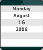 |
Your new object should look like this now.
See we are getting there. IF you have done everything correct up to this point, you should be able to "DRAG" this around, and everything should move as 1. If something moves that shouldn't you will need to RIGHT-CLICK on that object, hit Properties, then make sure that the Group and Widget are both "DateWidget". then check it again. | |
| Time Object | ||
| Follow the exact same steps from above except this time you will put in:
"10:16 am" in the text area | ||
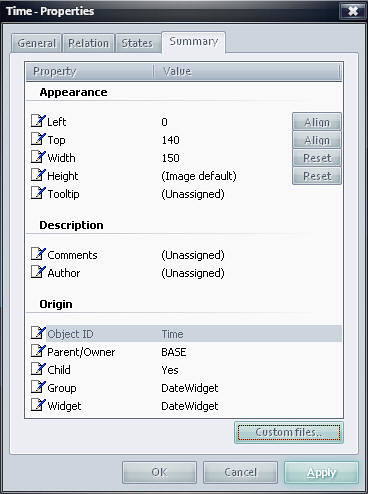 |
In the Object Properties dialog, select the "Summary" tab
In here we will change the following: Left: 0 Top: 140 Width: 150 Height: (image default) Object ID: Time Parent/Owner: BASE Child: YES Group: DateWidget Widget: DateWidget
When done editing these, click the "OK" Button. | |
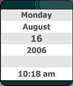 |
We are now done creating objects.
Your widget does nothing at this point except show the text we put into it. Its time to start making this thing WORK. | |
Please look at Part 2 for the continuation of this tutorial, and PLEASE let me know if you find these useful.
 |
Enjoy, RomanDA AKA: David A. Roman http://romanda.wincustomize.com http://www.romanda.org DXTutorials@RomanDA.org |
DX Tutorial #5: Slip Sliding Away
RomanDA's DX Tutorial Series
Sunday, August 13, 2006 by RomanDA | Discussion: DesktopX Tutorials
My goal is to make a set of tutorials for DesktopX. If you have ideas on what you would like to see, please email me at DXTutorials@RomanDA.org
| Slip Sliding Away | |
 |
After working on the GalCivII Widget Bar [ LINK ], I was using a lot of code that kept the "sliders" locked to the left side of the screen.
I was challenged to make it so they could "slide" to the top or bottom, or even to the other side of the screen. The actual code was not really that bad, but it was a little convoluted. |
| STEP 1: Setup DRAG | |
| First lets setup the sub "ON_DRAG" so that we can pull the x/y & cursor positions. | |
| '--- Function to handle the DRAG
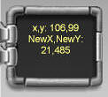
Sub Object_OnDrag(x, y, newX, newY) '--- Store the Currrent X/Y location of the object BEFORE its moved (or NOT MOVED!) '--- Set this to False so that it will move the item's x/y by default '--- Set the text in the interior object (its only so we can see what is going on, |
| STEP 2: Determine the Edges of the Screen | |
| It took me a long time to work out the following SIMPLE code. | |
 |
If this is your normal screen in my case ill use 1600x1200 just to have something to use for reference. | |
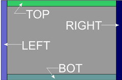 |
In this case I'm using the width of the Widget and height of the Widget for this "border".
oTop is the Height of the object
| |
| STEP 3: Setting the Screen Position | ||
| Now that we have the height/width areas designated, we need to setup a "test" to see where the cursor is.
In this case I used TOP/BOT/LEFT/RIGHT, you could re-arrange these to change what supersedes things.
| ||
STEP 4: Dragging things around | ||
| We now have our 4 screen "areas"; TOP/LEFT/BOT/RIGHT We can now use a SELECT CASE in order to handle the 4 states and an "ELSE". In order to keep the "LOOK" of this widget, we will ROTATE the object to keep the "rail" aimed at the edge of the screen.
| ||
STEP 5/6/7: Things keep dragging on and on. | ||
| We now have our 4 screen "areas"; TOP/LEFT/BOT/RIGHT We can now use a SELECT CASE in order to handle the 4 states and an "ELSE". In order to keep the "LOOK" of this widget, we will ROTATE the object to keep the "rail" aimed at the edge of the screen.
| ||
This is just PART of what would be needed to be able to move an entire widget around the screen.
You would also want to setup some sort of code to save the position, also you would want to setup something to store the default top/left/right/bot position.
Also, if you have items inside the widget (IE A CLOCK or a CALENDAR or a WEATHER OBJECT) you would have to have code for every object in there to move it around.
Good Luck, and happy DXing,
 |
Enjoy, RomanDA AKA: David A. Roman http://romanda.wincustomize.com http://www.romanda.org DXTutorials@RomanDA.org |
This Week in Skinning
Friday, August 11, 2006 by Zoomba | Discussion: OS Customization
| It's Friday! Huzzah! To celebrate the end of the week, here's a bit of a recap for you as to what's been happening in the world of skinning since Sunday. This is just a quick run-down of stats, stories and major happenings just in case you missed anything.
Submissions Ever wonder how many submissions get added to the library every week? Here are the numbers for a few of our more popular categories:
News The goal is to get at least three news articles up per week on WinCustomize, but some of them stand-out more than others. Here are a few of the larger stories posted to the front page this week:
Other misc news includes the Department of Homeland Security telling you to patch Windows. DeviantArt launches v5 of their site and Apple gets everyone worked up over their WWDC keynote speech. Next Week So that's what happened this week. Check back in next week for our first Skinner of the Month, a new contest for WinCustomize, and some news on the return of a large multi-site skinning competition!
|
 |
Handles
Where, oh where did that handle come from?
Monday, August 7, 2006 by KiloKrash | Discussion: Community
"KiloKrash, what the hell kinda name is that! You better not be doing any cocaine! You think I’m stupid, but I know these code words you kids use. Kilo means a kilo of coke, Krash means you’re crashing because you overdosed. How could you give me that name as an example, you should be ashamed."
After I collected myself, I explained to her that KiloKrash could be linked to many things. I however, used ‘Kilobyte’ and ‘PC Crash’ to create my handle...no NOT cocaine. Let’s see, add the crash, subtract the byte, replace the C with a K and Voila!
Now to my point of this post…How is it you came about choosing your handle? Is there an interesting story behind it? Please speak, share with the community your reasoning for your decision.
Cheers,
KK
Why do people hate the Mac so much?
Friday, August 4, 2006 by foreverserenity | Discussion: Personal Computing
I can’t understand it. Why is Macintosh so disliked by so many? I used to use the Mac a couple of years ago at one of my jobs. The boss liked Macs and only bought Macintosh. As a PC user at the time and having never used the Mac, I didn’t really feel intimidated by it.
It took me a couple of days to get the hang of it and I actually liked it! There was no big deal to it. After having used it for over three years (my time at that position) I actually loved it!
At my next position it was back to PCs again. Once again, it was no problem to get back with the flow of using it.
I came across some comments recently on a blog site and I can’t believe how much the each person either really hated or really loved Macintosh. I mean the things those people wrote, they got personal!
Is it really that serious? Can’t there just be some people who really, really love the Mac and some really, really love the PC? You know what? I blame that commercial that’s on right now. It’s their fault there’s all this ‘be hating’ around now. That or it just picked at a boil that was always under the surface and have opened up a really ripe wound!
These are some of the comments I read on the NY Times. It was an article that wasn’t even so much about PCs or Macs it was a totally different topic. I won’t post the article itself since it had nothing to do with what I’m talking about here, although it (the article) was interesting, that is for another blog at another time.
__________________-
“Mac users always fail to realize how few they are. It is a pain and expensive to create a parallel system for so few people. Don’t believe the product placement in movies, only 6% of our website’s visitors for example come from mac users (almost 3% use lineux for comaprison).
It would be like demanding MTV translate its site into spanish NOW, but at least there are a lot of people who speak Spanish.
You wanted an expensive white computer, and now you have it. Just don’t expect the rest of the world to jump.
Andrew
www.boomchicago.nl
— Posted by Andrew Moskos”
“macs suck
— Posted by Dom”
“Macs have an influential presence online which makes that 4% feels like 75%.
lonelygirl15 sounds like a show already.
— Posted by Ajit”
“# 1: Trying to mock Mac users by pointing out how few of them there are doesn’t work. In fact, that’s the key to Apple’s cult-like appeal. If everyone really started buying Macs, hardcore Mac users would be emotionally devastated. And if there are so few of them, why waste your breath baiting them, anyway?
— Posted by ted”
“Ted,
As a Mac user, I have to admit you’re right. If everyone’s computers ran an operating system as intuitive, beautiful, and straightforward as OS X, I’d be seriously upset at having lost my elite status.
Now if only we can get Microsoft to redesign the iPod, maybe I’ll switch back.
— Posted by Nick vdK”
“Mac users are very influential, much bigger than whatg they represent online. Only a single digit porcentage of people using Macs (4%) does not mean they are not important or influential. As an example, 45% of Wired Magazine users, a magazine read by influential people interested on advances in technology, life and culture, are Mac users (by the way, Jews are 0.5% of the world population but they account for more than 20% of Noble prizes).
— Posted by Max
“Andrew Moskos” is only partly right: Mac users are numerically a minority, but like “Ajit” notes, we have a disproportionate influence on the culture. We cluster into info. and other related media jobs, which control the mental world of all you PC hacks. Kind of like gay people. Oh, yes, I remember, the word is “elites”: few but strong!
— Posted by Tdawwg”
“August 3rd,
2006
4:36 pm
Mac Users may only be 6% on your site, but we are also better educated, make and spend more money and dominate the artistic and media-driven world. Once you go Mac you never go back.
— Posted by Mark Flora”


