The end of year musings: 2014 edition
Wednesday, December 31, 2014 by Frogboy | Discussion: Personal Computing
Naturally I’m waiting until the last day of the year to finally write this.
If you’re looking for a drab, properly edited, PR approved article, this is not that article. So hang on as we do a skim through of the hyperbole of awesomeness that’s been going on this year.
Let me get this part out of the way: If you’re a gaming journalist, we’re going to be at GDC with a suite. In that suite will be Soren Johnson (Civ IV), Bruce Shelley (Civ, Age of Empires), Dan Baker (co-author of the DirectX shader language, engine lead on countless games), Dave Pottinger (Age of Empire series), Dorian Newcomb (art director on countless games), Tim Kipp (system lead on countless games including Civ V and industry expert on touch UI integration). And we’re going to be showing a lot of never before seen things and reacting to some of the upcoming industry announcements that aren’t currently public. If you’re in the media and want to cover any of this, contact our PR manager, Stephanie Schopp (stephanie@tinsley-pr.com).
Now, let’s talk about this past year:
Here’s a brief recap for those of you in the Stardock community:
The new game studios
Back in 2011 when Stardock sold Impulse to Gamestop we were asked what we were going to do with all that capital. At the time, I said we would set up an investment fund to help fund startups. 2014 was the year when we unveiled the first of these new companies. It’s been a real challenge keeping the things we’re working on under wraps.
Oxide Games
 www.oxidegames.com was announced early this past year and unveiled a tech demo called Star Swarm. Someday we’d like to do a full on game of it but the purpose here was to show Mantle (and while we couldn’t say anything at the time, how a future DirectX 12) could dramatically change the way games are made. Right now, as we speak, any games you’re playing are communicating with the GPU via 1 core. You have 4 cores? 8 cores? That’s nice. They’re doing little for you in terms of improving your gaming experience. But Mantle and DirectX 12 will change that. This will be a very big deal in the coming years.
Oxide is making a new type of 3D engine that will take advantage of this which will allow us to make new types of strategy and role playing games into the future.
The Oxide team is led by what was essentially the Civilization V engineering leads which includes one of the developers of the DirectX shader language.
Mohawk Games
 Meanwhile, acclaimed designer, Soren Johnson and I founded Mohawk Games together. Soren is best known as the lead designer of Civilization IV. He has assembled an amazing team from around the industry and they’re currently working on a game called Offworld Trading Company. And the good news is that this game is expected to go into Steam early access around this February.
OTC has been a mixed blessing. I kid you not that this game is banned from being played outside of lunch hours now. Even though it won’t ship until 2016, it’s been being played multiplayer for a long time. Don’t worry single player fans, Soren has you covered. Even now, it’s single player AI is remarkably good (did I mention it’s still a year away from release). Once released, its addictiveness will no doubt result in arrests and investigations. I’ll be in Belize by then.
Stardock: Towson
We also opened an office in Towson Maryland. We’ve been lucky enough to recruit some amazing talent including Civilization V art leads (terrain, models, etc.), sound and music leads and some Big Huge Games veterans. We are very fortunately to be located down the street from Firaxis, the world’s #1 strategy game studio (imo) and we share the building we’re in with Brian Reynold’s Big Huge Games (though they managed to get the lead graphics dev we wanted for Star Control! ![]() )
)
The studio out there is working on Star Control. Right now, it’s just the underlying game systems (which uses Oxide’s Nitrous engine). The main game is expected to begin development this year once we’ve recruited a lead designer for the game. Unfortunately, Paul Reiche, one of the best game designers in our industry’s history and the creator of Star Control 1/2, is pretty busy on Skylanders these days.
We’ll be talking a lot more about the new Star Control in 2016. Not too much will happen this year other than saying that while we will continue to support and promote the original Star Control classic series (www.starcontrol.com) the new one will be a reboot and have a different set of lore from the classic series.
Mothership Entertainment
Meanwhile, down in Texas, industry veteran Paul Tozour and us have founded Mothership Entertainment. They’re working on a game that we expect to announce this year but won’t be released until 2016. I can’t even hint at it right now. ![]()
Stardock: Austin
All the new games, including Galactic Civilizations III and Sorcerer King will be using a new meta game service we internally call Tachyon. The simplest way to describe it is that it’s Battle.net built on top of Steamworks. So in case there’s any question on this: As far as Stardock is concerned, Steam is the PC game platform and Steamworks is its API. I could write entire articles on how impressed we’ve been with Valve. They run Steam in a way that only a privately held company could run it. But I digress.
We want our new games to be able to have a meta experience like you see with Battle.net (which we love). Luckily, we were able to recruit one of the original Battle.net architects, Adrian Luff from Blizzard to run the new studio.
Other cool stuff coming up
BonusXP
 Ensemble Studios created some of the best games of all time including Age of Empires and Age of Mythology. When Microsoft closed Ensemble, many of its key leads went on to form a new company called BonusXP.
In 2015, their first major PC game will be announced. The new game, whose developers include Dave Pottinger and Bruce Shelley is expected to be unveiled before GDC in 2015. One of the reasons we feel very certain this game will become very popular is that after playing it, its game mechanics seem so obvious in hindsight. In fact, I expect we’ll see a lot of games…borrow from it in the future. I’m a fan.
Windows 10
We have a lot of things coming up for our non-game software (Object Desktop). Still, if all goes well we will be in the position that in 2015, more than 50% of our revenue will come from games. Most of our customers know us from our non-games.
 Unfortunately, since our programs tend to end up part of the OS, we tend to not talk about what we’re coming out with until the new version of Windows is far enough along that something won’t get integrated. Which isn’t to say we mind if Microsoft incorporates our OS ideas into Windows. Anything that makes Windows better is good for us all. But we have some new things in development that are so obvious that once you see them in action you’ll know they’ll be part of the OS at some point.
Galactic Civilizations III & Sorcerer King
I can’t forget GalCiv III. The beginning of 2015 will start out with us releasing the types of games we’ve been traditionally known for: 4X strategy games. Both of these games excite me for very different reasons.
GalCiv III is being built on a brand new, 64-bit platform. It’s a custom engine designed to be built on for the next decade. This matters because it will allow us to create, what we hope, is a true living breathing galaxy with amazing depth over time.
 Sorcerer King, is exciting because the game lends itself to third-part modder expansions in a way nothing we’ve made before does. It was remarked by one of our modders that you could remake Baldur’s Gate with the Sorcerer King engine.
The people on the other end of your screen
I just wanted to end this with a mention of how much we appreciate you. There are very few independent tech companies from our generation left. And I can tell you, it’s a pleasure being able to talk to our customers and our friends in the media as openly and plainly as possible.
I believe this transparency has been crucial to our success over the years. We are techies. We make no bones about that. We love what we make and I say this without reservation, we love making this stuff for you.
Creating Shadows for ShadowFX
Wednesday, September 17, 2014 by Island Dog | Discussion: OS Customization
ShadowFX is the newest desktop customization app from Stardock that gives you the ability to add drop shadows to your windows in Windows 8. It’s very easy to use, just select which shadow you want from the drop-down list, and you’re good to go.
ShadowFX is also easy to customize, and making your own shadows is very simple. You can create your own shadows to use for yourself, and you can submit them and share with others on WinCustomize.com.
Learn more about ShadowFX | Get ShadowFX for just $4.99

There’s only a few files needed to put your own shadow together. Most of them are the actual graphics files and one is the theme.sfx file. I recommend taking a look at the default skin directory and see the files that are included for yourself. The default directory should be here: C:\Program Files (x86)\Stardock\ShadowFX\skins\skins
The four graphic files needed are for the left, right, top, and bottom shadows. Each image you create should have an active/inactive state. The theme.sfx file (open with a text editor), lets you define the parameters of the shadow. Here you can define things like the shadow name, image names, and image offsets.
Once have everything together in a folder, you can make a .zip file from that and rename it as a .shadowfxtheme file so it will install to ShadowFX when double-clicked. That covers the basics of creating your very own shadows for ShadowFX, and be sure to share your shadows with others on WinCustomize.com.
Review: Snagit 12 Screen Capture Software
Wednesday, September 3, 2014 by Island Dog | Discussion: Personal Computing
I’ve been talking about and recommending Snagit for many years here on WinCustomize. I started using it many versions ago as I needed a tool to capture screenshots with features that just couldn’t be found in Windows or other similar apps. A few months ago TechSmith released Snagit 12 with several new features including a new user interface for the editor, an enhanced capturing experience, and more. For the last month or so I’ve been using the latest version and wanted to share my thoughts about it, and a big thanks to Betsy Weber from TechSmith!
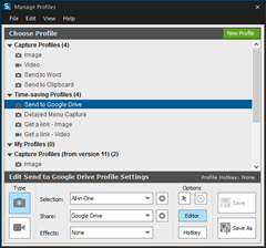
Snagit is obviously well known for capturing screenshots, but you should also know that it also captures video as well. Their new enhanced capture now lets you select the area to be captured first, then you can select whether you want to snap a screenshot or record a video clip. Another useful feature to note is scrolling capture. Need to capture an entire webpage of content for example? This lets you do that quickly and easily. Profiles can also be used to streamline your capturing process. These customizable profiles let you configure a capture and choose how to take the image and what to do with it when taken. For instance, you can set it up to export to a specific location like Dropbox, or be inserted directly into an application like Word.
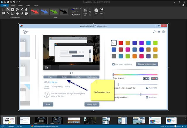
Once your image or video is captured it’s opened in the newly designed editor. Here you have plenty of editing options for images, and for videos you can do basic editing. Taking a screenshot is one thing, but what you can easily do with it afterwards is key in many cases. When writing articles about the various Stardock applications we have, it’s often useful to point out or emphasize specific parts of the UI to show users a feature or function. Snagit excels here because it has a variety of tools that are designed to accomplish this task. Whether it’s a simple arrow, a speech bubble, or one of the many stamp graphics available, you can be sure you have the right tool to show and direct viewers to exactly what you want them to focus on in an image.
The editor is actually very useful for all types of image editing. It use it frequently just for basic editing like resizing and cropping even with images I didn’t originally capture with Snagit. You can expand Snagit even more by downloading more stamps to use in your images, and there’s a wide variety available for download.
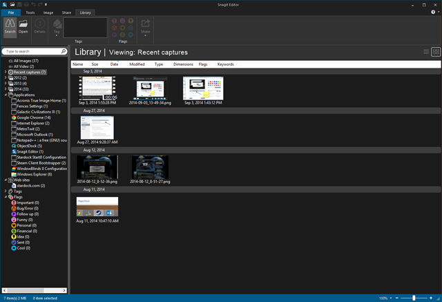
The number of images you capture can quickly add up, but Snagit has an integrated library where you can find, sort, and view past captures. The Snagit library sorts captures by date or by the application they were captured from. This is especially useful for me because I can quickly find the images that were taken from a certain app such as WindowBlinds or ObjectDock. Images can also be tagged or assigned flags for even more organization.
Getting your image captured and edited is one thing, but doing something with that image is another. That’s why sharing is a very big part of Snagit and they’ve continually updated this with more sharing options. Images can be saved in the familiar way of saving into a variety of supported image formats, or you can export images into various applications using the integrated output accessories. With just a click you can export right into Word, OneNote, Camtasia Studio and other supported applications. Snagit also lets you share to Facebook, YouTube (video captures), Dropbox, Google Drive and to Screencast.com. Other outputs for other services and apps can be downloaded to expand sharing even further.
There’s still lots of features I wasn’t able to cover, so be sure to visit the Snagit site to get an overview of everything that Snagit can do. It’s one of my most used apps on both my Windows PC and Mac, and I highly recommend it.
They offer a free trial, and there’s upgrade options also available for previous users.
Link: Snagit
Use Launch8 for a Quick Launch Dock to Windows 8 Start Screen
Tuesday, August 19, 2014 by Island Dog | Discussion: Personal Computing
Since the launch of Windows 8, Stardock has released several award winning apps, like Start8 and ModernMix to bring back lost functionality and add new features for users of Windows 8. Another Windows 8 app from Stardock is Launch8.
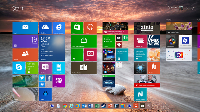
Launch8 adds the convenience of a quick access stationary dock on your Start screen. Drag and drop your favorite applications to your Launch8 dock and quickly launch them no matter where you have swiped to on your Start screen.
Learn more about Launch8 | Get Launch8 for just $4.99
Once Launch8 is installed you will have a dock on your Windows 8 Start screen. You can choose to place the dock at the top or bottom of the screen, and customize it to have a translucent background.
Apps are added by simply dragging and dropping them to the Launch8 dock. You can create shortcuts for Windows 8 Modern apps or regular desktop apps that you use everyday. Icons can be arranged by dragging them around, and the size can be controlled in the Launch8 configuration.
The Windows 8 Start screen can become quite large if you have a lot of apps displayed. The Start Screen scrolls from left to right to display all of your apps. Launch8 stays stationary so you will always have quick access to your shortcuts, regardless of where you have scrolled to on the Start screen.
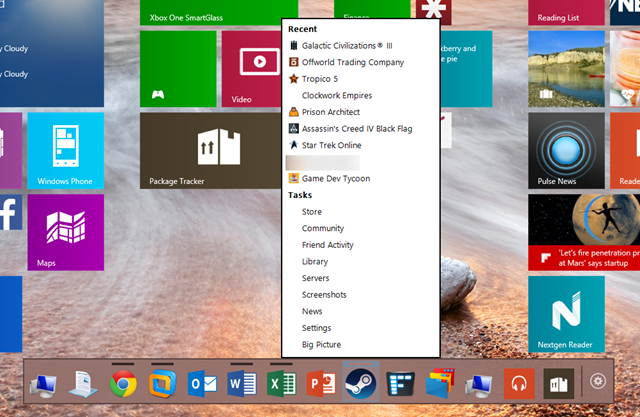
Launch8 can also be enabled to show jumplists for apps that utilize them. In the screenshot above I am viewing the jumplist for Steam showing items like my recently launched games. This is especially handy with many apps, including Office where you can open recent documents right from your dock.
If you need a way to have quick access to frequently used applications on your Windows 8 Modern Start screen, Launch8 is the perfect solution.
3 Stardock Apps for a Productive Office Desktop
Friday, July 18, 2014 by Island Dog | Discussion: Personal Computing
Whether you work in a traditional office environment or have your own home office setup, having your Windows desktop working at maximum efficiency is a key step in being as productive as possible. Stardock makes a bunch of great desktop customization and enhancement apps, and while they all offer a benefit to the desktop, I wanted to write about the ones I think are a huge benefit to your productivity as well.
I have used these applications in my home office for years, and I can say without a doubt they help keep my desktop organized and keep my workflow going.
Fences®
Fences is really one of those must-have tools for your desktop. It’s been very popular since it was first introduced and millions of users use it to keep their desktop icons clean and organized. Fences gives you the ability to create shaded areas on your desktop that hold your icons so you can keep them organized and your desktop clutter-free. Multiple fences can be created and their size and shape can be adjust to fit on your desktop just how you like them.
ObjectDock™
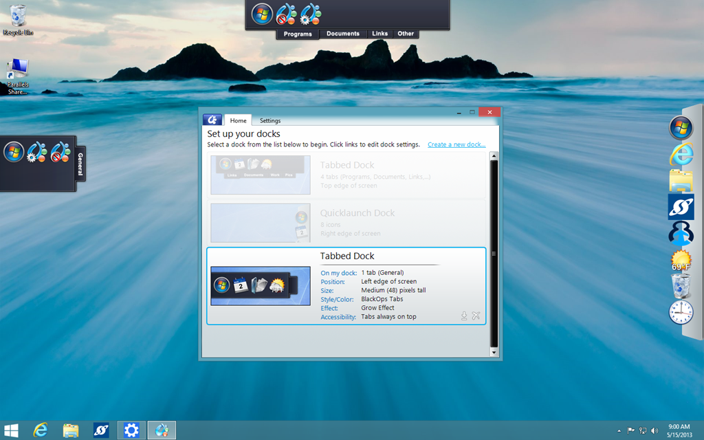
ObjectDock puts an animated dock on your desktop where you can launch applications, file shortcuts, folders, and more. The dock can be customized with custom backgrounds and icons, the size and position can be changed, and effects can also be applied. In addition, ObjectDock also supports docklets which are mini-apps that can display information like the weather, calendar, clocks, and more. ObjectDock also has tabbed docks which makes it easy to organize apps and shortcuts by using sorting them into different tabs. It’s a fantastic way to have quick access to frequently used items.
Tiles™
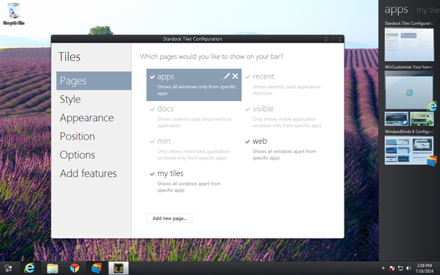
If you have lots of running applications on your Windows desktop then Tiles is an app that can help you greatly. Tiles puts a customizable sidebar on your desktop which contains multiple pages that let you manage your running tasks and application windows. You can switch between pages by swiping your mouse or using the keyboard, and Tiles even supports multi-touch displays.
$5 Stardock Apps for Windows 8
Monday, July 7, 2014 by Island Dog | Discussion: Personal Computing
Stardock has several apps under $5 that are designed to make Windows 8/Windows 8.1 easier to use and to restore lost features such as the Start menu. Below is a quick overview of each app and what it can do to enhance your Windows 8 experience.
Start8®
The start menu in Windows 8 was removed, and in the 8.1 update, Microsoft brought the start button back. Unfortunately, their start button DOES NOT bring the Start Menu with it, it launches the Windows 8 Menu. Start8 returns the missing Windows 8 start menu and brings additional features like customization, pinning of desktop and Metro apps, unified search, and more.
Start8 was listed in the "PCWorld Top 100 BEST" list, covered by USA Today, Forbes, CBS News, the Wall Street Journal and more!

ModernMix™
There are some cool and useful Modern UI apps available for Windows 8. The problem is, these apps take up the entire screen when opened, which is annoying when running an app like the weather app. ModernMix takes those apps using the Modern UI (Metro) and puts them in desktop windows so you can easily re-size, switch back and forth through running applications, and easily close out of them.

Decor8™
Windows 8 limits your start screen customization options to only a few provided background images and a few pre-defined color schemes. Decor8 removes these limitations and provides the freedom to personalize your start screen with your own images and colors.

Launch8™
Launch8 is an application for the Windows 8 Start screen which places a stationary dock on the Start screen. The Launch8 dock stays in place while you scroll through the Start screen and lets you quickly launch applications right from the dock. You can add apps to the dock by dragging and dropping so you’ll always have quick access regardless of where you have swiped through your Start screen.

Using Object Desktop Manager
Thursday, May 1, 2014 by Island Dog | Discussion: Personal Computing
If you are a subscriber to Object Desktop, it gives you a bunch of great applications like WindowBlinds, DeskScapes, Start8, ModernMix, and more. We also make a download and update manager specifically for Object Desktop users so you can easily manage the apps available to you with your subscription. I wanted to give you a look at Object Desktop Manager, and how you can take full advantage of it.
Learn more about Object Desktop
Purchase Object Desktop for just $49.99
Downloading ODM
You can find the download to Object Desktop Manager in your Stardock account. Here you can also download your apps individually if you need to do so. Just download and install the app and enter your Stardock account credentials.
Installing and Updating Apps
Installing and updating your Object Desktop apps is the main focus of Object Desktop Manager. Once ODM is setup you will see a list of all the applications available for you to download and install. All you have to do now is check which apps you want and click the install button. The installation will proceed and you’ll just follow a few prompts, and soon you will have all these cool apps ready for your desktop.
Updating app is very similar. As you can see in the screenshot below there’s an update for ModernMix, so I just need to check the box on that and install. When a new update is available Object Desktop Manager can notify you via the system tray, and you can even configure ODM to download the updates.
Managing Your Object Desktop Apps and Subscriptions
Not sure if you have a particular app installed? Need to uninstall it for some reason? No problem. Just click ‘Installed’ at the top of the ODM app and you’ll see a list of all the apps you currently have installed. You can even launch the software from here or uninstall apps from here as well.
Clicking the ‘Subscriptions’ link you can see your Object Desktop subscription information like your expiration date and product key. If you have a subscription to WinCustomize.com, you can also see the expiration date for that too. From here you can press the Extend button and be taken to our store to renew/extend your subscription.
Additional Settings
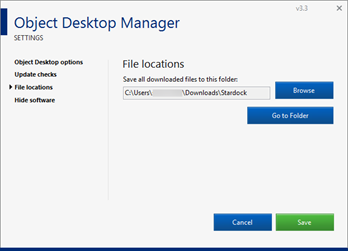
The default settings in Object Desktop Manager will work for most users, but if you need to change some of the configuration you can do that in the settings window. Just click the gear icon in the upper-right of ODM and click Settings. Here you can configure a variety of other settings like showing beta versions of app, launching ODM at Windows start, update check time and auto-downloading of updates, file locations, and more.
3 Tips for Using Stardock's Fences
Wednesday, April 9, 2014 by Island Dog | Discussion: Personal Computing
Fences has been one of the most popular desktop organization apps since its introduction several years ago. It has nearly 5 million downloads on Download.com alone and has been recommended by many publications including Lifehacker, PCWorld, and more.
If you aren’t familiar with what Fences does, let me give a brief explanation. If you have a desktop full of icons they can quickly add up and become an unorganized mess in a hurry. Fences lets users create shaded areas on the desktop which contain groups of icons which you can organize inside these areas.
There’s lots of other cool features in Fences that can help you to keep your desktop organized, and here are 3 of my favorite tips to get the most out of using Stardock’s Fences.
Use Rules for Sorting
This is an awesome feature that I think some users might overlook when setting up Fences. You can setup rules in Fences which will help you with sorting and auto-organizing icons. By default, any new icons appearing on your desktop just go right to the desktop. By using a rule, you can set it up to where a certain type of icon will be placed in a fence that you define.
For instance, you can create a rule that will place all new image icons into a fence you have created just for that purpose. You can choose from a variety of types for your rules such as images, documents, folders, web links, and more. You can also set name-based and time-based rules as well.
Customize the Appearance
We like customization, and there’s quite a few ways you can customize your fences. My personal favorite ability is being able to adjust the transparency of a fence. This works great when trying to blend in with a desktop wallpaper I might be using. Fences also allows you to adjust the color by using sliders, and you can also adjust the label text, size, and font used.
Another cool trick is that you can hide a fence by right-clicking the fence, and setting it’s opacity to 0. With that set, the fence and its icons will be hidden until you mouseover the fence.
Create Folder Portals
Do you have a favorite folder you access al the time and want an easier way to interact with it? With Fences you can create a Folder Portal that you can access the contents of any folder right on your desktop. Setting up a portal is nearly the same as setting up a regular fence, but you’ll just need to select the folder to you want to access.
Customize Your Windows Desktop With These $10 Apps
Friday, March 14, 2014 by Island Dog | Discussion: OS Customization
The ability to customize your Windows desktop has been around for quite some time now, and there's never been a better time to jump in and start making Windows look and work how you want it to. We've previously talked about how Stardock has several $5 apps to make Windows 8 more usable, and today we're going to take it a step further with some other customization and enhancement apps that are just $10.
Lets take a look at some of the best and most popular desktop customization apps that you can use to completely change the look and feel of Windows 8 and Windows 7.
WindowBlinds
WindowBlinds is the flagship application in the Object Desktop suite, and has been downloaded more than 18 million times on Download.com alone. WindowBlinds lets Windows users change the entire look of Windows by applying skins to the user interface. There are thousands available for download on sites like WinCustomize.com which offers a huge variety of skins in just about every color and design you could possibly imagine.
Users can even customize skins further by applying colors, textures, and by adjusting the transparency of different parts of the user interface. If you are using Windows 8 and the popular Start8 application to bring back the start menu, then WindowBlinds will also skin the start menu to match the rest of the skin.
TIP: Object Desktop includes all the apps we talked about today.
Get WindowBlinds for just $9.99.
DeskScapes
DeskScapes is another popular app, and it also goes along perfectly with other apps such as WindowBlinds. DeskScapes brings animation to your desktop by using videos and animated pictures as your desktop background. You can also customize your own background wallpaper with effects, and also includes support for multiple monitors.
TIP: Create your own animated wallpapers with the DreamMaker app included with DeskScapes.
WindowFX
WindowFX is a another cool product that really enhances your desktop experience by adding over 30 animated effects to your desktop windows and over 20 that can be added to your start menu. Animations can be applied to such things like open and closing windows, moving windows, and more.
Other features including the ability to automatically resize windows, hide labels on desktop icons, and use a focus feature to highlight open windows.
TIP: Many of the animations can be configured with different animation styles
Reminder: Backup Your Object Desktop Apps!
Tuesday, March 4, 2014 by Island Dog | Discussion: Personal Computing
This is something I’ve talked about many times before, but it always deserves repeating and a reminder every once in a while. When you purchase a subscription to Object Desktop you get a great deal on a whole suite of the best desktop enhancement and skinning applications available.

Included with your subscription is:
- WindowBlinds
- DeskScapes
- Fences
- Start8
- ModernMix
- Tiles
- and more!
As long as your subscription is active, you will always get updates to the latest versions and any new apps that are added during that time. While most people renew for many years, some also let their subscriptions lapse or just subscribe for one year at a time. When your subscription is no longer active, you will no longer have access to new updates, but you will still have the apps you had during your subscription to use.
However, it is very important that you backup and archive those apps for future use. If you are using the Object Desktop Manager app, it will save your downloaded files to a folder on your hard drive.
Typically, they will be here: C:\Users\YourName\Downloads\Stardock
You can specify that location in the ODM preferences.
Even if you have the Object Desktop Manager installed and use it, I also recommend downloading the individual files from your Stardock account and making a second backup with those. You can access your downloads here.






![preview-1-7998[1] preview-1-7998[1]](https://draginol.stardock.net/images/islanddog/3d81fd7d50bf_EDDD/preview-1-79981_thumb.jpg)


