Animated Wallpapers for Windows 8 with DeskScapes 8
Wednesday, February 20, 2013 by Island Dog | Discussion: Personal Computing
Animated wallpapers on the Windows desktop made their debut several years ago, with the original version of DeskScapes and Windows Vista Ultimate. Microsoft removed the option with Windows 7, users could continue to use Stardock DeskScapes to bring animated wallpapers (AKA Dreams) to the PC.
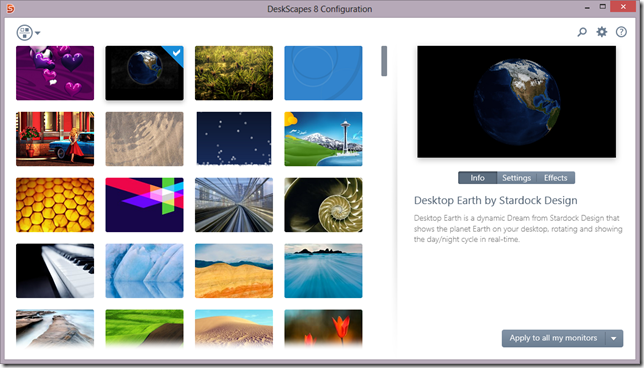
With Windows 8’s availability, Stardock has DeskScapes 8 (beta) available to get those animated wallpapers back on your desktop. DeskScapes does much more than that, as you can add over 40 effects to your static or video wallpapers, recolor wallpapers using simple sliders, add animations to static images, and more.
There are thousands of animated wallpapers available to download for free from WinCustomize.com. These range from subtle landscape scenes to custom 3D animations, so there’s something for just about every style you can imagine. DeskScapes 8 can also use WMV files so you can easily use your own videos as an animated background as a screensaver!
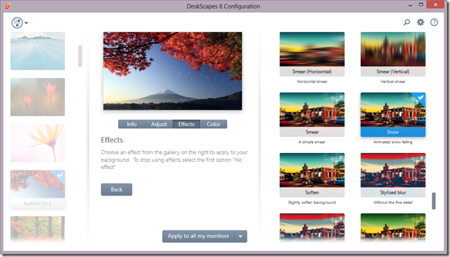
DeskScapes can apply animations to your favorite static images too. In the screenshot above, I have a nice looking landscape image and I have used DeskScapes to apply a falling snow effect which adds animated snowflakes on that image. DeskScapes also supports multiple monitors, so you can apply different wallpapers on each screen, or stretch over multiple monitors.
DeskScapes 8 is available as a free beta download now!
The full version is just $9.99 and is also part of the Object Desktop suite of apps which includes other great applications such as Start8, Fences, Decor8, WindowBlinds, and more.
Get more info and the beta here - https://www.stardock.com/products/deskscapes/beta/index.asp
Getting a Start Menu for Windows 8
Wednesday, January 30, 2013 by Island Dog | Discussion: Personal Computing
Whether you upgraded to Windows 8 from a previous version of Windows, or just bought a new PC, you may have noticed that the start menu in Windows 8 is missing. You didn’t do anything wrong, this is just how Windows 8 was designed. For those users who miss it, I want to show you a way to get the start menu for Windows 8 back.
Start8 from Stardock brings the start menu/button back to your Windows 8 desktop.
Along with the start menu/button, Start8 allows for further customization in both appearance and functionality. Pin your desktop and Metro apps to the Start8 start menu, boot directly to the Windows 8 desktop, shut down with one click, and much more.
After the quick/easy install…
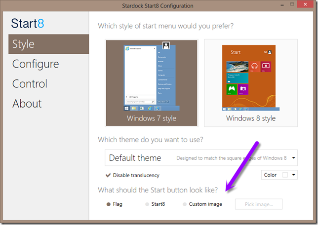
Start8 gives you a choice of styles for your start menu. Choose from the Windows 7 style - which most are probably familiar with - and the Windows 8 style, which gives you a start menu in the Modern UI (aka Metro) style. Additional options allow you to tailor the start menu to a size and style that works for you. Start8 also gives you several choices in start buttons to be displayed on the taskbar, you can easily create your own or download buttons created by others and shared on WinCustomize.com.
Customize the start menu…
Users can also configure Start8 to function in the way that best suits them. For example, have the Windows key on your keyboard set to show the Windows 8 start screen, and clicking the start button on the desktop will bring up the start menu. Another option is to have Start8 show the start button on a secondary taskbar, and it can also disable Windows 8 hot corner when at the desktop. Those are just a few examples, but you have the ability to set Start8 as you like.
Start8 is available as a free trial, and just $4.99 for the full version. It is also part of the Object Desktop subscription which includes Fences, and many other desktop enhancement and productivity applications for Windows. Object Desktop subscribers also enjoy the benefit of trying out any new software before our other customers.
More info can be found at Start8’s website.
Start8 - https://www.stardock.com/products/start8/
Object Desktop – http://www.objectdesktop.com
Add Windows Media Center to Windows 8 Pro (free offer expires January 31)
Wednesday, January 23, 2013 by Island Dog | Discussion: WinCustomize News
If you have already upgraded to Windows 8 Pro, be sure to visit http://windows.microsoft.com/en-US/windows-8/feature-packs before January 31 to take advantage of the free Windows 8 Media Center Pack offer.
The Media Center pack also includes video codecs for decoding MPEG2 videos (these were previously available in Windows 7, but are limited to the Media Center pack for Windows 8 Pro users).
Even if you have no plans to use Media Center, we encourage you to take advantage of this free upgrade AND use the code before the end of January. The future DeskScapes 8 beta and release will be encouraging the use of AVI/WMV codecs for dreams.
Using Decor8 to Change Your Windows 8 Start Screen
Monday, December 10, 2012 by Island Dog | Discussion: Personal Computing
Windows 8 has the new Start screen (aka Metro) which some users love, and others hate. After having use it for a while, I have come to like it and use it often especially since there have been some great apps released recently. One thing about the Start screen though is you really can’t customize it much aside from colors and a few included background images.
That’s where Decor8 comes in and gives you ability to further personalize your Windows 8 experience. Decor8 allows you to change the Windows 8 Start screen to one of many included images, or use your own images. You can also create a slideshow of pictures or have background images changed at timed intervals for an even cooler experience. Decor8 also does much more by letting you choose and create your own color themes, along with apply effects to your images and even control how many rows of tiles to show on your start screen.
You can get Decor8 here - https://www.stardock.com/products/decor8/
Using Decor8 is pretty simple. In the Backgrounds setting is where you can choose and set your start screen background image. As I mentioned before, there’s many included but you can certainly use any image on your PC. You can load an individual image file, or select image folders that Decor8 can display. All you have to do is select the image you want and you can click through to the start screen to see if you want to keep it or choose another. You can also choose several (or all) images and set them to change at timed intervals.
Decor8 also gives you the ability to apply effects to your background images. You can and adjust the fade on your images, add some blur, or adjust the color and contrast. This allows you to really personalize the start screen experience!
In the Colors settings, you can either choose to use a standard color theme, or get really creative and choose your own custom color scheme. Here you can change the colors of various areas including the background color, accent color, standard tile color, and the text color.
Additional features of Decor8 allow you to define the default row count for Tiles, and the ability to change your Lock screen images also. If you are tired of the default personalization options in Windows 8, then come give Decor8 a try and make your Windows 8 start screen your very own.
Decor8 is available as a free 30-day trial and can be purchased for only $4.99.
Get it now: https://www.stardock.com/products/decor8/download.asp
GUI Champs 2012: Most Creative and Most Usable Wallpaper Winners Announced!
Wednesday, November 14, 2012 by Island Dog | Discussion: WinCustomize News

We are excited to announce the winners in the Wallpapers category for Most Creative and Most Usable in the 2012 GUI Champs! We had over 70 wallpaper entries and it took our judges a while to decide on the finalists, which were then open to public voting.
Now for the winners!
Most Creative
First Place: The Cyper Club by neone6
39.41.jpg)
Second Place: Water Towers by RomanDA
36.36.jpg)
Third Place: Eyecon by TheMasterBaron
83.91.jpg)
Most Usable
First Place: Galaxus 7 by roflmfaoo
80.88.jpg)
Second Place: Bashful Benny waited too long by teddybearcholla
55.58.jpg)
Third Place: Morning Glow by DEVJIT
92.102.jpg)
Prizes:
Most Creative
-
1st Place:
$150 Cash, Logitech Optical Gaming Mouse G400, 1 Year Object Desktop Subscription and 1 Year WinCustomize Subscription
-
2nd Place:
$100 Cash, 1 Year Object Desktop Subscription and 1 Year WinCustomize Subscription
-
3rd Place:
$30 Stardock Money*, 1 Year Object Desktop Subscription and 1 Year WinCustomize Subscription
Most Usable
-
1st Place:
$150 Cash, Logitech Optical Gaming Mouse G400, 1 Year Object Desktop Subscription and 1 Year WinCustomize Subscription
-
2nd Place:
$100 Cash, 1 Year Object Desktop Subscription and 1 Year WinCustomize Subscription
-
3rd Place:
$30 Stardock Money*, 1 Year Object Desktop Subscription and 1 Year WinCustomize Subscription
Congratulations to the winners, and a big thanks to everyone who submitted wallpapers!
Life with Microsoft Surface: Day 6
Thursday, November 8, 2012 by Frogboy | Discussion: Personal Computing
Yesterday I mentioned that there's no Metro version of the Windows essentials utilities. This remains a baffling issue as a Live Movie Maker and a Live Writer would be very nice to haven.
I will say that the Metro version of Skype is nice. Which brings me to today's observation: Microsoft has got to come up with a distinct classification for WinRT apps because it's impossible to do a decent search on the terms Modern and UI. As in, what is the best Modern UI Facebook client.
The nice thing about the term Metro is that it's distinct. Like iOS or Android, it lends itself to being easily searchable and instantly recognizeable as being different from a normal Windows app. Modern UI won't cut it. We need a term or else we'll end up stuck with something like WinRT which in itself is problematic. I think Microsoft should have just bit the bullet and paid whatever they had to pay to keep referring to these apps as Metro apps.
Surface isn't competing against my iPad for use right now. Instead, it is competing for use with my MacBook Air. It's ironic that Surface shines the most as a notebook rather than as a tablet. I can, and have, used it as a tablet but I find it most useful in using the upgraded keyboard with it. Frankly, if it didn't have so many rough edges (not the hardware, but the software) I'd be tempted to recommend it over any ultra portable out there. It's that good.
Start8: Using a Custom Start Button Image
Monday, November 5, 2012 by Island Dog | Discussion: Personal Computing
Start8 has been well received and has become quite popular with users of Windows 8. I wanted to focus on one feature in particular today which is the ability to use custom images for the start button. Start8 already includes a couple you can choose from in the main configuration, and there’s also several custom ones available that are included as well.
Change the Start Button
Changing the start button image is easy, just click the ‘pick image’ box in the Style section of the Start8 configuration. You’ll then open up a window where you can choose from quite a few different start button images.
We have a gallery on WinCustomize just for Start8 start menu buttons, and you can download more from there, and make your own to submit to WinCustomize to share with others. Once you download a start button image, just place it in the Start button folder in the Start8 directory.
Typically, that would be here: C:\Program Files (x86)\Stardock\Start8\StartButtons
Create Your Own Button
Start8 Start buttons are pretty easy to create. It’s just one image file with 3 images stacked vertically saved in a .PNG format.
Here’s an example:
Here are the 3 graphics stacked. The top is the normal state, then the hovered state, and the bottom is the pressed state. Each image represents what the button will look like in those states. That’s what the start menu button consists of, and when you have your image done you can place it in the folder mentioned above.
A free trial for Start8 is available, and the full version is just $4.99.
IS Microsoft Surface the Zune of tablets?
Monday, November 5, 2012 by Frogboy | Discussion: Personal Computing
I'm writing this with my brand-new Microsoft Surface. The best way to describe it is that Surface is to tablets what the Zune was to music players. It's not terrible but the $500 device has nothing to recommend for it.
As a notebook device, it's certainly better than the iPad. It supports multiple users. It supports mice (and on-screen mouse cursors). In short, you could realistically use this device as a very very light work machine. In theory. It comes with a Windows RT version of Office Preview which works adequately, if slowly.
Ironically, it's as a tablet where it falls down. I always assumed that the "Metro" experience would shine on a tablet. It doesn't. It's annoying and perplexing even there. Give me the option of having the charms bar up all the time and the specific app bar up all the time and it would be much more tolerable. I really don't like having to swipe at the screen in just the right way to get options to display. Getting around the Metro experience is a chore, even as a touch device.
It's very frustrating, at times, to navigate around Metro. I'm still new with I accidentally closed my editor because I was trying to switch to another tab (Which you do by swiping down from the top and selecting the tab). However, if you swipe too far down, it closes the app. Bam. Gone.
What's worse is the app selection is pitiful. Don't even think about using Office apps as a pure tablet. It's very frustration trying to use what is clearly a Win32 port with a touch screen. It does much better once you've sat down, hooked up a mouse, and started working with a real keyboard. The situation with Modern UI apps (which I'm just going to keep calling Metro) is even worse. The included ones are slow. Very slow. I also couldn't find decent third party apps that I'd use. If there's a Pulse/Flipboard quality RSS reader for WinRT I haven't found it yet. There just isn't that much to do with it.
The form factor also makes it an awkward tablet. It's very long (or wide, depending on how you look at it). It's also quite heavy. Too heavy to want to use as a tablet for an extended period of time.
Getting more apps for it is also painful. The Windows Store is terrible. As anyone who has used Windows 8's store knows, it's an assault on the eyes. Lots of multi colored blocks that tell you nothing about the app. It's just very hard to find things.
The Unopening:
Here's my friend Paul (former guest on PowerUser.tv) trying it out.
Just a few points to take home from this from my notes:
The Bad:
- Note Facebook app
- No bundled Twitter app
- No bundled RSS app
- Apps load extremely slow
- Very hard to navigate around
- Too easy to unload things entirely
- Too heavy to use for an extended period of time as a plain tablet
- It's ergonomically inferior as a tablet
- The Office port is embarrassingly half-assed
- Lack of app selection makes it hard to justify using vs. an iPad or Android device.
- UI usability lacks a lot of polish, awkward to use at times
- You cannot use this as a laptop (the stand requires a desk)
The Good:
- The mouse and on screen cursor is a huge win.
- It's actually a pretty decent notebook PC if you buy the upgraded keyboard.
- The screen isn't bad.
Overall, for $599 it's not a bad little notebook PC. But I can't imagine why anyone would want to use this as a tablet versus its competitors unless you have some specific enterprise need for multiple users and superior security.
Grade:
Hardware: B
Software: D
Update:
I am really digging the form factor. It's replaced my MacBook Air for light computing. But it's pretty mediocre as a tablet. It's a light PC.
Meanwhile, Halloween strikes Stardock
Wednesday, October 31, 2012 by Draginol | Discussion: Stardockians
It’s a mad house! A MAD HOUSE!
I can feel your anger.
Prince Ari, turns out to be, Aladin!
I…don’t know what this is. Journey?

You gotta find that paw print!

She is in charge of our health care insurance.
The marketing team is ready!

Don’t let Kotaku see this
Awesome
This costume is so good that I actually don’t recognize who this is.
Just very disturbing.
Multiplicity 2.0: Feature Focus - Drag, Drop & Transfer Files
Monday, October 8, 2012 by Island Dog | Discussion: Personal Computing
This video demo shows how to easily drag, drop, and transfer files using Multiplicity 2.0.
https://www.stardock.com/products/multiplicity/index.asp


