Windows 8: Start button returns
Thursday, March 1, 2012 by Frogboy | Discussion: Personal Computing
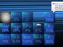
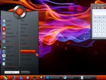
Here’s what we’ve put together in 24 hours:
So if Microsoft doesn’t restore the Windows 8 desktop to being able to work without jumping back and forth between it and Metro, we’ll do it.
Obviously we can improve on this but we’ll see how much Microsoft fixes things up before we invest too much time on this. Comment here if you think you’d be interested in something like this. As the Windows 8 beta evolves, we can start to look at what sorts of usability things need to be addressed and put together something more comprehensive.
Update: GO HERE to get it: https://www.stardock.com/products/start8/
Stardock is Hiring a Jr. Web Designer
Tuesday, February 28, 2012 by Island Dog | Discussion: Personal Computing
Any local Michigan folks looking for a Web Designer job should check this out.
https://www.stardock.com/about/jobs.asp#jr_web_designer
In this role you will work alongside other interactive designers and developers to produce work on usability and user centered projects. Projects include web pages, interactive kiosks, html emails, facebook pages, online banners and some print materials.
Responsibilities:
- Execute designs based on established look and feel and brand guidelines
- Work with lead designer
- Consistently bring new ideas to your designs
- Proactively participate in brainstorming sessions
Qualifications:
- 1-2 years design experience
- Proficiency with the Adobe Creative Suite: Photoshop, Illustrator, InDesign, Dreamweaver & Flash
- Professional experience with HTML and CSS is a must
- Ability to multi-task and balance multiple projects
- Graduate with BA or BFA
- Great attitude a must, as well as flexibility
A plus if you have the following:
- Experience in a creative or agency environment
- JavaScript, XML, and/or PHP
- Knowledge of Offset Printing processes
Interested and qualified candidates apply now!
If you're enthusiastic about the position and would like to tell us about it, please send Resume, pdf samples of work/or website address and salary requirements to klane@stardock.com, with "Jr. Web Designer" in the subject line.
WindowFX and Window Flipping
Thursday, February 16, 2012 by Island Dog | Discussion: Personal Computing
This is one of my favorite features of WindowFX, although there are many cool features which are equally as cool. Many people think WindowFX is only about animating windows and the start menu on your Windows PC desktop. Sure, that’s a big part of it but there’s other things that are especially useful as well. Let's look at what you can do using your middle mouse button.
You can set WindowFX to enable a flip feature where when you press the middle mouse button the window will “flip” and show you process information, allow you to open the containing folder, etc.
Get WindowFX here.
Using Stardock Tiles
Wednesday, February 15, 2012 by Island Dog | Discussion: Personal Computing
Tiles is one of the newest apps from Stardock that lets you take control of windows and running applications on your Windows desktop. Tiles places a customizable sidebar on the edge of your screen where you can view and interact with applications running. There are a bunch of options and configurations for Tiles that lets it work the way you want it to, making organization easy to do.
One of the ways I personally use Tiles is to use it a “virtual” desktop. I have several pages configured for common applications I use daily. For instance, I have a page for Office documents, one for web browsers, and another for e-mail clients. Usually with several applications running at the same time for each page, this can easily create a very crowded desktop. With Tiles though, I configure it to minimize and restore windows when pages are switched. When I switch to my Office page, all the windows in the Office page restore to the desktop. Switch to another page and those minimize and bring up the windows on the other page.
Here’s a quick video to show an example.
Another favorite use is just using it to switch applications. The Windows task bar isn’t bad, but unless you hover your mouse over an icon, you are limited to just seeing the icon representing an open window. Tiles gives you a live preview of the open window which is especially good when you have multiple windows open from the same application. Of course, you can customize Tiles to show icons, captions, etc. to give as much (or as little) information as you want.
These are just a couple of examples of how you can use Tiles to help manage your desktop. Tiles has a bunch of configuration options that lets you adjust Tiles to your workflow.
Get Tiles - https://www.stardock.com/products/tiles/
This Week in Skinning-February 10th
Skin Roundup for 2-10-12
Friday, February 10, 2012 by Island Dog | Discussion: OS Customization
![]()
Happy Friday everyone! This was a great week as we saw the first beta release of the very cool WindowFX 5, which you can get more info about here. I have been having a great time with it on my PC’s and I really like the start menu animations. Otherwise we had another good week of skins including a new Master skin from Xiandi.
Now for this weeks picks!
|
|
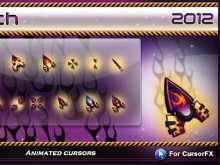
Nitro tech by Libardo You are missing out if you are not using CursorFX and downloading some of these cool cursors like this one. |
|
|
Space Invaders by Disturbedcomputer Retro gamers can rejoice with this very cool animated wallpaper. Nice work! |
|
|
Tiles 2597 by neone6 Neone6 has been doing some great work lately with skins for Tiles. Hope to see many more of these. |
|
|
Robots in love by vlad Just in time for Valentine’s Day comes a new wallpaper from vlad. Fantastic! |
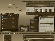
| Outlander by Xiandi The latest Master skin on WinCustomize with a slick style of brass and earth tones. |
Activating Existing Features in Tiles
Monday, January 30, 2012 by Island Dog | Discussion: Personal Computing
The other day I wrote a guide on how to purchase using the in-app functionality, and today I wanted to follow-up with another quick guide on how to activate purchases made. If you purchased an additional feature for Stardock Tiles, or have Tiles as part of the Object Desktop suite, you might need to activate your existing purchase/features.
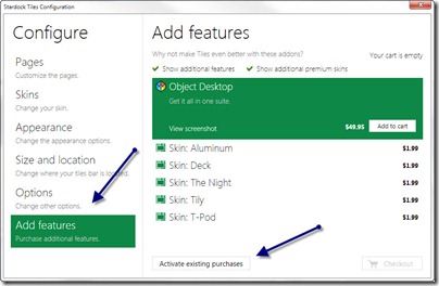
Open the Tiles configuration window and navigate down to the ‘Add features” area. Then click Activate existing purchases button.
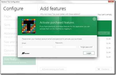
Now just enter your Stardock account e-mail and password.
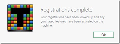
Tiles should recognize it and activate the features available for Tiles.
In-App Purchasing with Stardock Tiles
Friday, January 27, 2012 by Island Dog | Discussion: Personal Computing

Tiles 1.0 has been released and is now available for download. Tiles works by creating a side-bar on a user’s display. At the top of the side-bar are labels for each page such as ‘My Tiles’ or ‘Documents’ or ‘Apps’. Users can then drag and drop programs, documents, or website URLs onto Tiles. When the program is inactive, it appears as an icon. When it is active, it appears as a live preview tile.
Although it’s a free app there is an enhanced version available as well. You can upgrade to additional features or premium skins right inside the Tiles app itself. This guide will show you how.
Open the Tiles configuration screen by right-clicking and selecting it in Tiles. Choose the ‘Add features’ section. Here you can browse through the available features and premium skins. There’s a variety available and you can just purchase the entire bundle for $9.95, or just individual parts. You can also active existing purchases by entering your Stardock account information.
After you find the features you want and have added them to the cart, you can now begin the checkout process. You will first be asked to enter your e-mail address.
Next you enter your information and payment method.
Next you’ll see a summary and then you just need to click Purchase to complete the transaction.
You will now get a confirmation and your new features should be activated and ready to use!
This Week in Skinning-January 6th
Skin Roundup for 1-6-12
Friday, January 6, 2012 by Island Dog | Discussion: OS Customization
![]()
Welcome to the first edition of This Week in Skinning for 2012! January is usually a bit slow because so many take off for the holidays, but even so we always have skins to feature.
Now for this weeks picks!
|
|
Sunset_Butterfly by joyton This animated wallpaper puts a relaxing scene on your desktop with some smooth animations. |
|
|
Just that IP by pinchecl If you are looking for some fresh icon packs, pinchecl has been churning them out lately. |
|
|
Squares 1.0 by Osric_Wuscfrea This is a simple but cool looking set of skins for Rainmeter. |
|
|
Oak Tree by ernie leo I just enjoy the composition of this wallpaper. It goes great with darker themes. |
| En-Gauge by BoXXi A new and awesome skin from BoXXi. A fantastic design and use of colors. |
An Open Source, Customizable, Free Alternative to Windows Media Center!
Sunday, December 18, 2011 by DrJBHL | Discussion: Personal Computing
If you’ve been looking for a program to replace Windows Media Center which performs all its functions and is highly customizable, you’ve got to take a look at Media Portal.
It has Main areas: My Music, My Videos, My Pictures and my Weather. It’ll play all the file types WMC does, and do it your way via slews of plug-ins. You can create your own playlists and
- Watch Live TV or schedule and record
- Play videos, movies and DVDs
- Browse EPG and upcoming programs
- Listen to music and radio
- Stream media, radio, TV to any connected HTPC/PC connected to your network
- View pictures or create slideshows
- Browse all your movies
- Check weather, news, or information on the web and even play games
And, you can make it look the way you want with many different skins to choose from and tutorial videos. There are widescreen and non-wide galleries. You even skin the weather app.
Check out the skins here: http://www.team-mediaportal.com/extensions/widescreen
Anyway, I figured folks here would want to see it:


These are all different skins. You really should take a look at their gallery. It’s easy to navigate.
Hey! Have a happy Sunday!
Source:
http://www.team-mediaportal.com/
http://www.thewindowsclub.com/media-portal-open-source-windows-media-center-replacement
This Week in Skinning-December 16th
Skin Roundup for 12-16-11
Friday, December 16, 2011 by Island Dog | Discussion: OS Customization
![]()
Oh my, we have halfway through December and Christmas is just right around the corner. We are also wrapping up our 2011 Holiday skinning contest, and so far we have received a nice variety of skins.
Now for this weeks picks!
|
|
Season’s Greetings by amitsaran This is an awesome animated wallpaper for the holiday season. A great snow effect and beautiful background! |
|
|
Cubicals by pinchecl A new addition to the IconPackager gallery with a slick and detailed design. |
|
|
Alice, Her Dragon and The Christmas Tree by vlad Vlad has shared a new Christmas wallpaper with a fun and colorful design. |
|
|
Future sound two wb by madcat21 This WindowBlinds skin is just really cool. A very creative design, but still maintains usable every day. Great job! |
| Xmas Xtreme by WebGizmos This is a matching Winstep skin for the popular Christmas theme by mormegil. |


